TV Unit Decor · Listicle
20 TV Unit Decor Modern Interior Design Wins

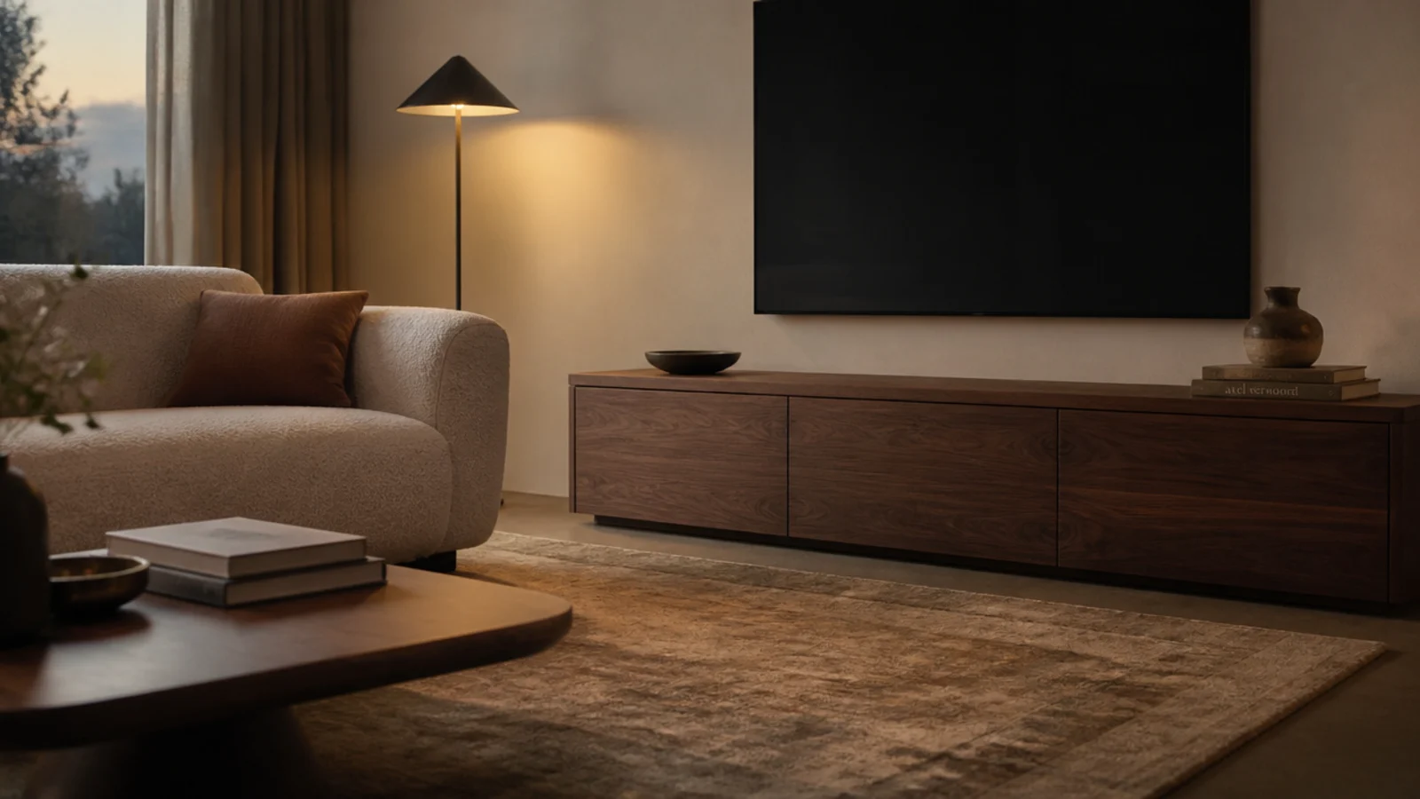
A television is the largest dark object most living rooms contain, and design fails around it in a predictable way: everything else gets quieter and quieter until the screen is the only thing left to look at. TV unit decor modern interior design solves that with proportion and repetition rather than concealment — give the black rectangle company, keep the cabinet below the sofa line, and let light come from three directions that are not the screen. Here are twenty decisions that consistently work.
In this guide22 sections — tap to openHide
- 1.What TV unit decor modern interior design solves first
- 2.Repeat the screen tone in three other objects
- 3.Work the wall to the rule of thirds
- 4.Test the sightline from the doorway
- 5.Balance the screen mass with height opposite
- 6.Run the rug toward the unit, not around it
- 7.Three light sources, none facing the screen
- 8.Repeat the timber tone at least twice more
- 9.Keep the unit lower than the sofa back
- 10.Treat empty space as a material
- 11.Give the room a second focal point
- 12.Scale the art to two thirds of the unit
- 13.Curve something to offset the rectangles
- 14.Choose texture over pattern near the screen
- 15.Hold one metal finish across the room
- 16.Hold the palette to three colours plus wood
- 17.Symmetry on a short wall, asymmetry on a long one
- 18.Zone an open plan with a back-to-back console
- 19.Hide function at seated eye level
- 20.Design the ceiling and floor planes too
- 21.Design for the screen switched off
- 22.Mistakes to Skip
What TV unit decor modern interior design solves first
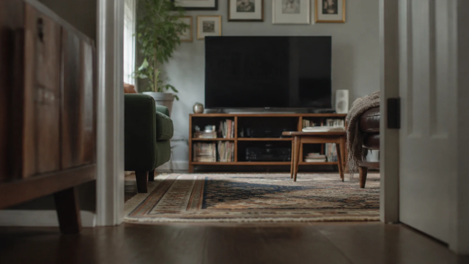
Start from the doorway. That first view, taken standing, decides whether a room reads as considered, and it is the one angle nobody photographs while arranging furniture. Walk in, stop, and look at what dominates.
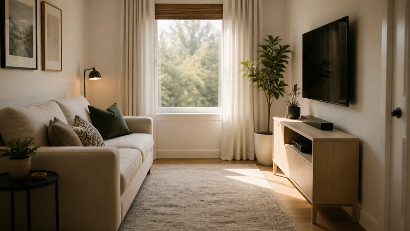
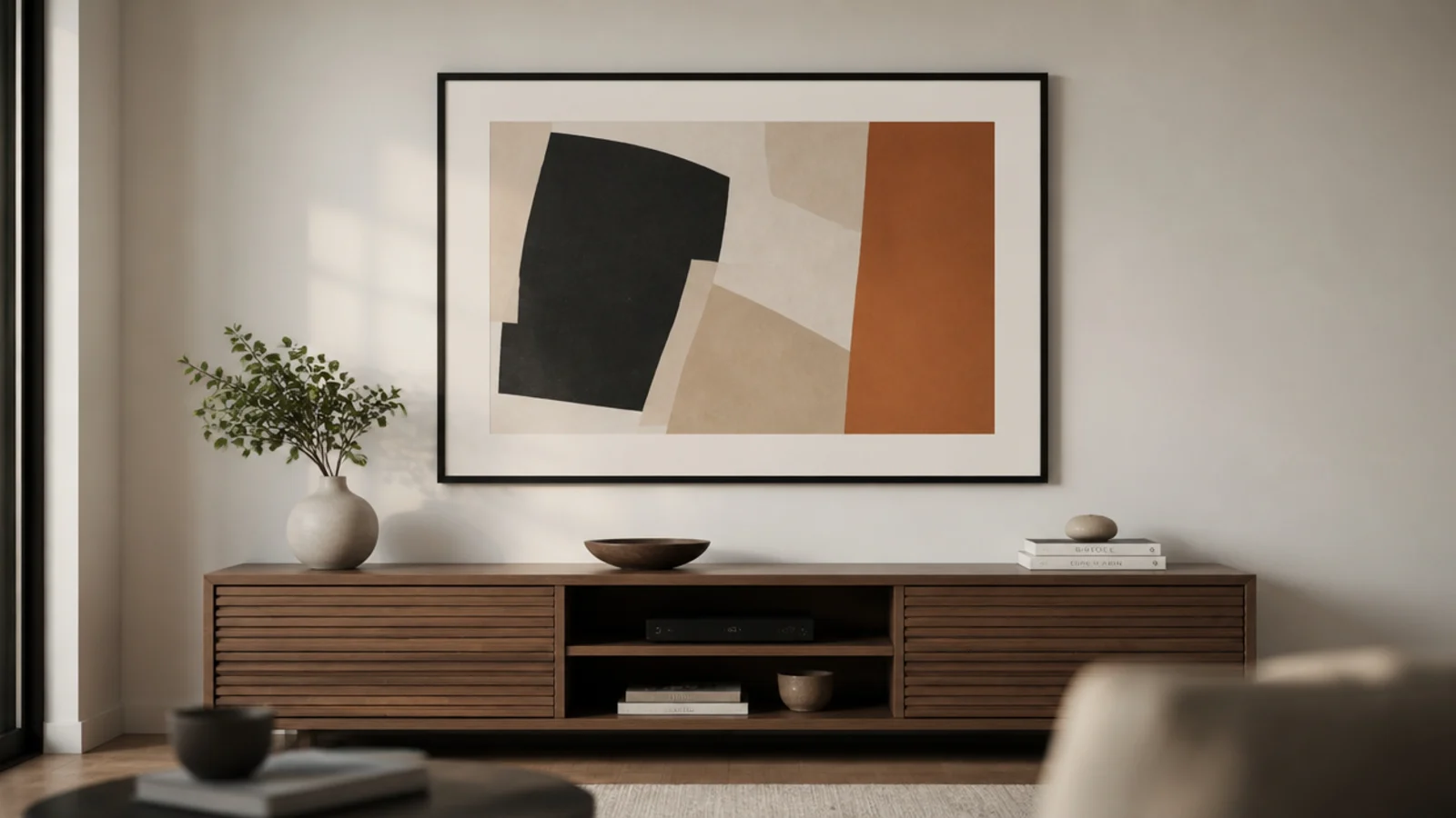
Then check the two proportions that matter. Cabinetry wants to cover roughly two thirds of the wall width, so a 12 foot wall carries a 90 to 96 inch run rather than a 48 inch unit stranded in the middle. And the cabinet top wants to sit below the sofa back, generally 16 to 20 inches against a 24 to 30 inch sofa, so the eye travels across the room instead of hitting a wall of furniture.
Then set the heights that are not negotiable. Screen centre at 40 to 42 inches, art bottom 8 to 12 inches above the cabinet top, rug edge 6 to 12 inches short of the unit. Everything else is preference. If the wall itself needs work first, the TV wall design guide covers panelling and paint.
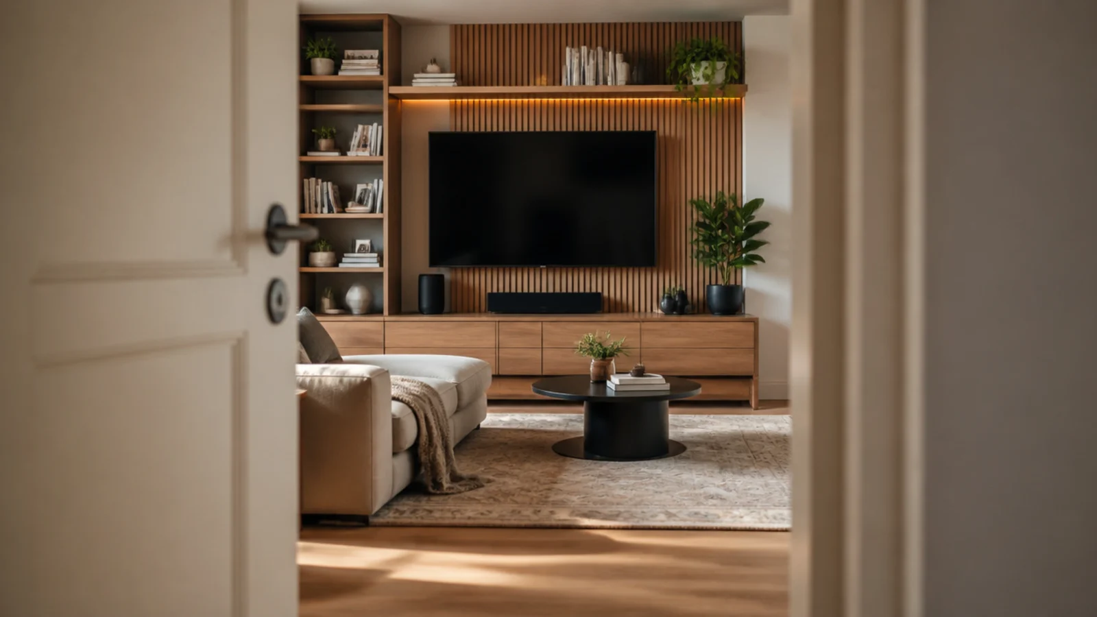
1. Repeat the screen tone in three other objects
A single black rectangle on a pale wall has nowhere to belong. Repeat that darkness deliberately — a charcoal basket on the floor, a black lamp base across the room, a slim dark frame — and the panel joins a family instead of leading one. Three repetitions is usually enough; two reads as coincidence.
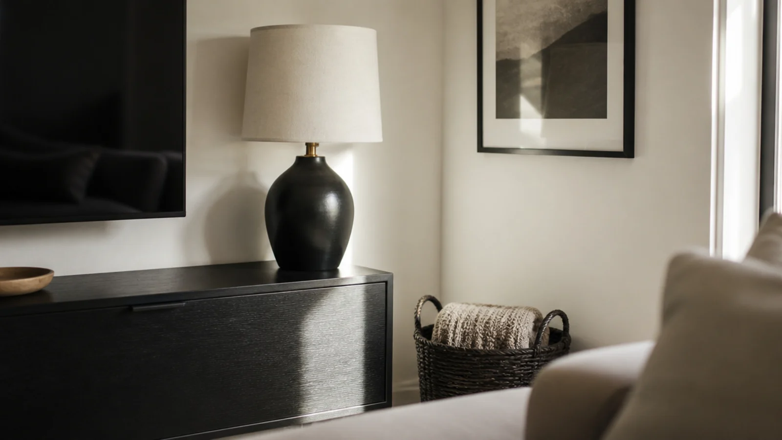
2. Work the wall to the rule of thirds
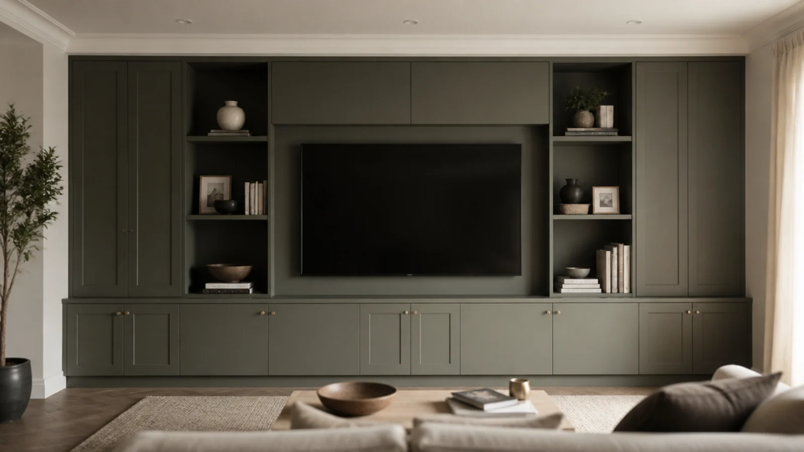
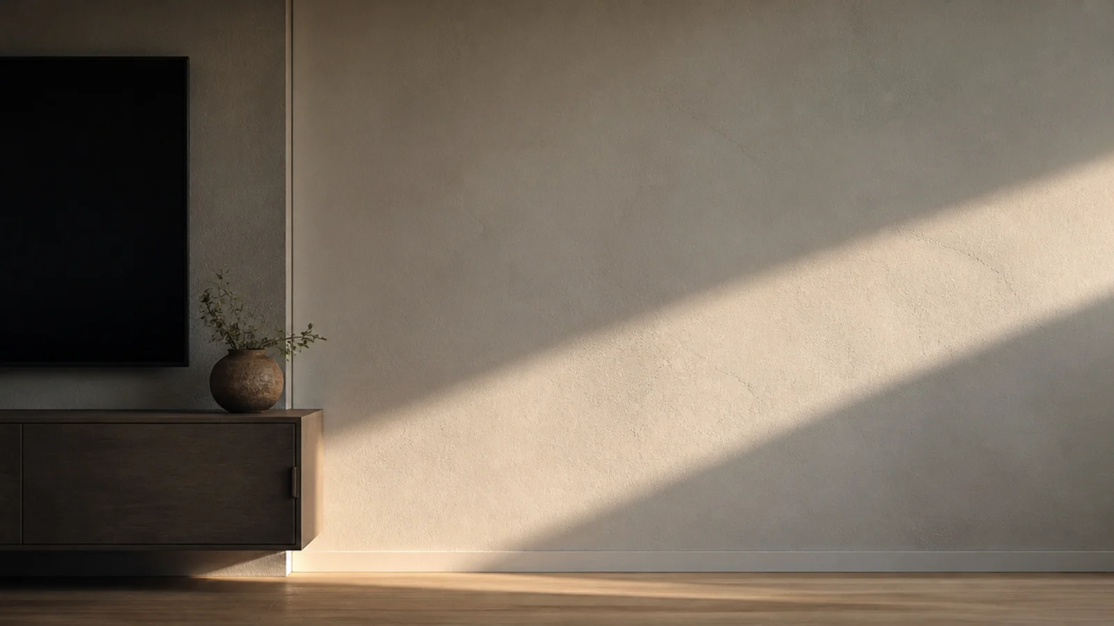
Divide the wall into three vertical bands and let cabinetry hold two of them. The remaining third stays empty plaster. It is the same instinct that stops a photograph feeling centred and dead, and it is why a unit that fills exactly half a wall always looks awkward from the sofa.
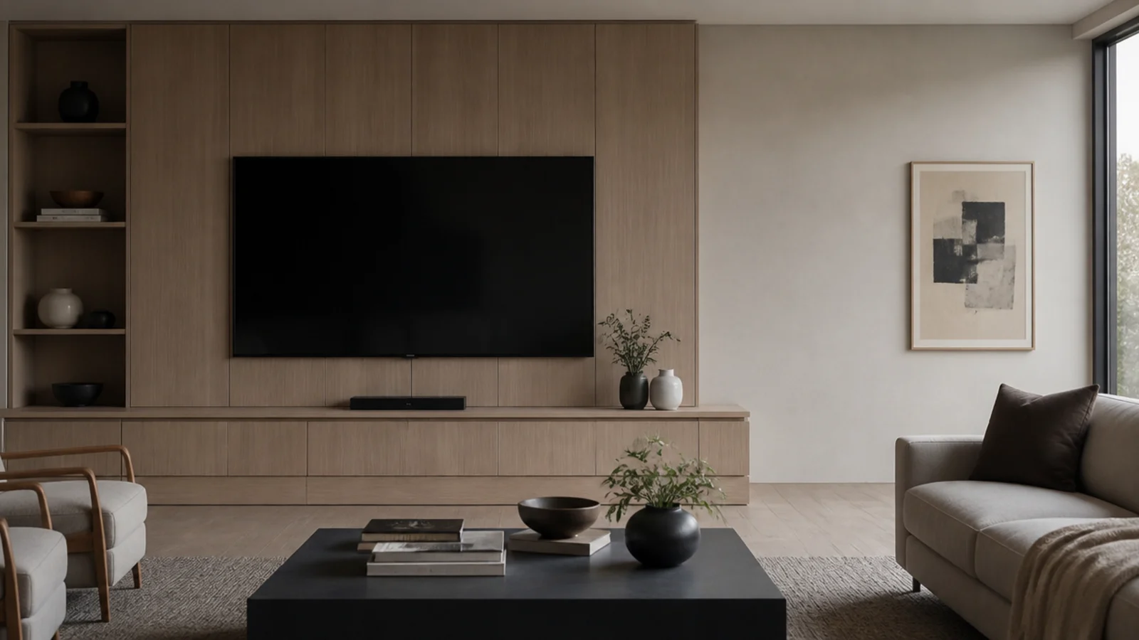
3. Test the sightline from the doorway
Sit down to plan the viewing, but stand in the doorway to plan the design. Anything that reads badly from the entry — a trailing cable, a mismatched basket, a stranded piece of art — reads badly to every visitor before they take a seat. Fix that view first. I keep a photograph of that exact angle on my phone while shopping, because a cabinet that looks generous in a showroom often looks squat from twelve feet away in a real hallway.
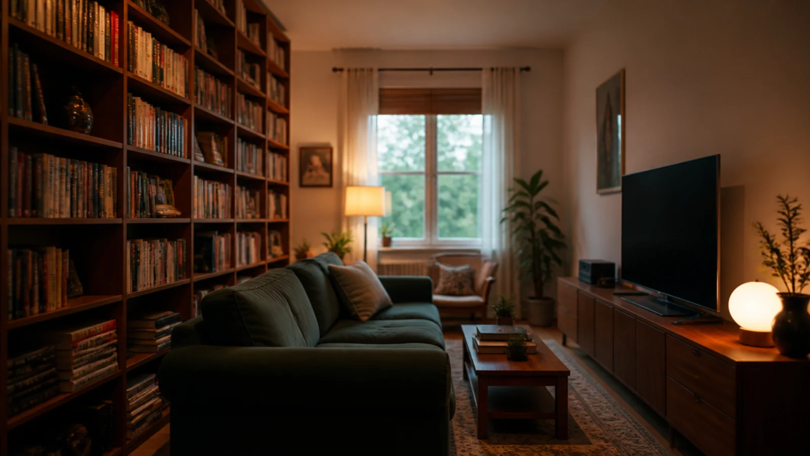
4. Balance the screen mass with height opposite
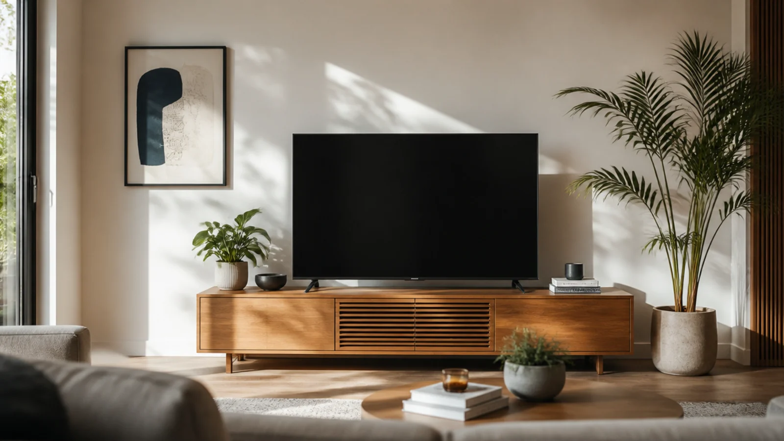
A media wall is heavy. Without something tall on the facing or adjacent wall, a room tips visually toward the screen. A bookcase, a tall plant at 5 to 6 feet, or a full-length curtain run gives the eye a counterweight and makes the seating feel held between two ends.
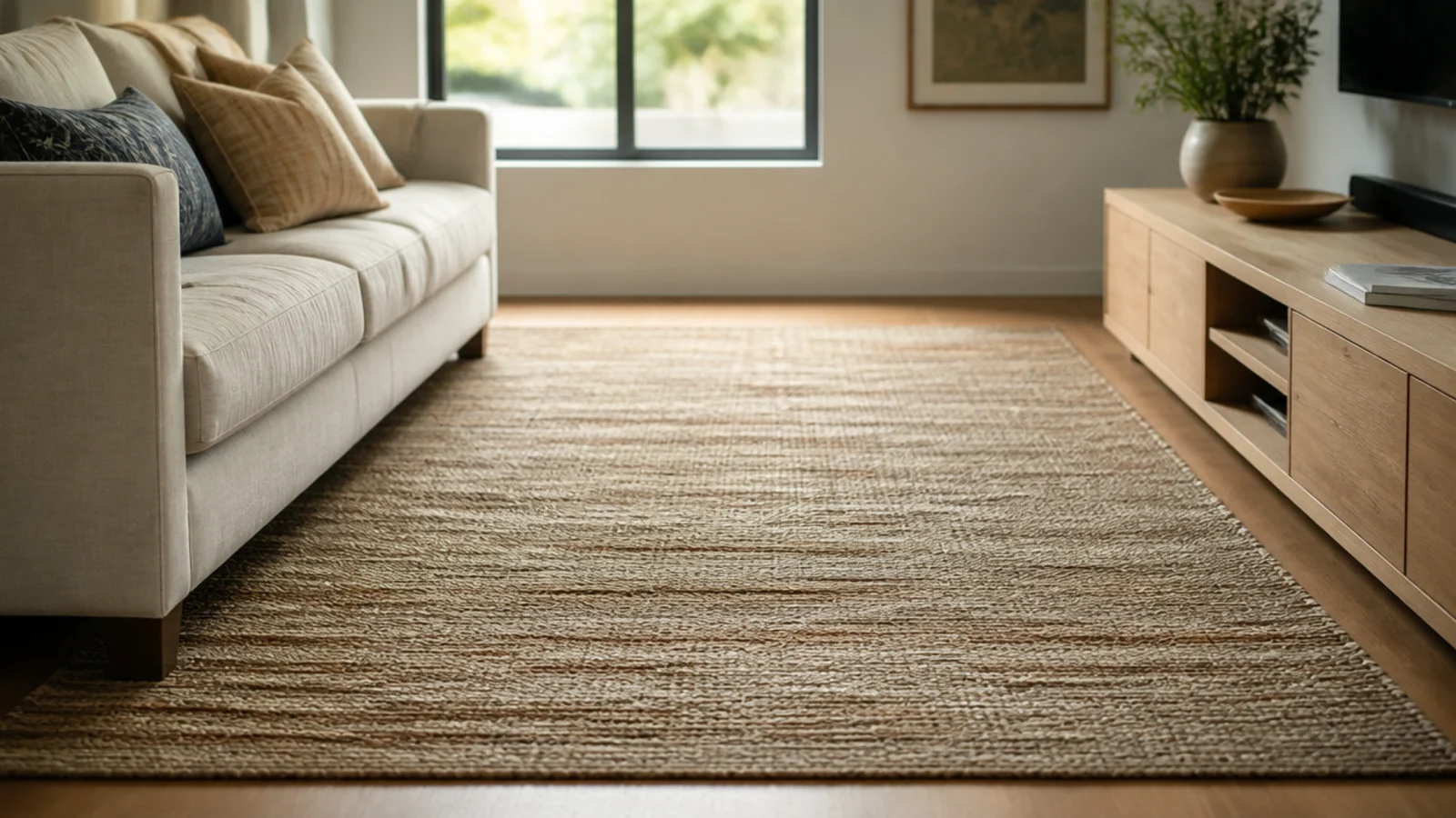
5. Run the rug toward the unit, not around it
Let the rug pass under the front legs of the seating and stop 6 to 12 inches short of the cabinet. That connects the two ends of the room. An 8 by 10 foot rug suits most living rooms with a three-seat sofa; anything under 5 by 8 usually floats and cuts the floor into fragments.
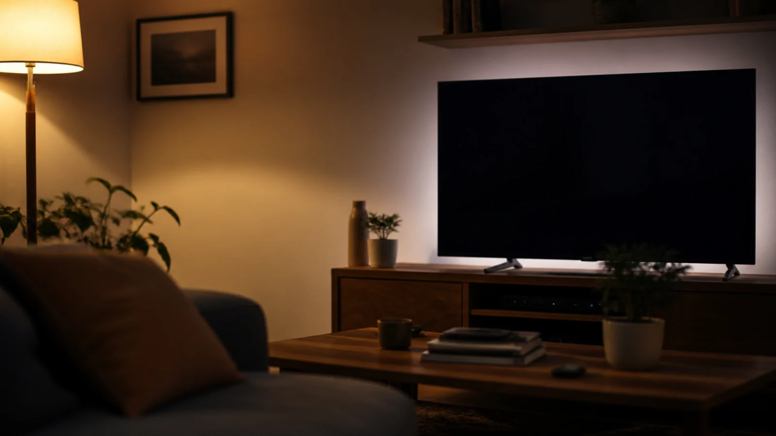
6. Three light sources, none facing the screen
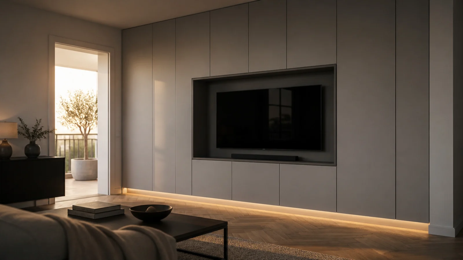
Layer a bias strip at 6500K behind the panel, a 2700K lamp well off to one side, and a wash up a wall or ceiling. Put all three on dimmers and run them near 20 per cent while watching. Nothing should sit where its reflection lands in the glass.
7. Repeat the timber tone at least twice more
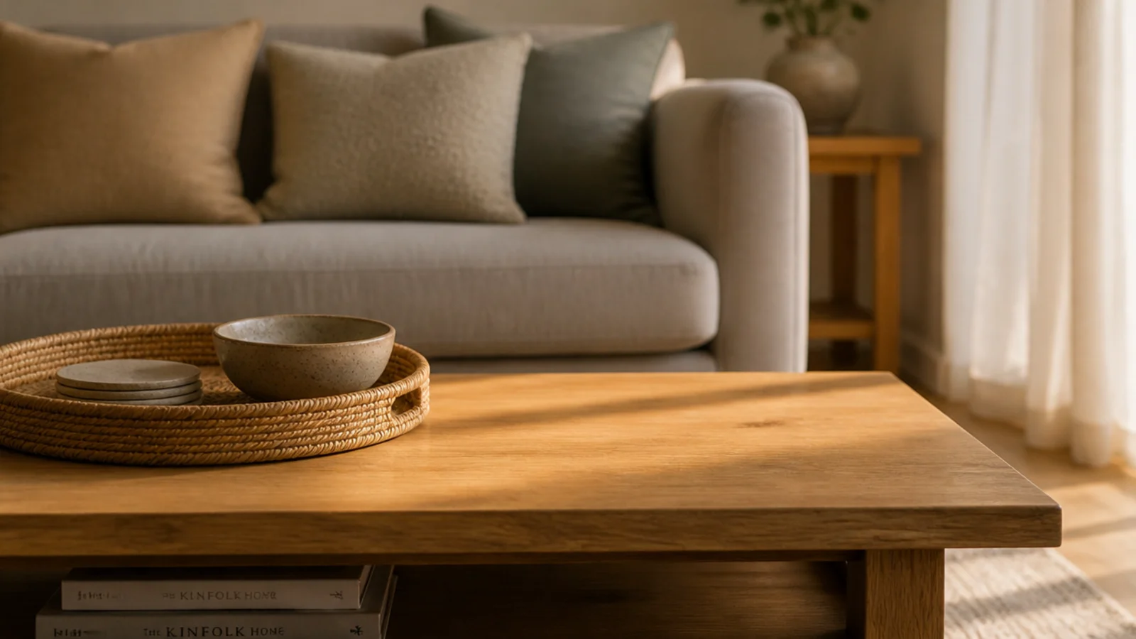
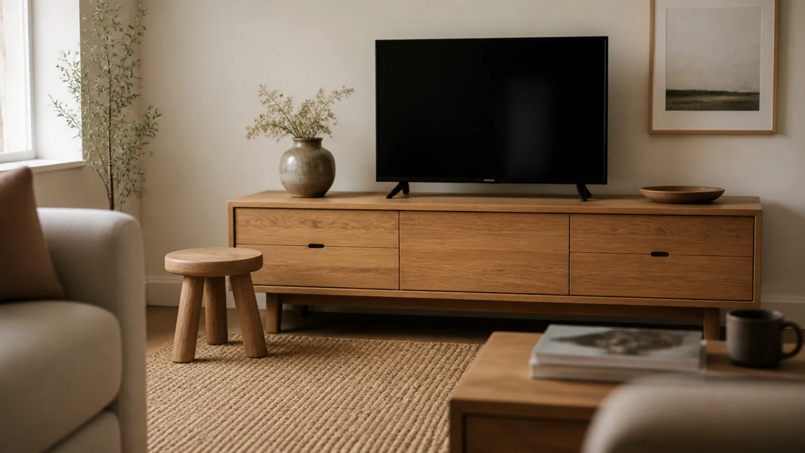
One oak cabinet in a room of painted furniture reads as an outsider. The same tone appearing three times — the unit, a stool, a frame — reads as a decision. Match closely or contrast hard; two woods within a couple of shades of each other is the combination that always looks accidental.
8. Keep the unit lower than the sofa back
A 16 to 20 inch cabinet against a 24 to 30 inch sofa lets the eye run over both. Once the media unit passes the sofa height the room starts feeling boxed, which is the usual complaint about tall wall systems in small living rooms.
9. Treat empty space as a material
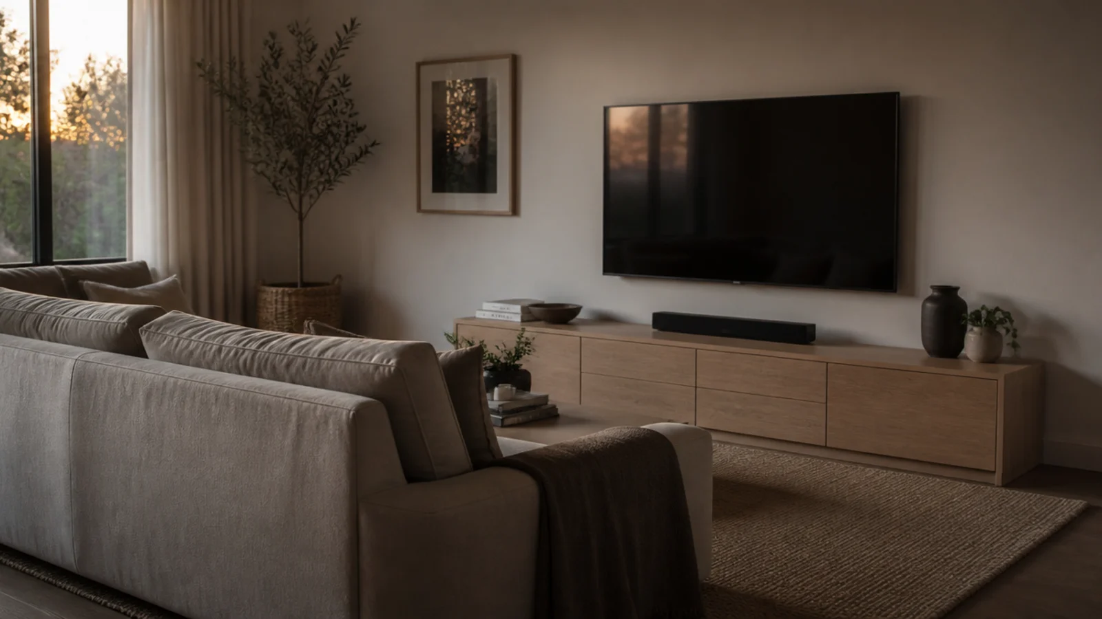
The bare third of the wall is not unfinished, it is the thing making the other two thirds work. Resist filling it for at least a month after the unit goes in. Most rooms that feel busy are not over-decorated so much as under-spaced. If the wall genuinely cannot take the emptiness, a single tall plant on the floor fills it without adding another surface to keep tidy.
10. Give the room a second focal point
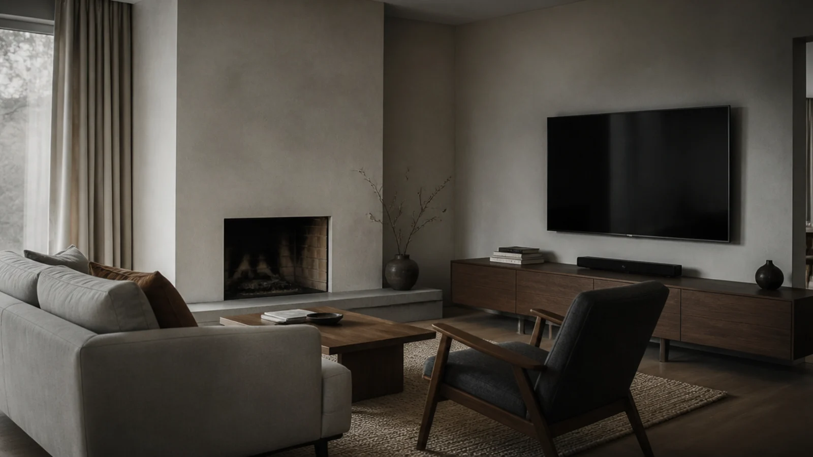
A room with one focal point is a viewing room. A fireplace, a window with a view, or a strong piece of art on another wall gives the space somewhere else to be during daylight. Keep the second focal point on a different wall so the two never compete head on.
11. Scale the art to two thirds of the unit
Above a 72 inch cabinet, that means roughly 48 inches of artwork, as one piece or a tight group with 2 to 3 inch gaps. Keep the bottom edge 8 to 12 inches above the cabinet top. Small art above a wide unit is the most common proportion mistake in living rooms.
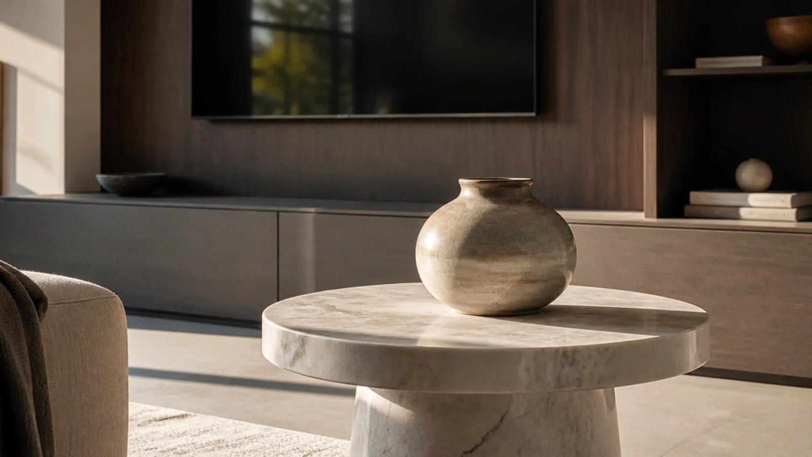
12. Curve something to offset the rectangles
A media wall is a stack of rectangles with another rectangle on it. One round side table, a bulbous vessel or an arched mirror releases the tension immediately. It only takes one — a room of curves has the opposite problem. A 16 to 20 inch round table beside the sofa is the easiest version, and it doubles as the surface that keeps mugs off the media unit.
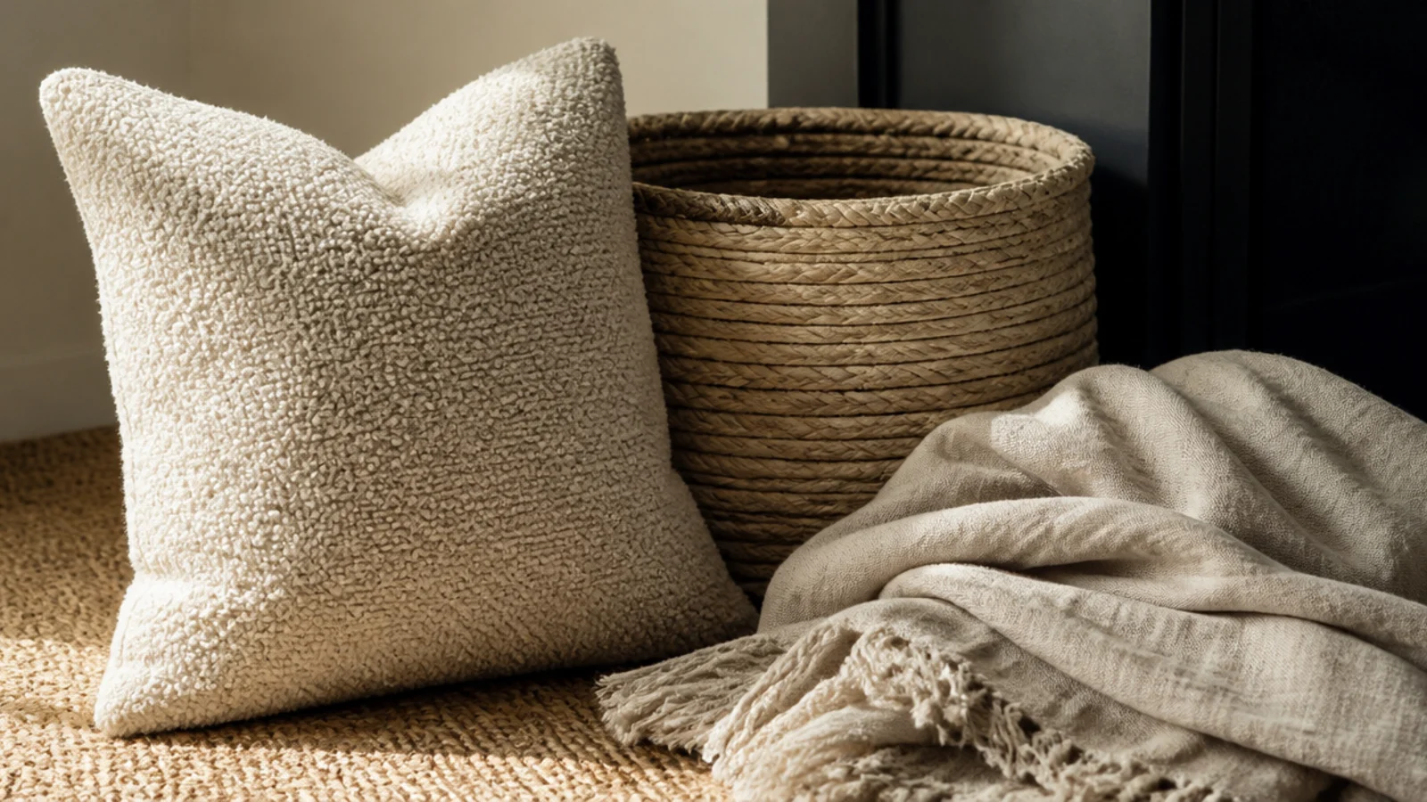
13. Choose texture over pattern near the screen
Boucle, seagrass, raw linen and unglazed ceramic add interest without adding information to compete with a moving picture. Save pattern for a rug or a cushion on the far side of the room. The living room setups guide has more on layering soft materials.
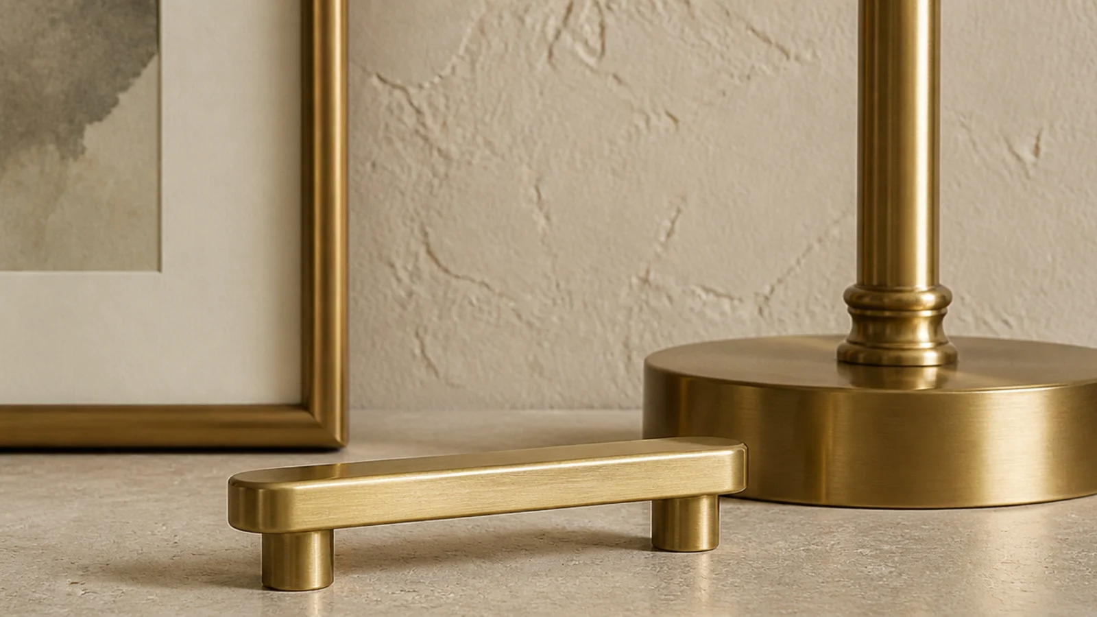
14. Hold one metal finish across the room
Cabinet pulls, lamp stems, frame edges and curtain hardware in a single finish will do more to pull a living room together than a matching furniture set. Brushed brass, blackened steel and brushed nickel all work; the mistake is using all three because each looked good alone.
15. Hold the palette to three colours plus wood
Three tones plus one timber colour is enough for a room this size. The screen is already supplying black and the wall is supplying a neutral, so the third is usually a soft accent — clay, olive, deep blue. Anything beyond that starts fighting for attention with something that lights up.
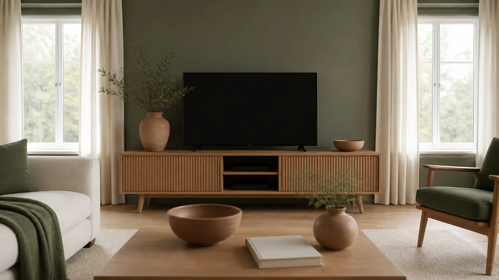
16. Symmetry on a short wall, asymmetry on a long one
Under about 10 feet, a centred screen with matching flanks looks composed. Past that, the mirroring turns stiff. Weight one end with a tall cupboard or bookcase, run the rest low, and balance the far side with a floor lamp or a large plant rather than a second cupboard.
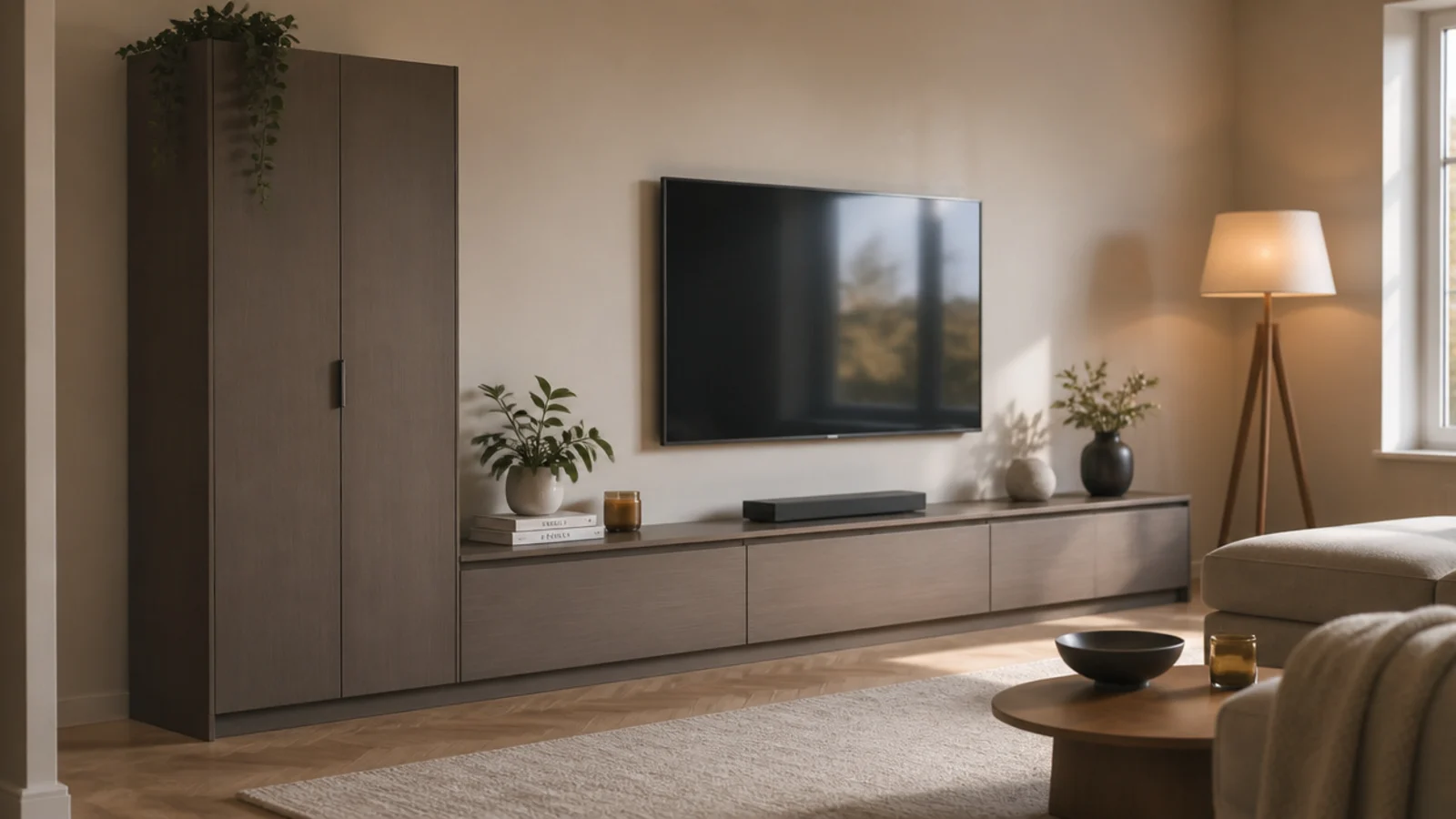
17. Zone an open plan with a back-to-back console
A 10 to 12 inch console standing against the back of a sofa creates a boundary between the viewing zone and the rest of an open plan without building a wall. It also gives lamps a home and stops cables trailing across an open floor.
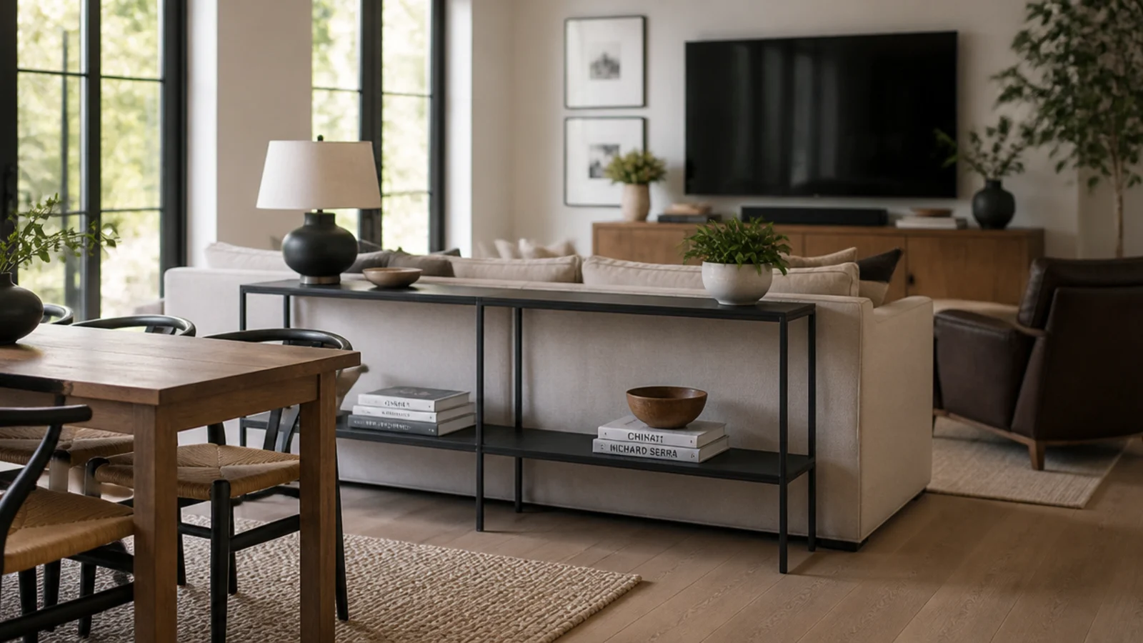
18. Hide function at seated eye level
Photograph the wall from sofa height and see what lands in the eyeline. That band, roughly 36 to 48 inches, should hold closed doors and the screen only. Put open shelving above or below it, where the clutter reads as background rather than content.
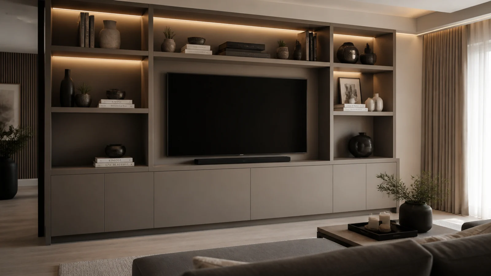
19. Design the ceiling and floor planes too
A soft uplight washing the ceiling and a generous rug below give the media wall a top and bottom edge, which is what makes a room feel resolved. Both planes are usually left blank, and both are cheaper to change than any piece of furniture.
20. Design for the screen switched off
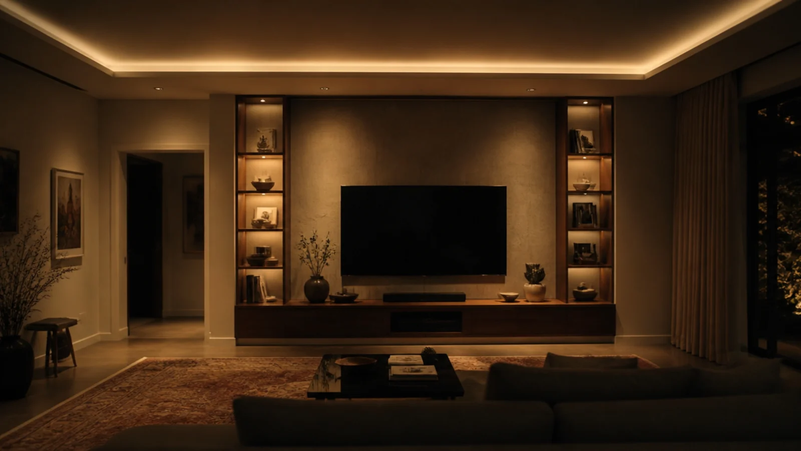
The television is dark for most of the week. Judge the room in daylight with the panel off, and if the composition falls apart without it, the design is leaning on the wrong element. The modern media wall details cover the joinery side of the same problem.
For the practical layer underneath all this, the clutter-hiding ideas cover cables, ventilation and grommets. If the composition needs a coffee table to finish it, the modern center table guide has the clearances, and mirror wall decor ideas covers the reflective counterweight on a facing wall.
Mistakes to Skip
- Buying furniture to fill a wall rather than to serve the room. A unit chosen for its length rather than its storage becomes an expensive shelf for clutter within a season.
- Placing a lamp where its reflection lands in the screen. Sit down and look at the dark panel before deciding any light position; the reflection is invisible from standing height.
- Hanging small art above a wide unit. Two thirds of the cabinet width is the working minimum, and a tight group counts as one piece.
- Choosing a rug that stops short of every piece of furniture. A floating rug divides a room; one that reaches under the seating unifies it.
- Styling the wall for a photograph rather than for a Tuesday. If the arrangement cannot survive a remote, a mug and a blanket, it is not a design, it is a set.
Frequently asked questions
How do you stop a television dominating a living room?
Give the screen company rather than trying to hide it. Repeat its darkest tone in two or three other objects — a basket, a frame, a lamp base — so the panel stops being the only black rectangle. Then keep the unit lower than the sofa back so the eye travels across the room rather than stopping.
Where should a rug sit in relation to the TV unit?
Run the rug so its far edge passes under the front legs of the seating and stops 6 to 12 inches short of the media unit. A rug that floats in the middle of the floor cuts the room into pieces, while one that reaches toward the unit ties the two ends of the room together.
What lighting works best in a room with a television?
Three sources, none of them pointing at the screen: a bias strip behind the panel at around 6500K, a table or floor lamp at 2700K well off to the side, and something that washes a wall or ceiling. Put all three on dimmers and run them near 20 per cent while watching.
How wide should artwork be above a TV unit?
Roughly two thirds the width of the unit below it, hung or leaned as a single piece or a tight group. Anything narrower looks stranded, and anything wider competes with the screen. Keep the bottom of the art 8 to 12 inches above the cabinet top.
Should a modern living room be symmetrical around the television?
Symmetry works on a short wall where the screen is genuinely central, and it starts to look forced on a long one. On a wide wall, weight one end with a tall element and let the other run low, then balance the composition with a floor lamp or a plant rather than a mirrored cabinet.
Want more like this? Browse all 15 tv unit decor guides — they all use the same measurements and budget tiers.
Pin it for later
Save this to your TV Unit Decor board
Pin it now so it is waiting for you when the tape measure comes out — and so the next person hunting for this idea can find it too.
Save this pinKeep going
More ideas worth saving while you have the tape measure out.