TV Unit Decor · Listicle
30 Stunning TV Unit Decor Modern Homes Copy

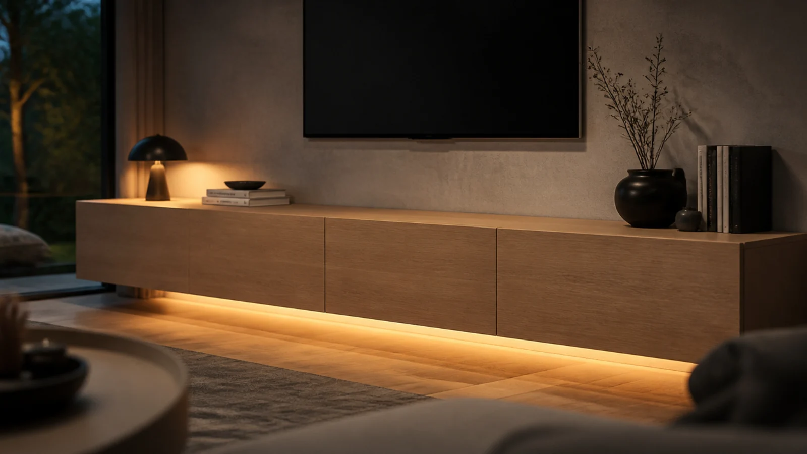
There is a reason a media wall in a magazine looks calm and the same pieces at home do not. Modern rooms are built on gaps and lines rather than objects: a 6 mm reveal at the floor, 14 inches of clear air under the cabinet, one continuous horizontal run instead of three stacked boxes. TV unit decor modern homes copy well is almost always about what has been removed — handles, plinths, joins, cables — and almost never about what has been added. Here are thirty details worth stealing, with the measurements that make each one work.
In this guide32 sections — tap to openHide
- 1.What TV unit decor modern rooms get right first
- 2.Handleless fronts with push catches
- 3.One continuous slab instead of three boxes
- 4.Float it and keep the floor visible
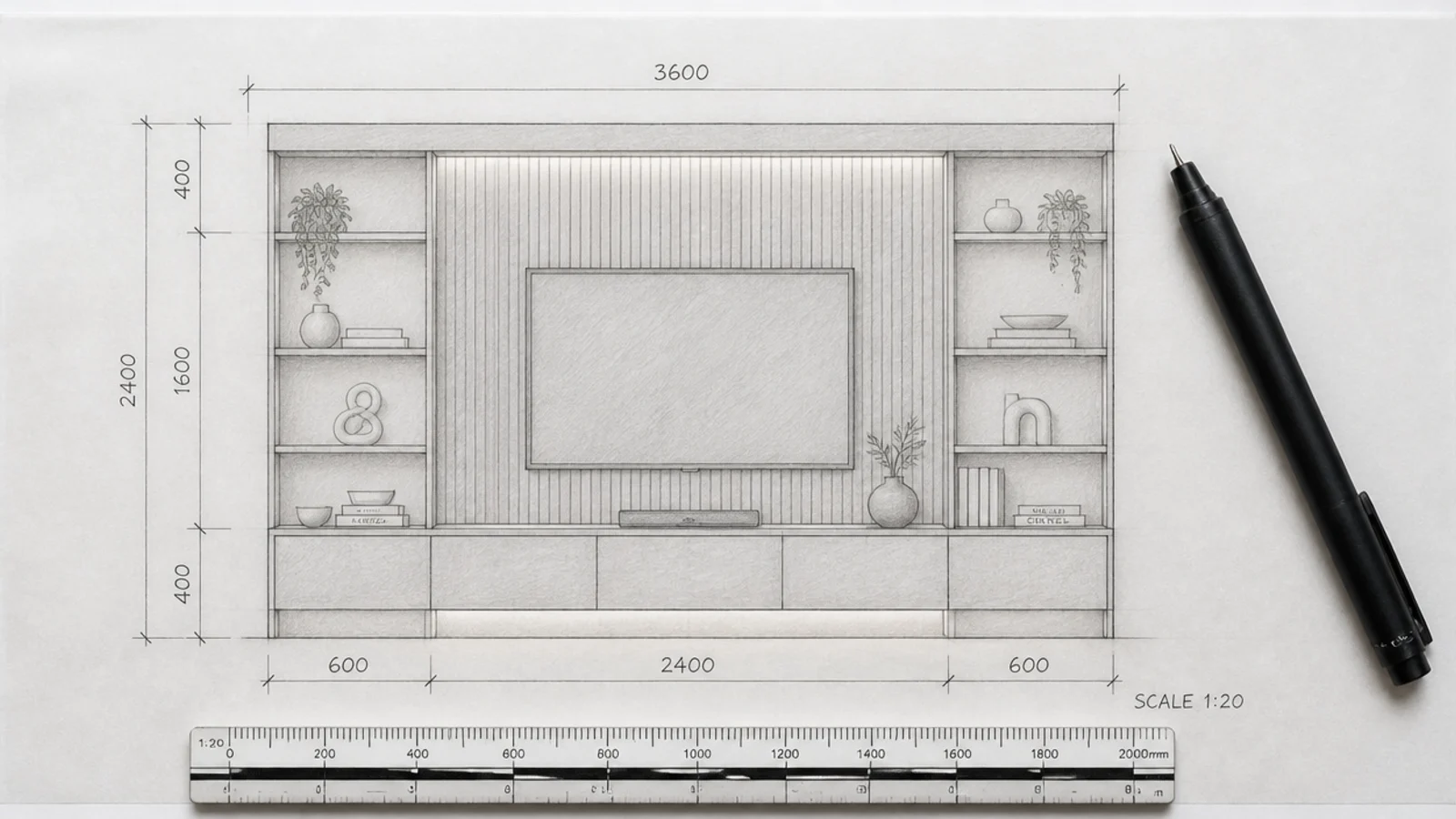
- 5.A fluted timber panel behind the screen
- 6.Micro-cement rather than high-gloss laminate
- 7.A six-millimetre shadow reveal instead of a plinth
- 8.A matte black surround that swallows the screen
- 9.An integrated light wash under the cabinet
- 10.A pull-out cable tray on drawer runners
- 11.Colour-drench the wall and the unit together
- 12.Slatted doors in twenty-millimetre battens
- 13.A twenty-millimetre porcelain top
- 14.A niche deeper than the panel itself
- 15.Full height, with a gap at the top
- 16.Hidden castors so it moves for cleaning
- 17.Twelve inches deep on the half without gear
- 18.Soft-close hardware you can actually feel
- 19.One material in three finishes
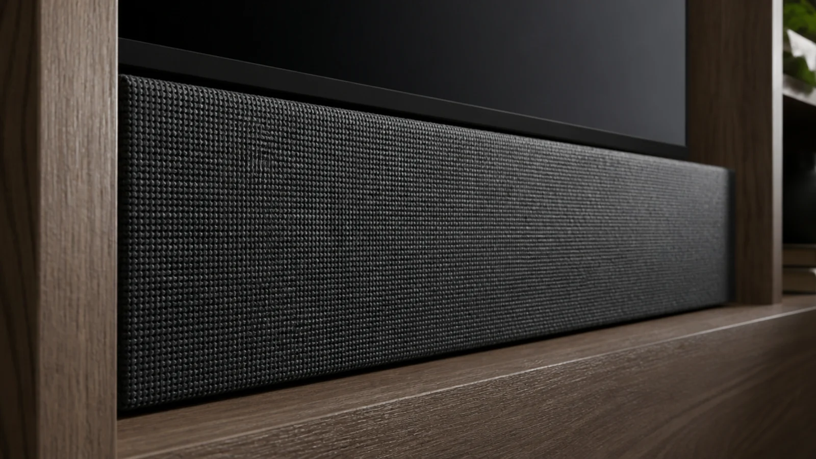
- 20.An acoustic fabric front for the centre speaker
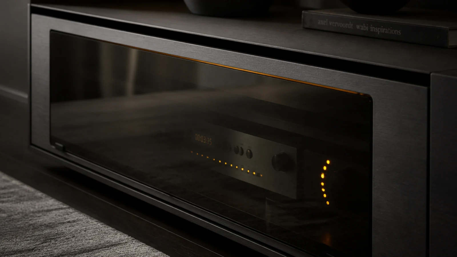
- 21.Frameless glass with a vent gap above
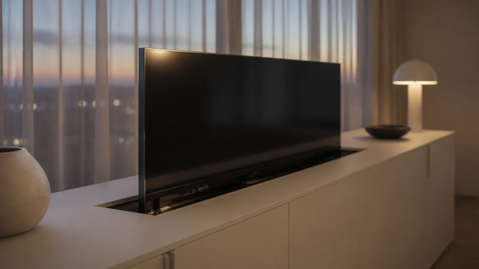
- 22.A lift cabinet that hides the screen entirely
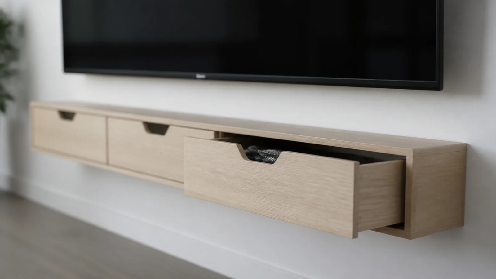
- 23.Wall-hung drawers with eight-inch fronts
- 24.Put the socket inside the carcass
- 25.Mitred corners with no visible edge tape
- 26.Match the grain across every door
- 27.Warm interior shelf light on a door switch
- 28.A single shelf and nothing else
- 29.Eighteen-millimetre ply instead of glass shelves
- 30.Paint the wall behind darker than the room
- 31.Leave the top empty on purpose
- 32.Mistakes to Skip
What TV unit decor modern rooms get right first
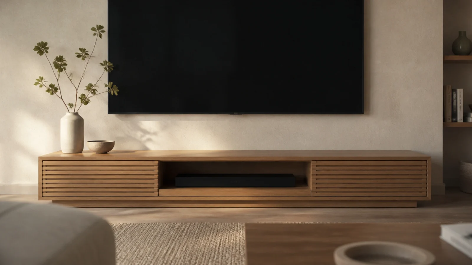
The first decision is scale, and it belongs to the wall rather than the television. A run covering roughly two thirds of the wall width reads as architecture; a 48 inch cabinet on a 12 foot wall reads as furniture that wandered in. For a 55 inch panel, which is about 48 inches across, that usually means 84 to 120 inches of continuous cabinetry.
The second is the line. Keep the top of the unit at one unbroken height, ideally 16 to 20 inches, and let everything else vary behind it. Screen centre still wants to land at 40 to 42 inches, which is seated eye level on a 17 to 19 inch sofa seat.
The third is depth strategy. Give the gear bay 20 inches, since a receiver is 13 to 17 inches deep and needs 3 to 4 inches behind for cable, and drop the display half to 12. Flat-pack modern units run $200 to $600, a made-to-measure ply carcass with sprayed fronts $1,800 to $4,500. If you are matching the wall behind, the TV wall guide covers panelling and paint.
1. Handleless fronts with push catches
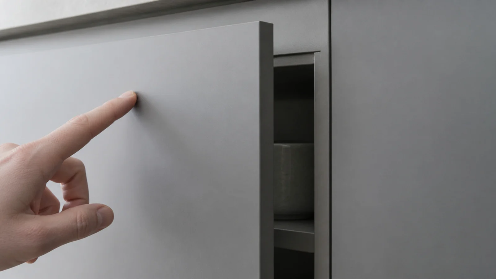
Removing the handles removes a horizontal line of hardware and half the visual noise. Push-catch mechanisms cost $3 to $8 a door and should be rated to around 40,000 cycles. Keep any single handleless door under 24 inches wide, because a wide front flexes and the catch stops finding its keeper.
2. One continuous slab instead of three boxes
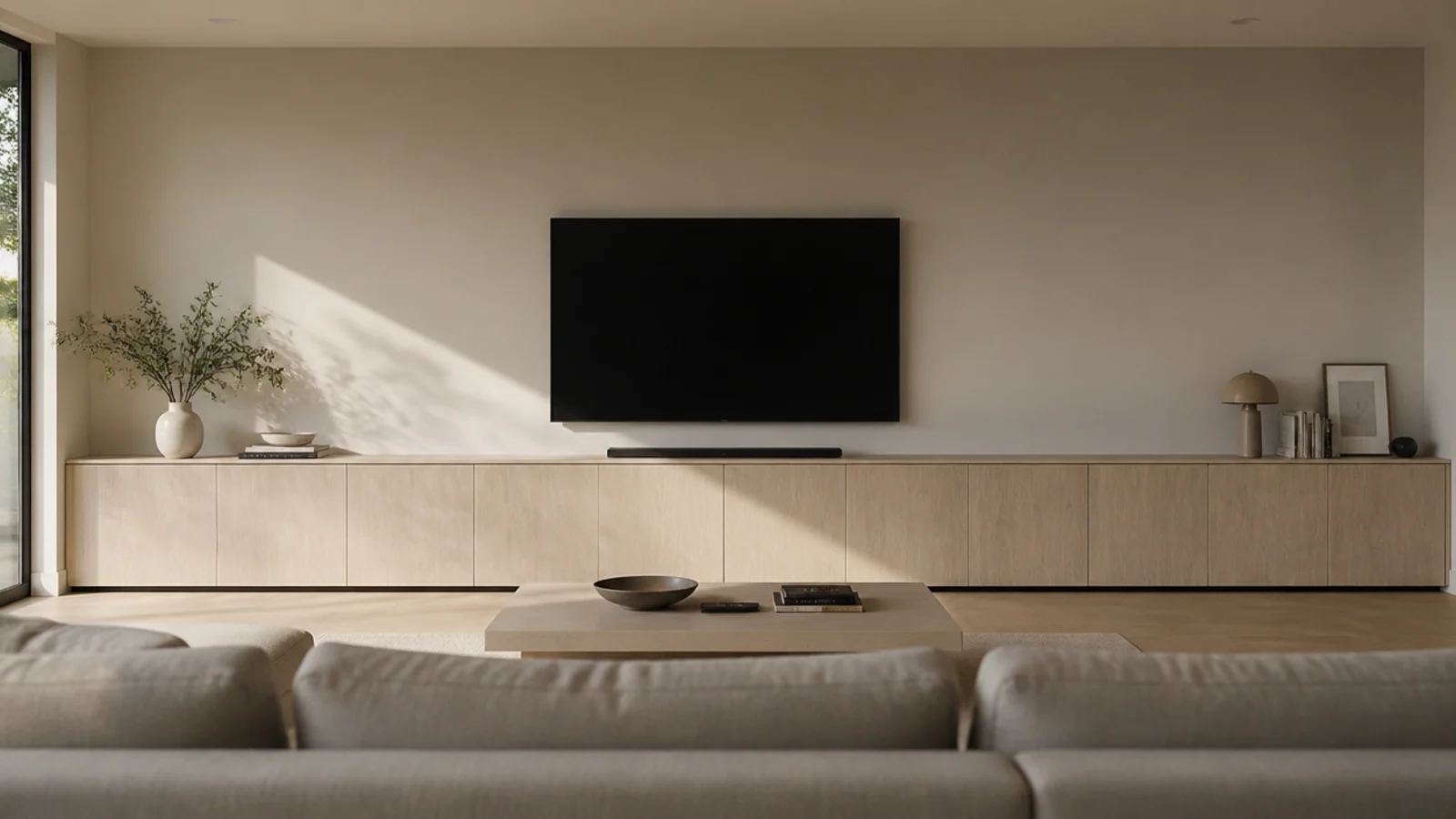
Three separate cabinets pushed together always show their joins, and the eye reads three objects. A single carcass, even at 96 inches, reads as one. If it must be built in sections, align the fronts as one grid and hide the carcass joins behind door gaps of a consistent 3 mm.
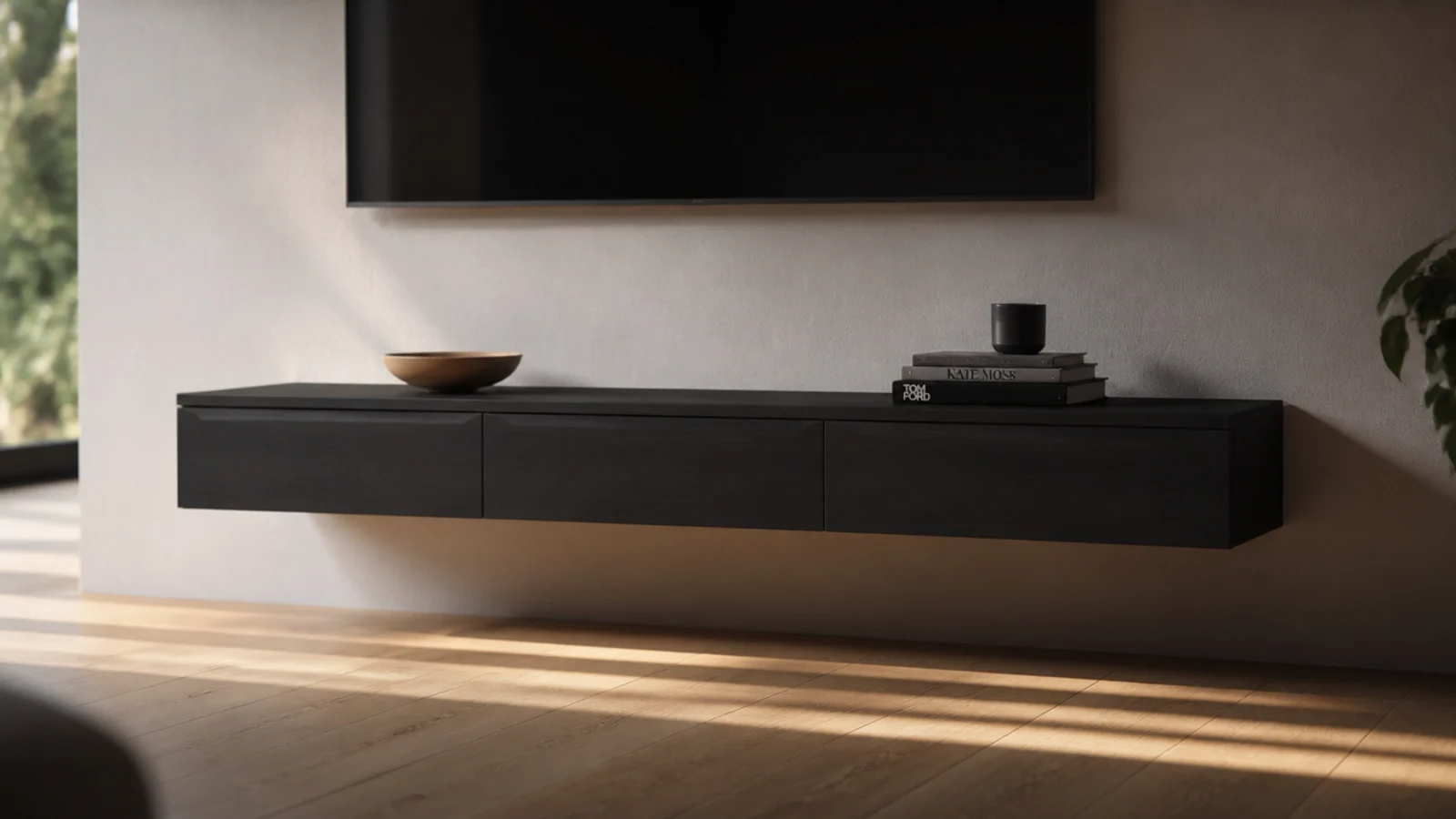
3. Float it and keep the floor visible
Clear floor under the unit is the cheapest way to make a small living room feel bigger, because the eye keeps reading the floor plane to the wall. Keep 12 to 16 inches of clearance, fix into studs at 16 inch centres, and use a French cleat, which carries over 100 pounds across two studs.
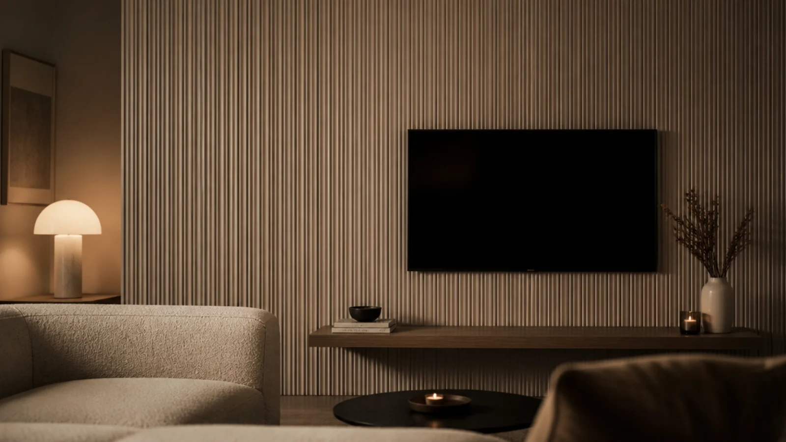
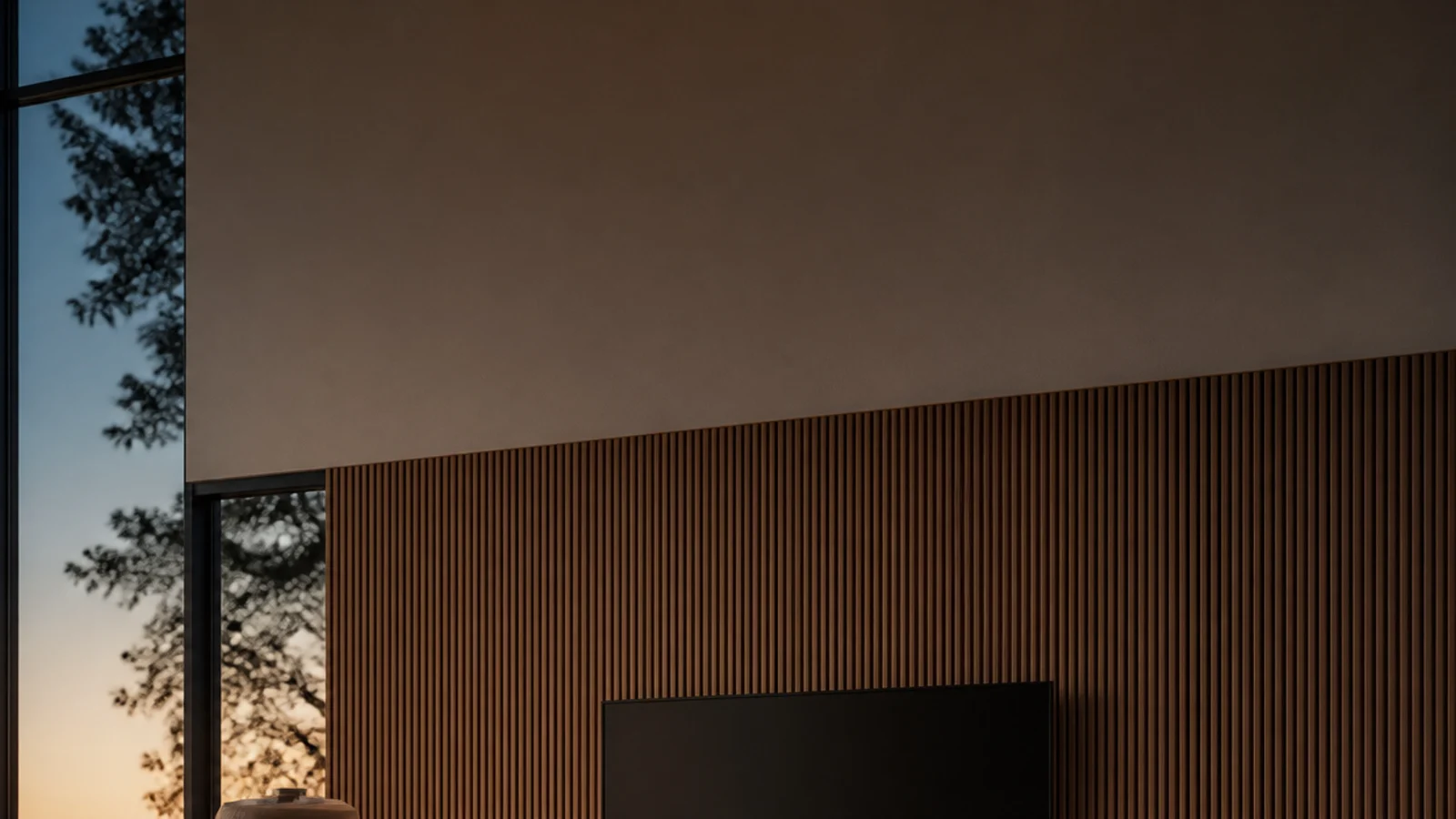
4. A fluted timber panel behind the screen
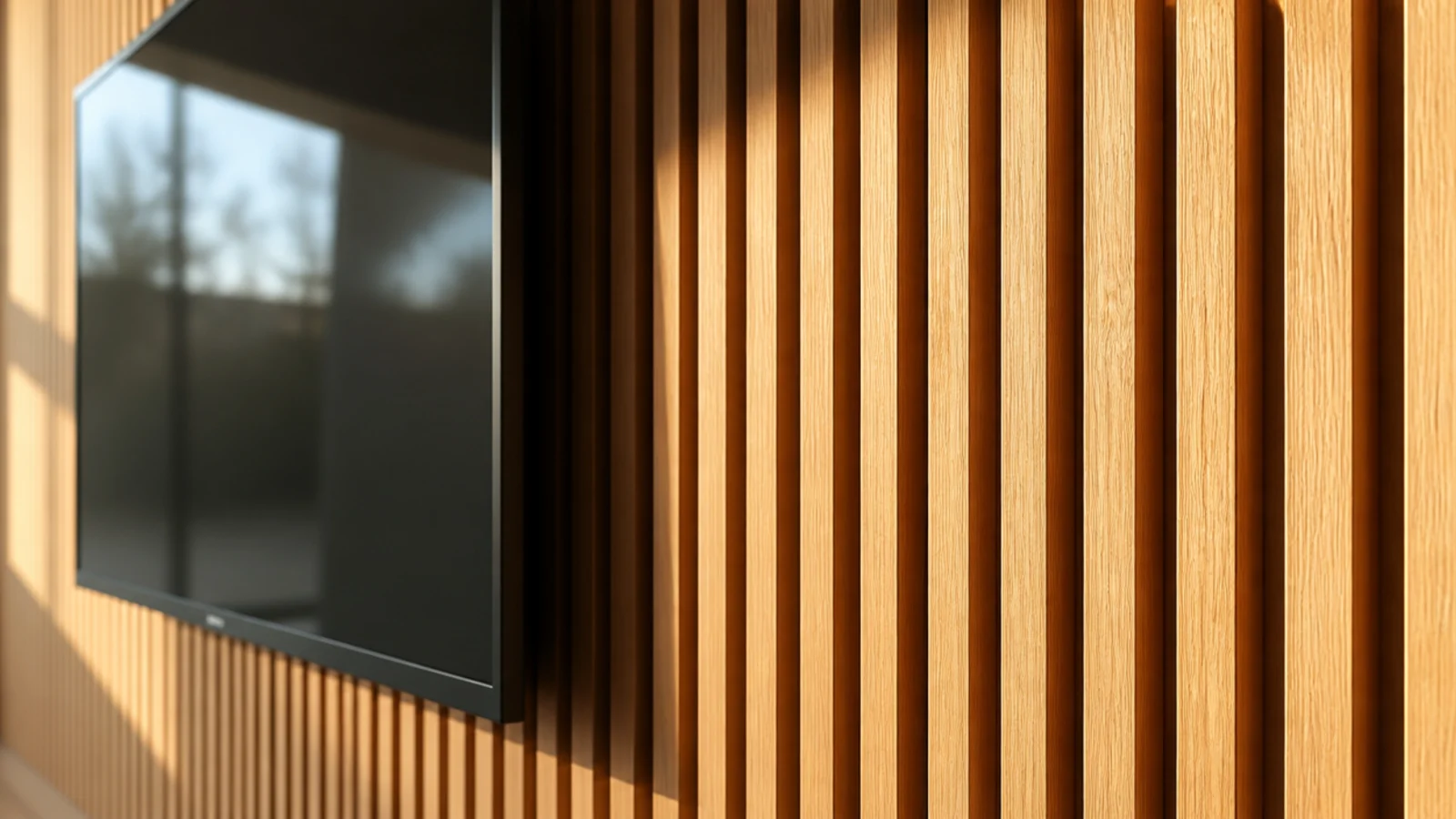
Vertical ribs give a flat wall its own shadow, which stops a big black rectangle sitting on nothing. Standard fluted panels use 12 mm ribs at 25 mm spacing on a 2400 by 1200 sheet. Run them floor to ceiling behind the unit only, not around the whole room, or the effect turns into a sauna.
5. Micro-cement rather than high-gloss laminate
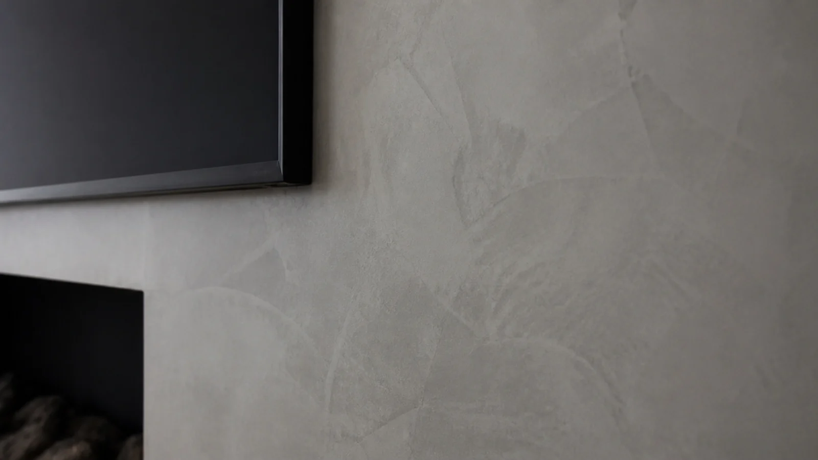
Gloss shows every fingerprint and every reflection of the screen. A hand-trowelled micro-cement finish, applied in two coats at 2 to 3 mm total, reads as a mineral surface and hides marks. Budget $12 to $25 a square foot applied, and seal it before it meets anything wet.
6. A six-millimetre shadow reveal instead of a plinth
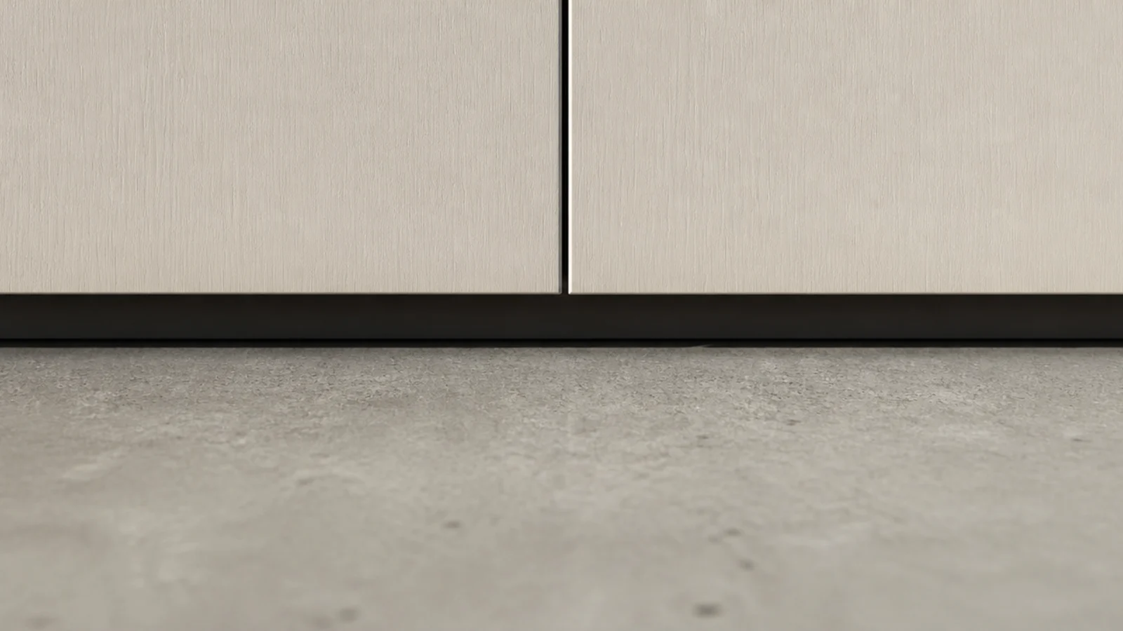
Recess the base by 6 to 10 mm and the cabinet appears to hover even when it is standing on the floor. It also gives the vacuum somewhere to go and hides an uneven floor line, which a flush plinth exposes ruthlessly across a long run.
7. A matte black surround that swallows the screen
Paint the recess or the wall panel directly behind the panel in a matte, low-sheen black and the bezel stops registering. It works because the eye reads contrast edges, not objects. Use a true matte — anything with sheen bounces the picture back at you as a halo.
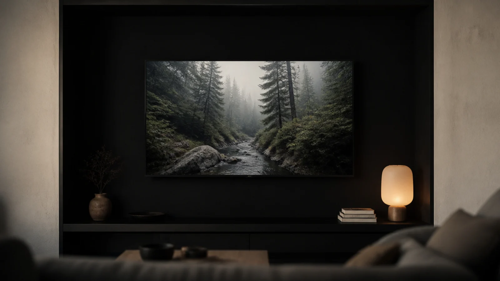
8. An integrated light wash under the cabinet
A warm 2700K strip at 4 to 6 watts per metre tucked behind the front rail throws a gradient onto the floor and makes a floating unit look lit rather than lamp-lit. Set it on a dimmer at around 20 per cent for evening viewing, since anything brighter competes with the screen.
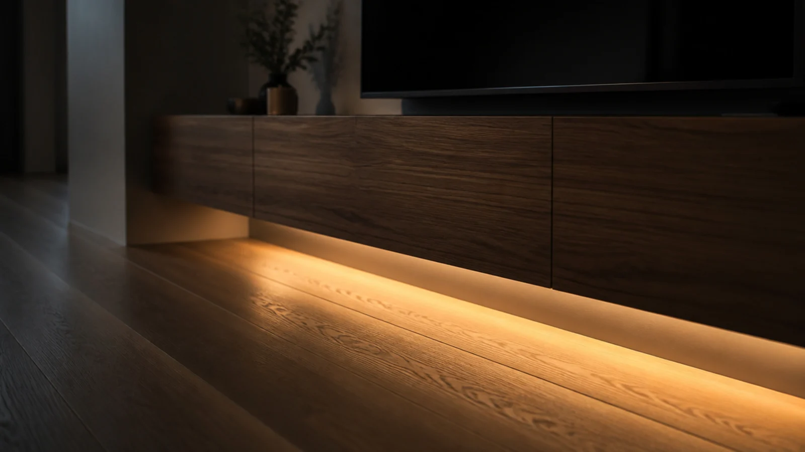
9. A pull-out cable tray on drawer runners
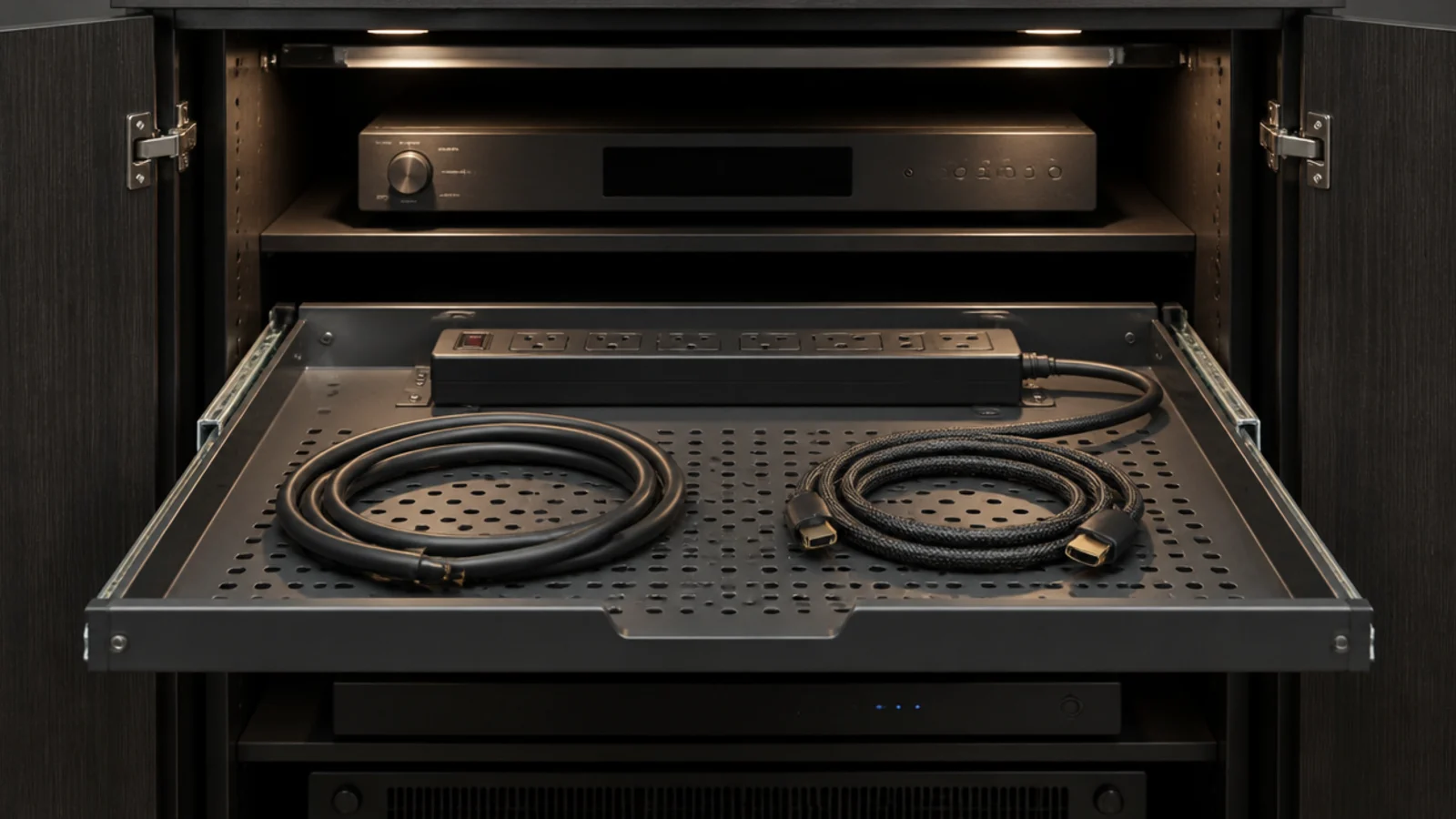
Fix a shallow perforated tray to a pair of ball-bearing runners inside the cabinet and mount the power strip on it. Every future swap becomes a pull rather than a house move. Runners rated at 45 pounds are far more than enough, and a pair costs $12 to $20.
10. Colour-drench the wall and the unit together
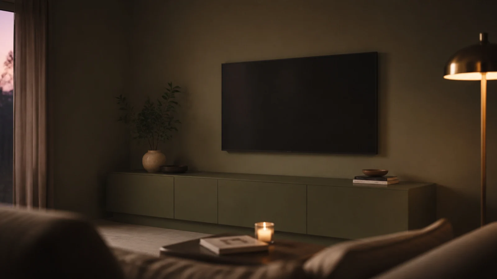
Painting the wall, skirting and cabinet fronts in one shade at one sheen collapses the furniture into the architecture. Eggshell on joinery and matt on plaster is close enough that the eye does not separate them. Deep olive, clay and charcoal all sit better behind a screen than pale grey.
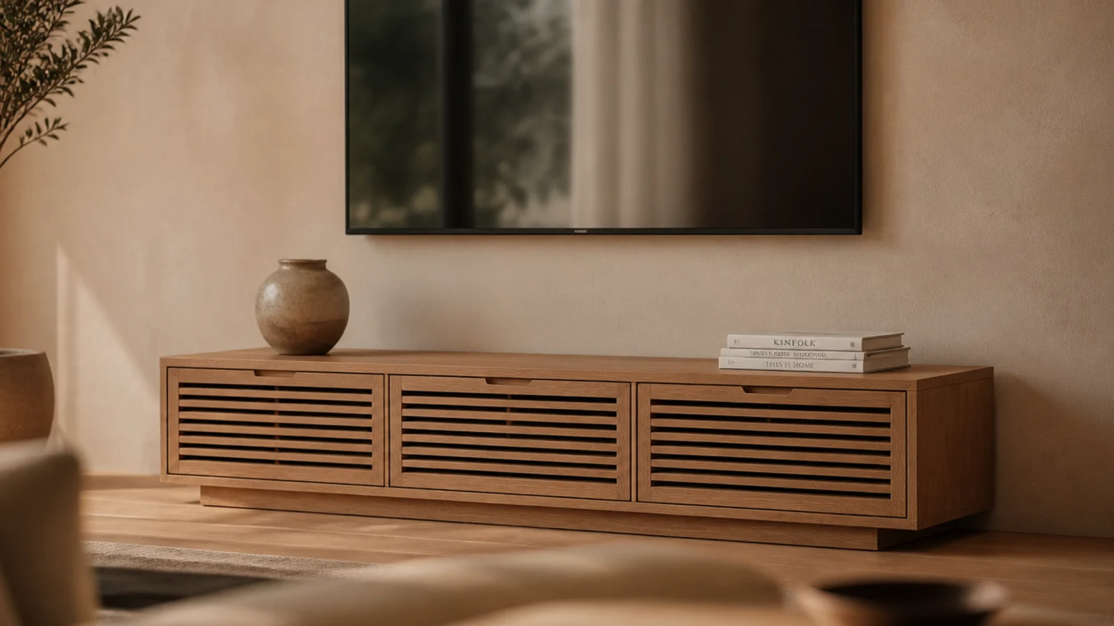
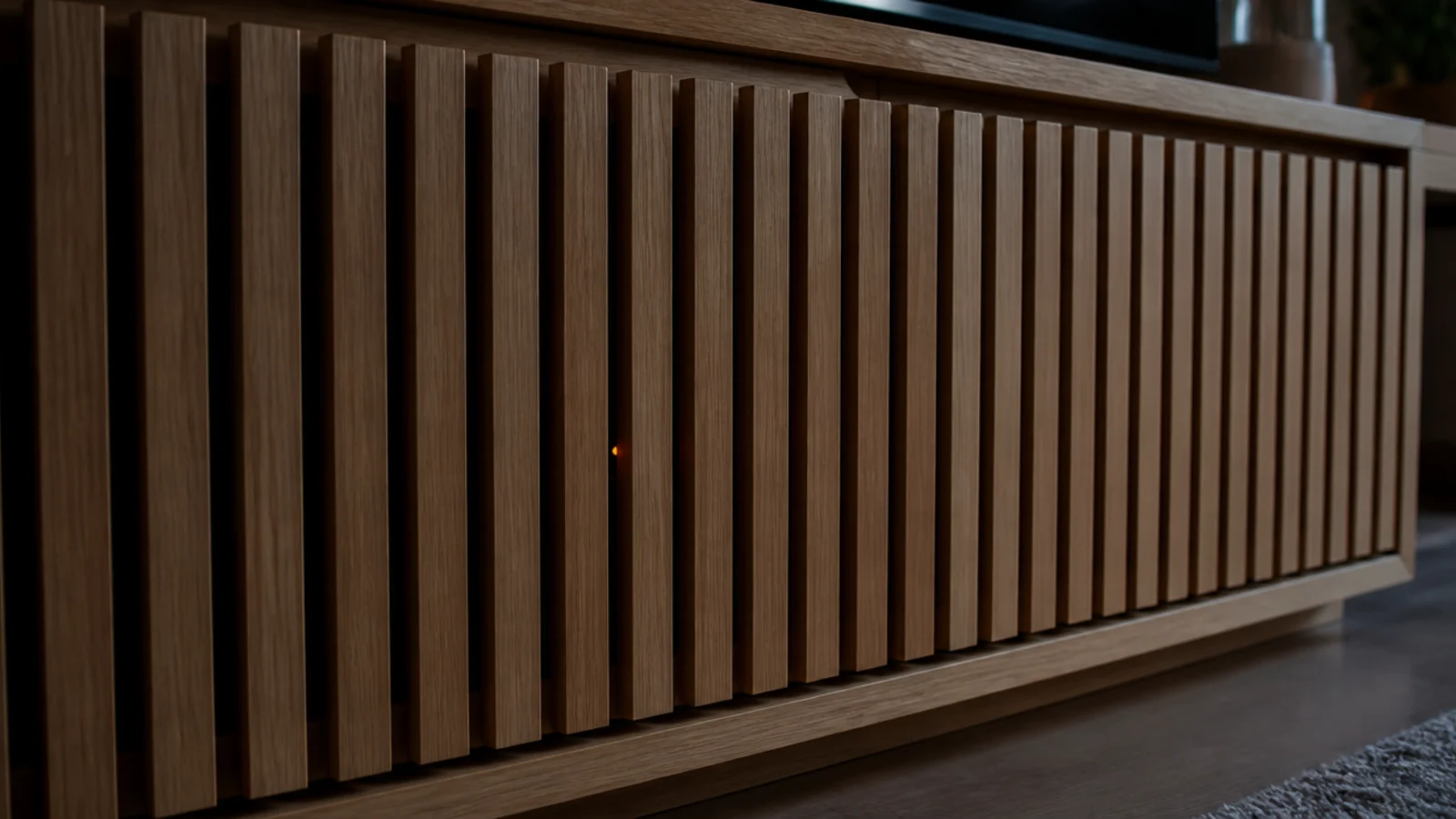
11. Slatted doors in twenty-millimetre battens
Battens at 20 mm with 10 mm gaps hide the gear from a seated eye and still pass air, which solid MDF cannot. That matters because a receiver sheds 100 to 200 watts of heat and starts throttling above 40 degrees Celsius. Slats give roughly a third open area with no visible vent grille.
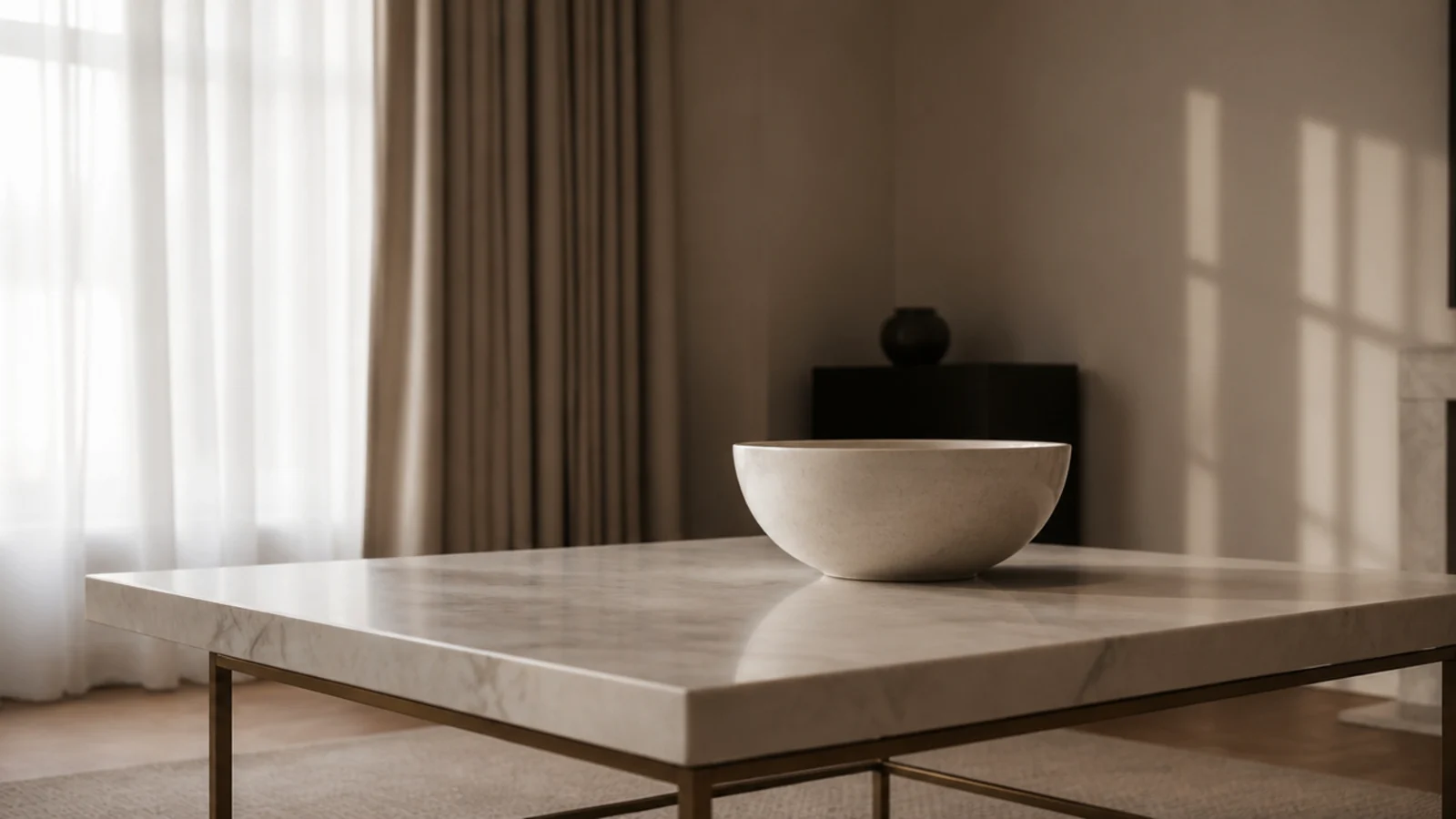
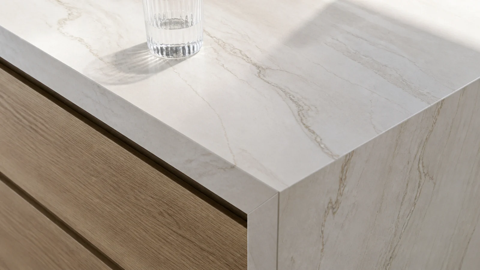
12. A twenty-millimetre porcelain top
Sintered stone and porcelain give you the look of a stone slab at 20 mm thickness without sealing, staining or heat marks. Expect $60 to $140 a square foot fabricated. Real marble is porous, needs sealing annually and rings from a wet glass, which is a poor match for a surface that holds drinks.
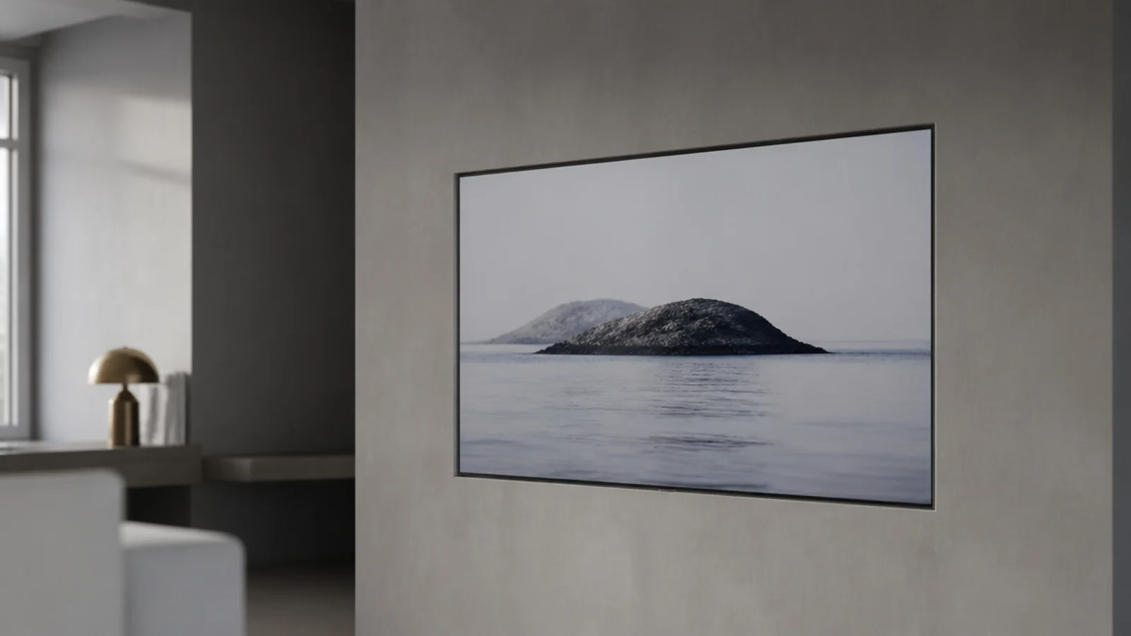
13. A niche deeper than the panel itself
Recessing the screen into a plastered niche about an inch deeper than the panel makes the wall read flat. Leave a 20 mm shadow gap all round and allow at least 2 inches of clear air behind the TV for its own heat and its cable bend radius.
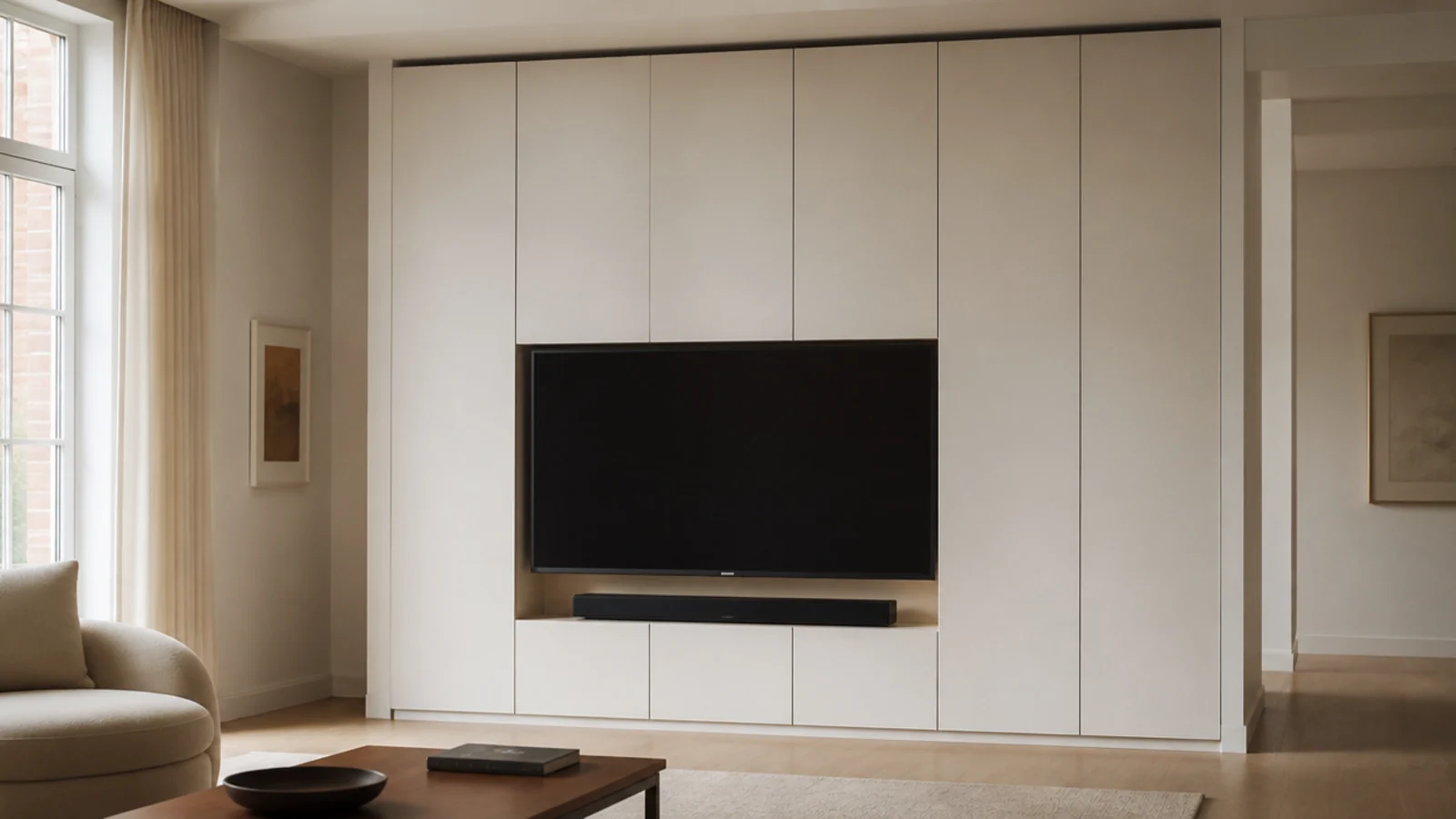
14. Full height, with a gap at the top
Joinery that stops 4 to 6 inches short of the ceiling reads deliberate; joinery that stops one inch short reads as a mistake. The gap also gives you a tolerance for out-of-level ceilings, which almost every older room has by half an inch across a long wall.
15. Hidden castors so it moves for cleaning
Two 40 mm castors behind a recessed plinth let a heavy freestanding unit roll forward for cable work, then roll back to the same line. Add a felt pad stop so it always returns to the same place, and strap the unit to the wall once it is home.
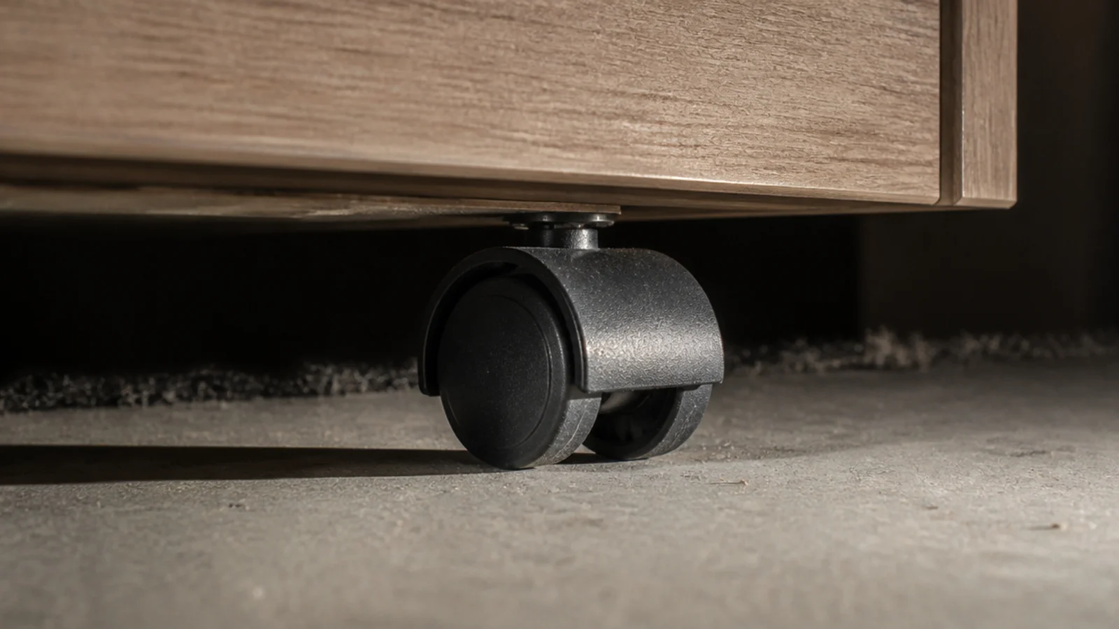
16. Twelve inches deep on the half without gear
Only the bay holding a receiver or console needs 20 inches. Stepping the rest of the run back to 12 inches gives back a foot of floor in a narrow room and creates a natural break in the elevation. Keep the front faces aligned and let the carcass step behind them.
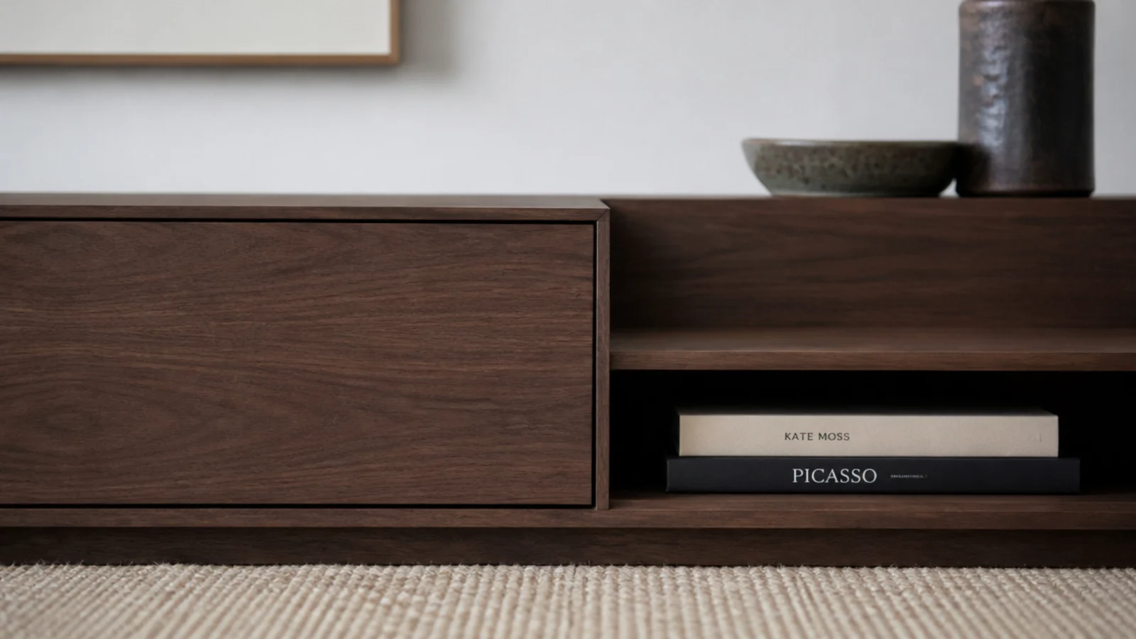
17. Soft-close hardware you can actually feel
The difference between a $200 unit and a $2,000 one is mostly in the last inch of travel. Soft-close hinges add $4 to $9 a door and undermount runners $25 to $60 a drawer. On a media unit that opens several times a night, it is the upgrade you notice most.
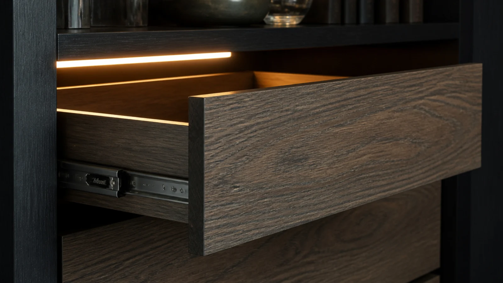
18. One material in three finishes
Oak smooth, oak fluted and oak end-grain on one unit gives texture without a second colour to reconcile. Two woods within three shades of each other is the one combination that always looks accidental, so either match exactly or contrast hard.
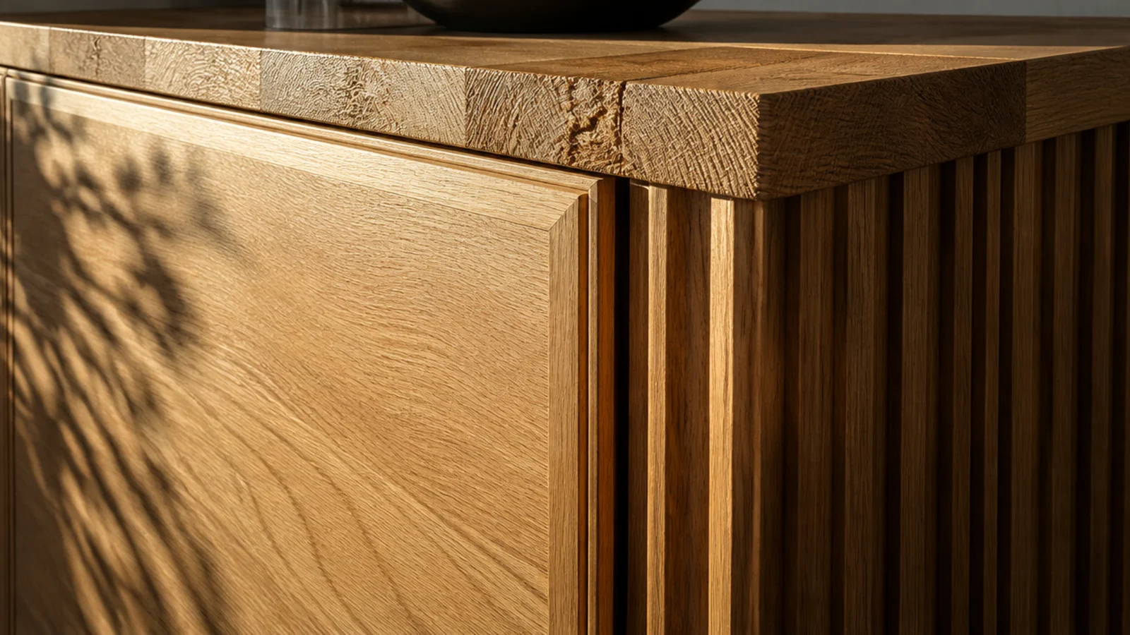
19. An acoustic fabric front for the centre speaker
If a centre channel lives in the unit, a stretched acoustic fabric panel lets sound through while hiding the driver. Keep the speaker face within 2 inches of the panel and aim it at ear height, roughly 40 inches, rather than firing into the sofa base.
20. Frameless glass with a vent gap above
Glass doors trap heat efficiently, which is exactly the problem. A frameless smoked panel with a 15 to 20 mm gap along its top edge keeps the look and lets hot air leave. Pair it with a rear vent low down so air actually crosses the bay.
21. A lift cabinet that hides the screen entirely
A motorised lift turns a long sideboard into a media unit only when you want one. Mechanisms carry 60 to 120 pounds and add $400 to $1,200, and they need 4 to 6 inches of clearance behind the panel inside the carcass. Worth it in a room that is not primarily for watching.
22. Wall-hung drawers with eight-inch fronts
Shallow drawers stop things stacking. An 8 inch front with a 6 inch internal depth holds remotes, controllers and cables in a single layer, so you can see everything at once. Three of them across a run beats one deep drawer that fills with archaeology.
23. Put the socket inside the carcass
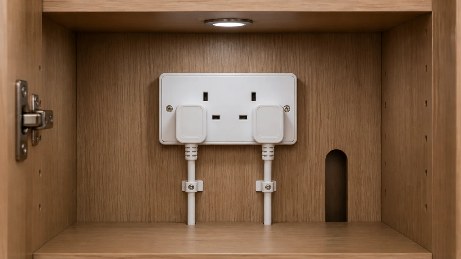
Having an electrician move the socket to the inside face of the cabinet removes the last visible plug. Use a twin socket with right-angle plugs, keep it above the cable tray, and never run standard flex inside a wall cavity to achieve the same look.
24. Mitred corners with no visible edge tape
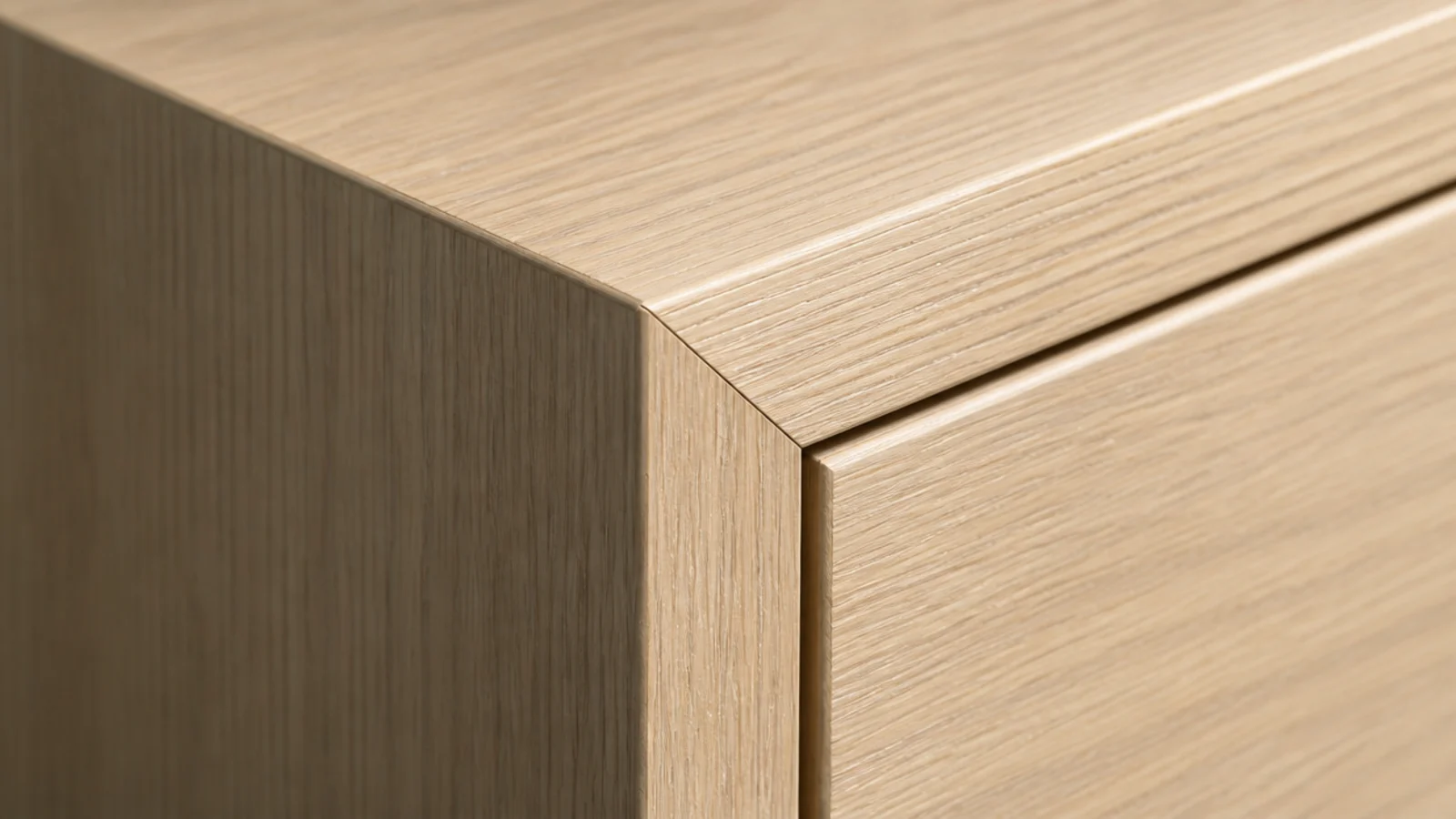
A 45 degree mitre lets veneer or laminate run around a corner without showing the substrate. It is the detail that separates joinery from flat-pack at a glance, and it costs perhaps 10 per cent more on a made-to-measure quote. Ask for it on the exposed ends only if budget is tight.
25. Match the grain across every door
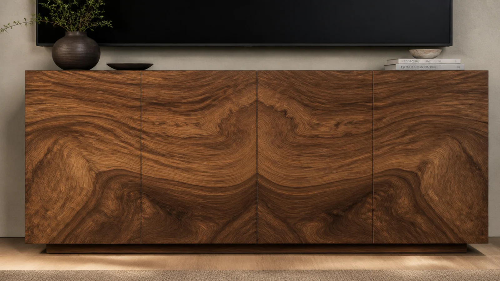
Sequential veneer means the figure flows from one door to the next, so a bank of four fronts reads as one panel. Ask the maker for a book-matched or slip-matched set from a single leaf. The modern TV cabinets guide covers what to check on a spec sheet.
26. Warm interior shelf light on a door switch
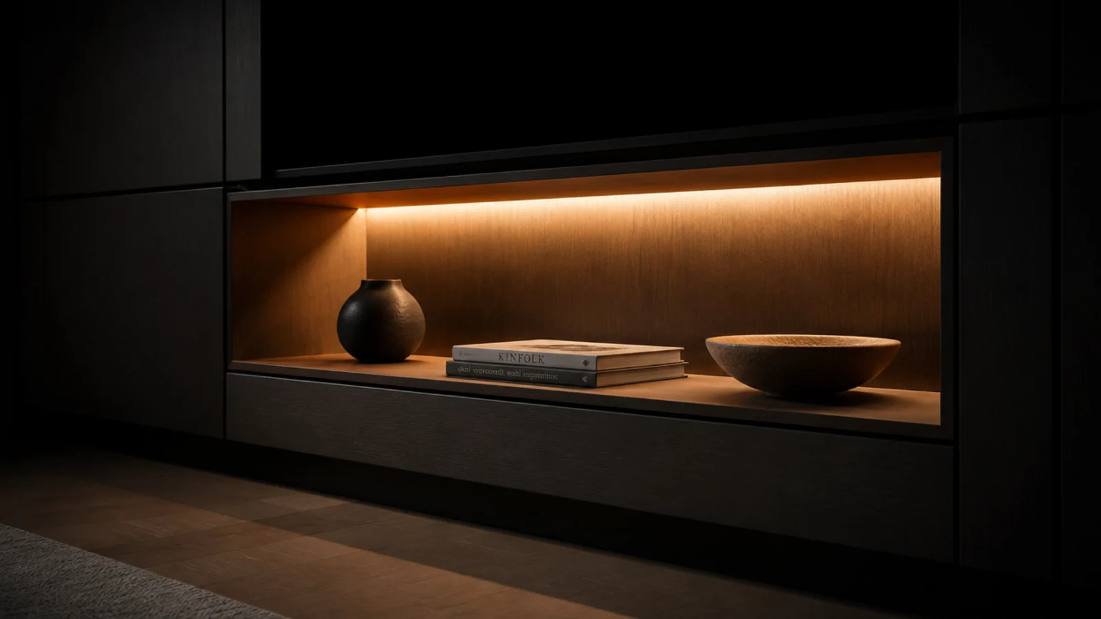
A 2700K strip drawing about 3 watts per metre inside an open bay makes objects look considered after dark. Wire it to a door switch and it only exists when needed. Keep the strip behind a front rail so you see the light and never the diodes.
27. A single shelf and nothing else
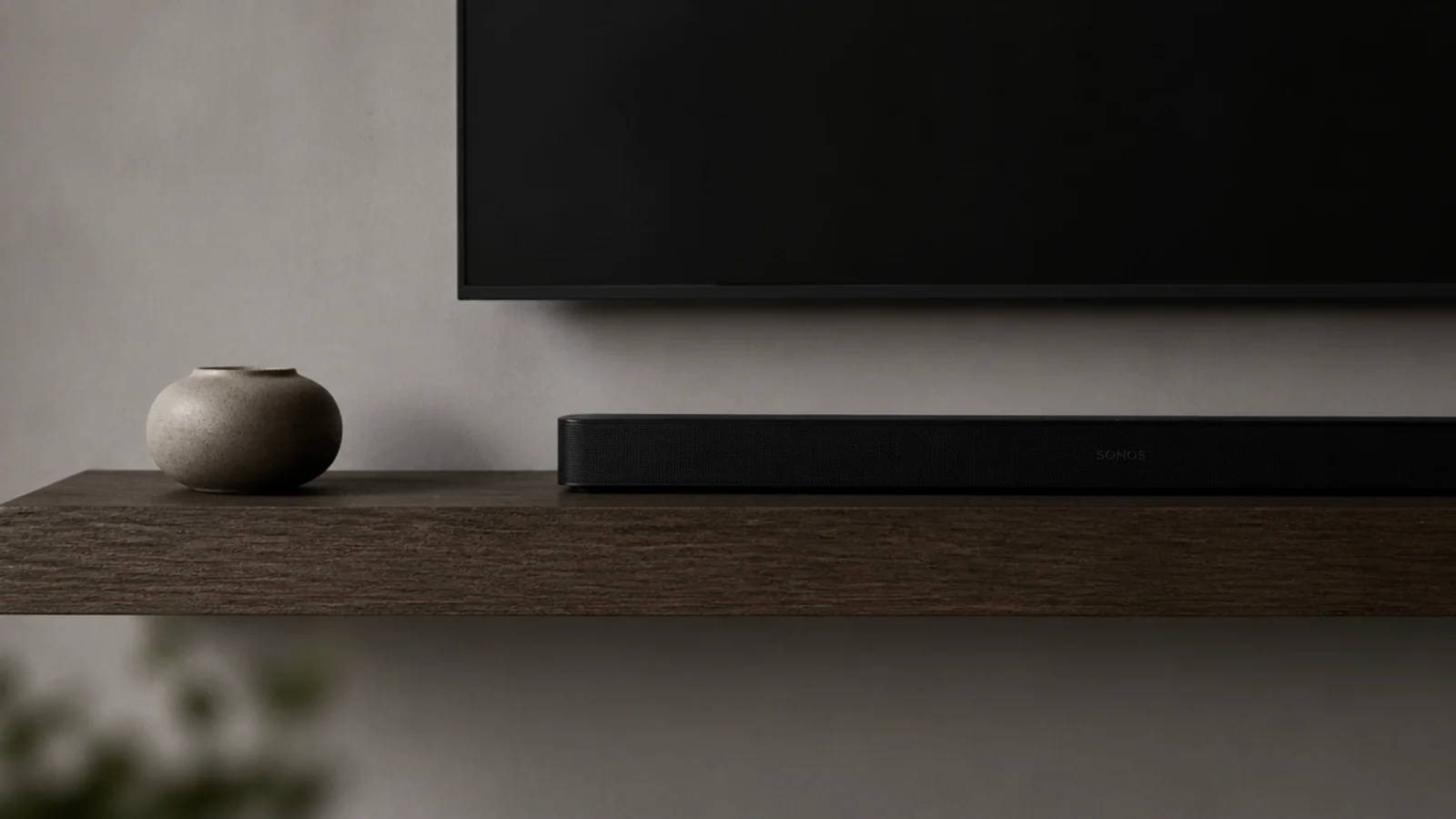
The most restrained version: one 12 inch deep floating shelf under the screen carrying a soundbar and one object. Fix it into studs and 18 mm ply spans 30 to 32 inches under 30 pounds without visible deflection. Everything else lives in another room.
28. Eighteen-millimetre ply instead of glass shelves
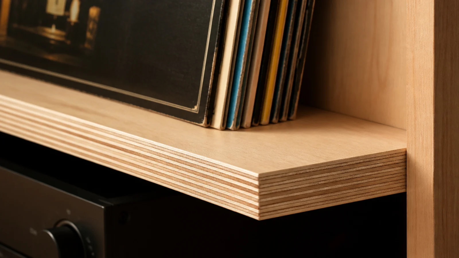
Glass shelves date a media unit faster than any other single element and they flex under a receiver. Birch ply at 18 mm with the laminations left exposed carries the weight, reads current, and costs a fraction. Sand the edge to 180 grit and oil it.
29. Paint the wall behind darker than the room
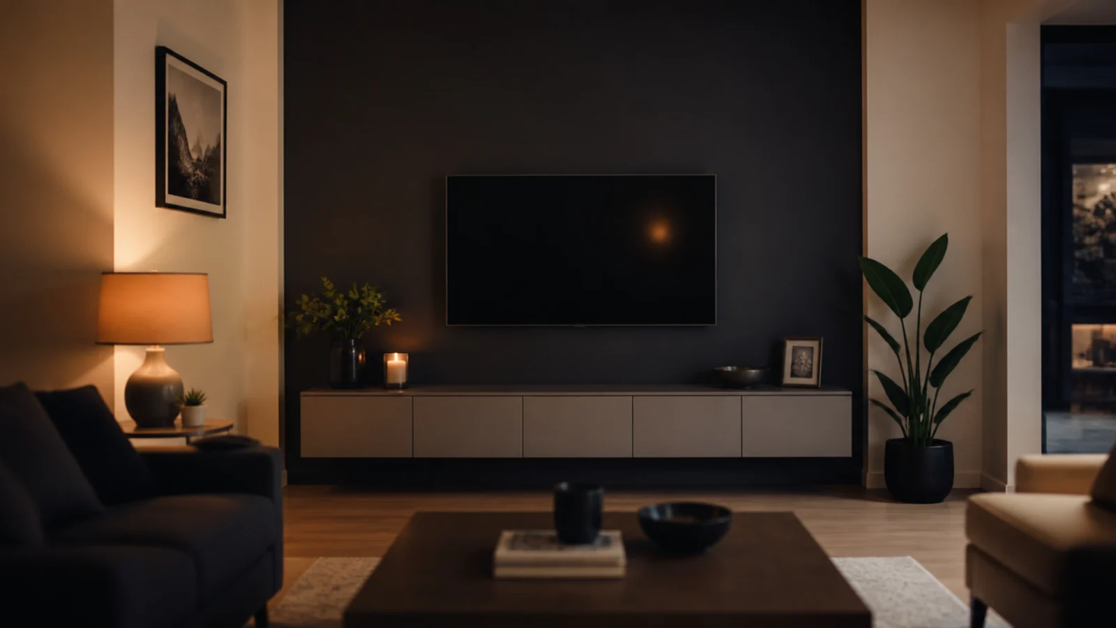
A darker backdrop reduces the contrast between a bright picture and the surrounding wall, which is easier on the eyes and makes the image look richer. Keep the two side walls pale so the room does not close in, and add bias lighting behind the panel.
30. Leave the top empty on purpose
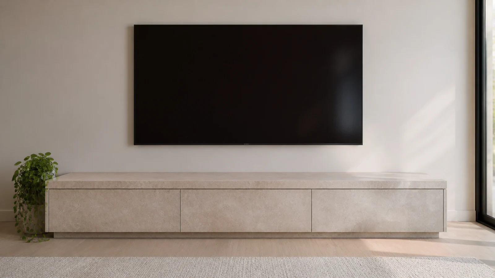
An empty surface is the most modern move available and the hardest to hold. If the unit is doing the architectural work, objects on top only interrupt it. Put the plant on the floor beside it instead. The modern interior design guide goes further into restraint.
For the version of this that survives a real household, the clutter-hiding TV unit ideas cover cable routing and ventilation in detail. If your run includes open shelving either side, built-in shelves for the living room has the proportions.
Mistakes to Skip
- Specifying gloss white for a wall that faces a window. Every reflection lands on the screen, and fingerprints show on a handleless front more than on any handled one.
- Floating a stone-topped unit on drywall anchors. A 20 mm porcelain top plus carcass plus gear passes 150 pounds easily, and that load belongs on studs or a cleat, not toggles.
- Sealing every bay behind solid doors. Slats, a rear vent or a gap above glass is what stops a receiver dropping into protection mode halfway through a film.
- Making the run too short for the wall. A 48 inch unit under a 55 inch screen on a long wall reads as a placeholder no matter how good the finish is.
- Choosing the veneer from a 2 inch sample. Grain scale reads completely differently across 96 inches, so ask for a sample at least 12 inches wide before signing off.
Frequently asked questions
What makes a TV unit look modern rather than dated?
Three things do most of the work: no visible handles, one continuous horizontal line instead of stacked boxes, and a shadow gap where the unit meets the floor or wall. Matte finishes and a single material in two or three treatments finish the effect far more reliably than gloss.
Should a modern TV unit be floating or freestanding?
Floating, if the wall has studs where you need them. Keeping 12 to 16 inches of clear floor under the cabinet makes a room read larger and lets a robot vacuum pass, since most are 3.5 to 4 inches tall. Freestanding wins where the wall is hollow or you rent.
How wide should a modern media wall be?
Work to the wall, not the screen. A run that covers roughly two thirds of the wall width reads as architecture, while a short unit reads as furniture pushed against plaster. For a 55 inch panel that usually means 84 to 120 inches of continuous cabinetry.
Do handleless doors work with heavy media gear?
Yes, provided the push-catch hardware is rated for the door weight and the hinges are soft-close. Look for hardware tested to about 40,000 cycles and keep any single door under 24 inches wide, because a wide handleless front flexes and the catch stops aligning.
Is a stone top worth it on a media unit?
A 20 mm porcelain or sintered stone top costs less than marble, resists heat and never stains from a wet glass. Real marble is porous and needs sealing yearly. Both add serious weight, so a floating unit with a stone top must be fixed into studs, not anchors.
Want more like this? Browse all 15 tv unit decor guides — they all use the same measurements and budget tiers.
Pin it for later
Save this to your TV Unit Decor board
Pin it now so it is waiting for you when the tape measure comes out — and so the next person hunting for this idea can find it too.
Save this pinKeep going
More ideas worth saving while you have the tape measure out.