Rugs In Living Room · Listicle
25 Neutral Area Rugs In Living Room Setups To Copy

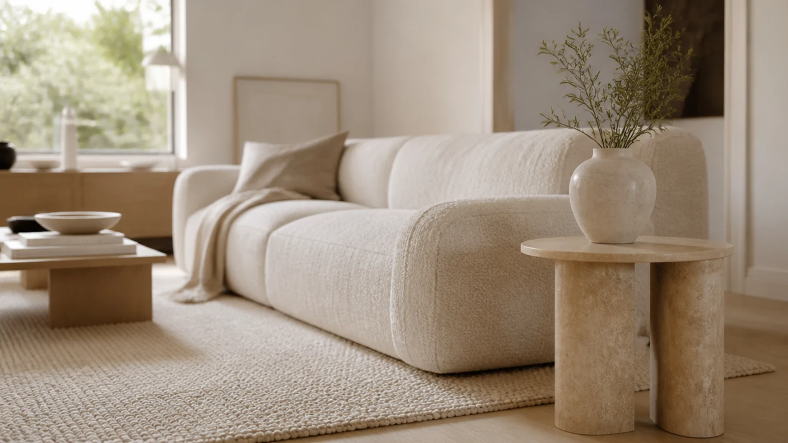
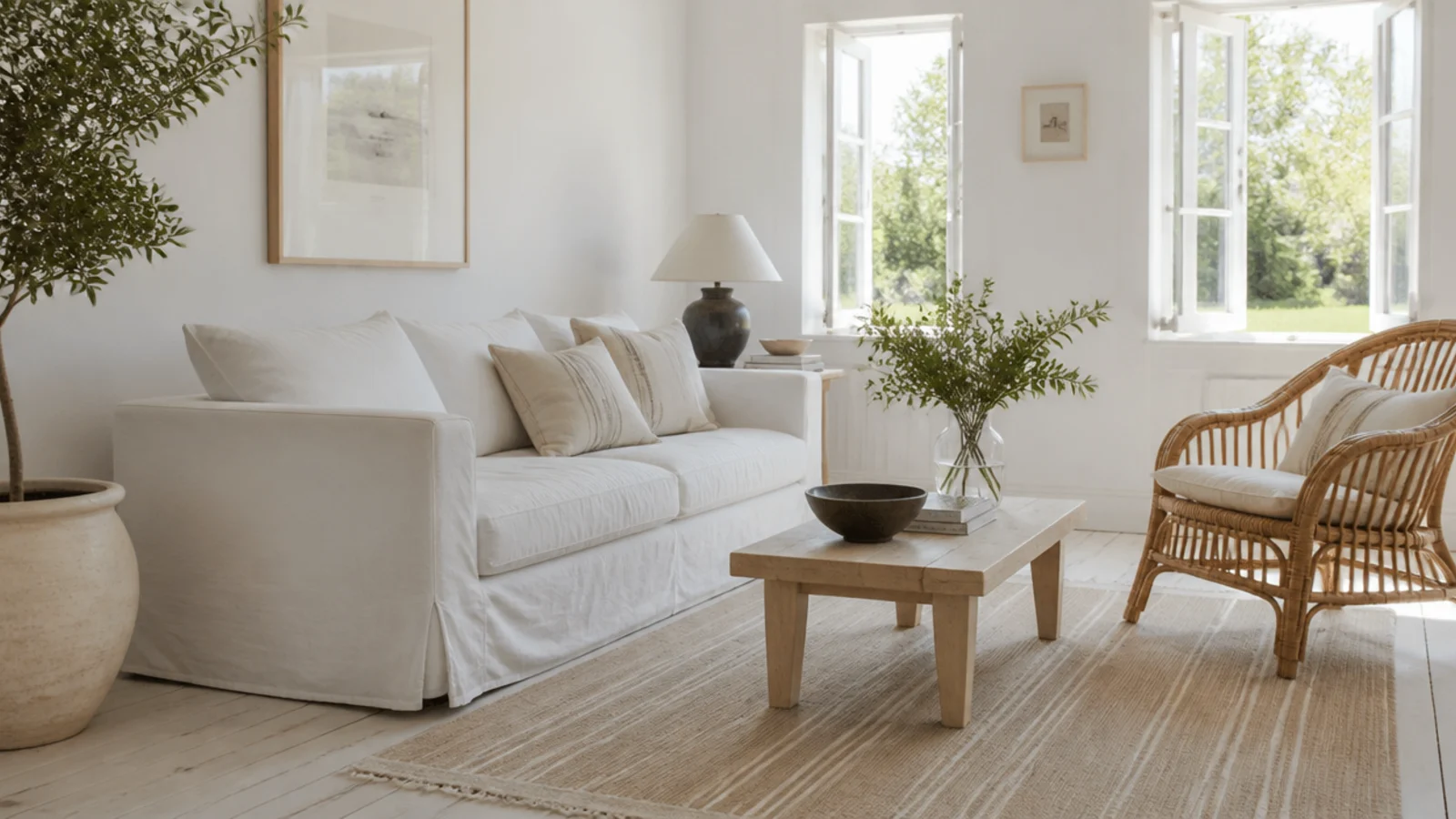
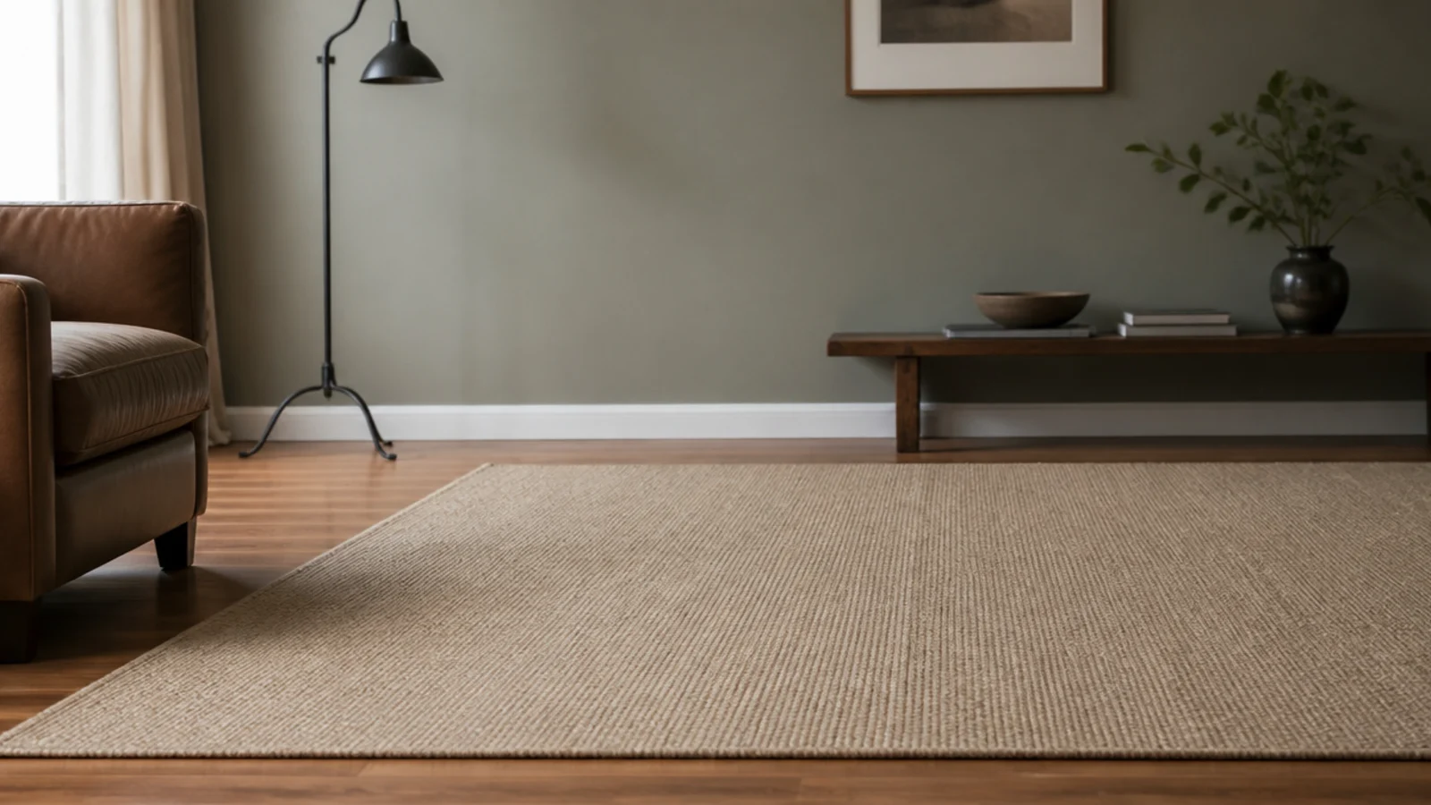
Neutral area rugs in living room schemes fail for one of two reasons, and neither is the colour itself. Either the undertone fights the floor, or the rug is a flat solid in a room that walks on it daily. I have made both mistakes — a greige 8x10 that turned pink against warm oak, and a plain cream that had a visible lane down the middle by its first winter. Below are twenty-five setups that stay quiet without going flat, with the undertone tests, texture swaps and cleaning intervals behind each one.
In this guide27 sections — tap to openHide
- 1.What neutral area rugs in living room schemes get wrong
- 2.Test the undertone against the floor, not the sofa
- 3.Warm neutral over yellow-toned boards
- 4.Cool neutral over ash and grey-washed floors
- 5.Greige is the compromise that fails most often
- 6.Heathered instead of flat solid
- 7.Tone-on-tone pattern to hide crumbs
- 8.High-low carved wool for shadow instead of colour
- 9.Chunky loop for texture in a plain room
- 10.Three neutrals at three clearly different values
- 11.Put the darker neutral in the walkway
- 12.Keep ivory where nobody walks
- 13.Know what a plain cream 8x10 looks like at one year
- 14.Match texture across the room, not colour
- 15.Undyed wool and its natural colour variation
- 16.Add a fine border a shade or two deeper
- 17.Low contrast lattice and diamond patterns
- 18.Natural fibre for warmth without any colour
- 19.A two-neutral stripe for a long room
- 20.Add sheen carefully and never viscose
- 21.Wool with charcoal flecks through the field
- 22.Repeat the rug darkest tone twice and stop
- 23.Look at the sample at nine in the morning and nine at night
- 24.Expect a pale rug to shift with sun exposure
- 25.Set a cleaning cadence a pale rug can survive
- 26.Know when to stop fighting and go darker
- 27.Mistakes to Skip
What neutral area rugs in living room schemes get wrong
Test the undertone against the floor, not the sofa. Order swatches, lay them directly on the boards, and look at them twice: once in daylight and once at night under lamps. Warm yellow-toned oak wants a rug with a warm base. Put a cool pink-grey rug on it and the whole floor reads slightly muddy at every hour, which no cushion or throw ever fixes.
Then decide how much variation the rug carries. A flat solid shows everything — a plain cream 8x10 in a walking route develops a visible traffic line inside a year. A heathered, flecked or tone-on-tone version of exactly the same shade hides the same wear almost completely, because the variation breaks up the shadow before your eye reads it as a line.
Last, plan the values rather than the shades. Three neutrals at three genuinely different values — pale rug, mid sofa, dark timber — makes a room look composed. Three shades of beige at the same value makes it look washed out. Texture is the other half of that: a high-low carved wool or a chunky loop gives a floor depth that no amount of extra beige can.
For the opposite approach in a room that takes real punishment, see the dark rug ideas. And if a pale rug is already too far gone, the layered rug looks show how to cover the worst of it.
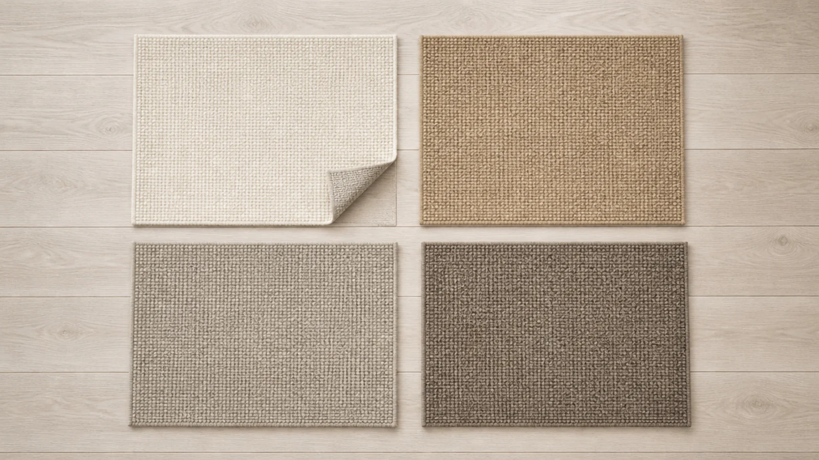
1. Test the undertone against the floor, not the sofa
The floor is the largest surface the rug touches and the one it will be compared against forever. Lay the swatch flat on the boards and step back six feet. If it looks slightly grey, pink or green against the wood, that reading will not improve once the rug is 80 square feet instead of 8 inches.
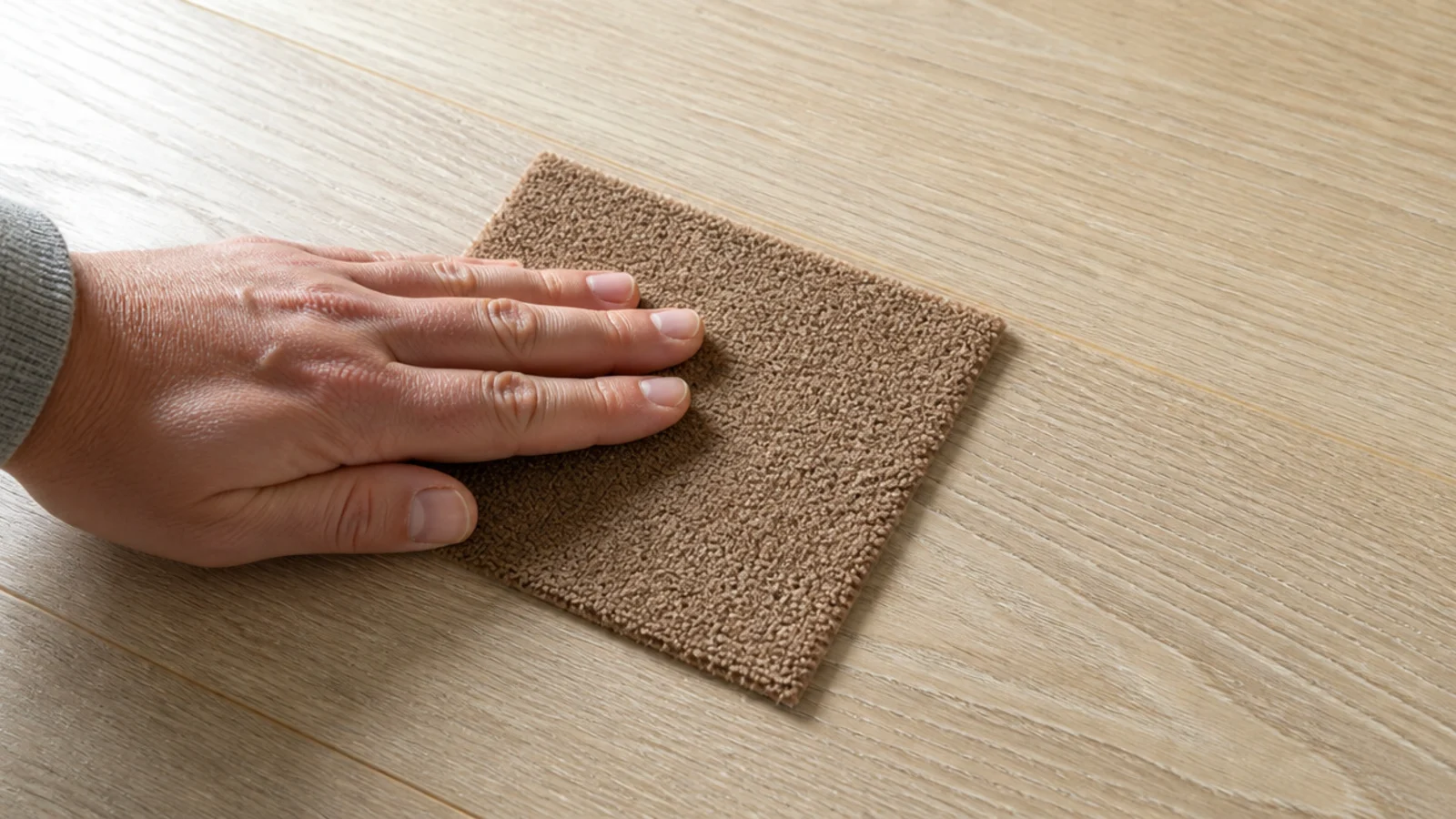
2. Warm neutral over yellow-toned boards
Warm oak, pine and most limed floors carry a yellow base, and they pair happily with oatmeal, camel, sand and warm mushroom. The test is whether the two surfaces feel like they belong to the same room at nine at night under lamplight, which is when warm floors are at their warmest.
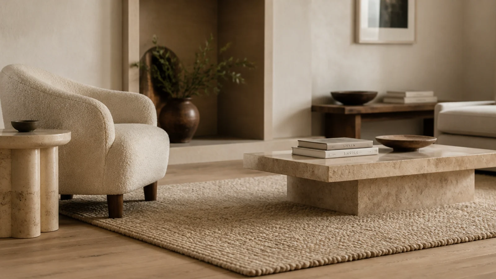
3. Cool neutral over ash and grey-washed floors
A cool floor needs a rug with grey rather than yellow in its base — dove, stone, pale flint. Putting a warm cream on a grey-washed floor makes the rug look slightly dirty and the floor look slightly blue. Both surfaces are fine; the pairing is what fails.
4. Greige is the compromise that fails most often
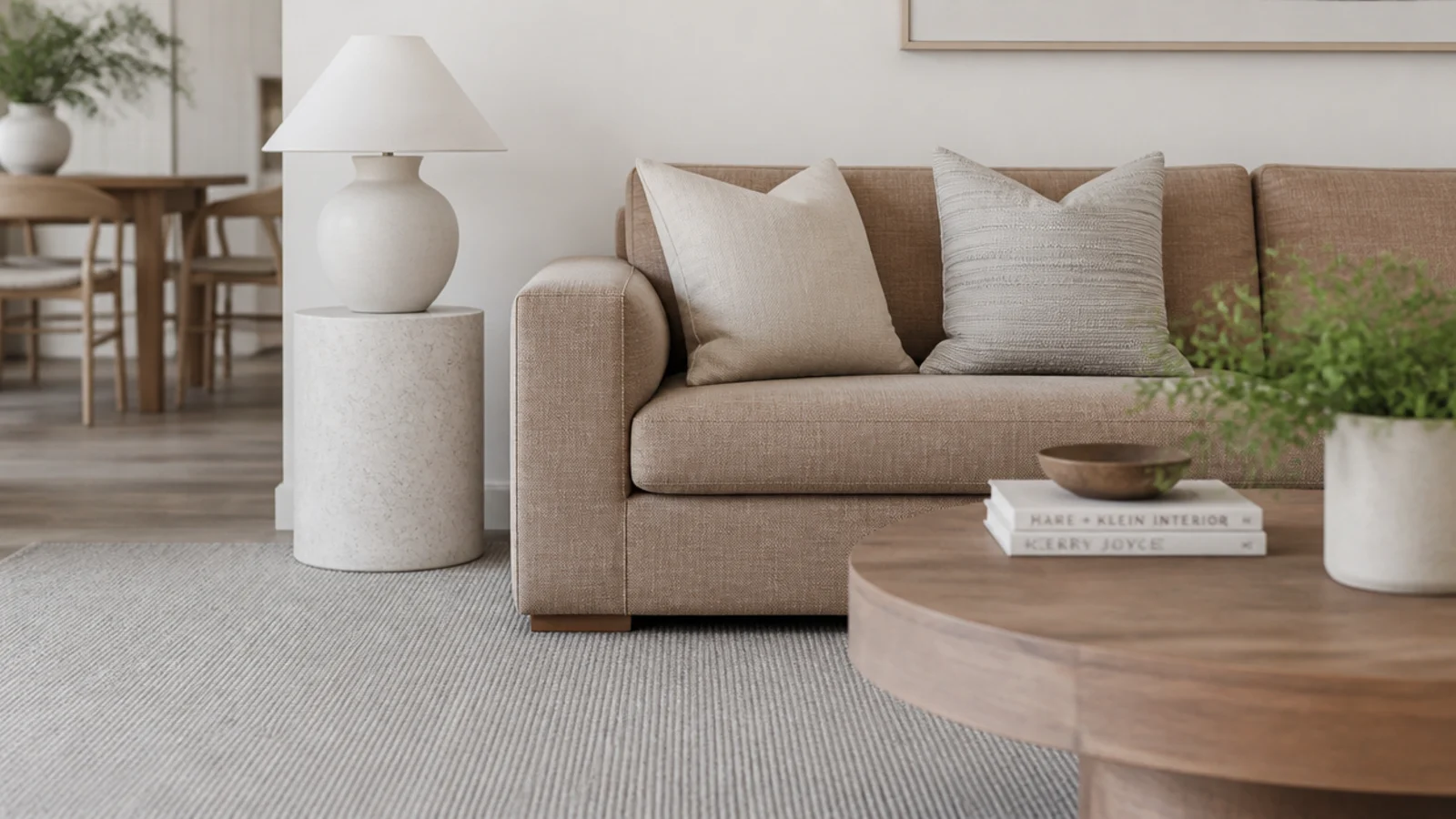
Greige sits between warm and cool and takes its reading from whatever is next to it, which is exactly why it is the shade most likely to disappoint. It can look perfectly balanced in a showroom and distinctly pink on your boards. Never buy greige without a swatch on your own floor first.
5. Heathered instead of flat solid
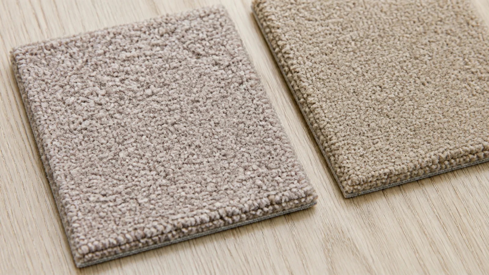
Heathered yarn twists two or three close tones together in every strand, so the surface has micro-variation before anything is spilled on it. In a living room that gets used daily, a heathered oatmeal and a flat oatmeal look identical on day one and completely different at year two.
6. Tone-on-tone pattern to hide crumbs
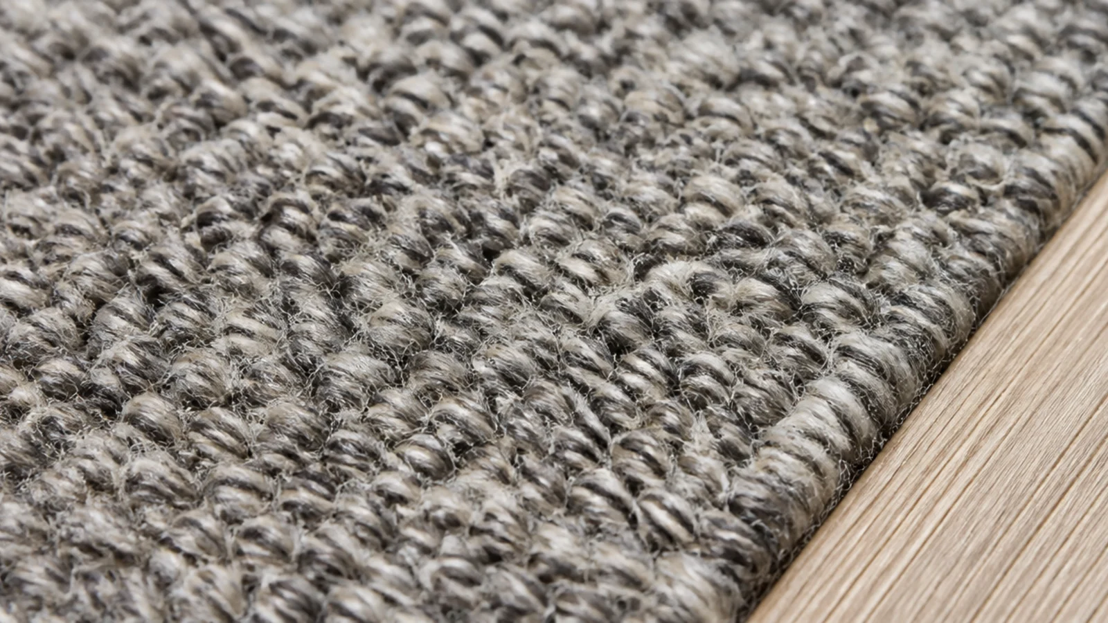
A pattern woven a single shade away from the field reads as texture from standing height and as pattern from the floor. That low contrast is what hides crumbs, lint and paw prints. It is the most practical decorative choice available in a pale rug and it costs nothing extra.
7. High-low carved wool for shadow instead of colour
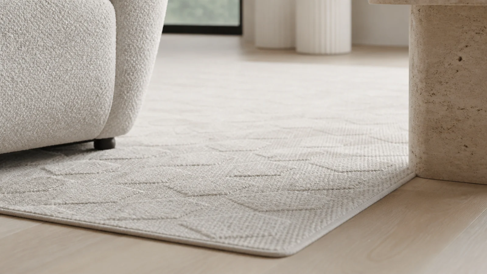
Carving mixes cut pile and loop pile at different heights so the surface throws its own shadows. In a north-facing room, where flat colour goes lifeless, that shadow is doing the work daylight will not. Expect a premium of roughly 20 to 30 percent over a flat wool of the same face weight.
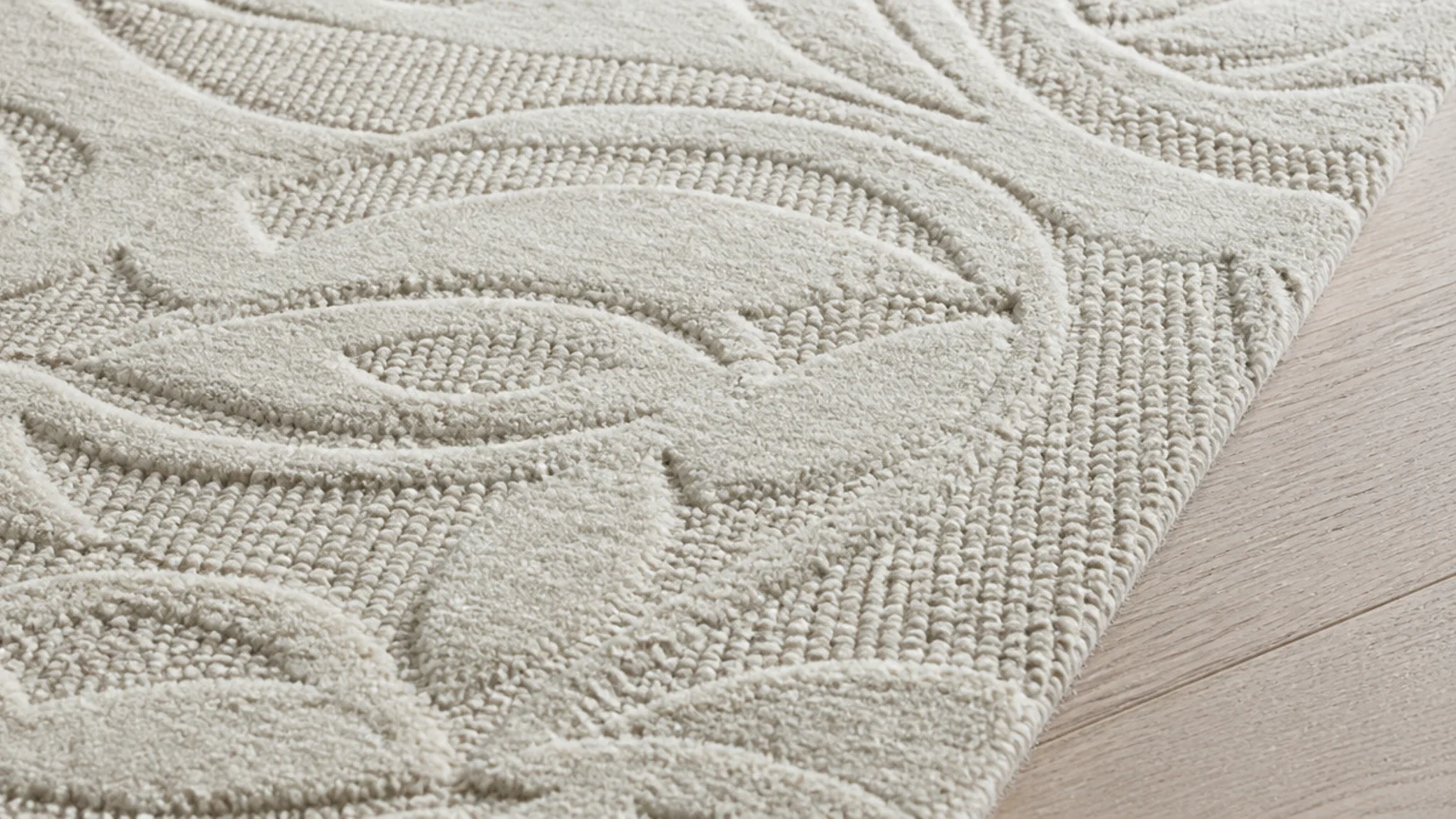
8. Chunky loop for texture in a plain room
A heavy loop pile at 40 to 60 ounces gives a plain room something to look at without adding a single colour. Keep the loops tight rather than long if there are pets in the house, because claws catch in a loose loop and pull a run across the field.
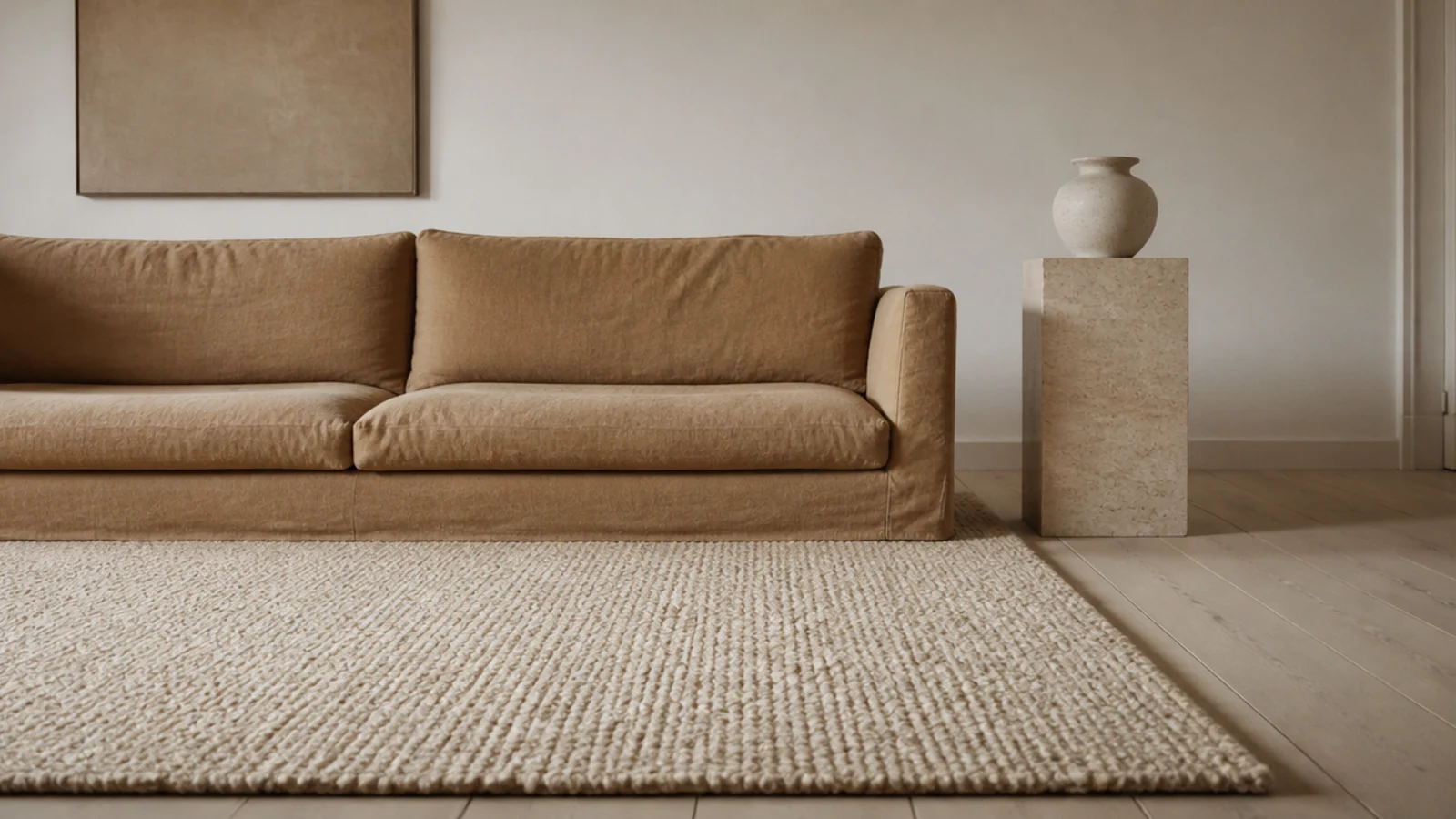
9. Three neutrals at three clearly different values
Squint at the room. If everything blurs into one tone, the values are too close. A pale rug, a mid-tone sofa and something genuinely dark — a walnut console, an iron lamp, a charcoal cushion — gives the eye a ladder to climb. Value contrast is what stops neutral becoming vague.
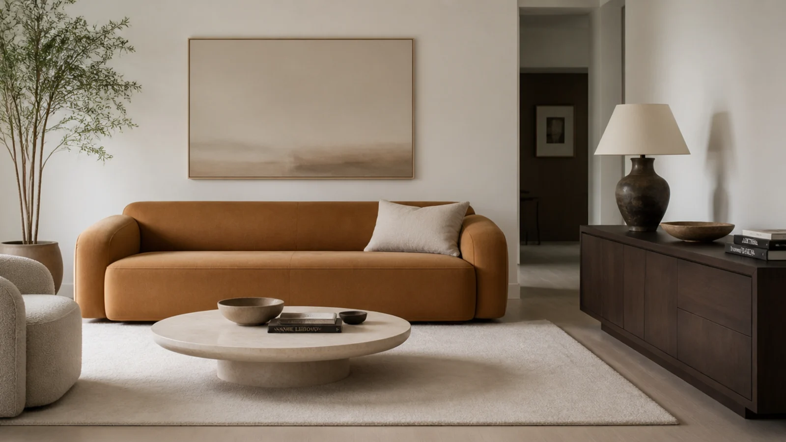
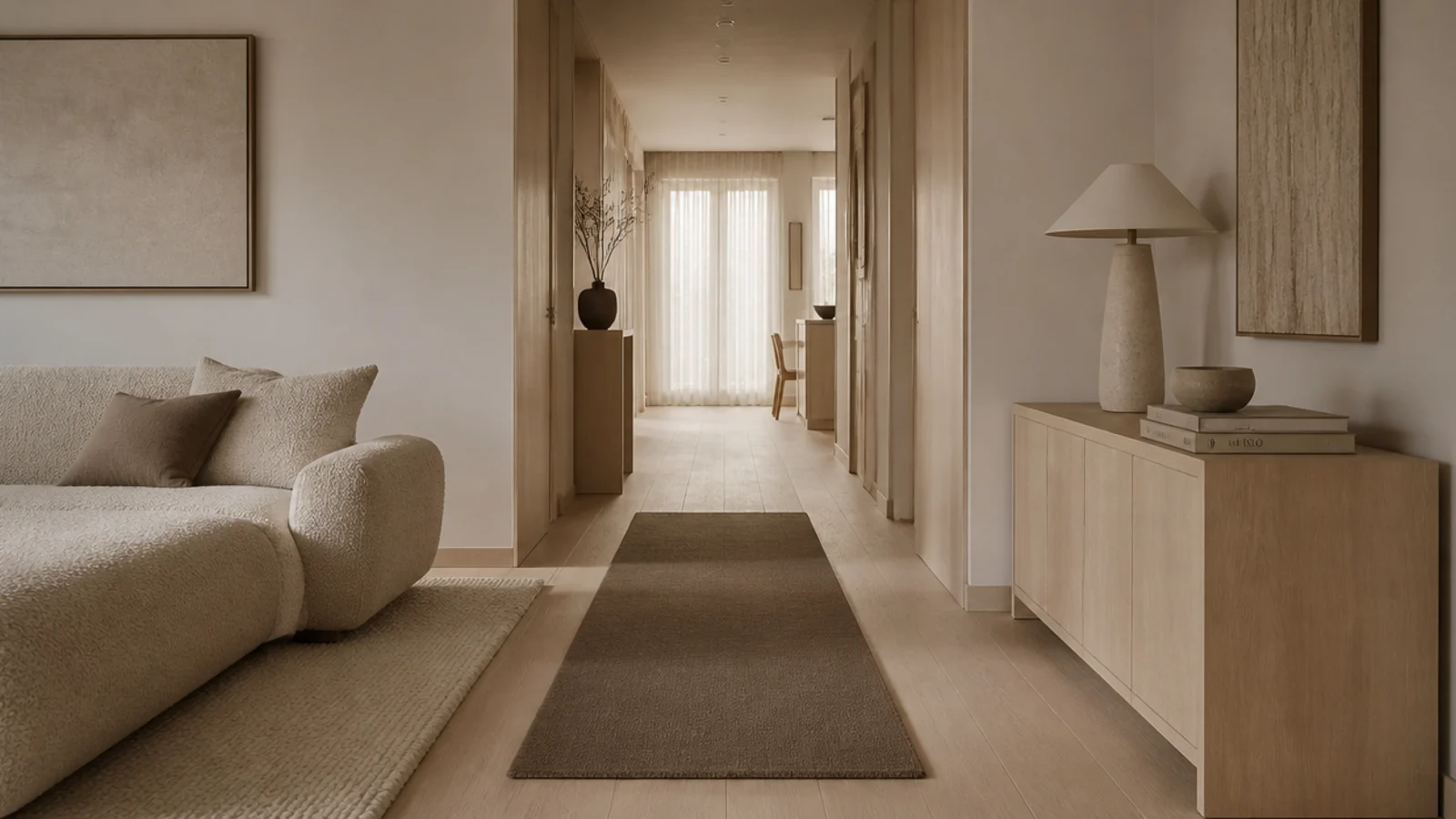
10. Put the darker neutral in the walkway
If the room has an obvious route through it, put the deepest neutral there and save the pale one for the seating zone. A mushroom runner across a walking line takes the wear that would otherwise print itself into a cream field, and it costs a fraction of replacing the main rug.
11. Keep ivory where nobody walks
Ivory is beautiful and completely unforgiving. Under a reading chair in a corner, out of the traffic route, it stays ivory for years. Across the middle of a family room it is a maintenance project. Match the shade to the footfall rather than to the mood board.
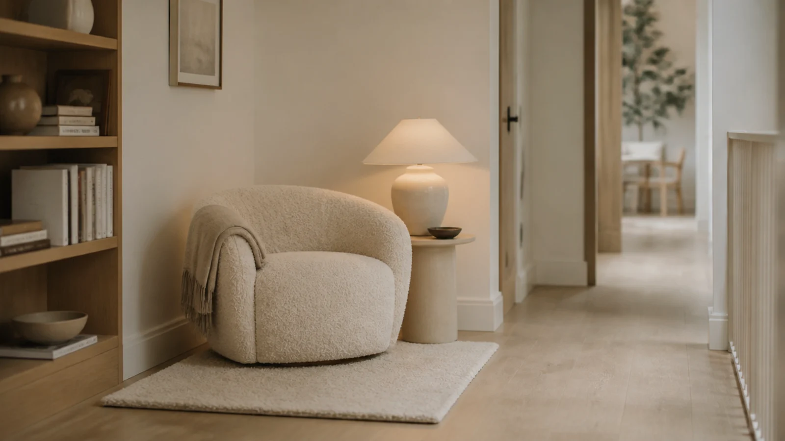
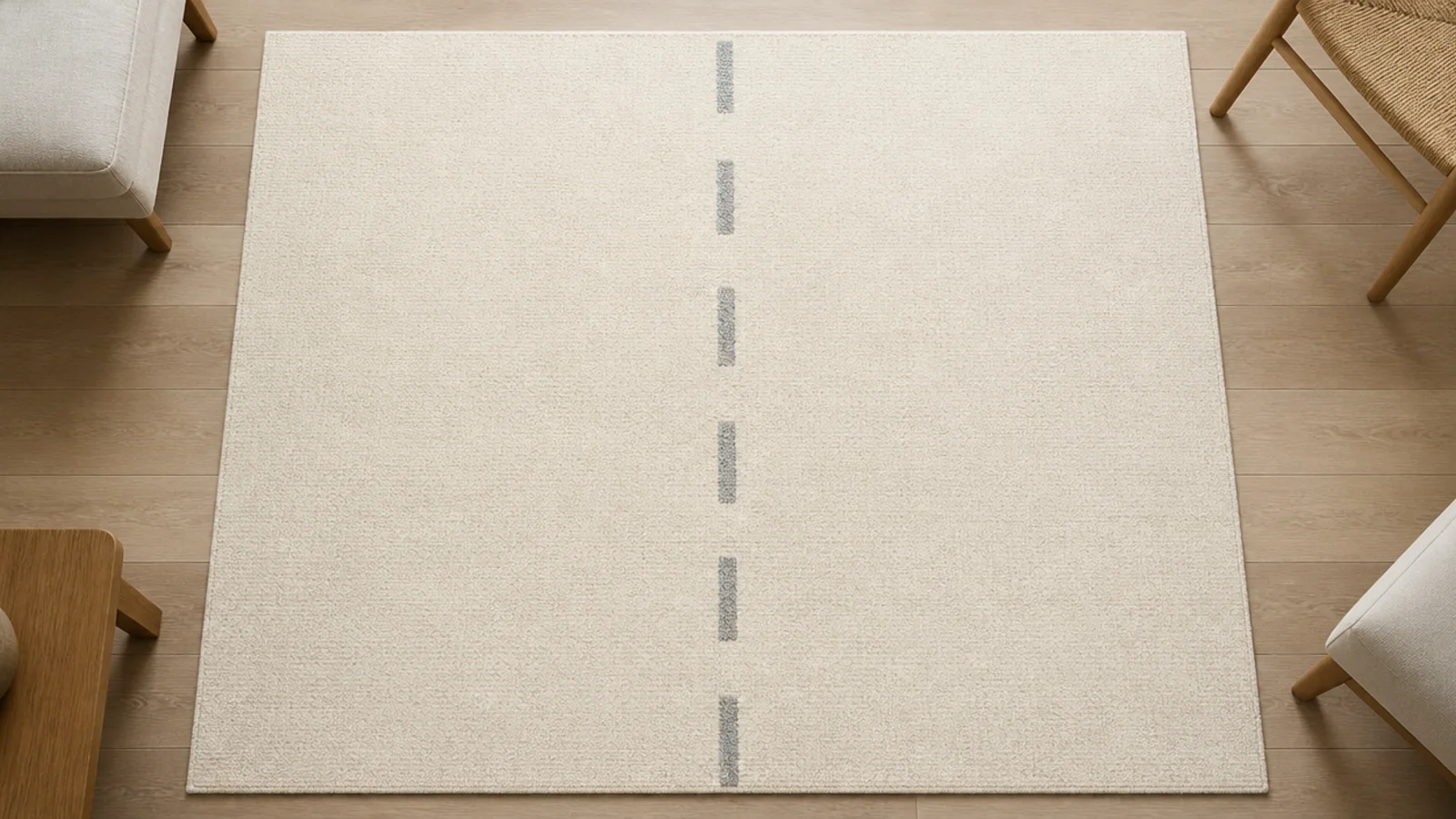
12. Know what a plain cream 8x10 looks like at one year
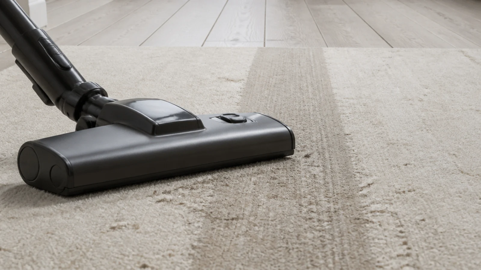
A faint grey lane down the centre, slightly darker where the sofa is passed, and a shadow at the doorway end. That is normal, not neglect, and vacuuming does not remove it because it is compressed fibre as much as soil. Knowing this before you buy is the difference between disappointment and a plan.
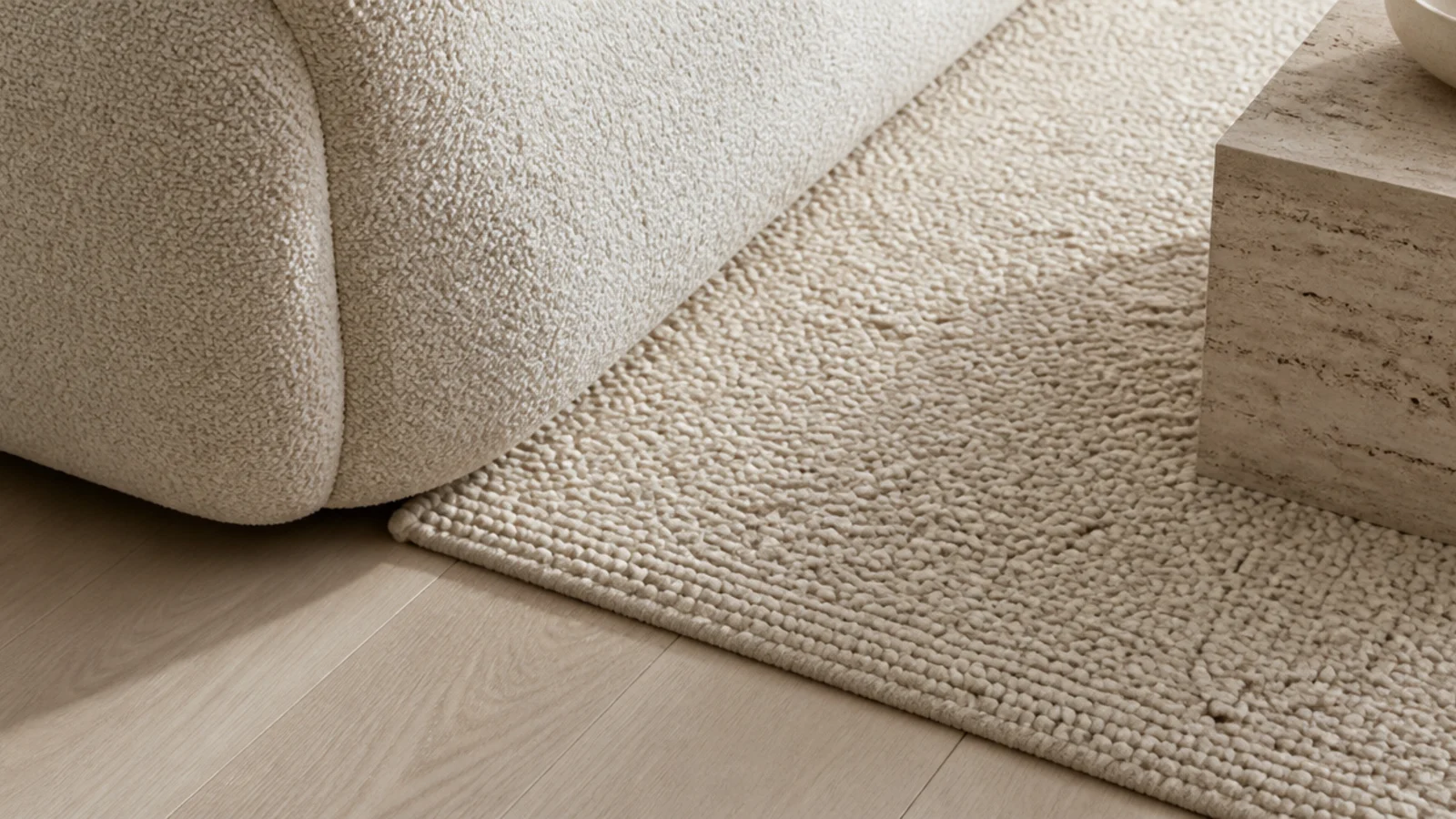
13. Match texture across the room, not colour
Pairing a bouclé sofa with a looped wool rug ties a scheme together far more convincingly than matching two beiges. The eye reads surface quality before it reads exact shade, which is why texture matching survives different light and different times of day where colour matching does not.
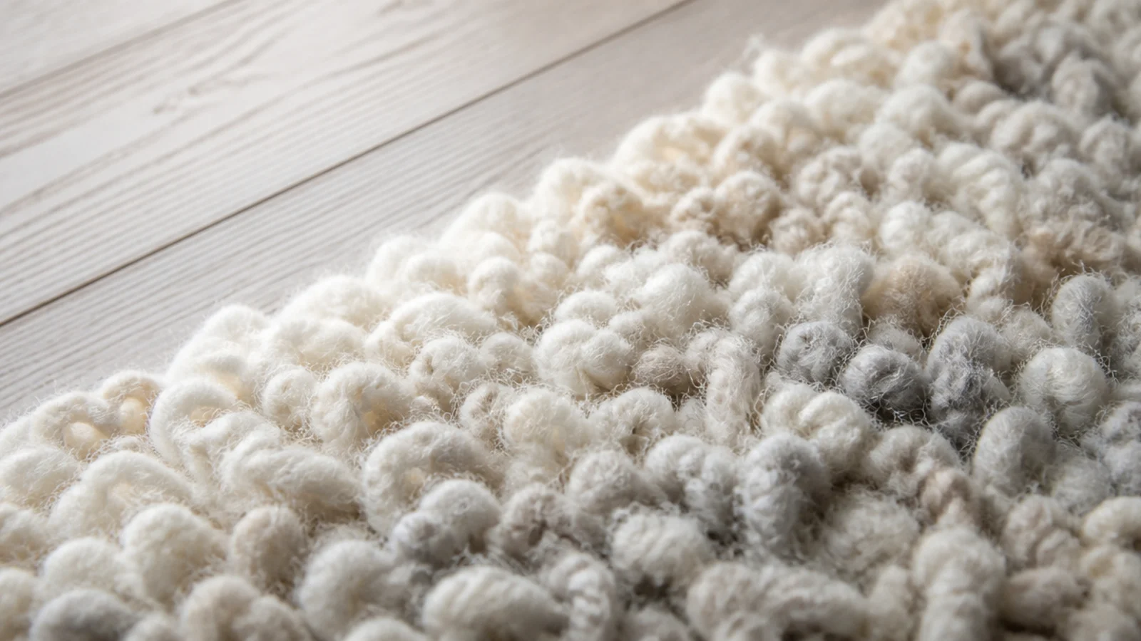
14. Undyed wool and its natural colour variation
Undyed wool arrives in ivory, oatmeal, soft grey and brown straight off the animal, and blending those gives a depth no dye lot reproduces. It also never suffers a dye-lot mismatch on a repair. Undyed rugs cost about the same as dyed and age more gracefully as the sun works on them.
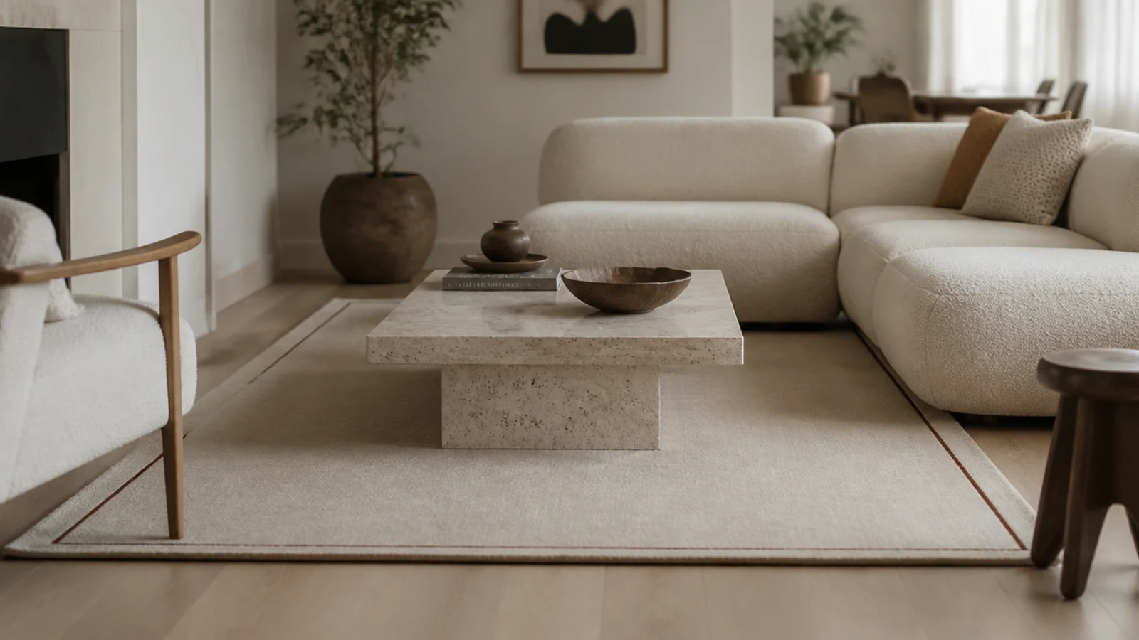
15. Add a fine border a shade or two deeper
A narrow border — an inch or two on a large rug — in a slightly deeper neutral frames the seating group and makes a plain field look specified rather than default. Repeat that border tone once elsewhere, in a cushion pipe or a lampshade trim, and the whole thing reads as deliberate.
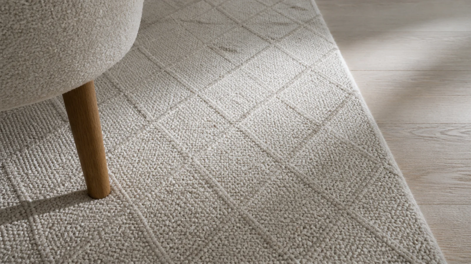
16. Low contrast lattice and diamond patterns
A diamond or lattice woven one shade off the ground gives structure without pattern noise. It suits rooms that already have visual activity in the art or the curtains. Look for the pattern to be woven rather than printed — fold a corner and check the colour runs to the base of the pile.
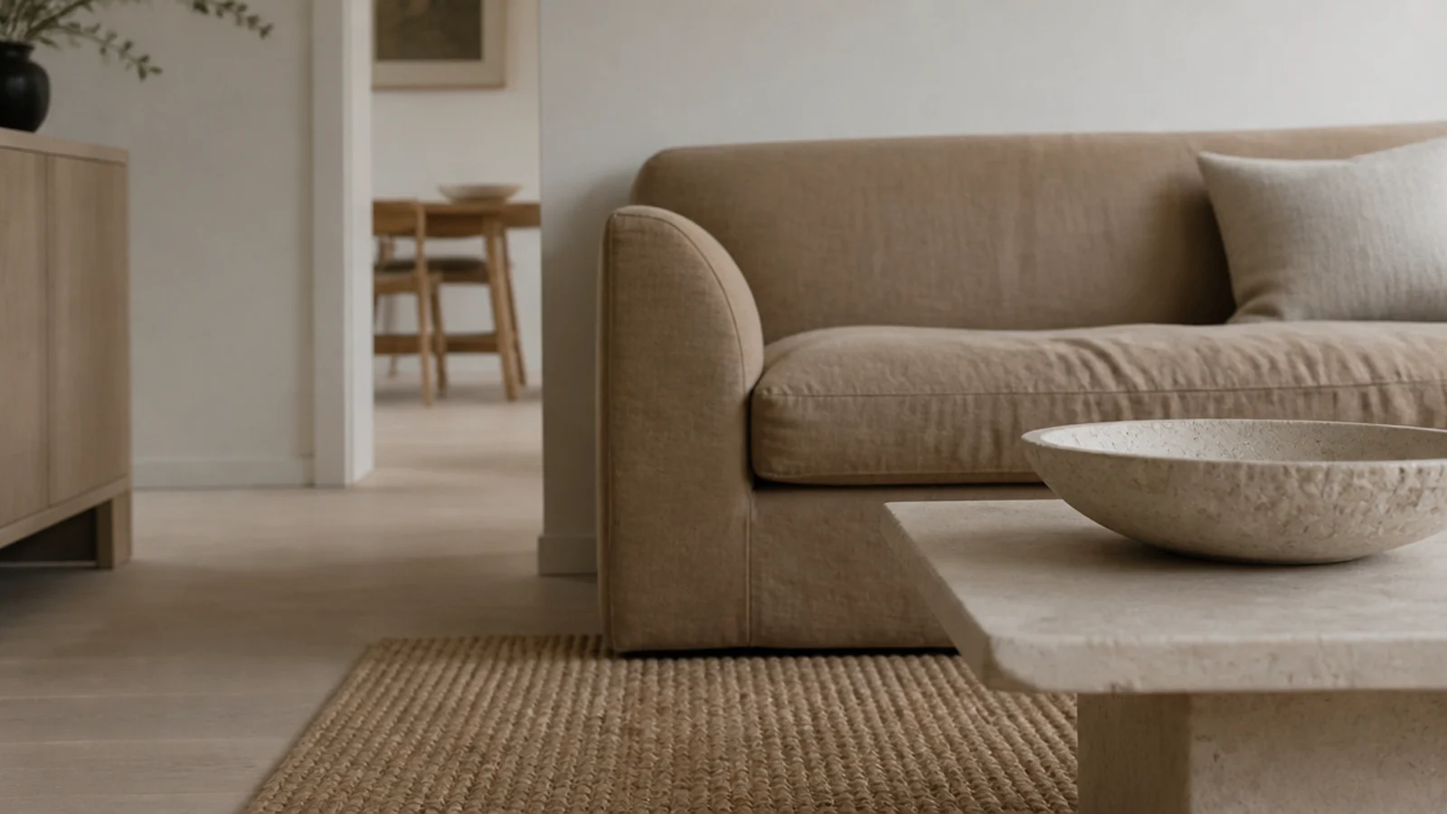
17. Natural fibre for warmth without any colour
Jute and wool-jute blends bring warmth through braid and grain rather than dye, at $200 to $450 for an 8x10. Keep jute out of the drinks zone, since water leaves a permanent brown ring, and vacuum with suction only. A wool-jute blend gives most of the look with far better spill behaviour.
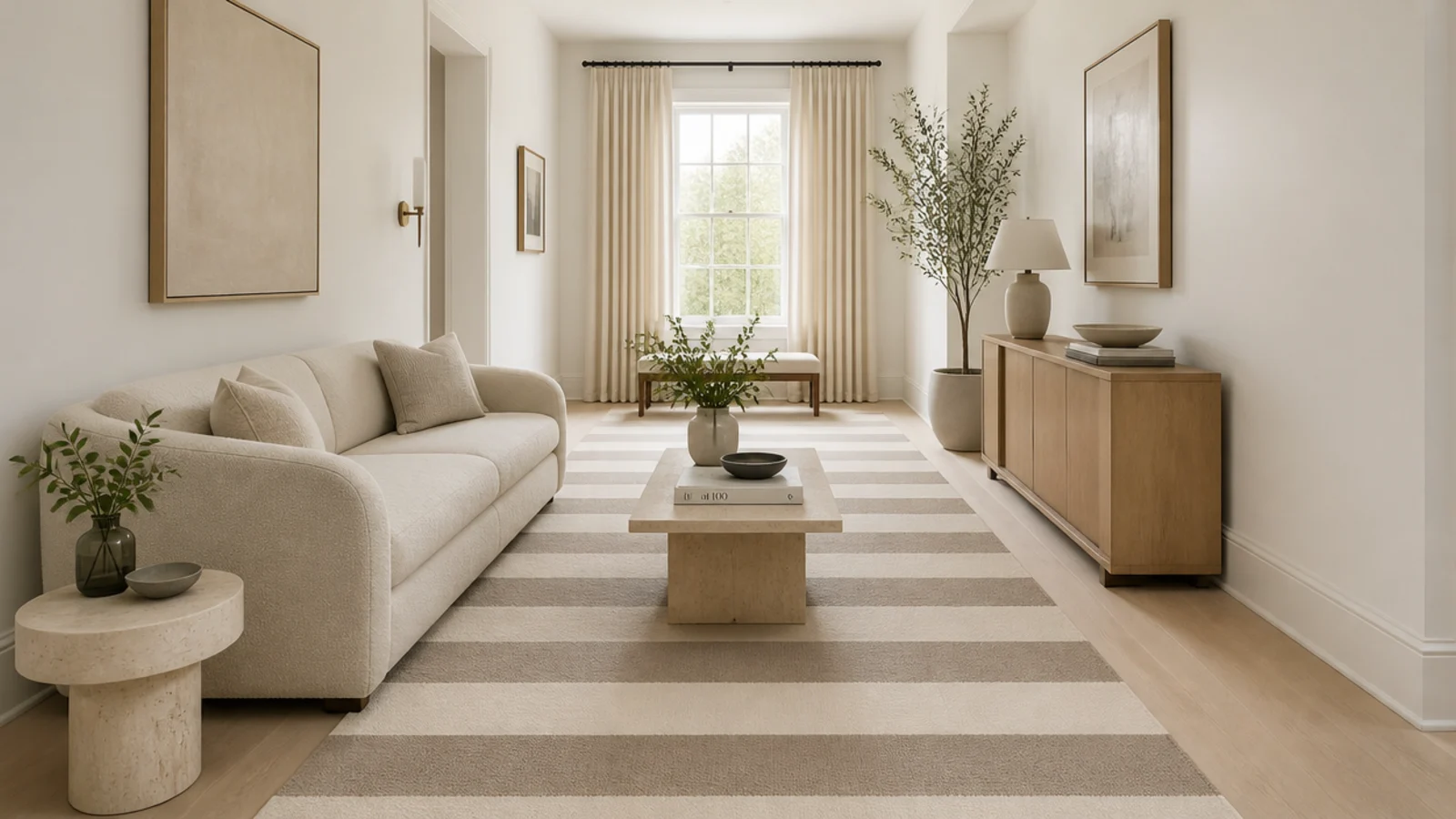
18. A two-neutral stripe for a long room
Wide stripes in two close neutrals, run along the length of a narrow room, stretch it visually and give the floor a direction. Keep the contrast gentle — two values apart at most — or the stripe stops being a neutral and starts being the loudest thing in the room.
19. Add sheen carefully and never viscose
A little light on the yarn adds life to a neutral, and there are safe ways to get it: mercerised cotton passes in a flatweave, or a lustrous long-staple wool. Viscose and art silk deliver more sheen and mark permanently the first time water touches them, which rules them out of any living room.
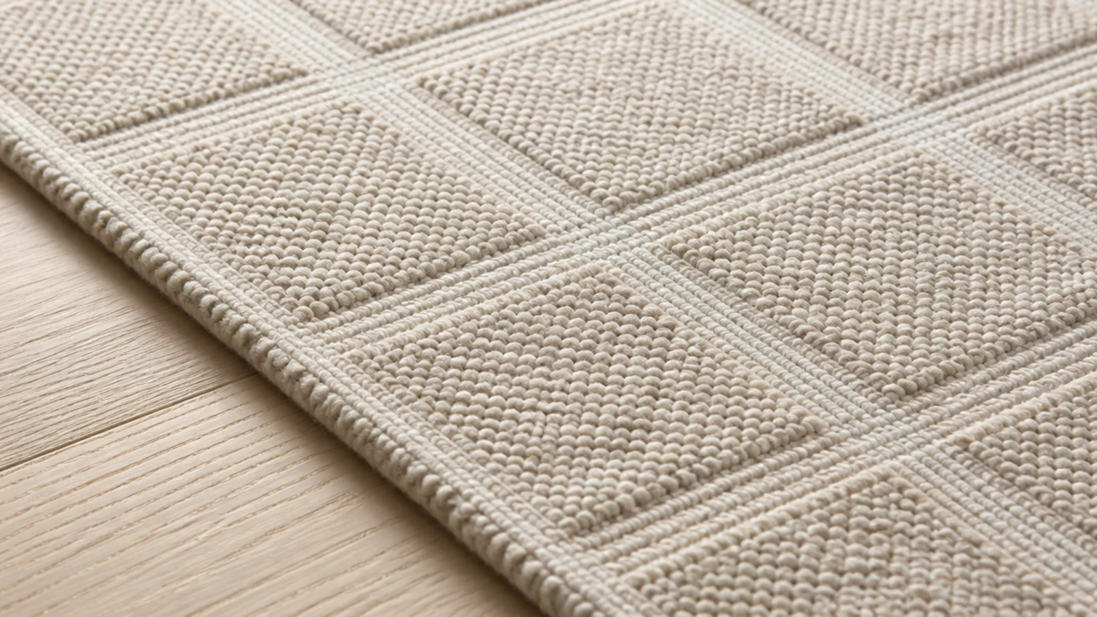
20. Wool with charcoal flecks through the field
A pale ground shot with fine dark fibres is the most effective crumb-hiding surface in a light rug. From standing height it reads as a soft pale neutral; up close the flecks are doing all the disguising. It suits family rooms where a plain cream would be replaced within two years.
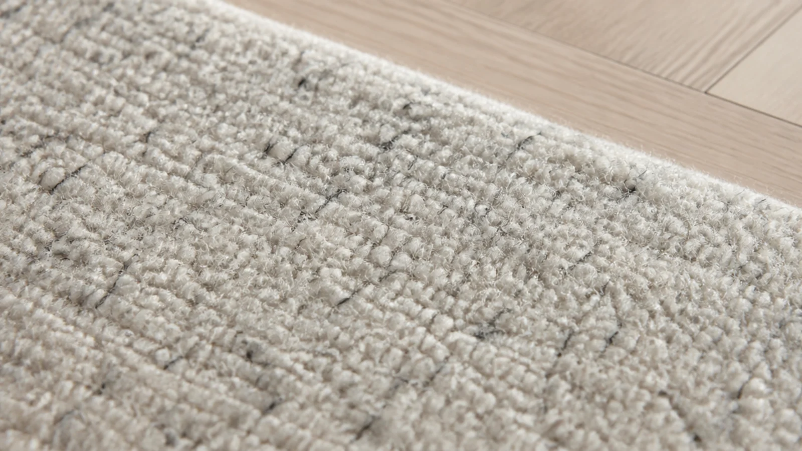
21. Repeat the rug darkest tone twice and stop
Take the deepest shade in the rug and let it appear exactly twice more in the room — one cushion, one small object. Two repetitions read as a scheme. Four or five read as a matching set, which is the specific way neutral rooms tip from calm into flat.
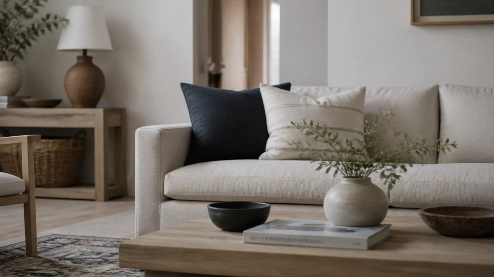
22. Look at the sample at nine in the morning and nine at night
Neutrals move more under artificial light than any other colour family. A rug that reads warm sand in north daylight can read distinctly yellow under a 2700K bulb. Look at the swatch at both ends of the day before ordering, because you will see the room far more often at night.
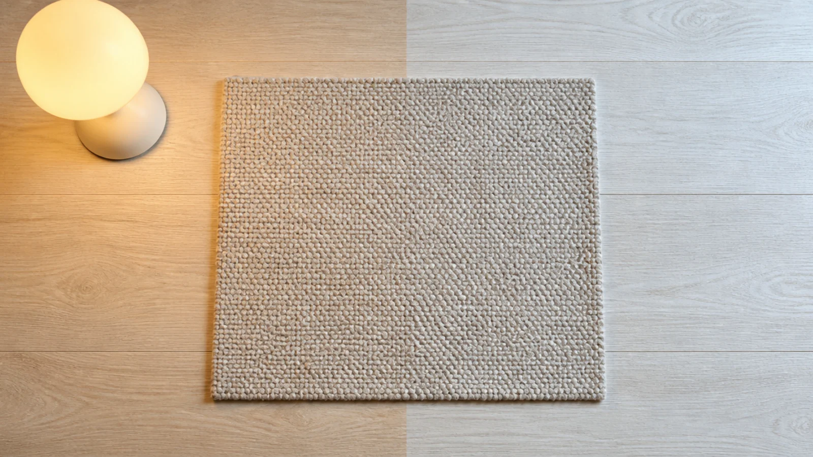
23. Expect a pale rug to shift with sun exposure
Strong window light warms a pale wool over months, so the half nearest the glass drifts a shade further than the far half. Rotating 180 degrees every six months evens it out. On an unrotated rug the difference becomes obvious at about the two-year mark and cannot be reversed.
24. Set a cleaning cadence a pale rug can survive
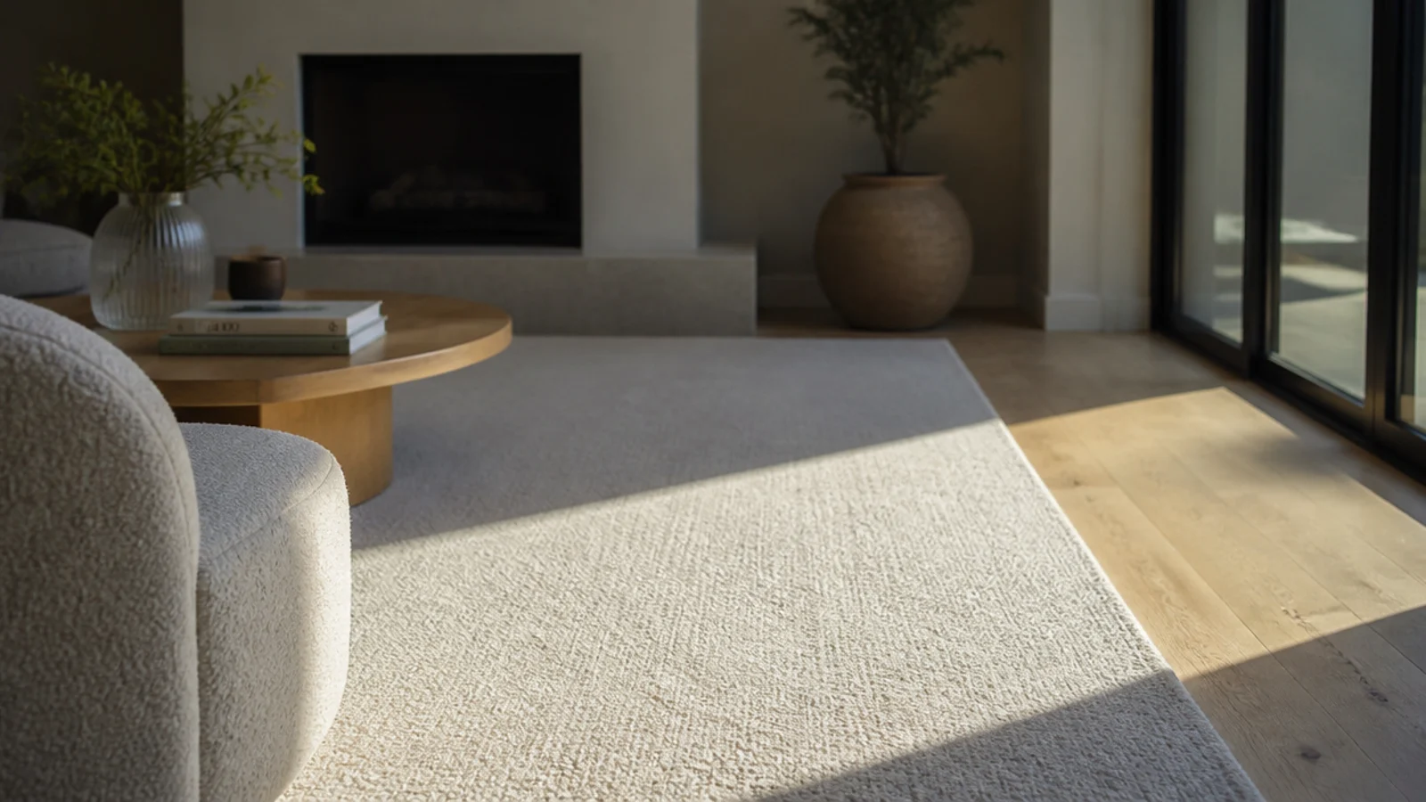
Vacuum the traffic lane twice a week and the whole rug weekly, brush off on loop and hand-knotted. Blot spills from the outside in, never rub. Book a professional wash every three years rather than five, at $3 to $6 a square foot, because pale wool shows soil long before dark wool does.
25. Know when to stop fighting and go darker
If you are cleaning the same lane every week, the rug is wrong for the room rather than badly maintained. Dropping two values to a mushroom or a soft charcoal solves in one purchase what no cleaning routine will. It is not a defeat; it is matching the floor to the life happening on it.
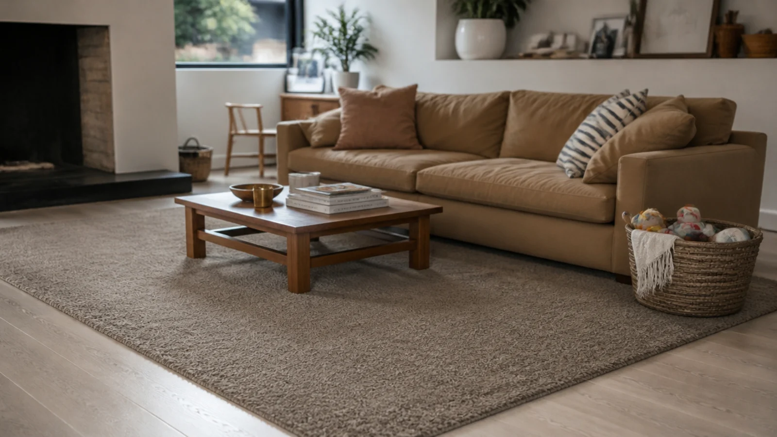
For the table that sits in the middle of all this, the modern center table guide covers proportions and finishes, and the mirror wall decor ideas show how to bounce more light into a neutral room without adding colour.
Mistakes to Skip
- Choosing the neutral from a screen. Undertone is the property photographs distort most, and a rug that reads warm greige online can turn pink the moment it lands on your boards.
- Buying a flat solid cream for a room with a walking route through it. The traffic line arrives within a year and it is compressed fibre, not soil, so cleaning will not lift it.
- Matching three shades of the same value. Without a clear light, mid and dark ladder, a neutral room reads as faded rather than calm, and adding more beige makes it worse.
- Assuming neutral means low maintenance. A pale rug needs more vacuuming, more rotation and a shorter interval between professional washes than a mid-tone one does.
Frequently asked questions
How do I pick the right neutral for my floor?
Order swatches and lay them directly on the boards, not on a table. Warm yellow-toned oak needs a rug with a warm base; a cool pink-grey rug against it looks muddy at every hour. Look at the swatch in daylight and again at night under lamps, because artificial light shifts undertone hard.
Will a cream rug show every mark?
A flat solid cream in a walkway will develop a visible traffic line within about a year. A heathered, flecked or tone-on-tone version of the same shade hides the same wear almost completely, because the variation breaks up the shadow. If you want pale, choose variegated rather than plain.
What is the difference between beige, greige and taupe?
Beige carries a yellow base, taupe carries a brown-grey base, and greige sits between the two and picks up whatever is around it. That is why greige is the shade most likely to look wrong in a real room. Test it on your own floor before committing to anything sold as greige.
How do I stop a neutral room looking flat?
Use three neutrals at three clearly different values rather than three shades of one. Add texture instead of colour: a high-low carved wool, a chunky loop or a heavy flatweave gives a floor shadow and depth. Repeat the rug darkest tone twice elsewhere in the room and no more.
How often does a pale rug need cleaning?
Vacuum the traffic lane twice a week and the whole rug weekly, with the rotating brush off on loop and hand-knotted constructions. Rotate 180 degrees every six months. Plan a professional wash every three years rather than five, at roughly $3 to $6 per square foot, because pale wool shows soil sooner.
Want more like this? Browse all 15 rugs in living room guides — they all use the same measurements and budget tiers.
Pin it for later
Save this to your Rugs In Living Room board
Pin it now so it is waiting for you when the tape measure comes out — and so the next person hunting for this idea can find it too.
Save this pinKeep going
More ideas worth saving while you have the tape measure out.