Rugs In Living Room · UGC
25 Colorful Rugs In Living Room Looks I Tried

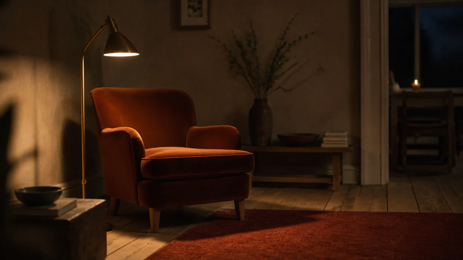
Colorful rugs in living room schemes are the purchase I have got wrong most often, and the one I have learned most from. Over about nine years and four homes I have bought a mustard I stopped seeing, a coral I returned in four days, a green kilim that turned out to be half viscose, and a terracotta I would buy again tomorrow. Here are twenty-five of them, what each one actually did to the room, and the tests I now run before anything saturated comes through the door.
In this guide27 sections — tap to openHide
- 1.How I judge colorful rugs in living room schemes now
- 2.The deep terracotta 8x10 that fixed a cold room
- 3.The mustard rug I loved for exactly six months
- 4.An indigo flatweave under a cream sofa
- 5.An overdyed vintage in raspberry
- 6.A green kilim that turned out to be a viscose blend
- 7.Ochre and cream stripes in a narrow room
- 8.A multicolour Persian that hid absolutely everything
- 9.Bright coral: the one I sent back
- 10.Deep plum in a room that never gets sun
- 11.Five colours in one rug, one clearly dominant
- 12.Colour blocking in rust and clay
- 13.Faded rose over old pine boards
- 14.A cool blue rug against warm wood, and why it failed
- 15.Turquoise, but only in a very small dose
- 16.Emerald polyester and how fast it matted
- 17.Layering one bright small rug over a neutral base
- 18.Repeating the rug colour twice and no more
- 19.Testing the colour at nine at night
- 20.What the window half looked like after two summers
- 21.Solution-dyed brights against piece-dyed ones
- 22.A dark border to hold a bright field
- 23.Bright colour on low pile against bright colour on shag
- 24.The damp cloth test before any cleaning
- 25.Where the brightest rug ended up in the end
- 26.The two colours I would not buy again
- 27.What I'd Do Differently Now
How I judge colorful rugs in living room schemes now
Three questions, in this order, and they have saved me a lot of money.
Where does the sun fall? Saturated colour has more pigment to lose, and reds and purples go first. In a south-facing room I now buy solution-dyed synthetic, where the pigment is mixed into the polymer before the fibre is extruded, or I accept the fading and rotate the rug 180 degrees every six months so it happens evenly rather than as a hard line.
Is the rest of the room quiet? A bright rug works when it is the only strong colour present. My mustard failed not because it was mustard but because the curtains were also doing something. I now repeat the rug's shade exactly twice more, in small things, and leave everything else neutral.
What is it actually made of? I ask for the fibre percentages before the price. Any viscose content marks permanently from plain water, and I have lost one rug corner learning that. Wool holds colour and deepens with age; printed synthetics lose it because the colour sits only on the fibre tips.
Everything below passed at least two of those, and where something failed I have said so. For the calmer version of the same room, the neutral rug setups cover what I use now between colour experiments.
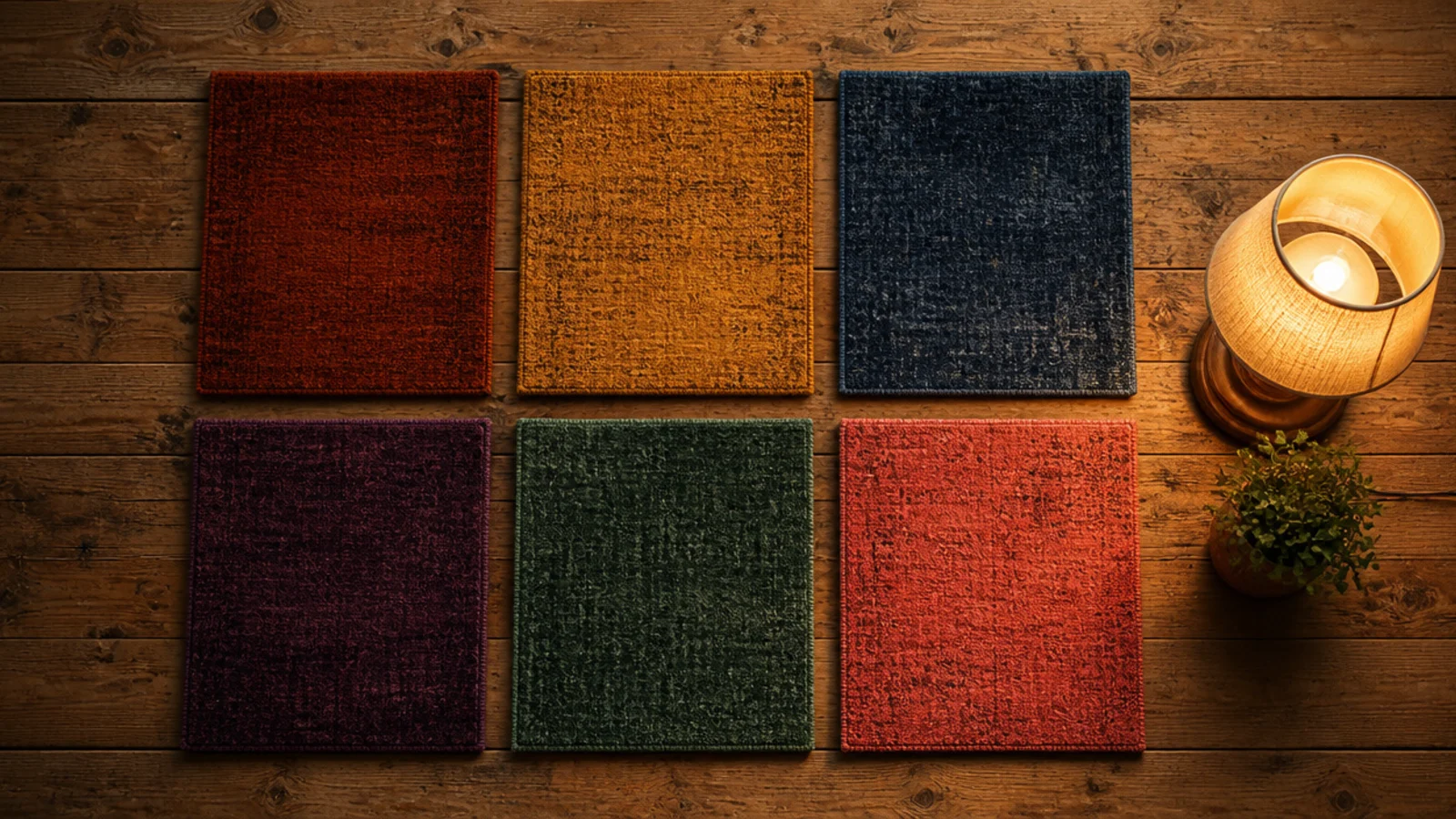
1. The deep terracotta 8x10 that fixed a cold room
This is the one I would buy again. A north-facing sitting room that never felt right got a deep terracotta wool rug and became usable in an afternoon. Warm earth colours do something in flat northern light that no amount of lamp temperature achieves. It cost around $850 and I have had it seven years.
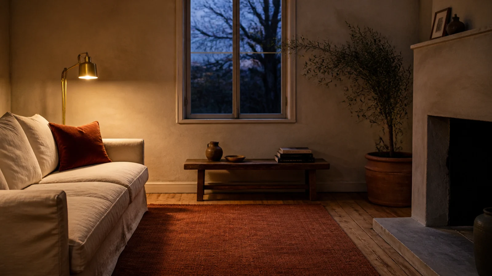
2. The mustard rug I loved for exactly six months
Mustard photographs beautifully and lives loudly. Mine was the first thing I saw walking into the room every single time, which is fine for a season and tiring by month seven. If you want yellow, I would now take it in a stripe or a border rather than across a whole 8x10 field.
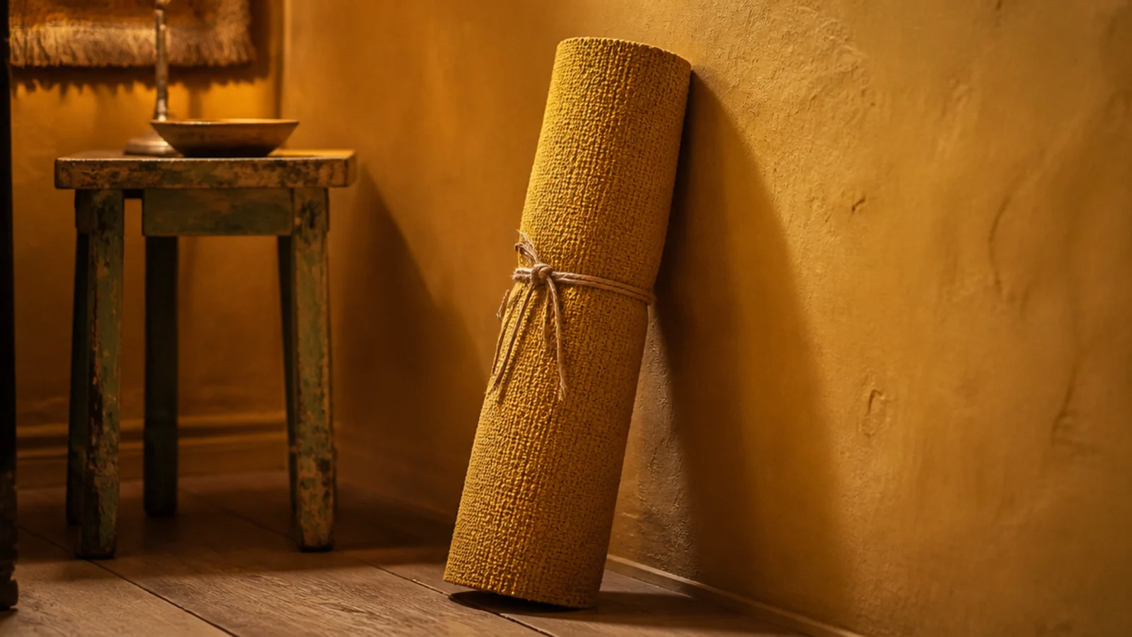
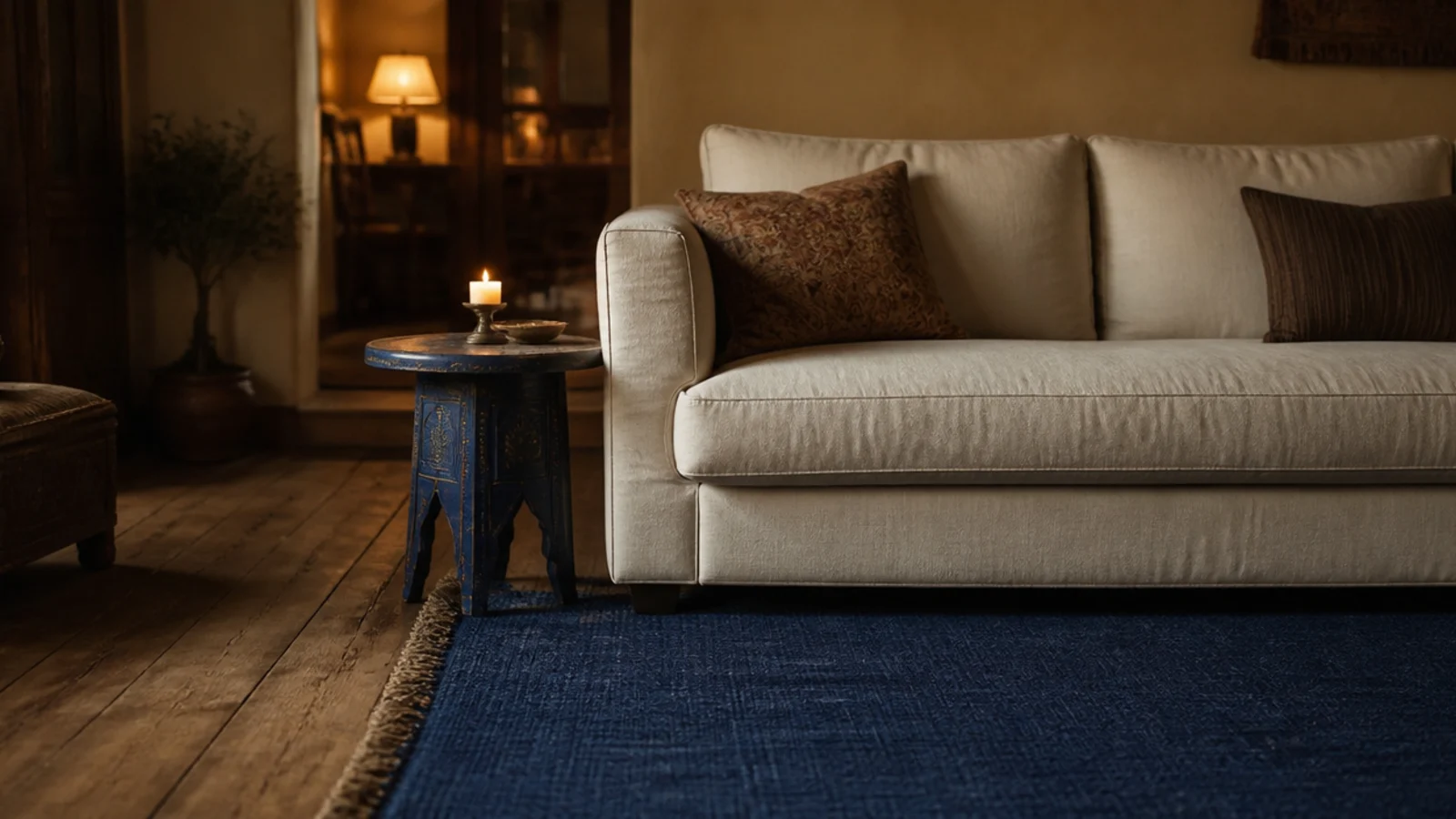
3. An indigo flatweave under a cream sofa
The most successful pairing I have done. Deep indigo grounds a pale sofa without any pattern, and at roughly 1/8 inch a flatweave cleared every door in the flat. It also hid a great deal — dark blue is nearly as forgiving as charcoal and considerably less severe.
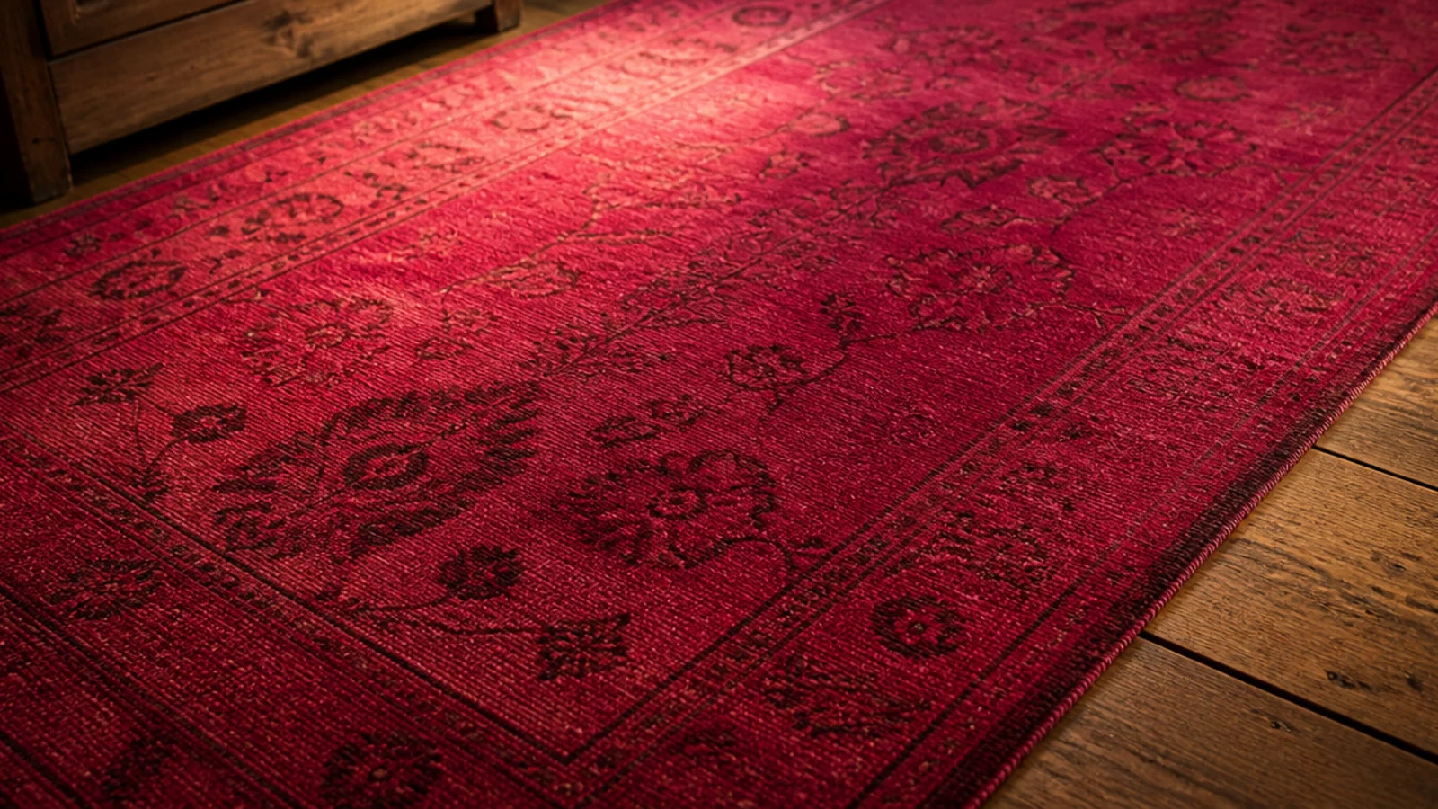
4. An overdyed vintage in raspberry
Old hand-knotted wool, stripped and redyed one saturated colour, gave me real weaving at $520 for a 6x9. The pile was low because it was genuinely worn, which suited furniture legs perfectly. I asked whether it had been washed after dyeing, and it had — unwashed overdyes can transfer colour onto pale socks.
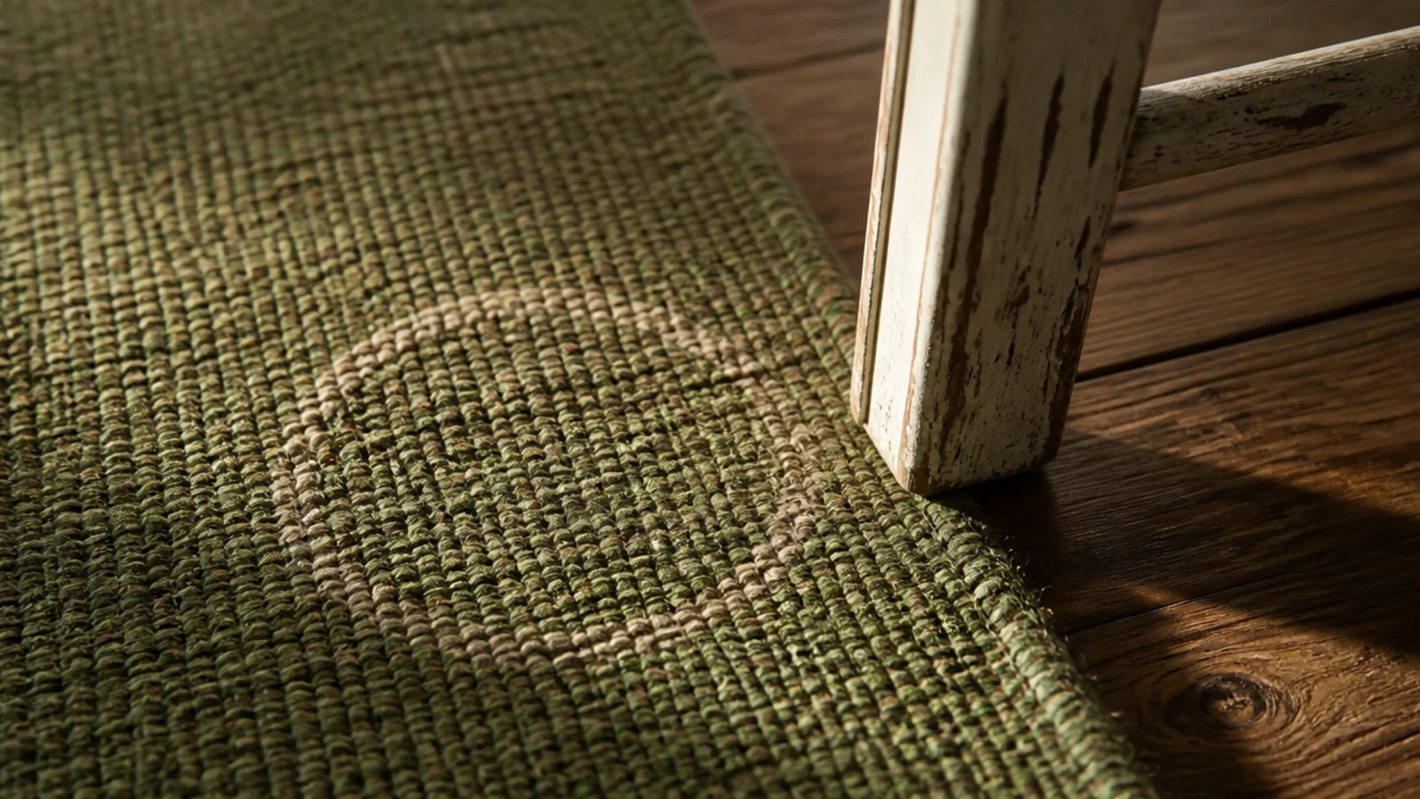
5. A green kilim that turned out to be a viscose blend
Sold as a wool kilim, actually 40 percent viscose, and I did not read the label. A knocked glass of water left a dull pale ring at one corner that never lifted. The lesson cost about $300 and it is the reason I now read fibre percentages before I look at anything else.
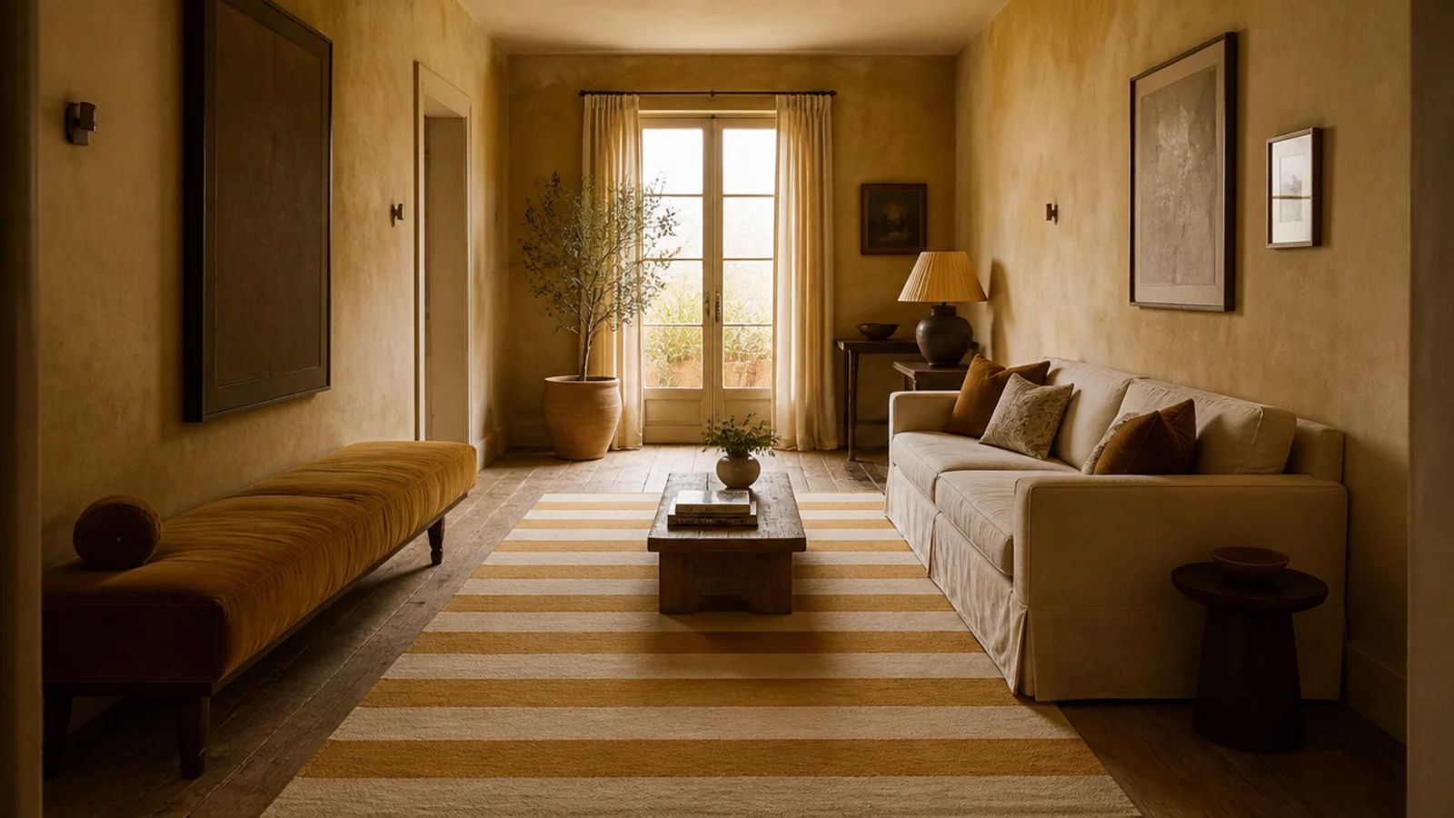
6. Ochre and cream stripes in a narrow room
Broad stripes run along the length of a slim room genuinely stretch it. Two tones, both warm, and the pattern reads as texture from standing height. This is the version of yellow I still use — it gives warmth without the whole floor committing to a single strong colour.
7. A multicolour Persian that hid absolutely everything
Two years of a family living room and it still looks unbothered. A busy multicolour pattern disguises crumbs, paw prints and the ghost of a spilled drink better than anything else I have owned. If a room takes real punishment, this is the honest answer rather than a pale neutral.
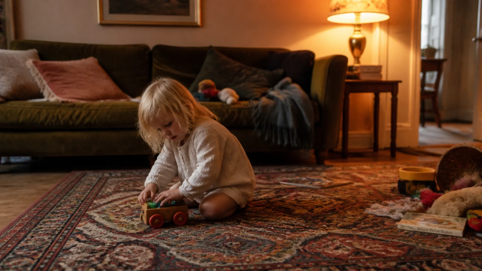
8. Bright coral: the one I sent back
Four days. Coral reads warm and cheerful on a screen and reads distinctly pink at nine at night under a 2700K bulb, which is when I was actually in the room. Return freight on an 8x10 cost $95, which was still cheaper than living with it.
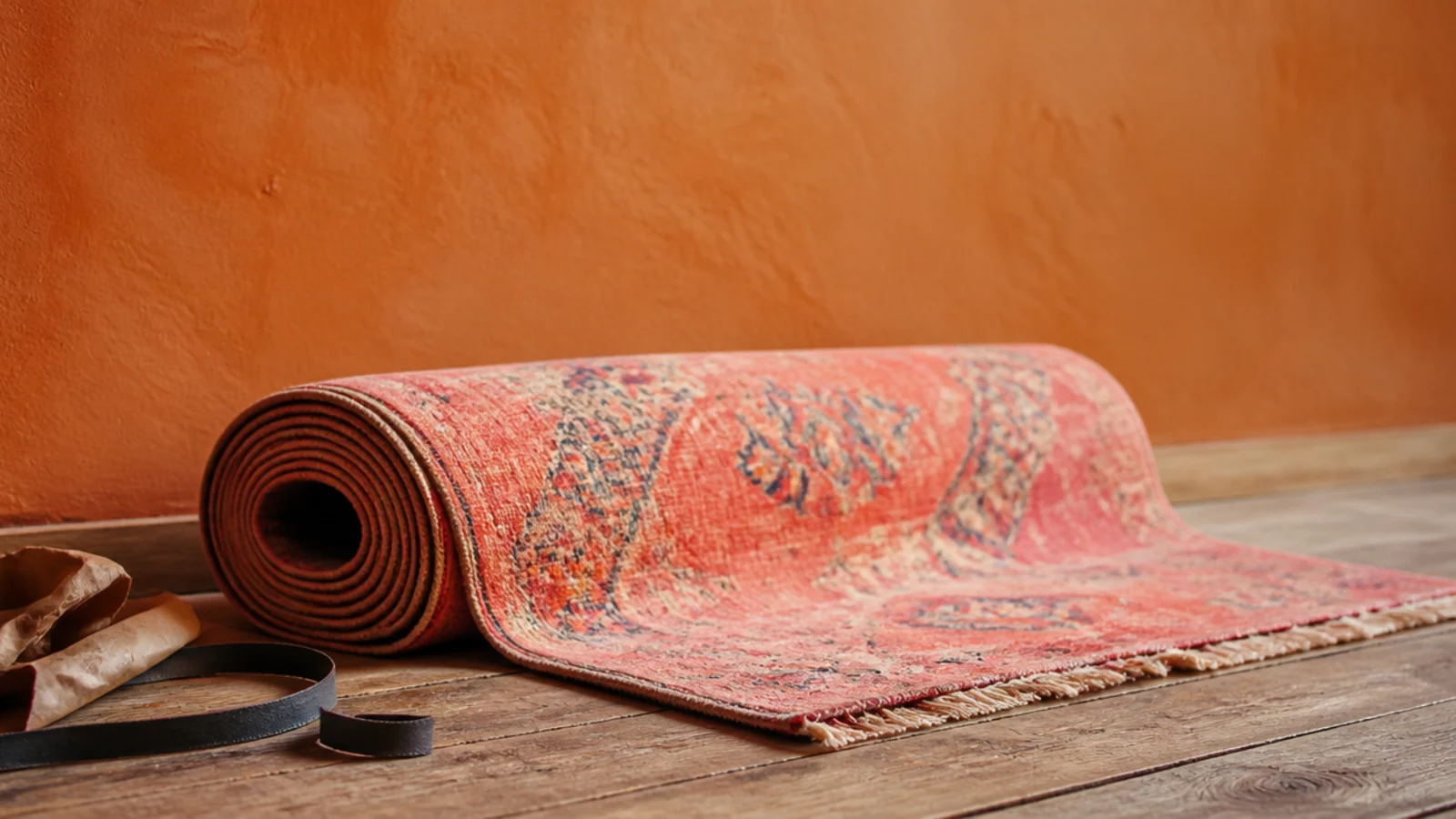
9. Deep plum in a room that never gets sun
Counterintuitive and it worked. A dark saturated colour in a genuinely dim room stops the space looking like it is failing to be bright, and it lets lamplight do the work. Plum also has no fading risk in a room with no direct light, so a piece-dyed wool was fine.
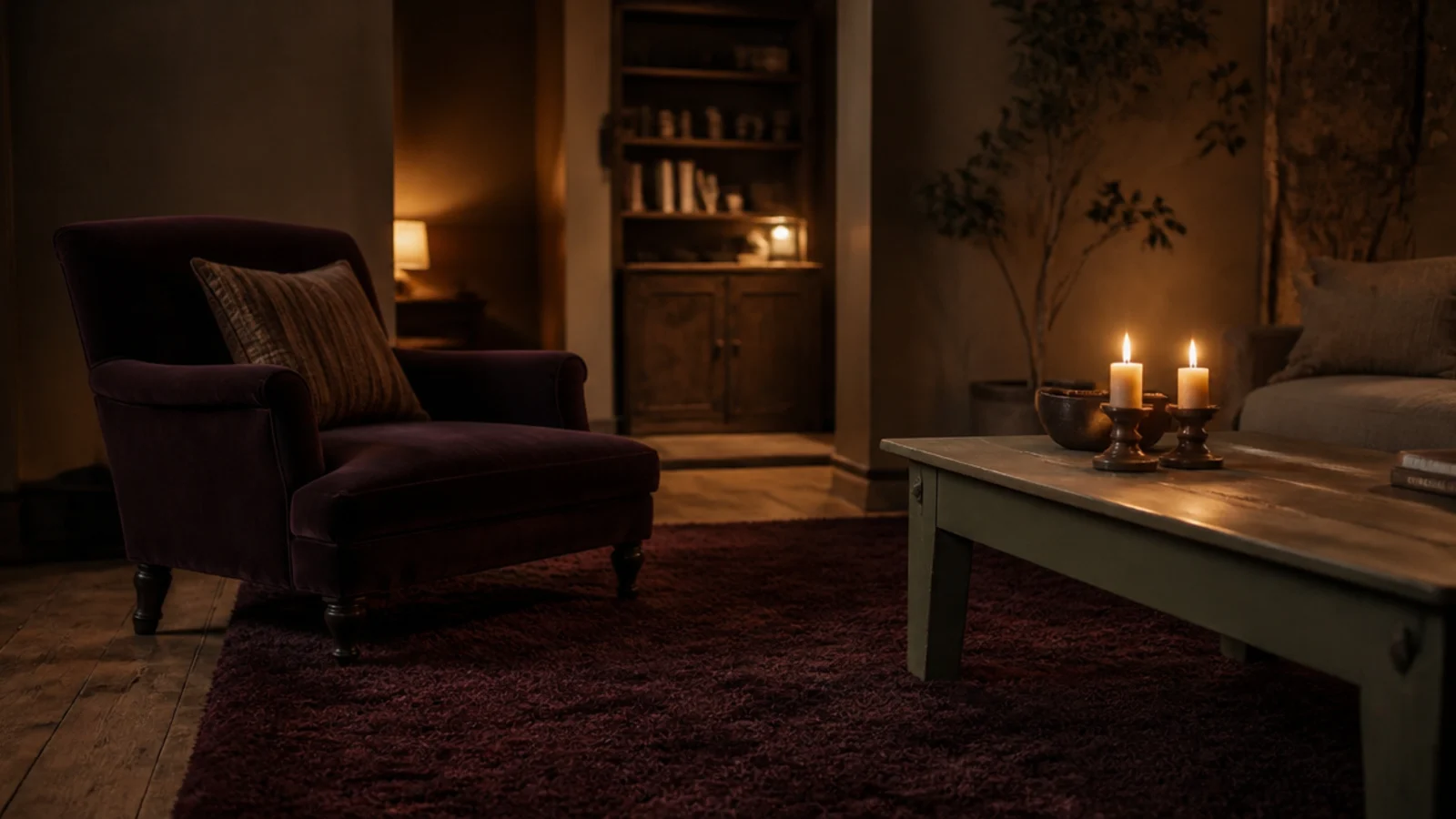
10. Five colours in one rug, one clearly dominant
The rule I now apply to any patterned rug: one colour should occupy more than half the field and the rest should be passages. Five colours at equal weight is where a rug starts to fight the room. One dominant tone also gives you something obvious to pick up in a cushion.
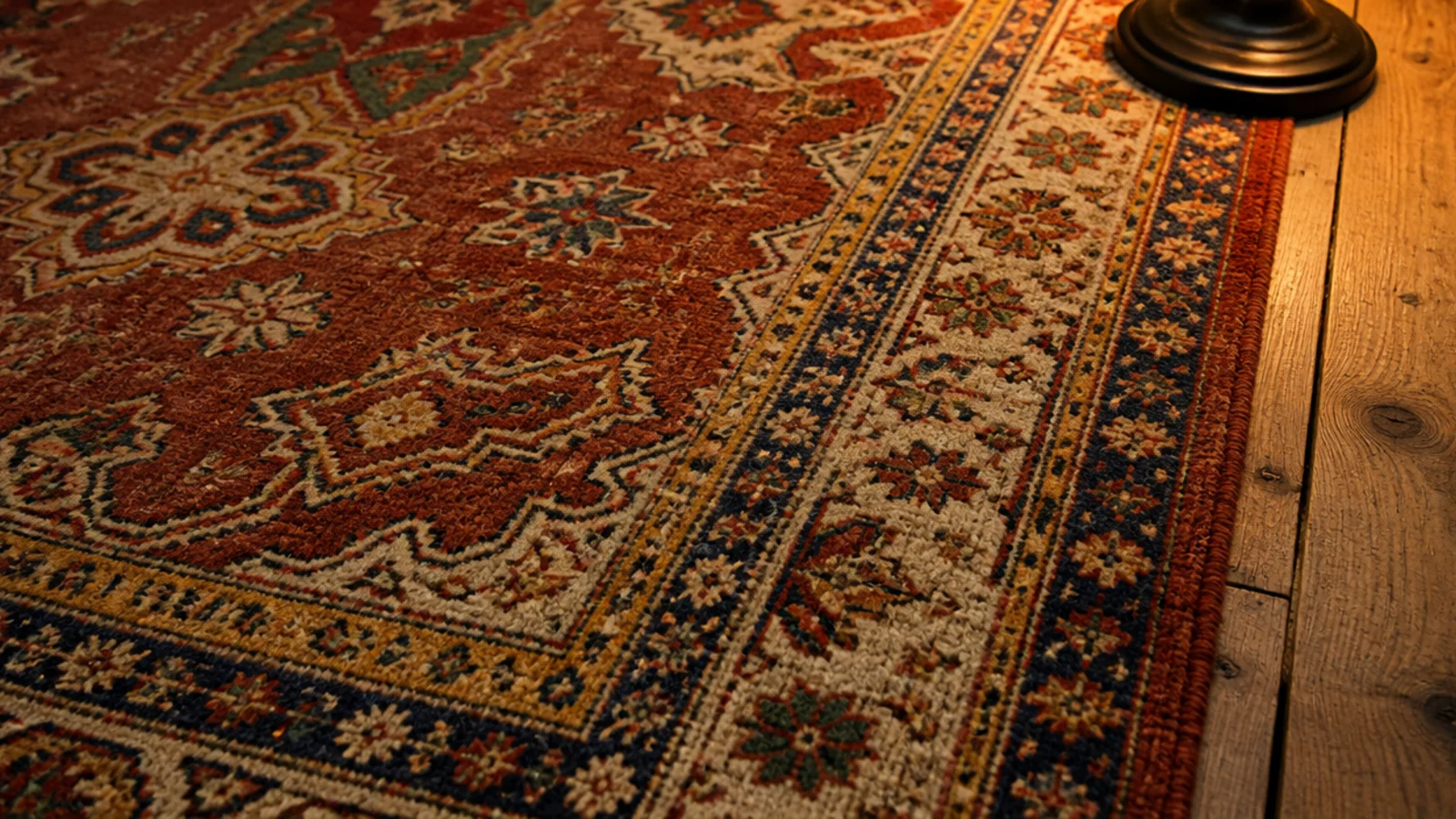
11. Colour blocking in rust and clay
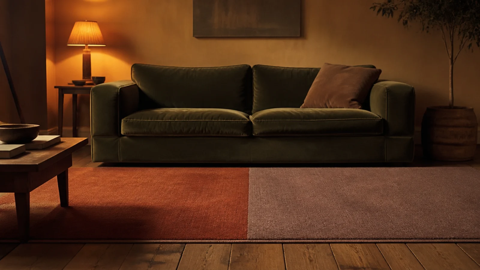
Two warm colours meeting on a straight line, with the join running under the coffee table rather than under a sofa leg. It is a modern idea executed in old colours, which is why it has not dated. Keep the two tones at least three values apart or the join looks like a fault.
12. Faded rose over old pine boards
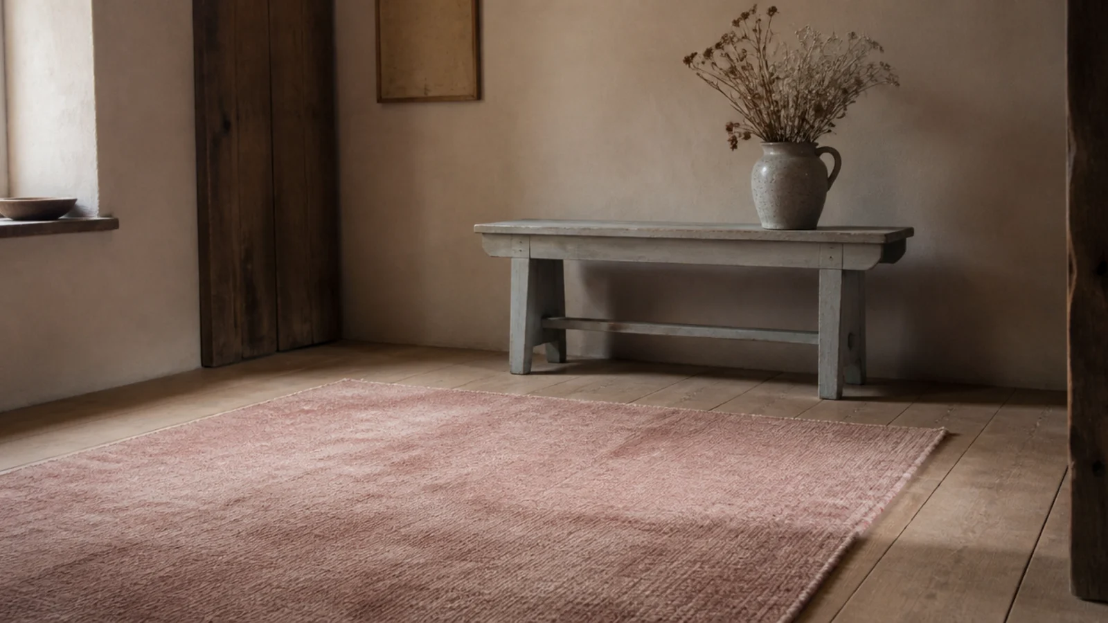
Rose only works when it is properly faded — a clean pink field reads as a decision made for a photograph. A washed vintage rose over warm pine is one of the softest floors I have had, and the warmth in both surfaces meant they never argued with each other.
13. A cool blue rug against warm wood, and why it failed
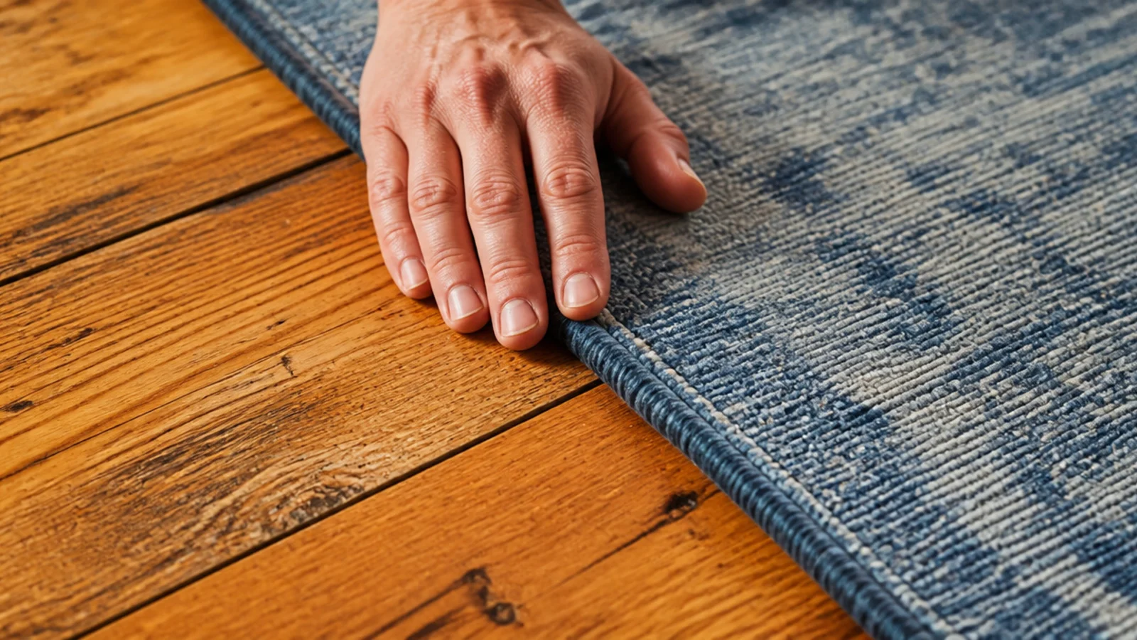
Not the rug's fault. A blue-grey field on orange-toned pine made both surfaces look slightly dirty, and no cushion or throw corrected it. This is the mistake I now test for first: swatch on the boards, six feet back, daylight and lamplight. Undertone mismatch is unfixable after purchase.
14. Turquoise, but only in a very small dose
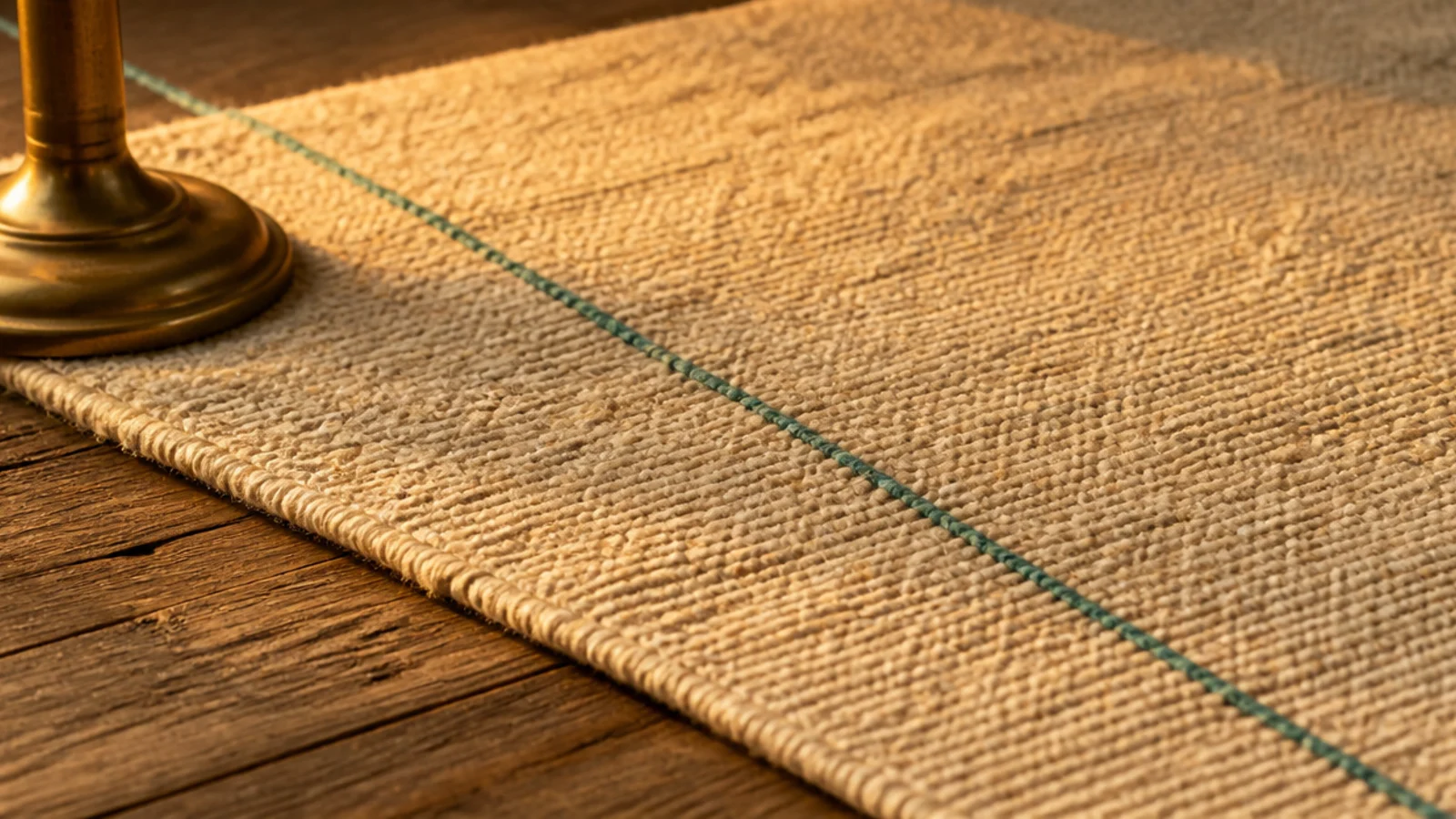
A thread of turquoise through a cream ground gives a room a lift; a turquoise field gives it a theme. I use strong cool colours as lines and accents now, and keep the large fields to warm tones, which sit more comfortably against every timber floor I have owned.
15. Emerald polyester and how fast it matted
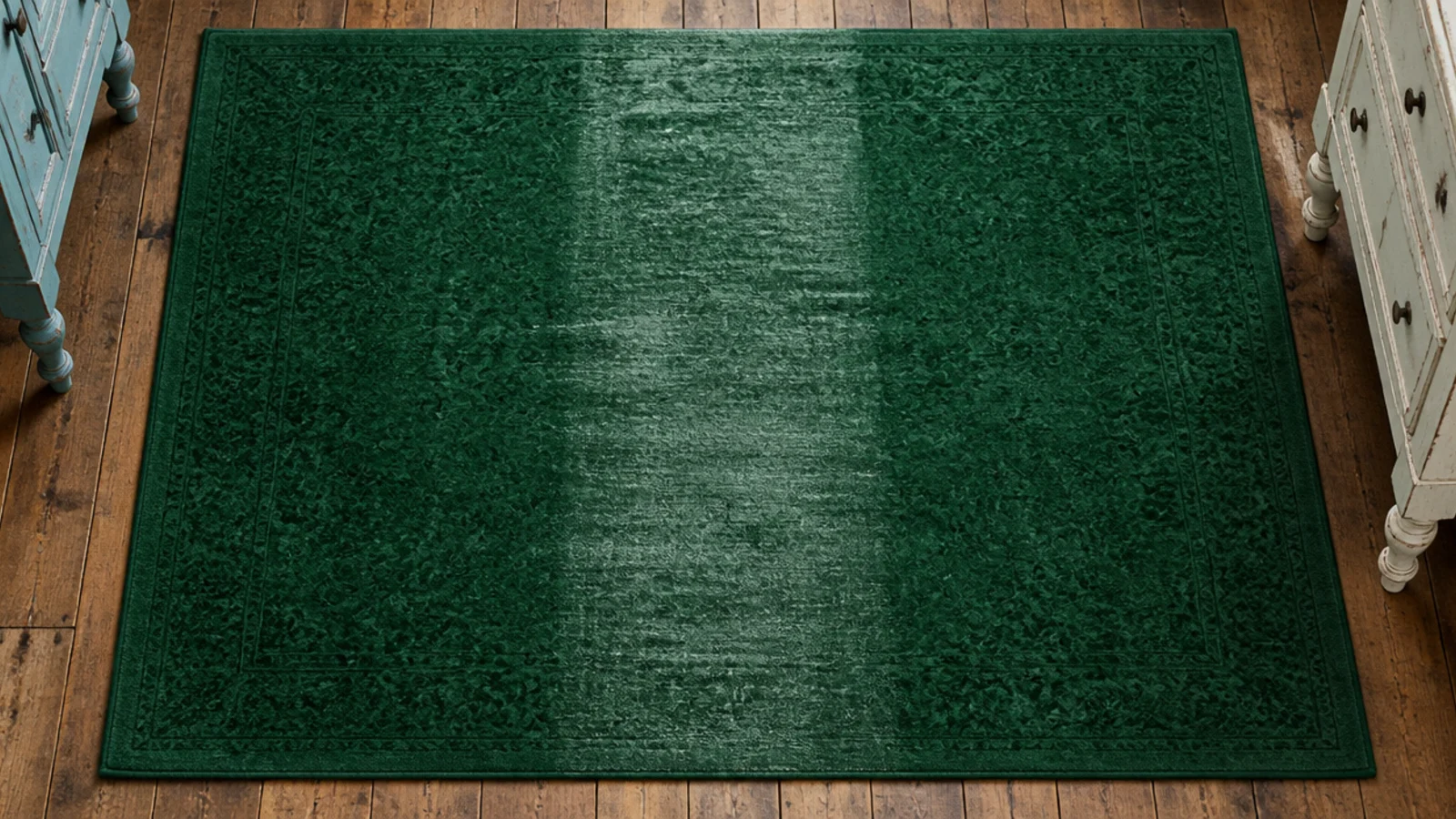
Polyester holds saturated colour better than any other budget fibre, which is why the strongest cheap colours are polyester. Mine developed a glossy flattened lane through the middle at about eighteen months. At $220 for an 8x10 that is not a disaster, but it is a three-year rug, not a ten-year one.
16. Layering one bright small rug over a neutral base
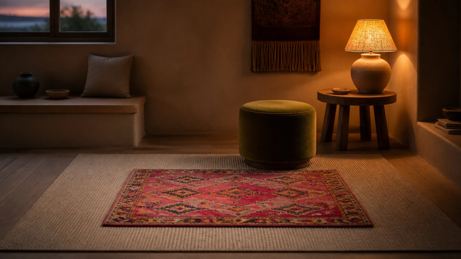
My current arrangement, and the one I recommend most. A large plain oatmeal base sets the room proportion, and a 5x8 of something saturated sits centred on it with 12 to 18 inches of reveal. When I tire of the colour I replace the small rug, not the floor.
17. Repeating the rug colour twice and no more
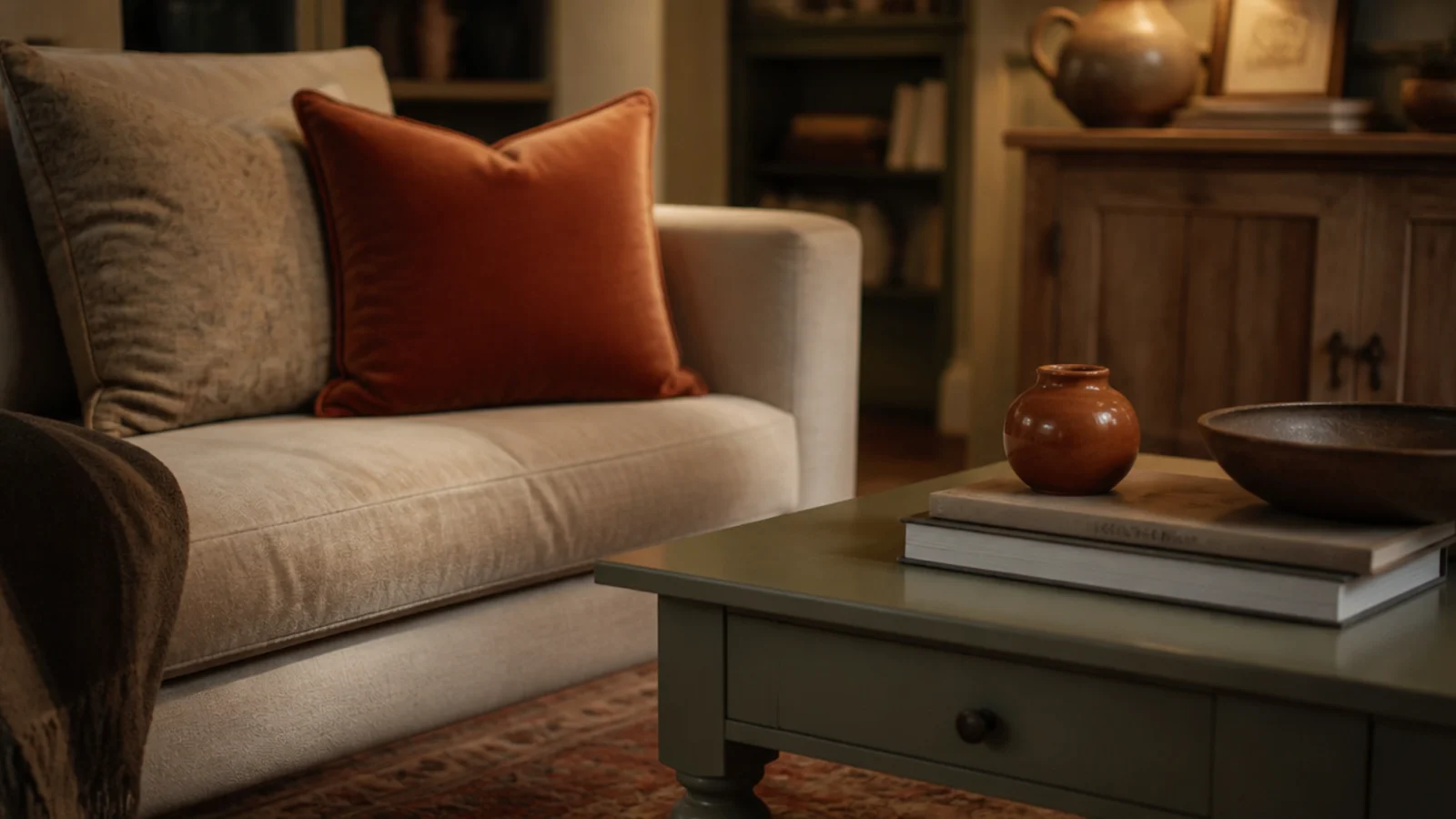
Two repetitions of the rug's dominant shade — one cushion, one small ceramic — reads as a scheme. Four or five reads as a matching set, which is the exact point a colourful room stops looking confident. This is the single easiest correction to make and it costs nothing.
18. Testing the colour at nine at night
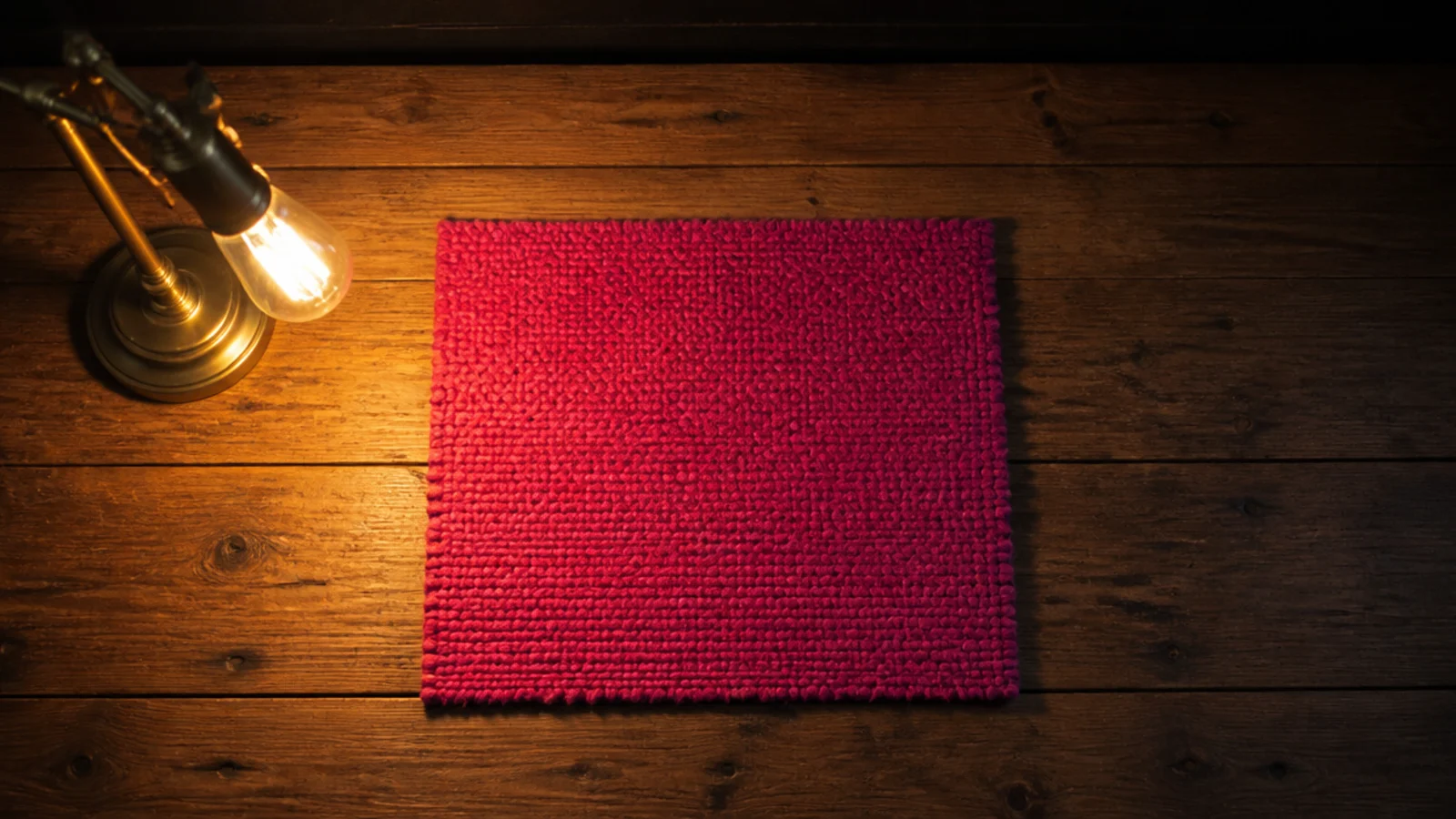
I look at every swatch twice now: once in daylight and once after dark under the lamps I actually use. Warm bulbs push reds toward orange and greens toward khaki. The coral would never have been ordered if I had done this the first time.
19. What the window half looked like after two summers
A visibly paler band running exactly where the light falls, with a hard edge along the shadow line. Rotating twice a year would have softened it into a gradient. Now it is a permanent record of where I did not move the rug, and no cleaning brings the colour back.
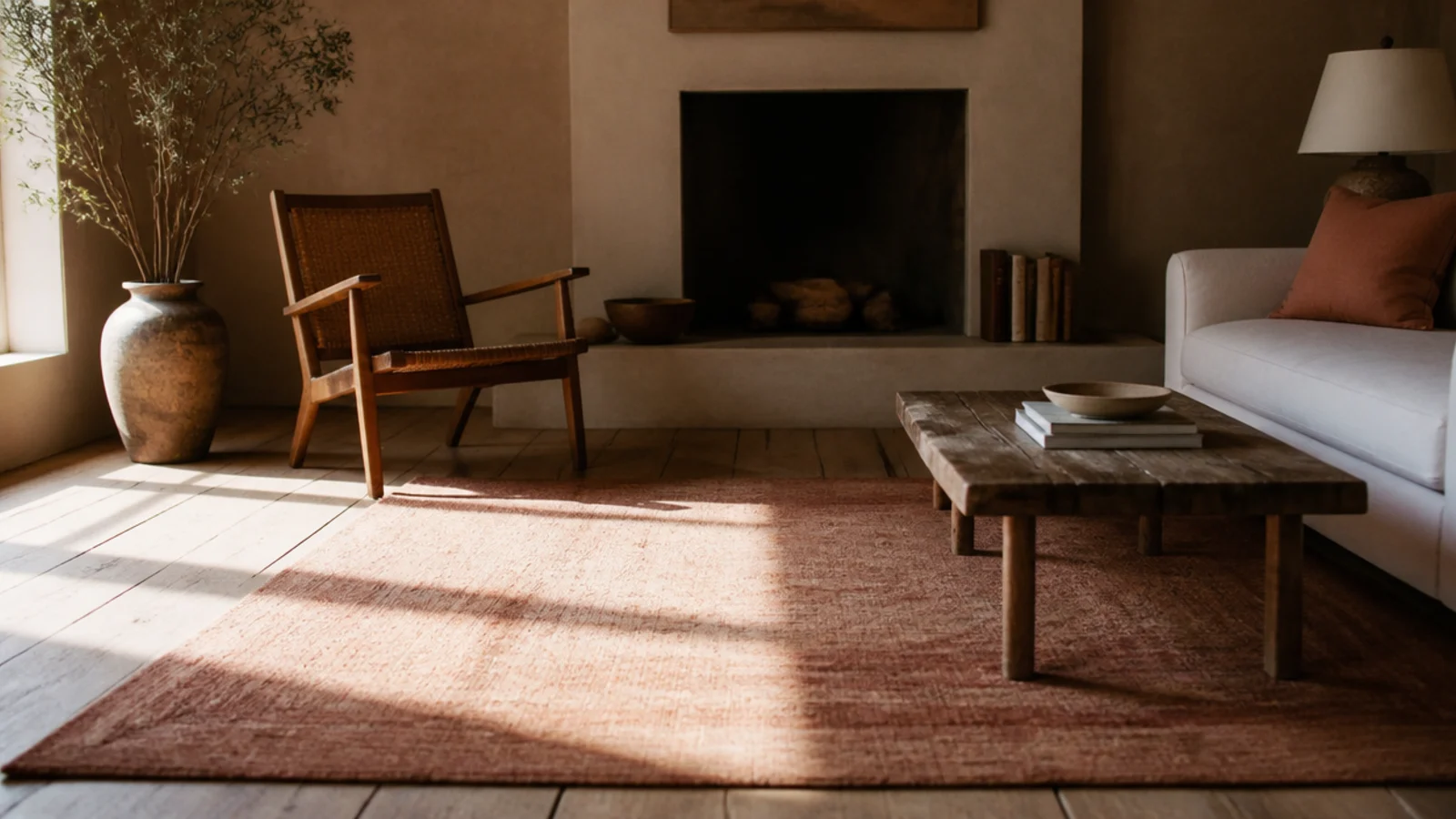
20. Solution-dyed brights against piece-dyed ones
Two rugs, the same window, four years apart in behaviour. The solution-dyed polypropylene looks essentially as it did; the piece-dyed one has lost noticeable depth. If a bright rug has to live in sunlight, I now ask the question directly, and vague answers get treated as a no.
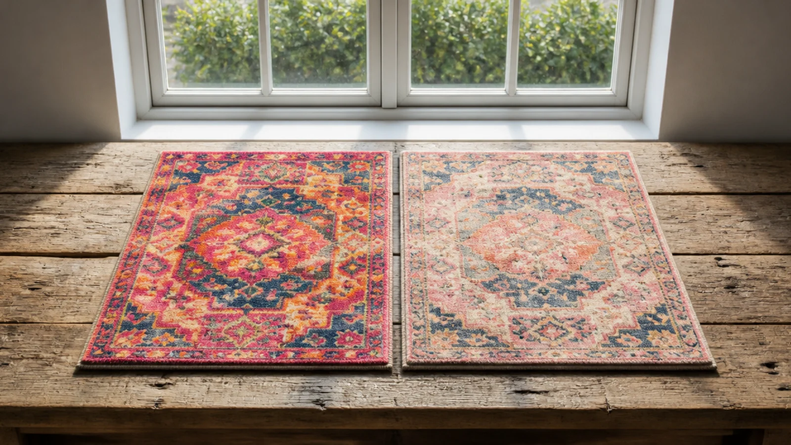
21. A dark border to hold a bright field
A narrow charcoal or deep brown border around a saturated field stops the colour bleeding visually into the room, and it ties the rug to darker furniture. It is the trick I use when a rug is one step brighter than the room can comfortably carry.
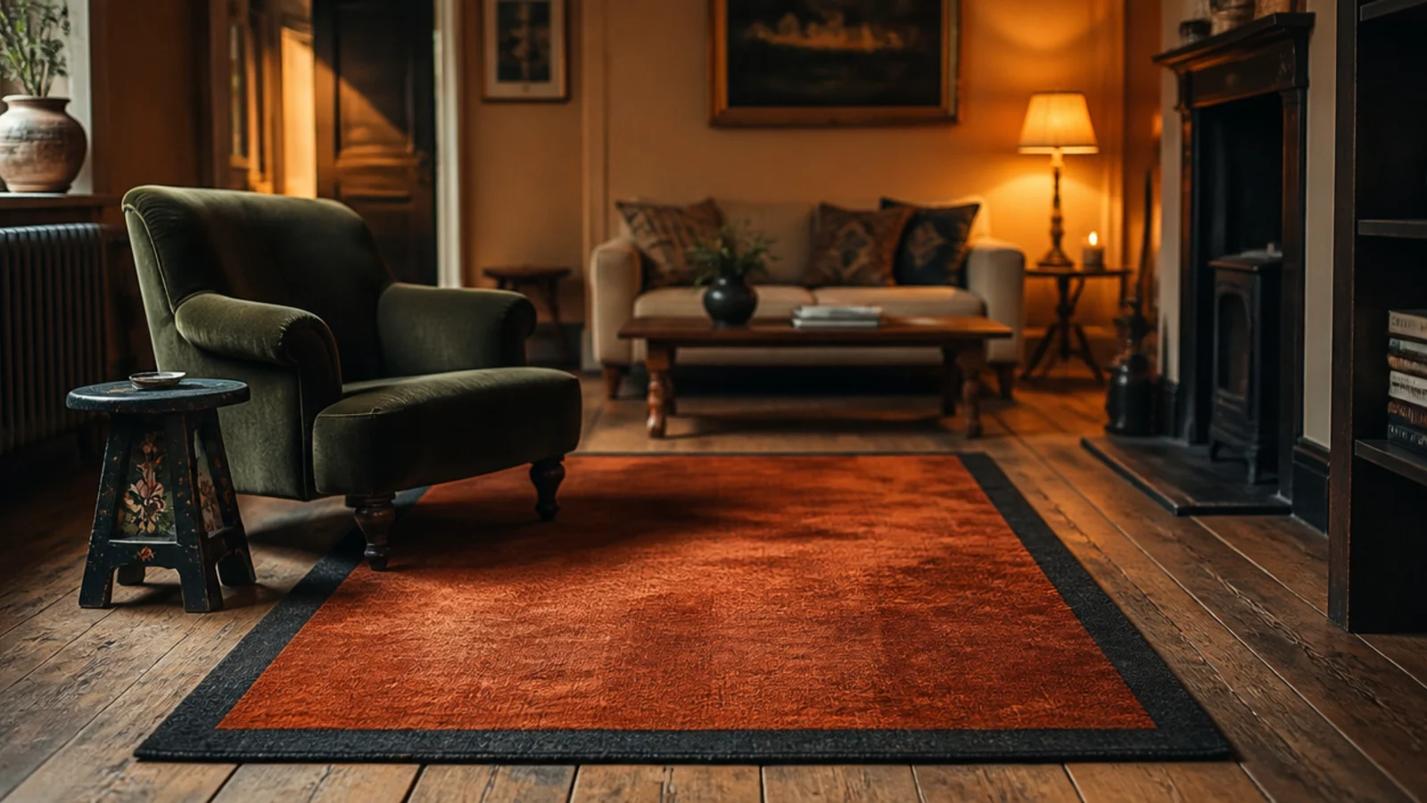
22. Bright colour on low pile against bright colour on shag
The same rust reads deeper and richer on a shag and flatter and cleaner on a flatweave, because pile depth changes how much light the surface swallows. If a colour feels slightly too strong on a sample, the deeper pile version will feel stronger still, not softer.
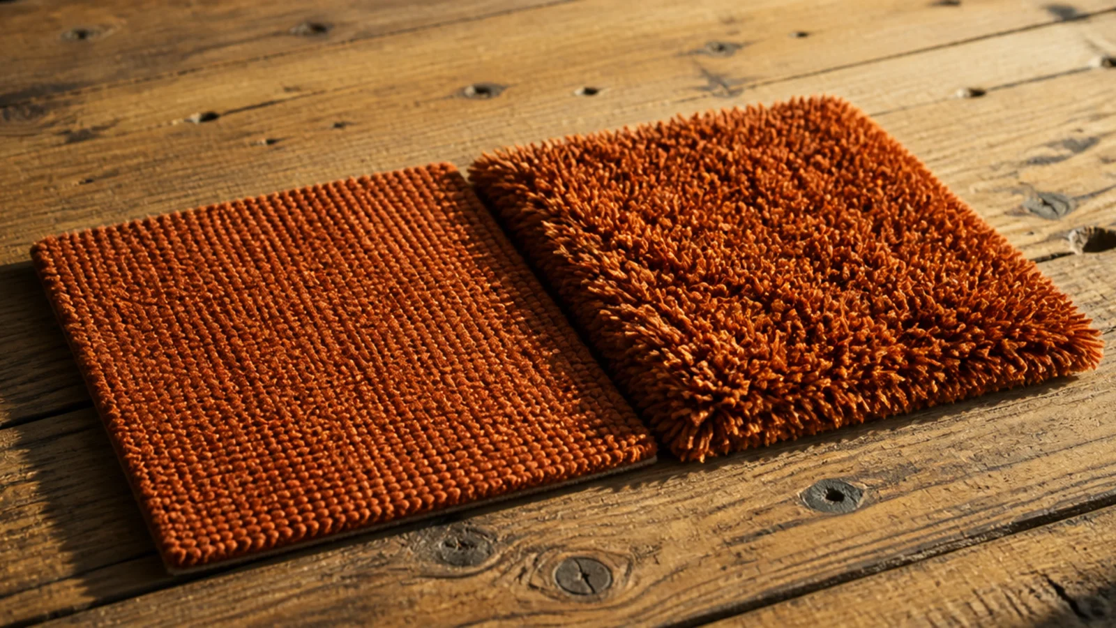
23. The damp cloth test before any cleaning
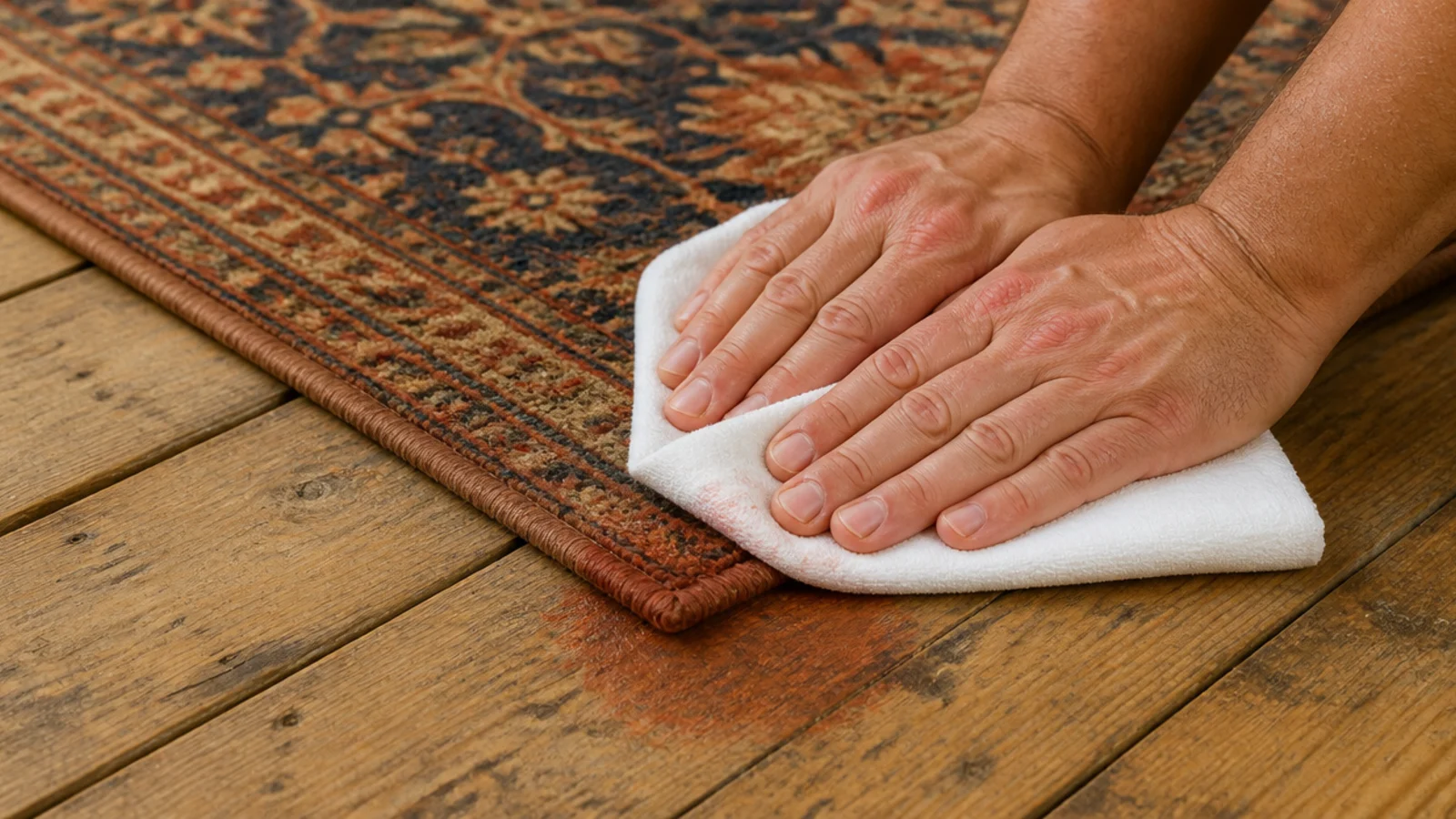
Press a damp white cloth firmly onto a hidden corner for thirty seconds and look at the cloth. Any colour transfer means blot-only at home and a professional wash for anything serious. I run this on every saturated rug the week it arrives, before there is anything urgent to clean up.
24. Where the brightest rug ended up in the end
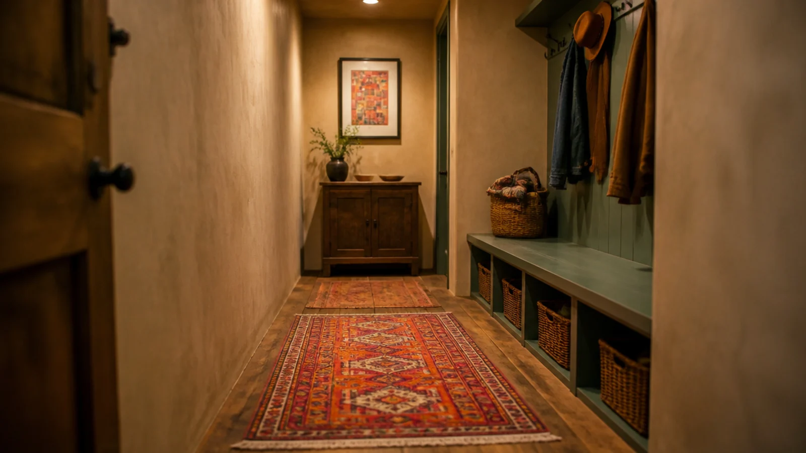
In a small windowless hallway, where there is no daylight to fade it, no furniture to crush it and only six feet of it visible at a time. Strong colour often works better in a room you pass through than in one you sit in for three hours.
25. The two colours I would not buy again
Coral and emerald, both across a whole field. Coral because it changes character completely under warm light, and emerald because the versions I could afford were polyester and matted early. Both are fine as an accent line. Neither is something I would commit 80 square feet to again.
What I'd Do Differently Now
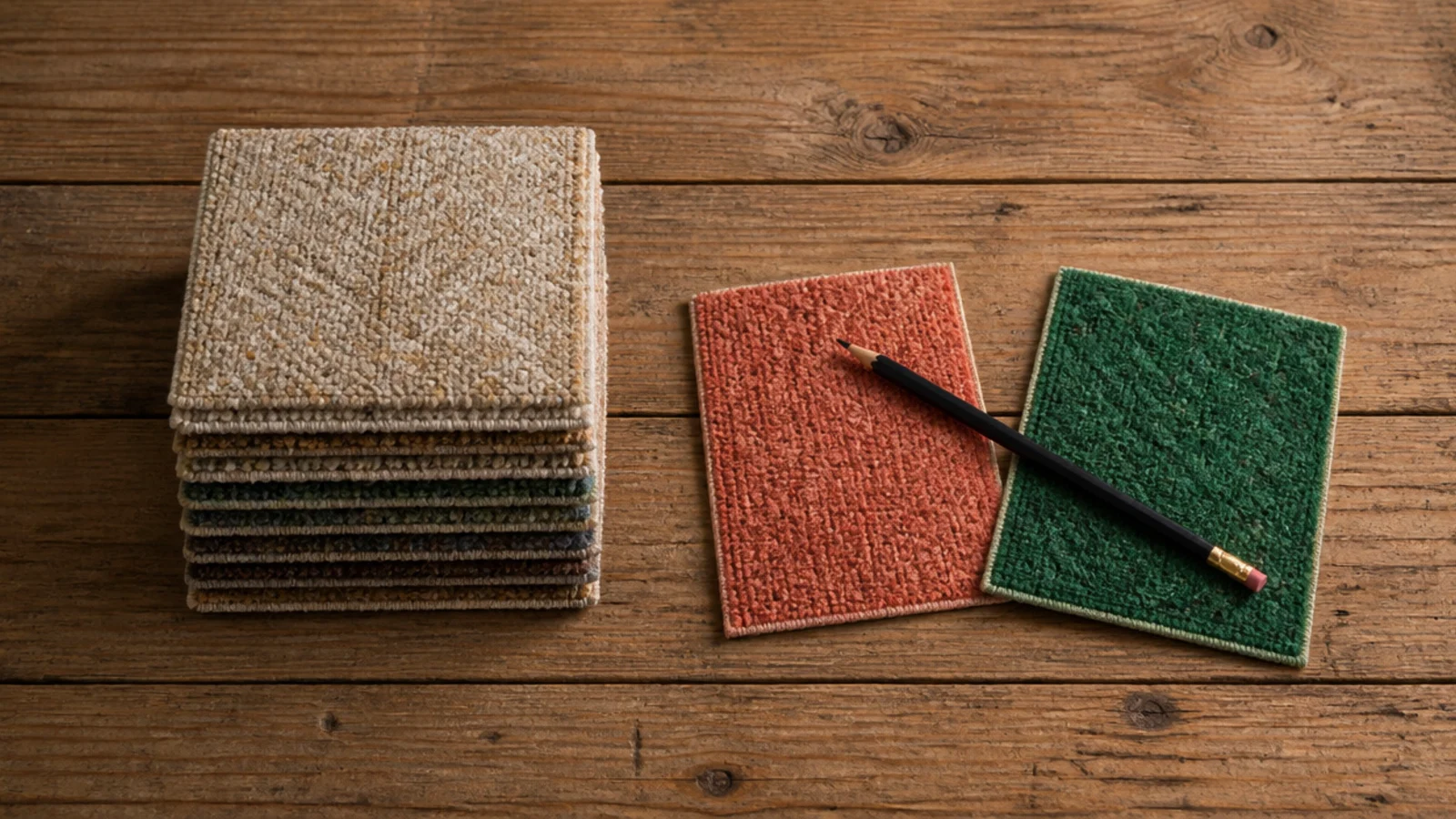
I would test undertone against the floor before anything else, every time. The blue rug and the coral both failed on undertone rather than on colour, and both failures were visible in a $3 swatch and thirty seconds of looking. I now order samples for every rug over $200 and I look at them twice — once at nine in the morning and once at nine at night.
I would also stop buying strong colour across a whole field. The rugs I have kept longest are either a large calm base with something bright layered on top, or a pattern where one warm tone dominates and the brights are passages within it. Both let me change my mind for the price of the small rug rather than the price of the floor.
And I would ask about fibre before price on anything saturated. The green kilim taught me that a beautiful colour on a viscose blend is a rug with a countdown running, and the emerald polyester taught me that cheap saturated colour usually means a fibre that mats. Wool for rooms I sit in, solution-dyed synthetic for rooms with sun and mess.
The terracotta is the one I would repeat without hesitation. Warm, wool, dominant but not loud, in a room that had nothing else competing. If you want the same colour discipline applied to something you can put in a machine, the washable rug comparison covers what survives a wash. For the table and the lighting that sit inside all this, the luxury center table guide and the candle decor ideas are where I would go next.
Frequently asked questions
Do colourful rugs fade faster than neutral ones?
Saturated colours show fading sooner because there is more pigment to lose, and reds and purples go first. Solution-dyed synthetics hold their shade for years because the colour is in the fibre itself. Whatever you buy, rotate it 180 degrees every six months so the change happens evenly instead of as a hard line.
How do I use a bright rug without the room feeling loud?
Let it be the only strong colour in the room and repeat its shade exactly twice more in something small. Keep the walls and the big upholstery quiet. A bright rug with a bright sofa and bright curtains reads as chaos, while the same rug in a calm room reads as a deliberate choice.
What fibre holds colour best?
Solution-dyed polypropylene, because the pigment is mixed into the polymer before the fibre is extruded, so sunlight and diluted bleach barely touch it. Wool holds colour well and deepens slightly with age. Printed rugs are the worst, since the colour sits only on the fibre tips and wears off with vacuuming.
Will a colourful rug bleed when it gets wet?
It can, especially on hand-dyed and overdyed pieces. Test before you ever clean it: press a damp white cloth firmly onto an inconspicuous corner for thirty seconds and look at the cloth. Any colour transfer means blot-only cleaning and a professional wash rather than anything wet at home.
Is a patterned rug better than a solid bright one?
In a room that gets used, yes. A multicolour pattern hides crumbs, paw prints and spills almost completely, while a solid bright shows every one of them. Pattern also lets you pull one shade out for cushions without committing the whole floor to a single colour that may date.
Want more like this? Browse all 15 rugs in living room guides — they all use the same measurements and budget tiers.
Pin it for later
Save this to your Rugs In Living Room board
Pin it now so it is waiting for you when the tape measure comes out — and so the next person hunting for this idea can find it too.
Save this pinKeep going
More ideas worth saving while you have the tape measure out.