Floating Shelves · Listicle
15 Cozy Floating Shelf Ideas That Look Pricey

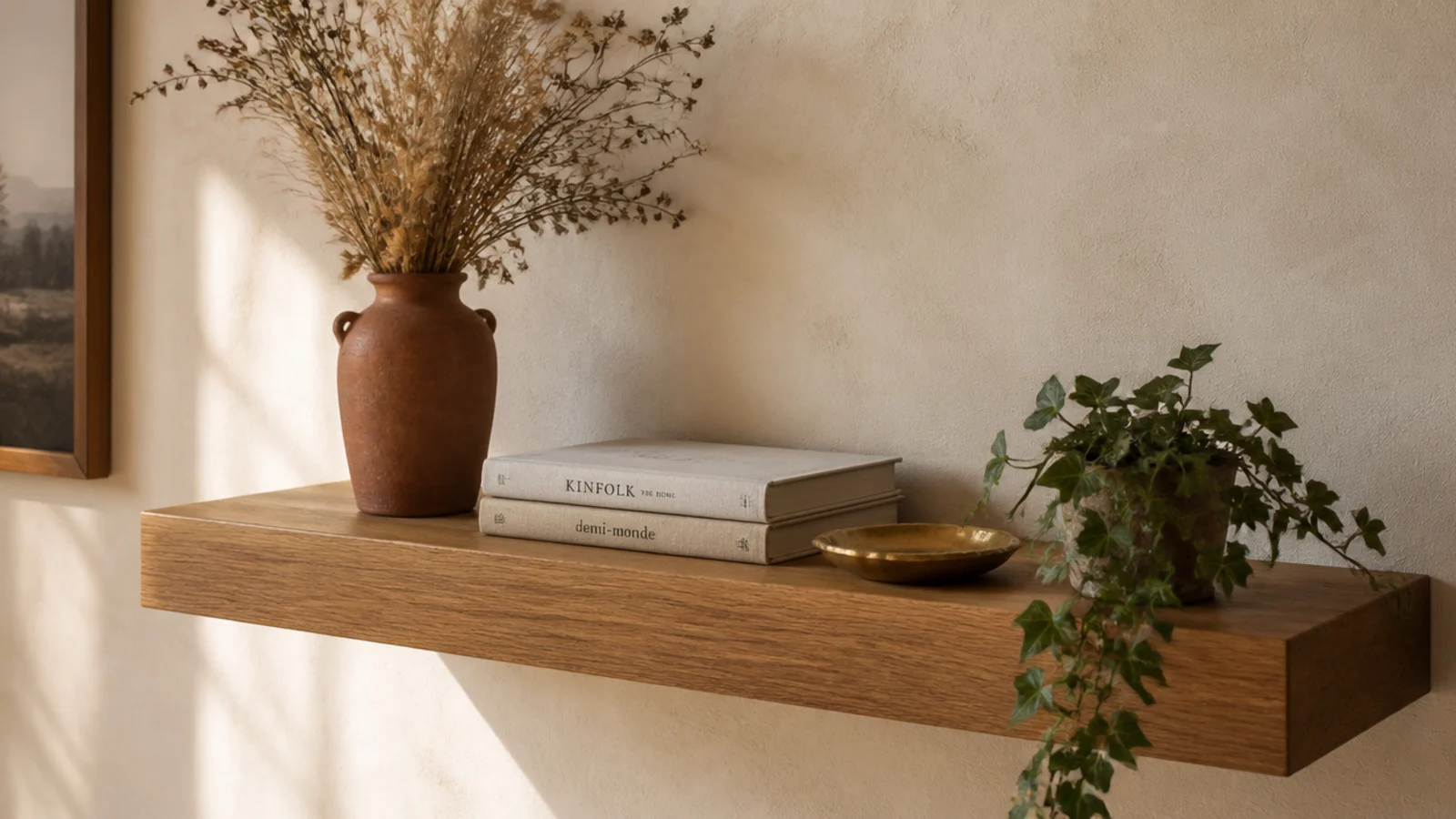
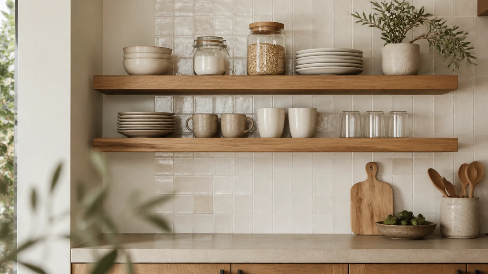
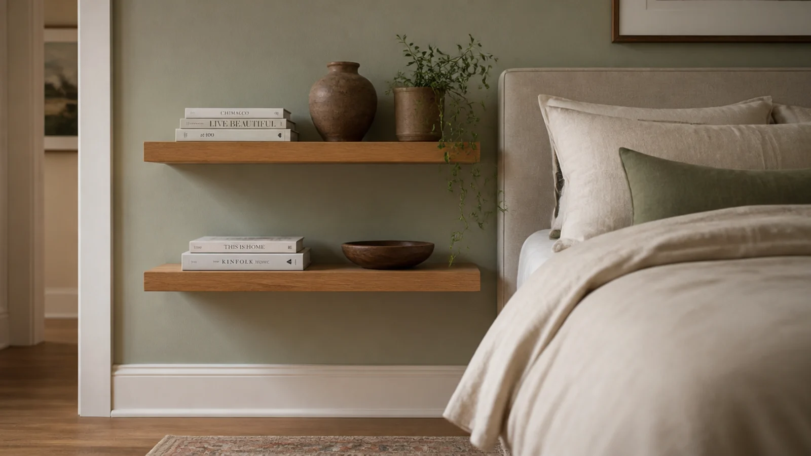
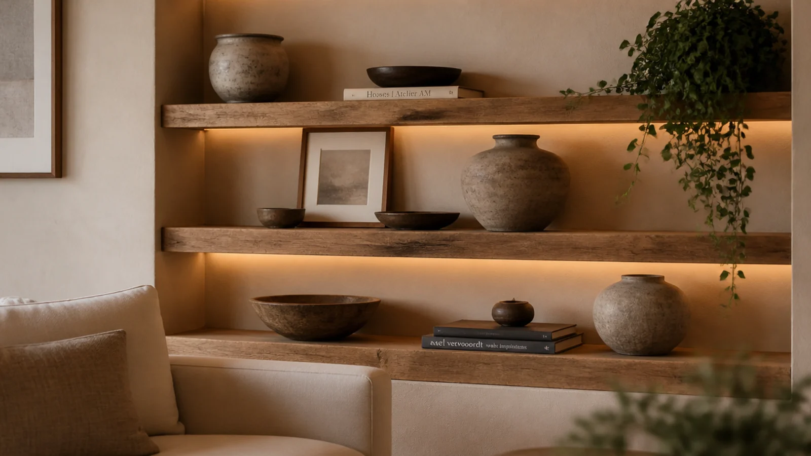
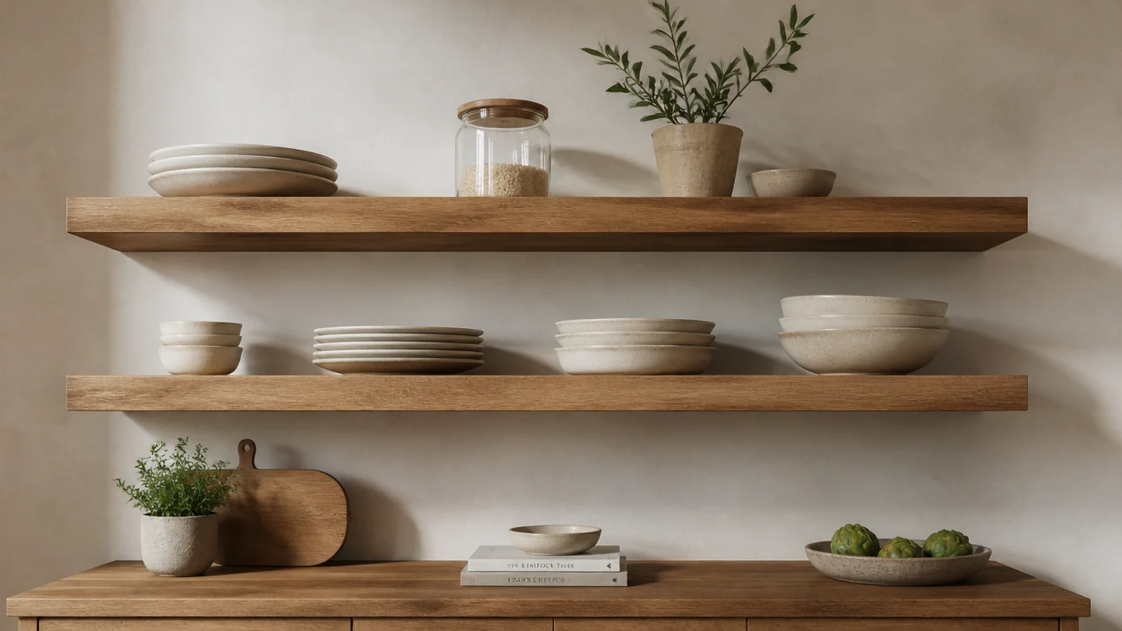
Floating shelf styling is where most people lose the room, because the shelf itself is usually fine. I have restyled shelves in other people's homes for years and the fix is almost never new objects — it is fewer of them, arranged with more nerve. These fifteen moves make a $30 board on painted-out brackets look like something a decorator specified.
In this guide17 sections — tap to openHide
- 1.The floating shelf styling rules that read as expensive
- 2.Put the biggest piece a third of the way along
- 3.Layer a leaning frame behind everything else
- 4.Repeat one material three times across the run
- 5.Choose one oversized piece over five small ones
- 6.Turn one book cover-out
- 7.Use a stack of books as a plinth
- 8.Let one thing trail past the front edge
- 9.Keep a third of every shelf empty
- 10.Hold the palette to three tones plus wood
- 11.Vary texture instead of color
- 12.Compose across two shelves, not one
- 13.Add one small warm light
- 14.Break the top line with one tall object
- 15.Hide the practical things in one basket
- 16.Restyle with three swaps, not thirty
- 17.Mistakes to Skip
The floating shelf styling rules that read as expensive
Expensive-looking shelves share a short list of habits. They hold fewer objects than you expect, at more varied heights than you expect, with far more empty surface than feels comfortable the first time you try it.
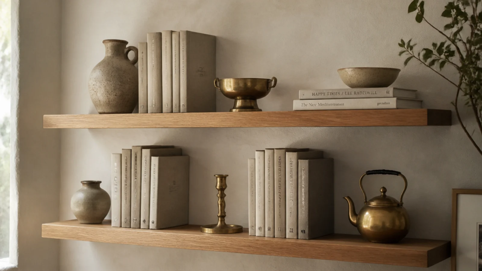
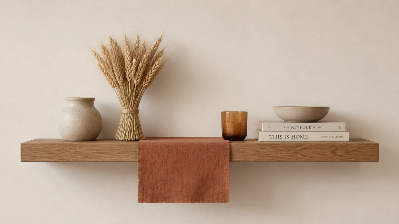
The ratio I use is three objects per shelf at three clearly different heights, with roughly a third of the surface left bare. Something tall like a vessel or dried stems, something low and wide like two books lying flat, and something soft that breaks the front edge.
Height needs room to work. Leave 13 inches of clear space between tiers so a standing hardback fits with air above it. Anything under 10 inches turns the shelf into a filing slot and no amount of styling saves it.
Two hardware details do more than any object you can buy: round the front edge so it feels soft under your thumb, and paint the brackets the wall color. Painted-out L brackets read as floating from every normal viewing angle, and a visible black bracket under a stained shelf announces the price of the shelf from across the room.
Budget-wise, a thrifted styling kit of stoneware and books runs $20 to $40 ($), one good hand-thrown vessel plus a brass piece runs $60 to $150 ($$), and a large ceramic or a framed original runs $250 and up ($$$). You need one of the third to carry a whole wall.
1. Put the biggest piece a third of the way along
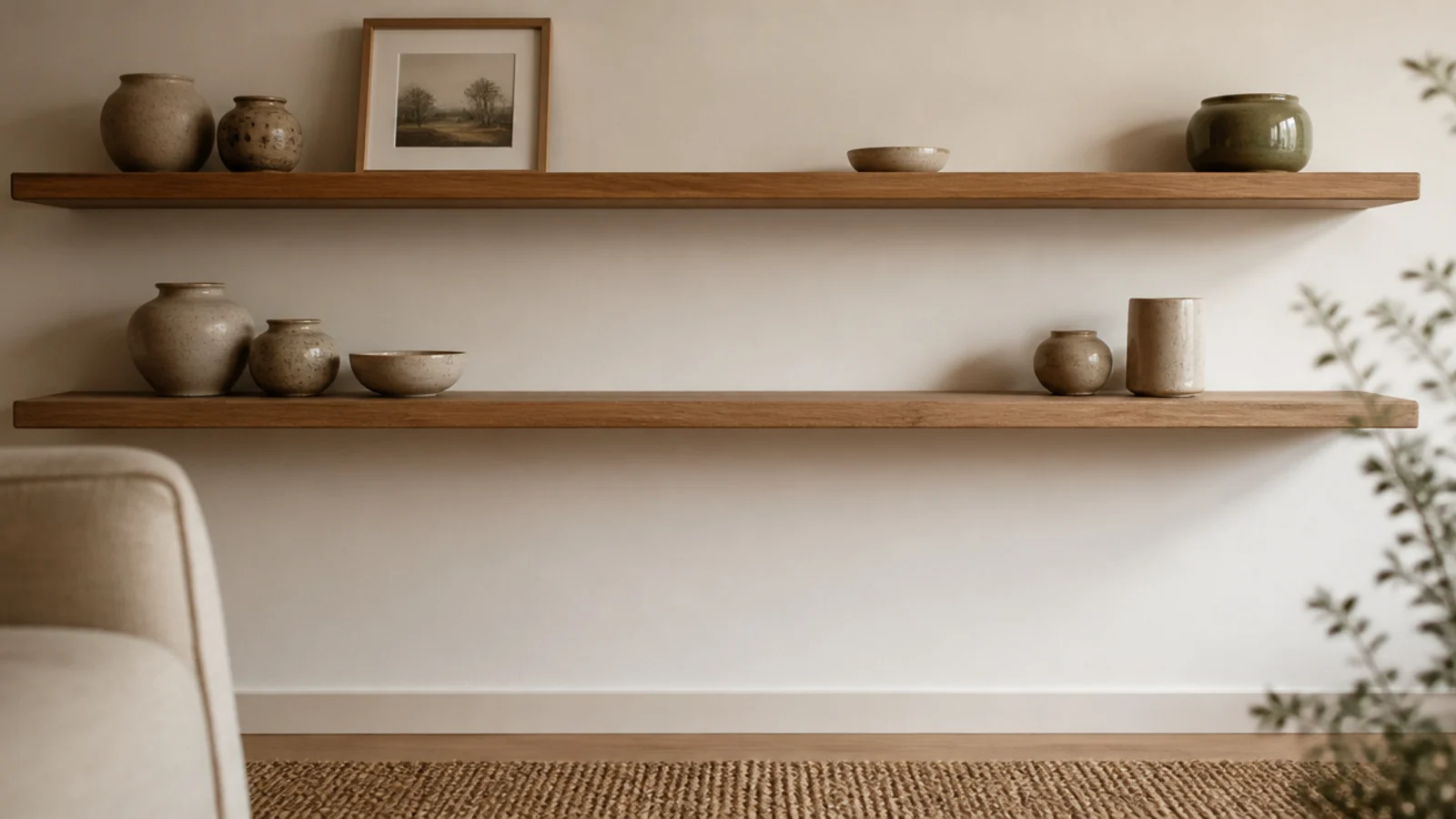
Centering the largest object is the most common styling instinct and the one that flattens a shelf fastest. Dead center reads as staged; a third of the way along reads as composed.
Set your heaviest visual weight at that third, then let the rest of the shelf fall away from it in decreasing sizes. On a 32-inch shelf that puts the big vessel about 11 inches from one end, with a long clear run on the other side. That long run is not wasted space — it is the thing making the vessel look chosen.
2. Layer a leaning frame behind everything else
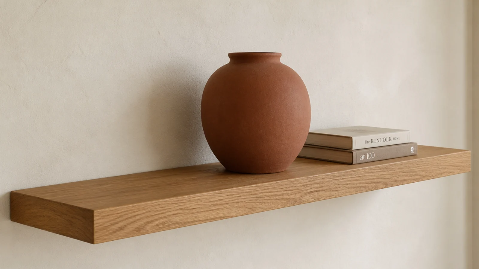
A row of objects on an eight-inch shelf is flat, and flat photographs badly and reads cheap in person. Depth is what is missing.
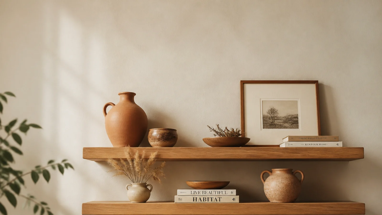
Lean one framed print or a small mirror against the wall at the back, then place a low object in front of it so the two overlap slightly. That overlap is the whole trick. An 8x10 frame costs $8 secondhand and does more for the shelf than another ceramic. On a shallow six-inch shelf, use a postcard or a small canvas so the lean stays stable.
3. Repeat one material three times across the run
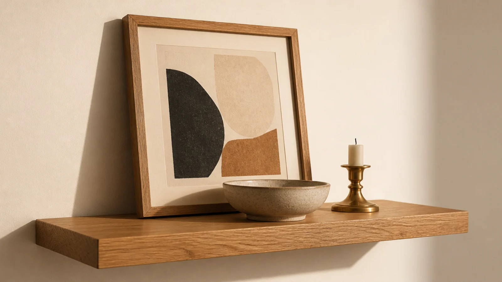
Mixed objects look collected rather than composed until something repeats. Pick one material — brass, terracotta, clear glass — and place it three times across the whole run of shelves, never side by side.
Your eye follows the repetition and reads the arrangement as deliberate, even though nothing matches. This is the single most reliable trick in this list and it costs nothing if you already own three brass things. Two repeats is a coincidence; three is a rhythm.
4. Choose one oversized piece over five small ones
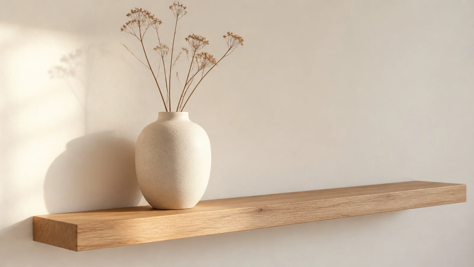
Small objects are how shelves get cluttered, and they are usually more expensive in aggregate than one large piece. A single 12-inch stoneware vase on an otherwise empty shelf looks like a decision.
Thrift stores are full of large ceramics nobody wants because they are awkward to display, which is exactly why they are cheap. Look for matte glazes in cream, sand or clay. In a small room this substitution matters even more: fewer, larger objects make a tight space read calm rather than busy.
5. Turn one book cover-out
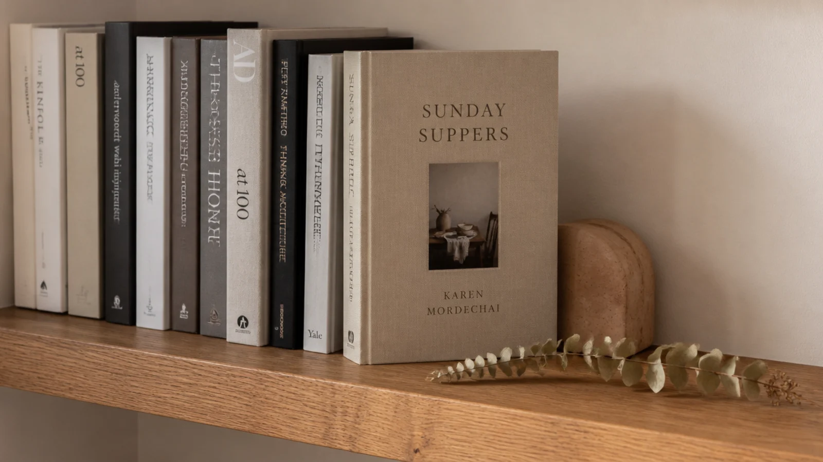
A row of spines is storage. One book turned cover-out among them is styling, and the change takes two seconds.
Choose a cover with one dominant color that already exists in the room, and lean it against the group rather than propping it dead upright. If the spines are a riot of publisher colors, turn a few stacks page-edge out instead — the cream block of paper edges calms the whole shelf down for free.
6. Use a stack of books as a plinth
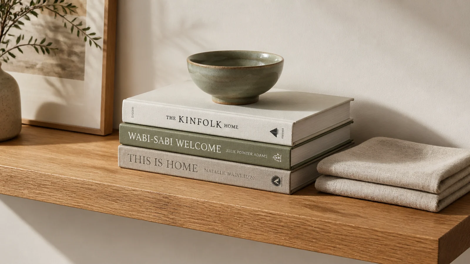
Small objects disappear on a shelf unless you lift them. Three hardbacks stacked flat, largest at the bottom, raise a little ceramic about four inches and instantly give it presence.
This also solves the height problem on a shelf where everything you own is roughly the same size. Keep the stack to three books; four starts to look like you are storing them. Turn the spines to the wall if the covers are loud, and the stack becomes a neutral cream plinth.
7. Let one thing trail past the front edge
Every shelf line is a hard horizontal, and hard horizontals feel rigid. One soft thing spilling below the edge breaks it.
A trailing pothos, string of pearls or ivy is the obvious answer, and the trailing length is what makes it work — anything under six inches of fall just looks like a plant on a shelf. A length of linen draped over the edge does the same job in a room with no light. Keep the pot small so the plant, not the container, is the event.
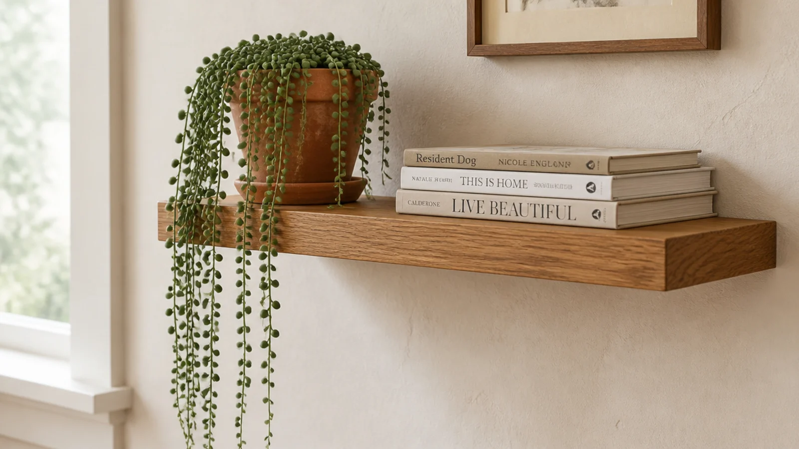
8. Keep a third of every shelf empty
This is the rule people resist and the one that changes everything. Roughly a third of every shelf surface should hold nothing at all, in one continuous run rather than scattered gaps.
Even spacing between objects reads as a shop display; grouped objects with one generous gap read as a home. If you cannot bear to remove things, put the overflow in a box for two weeks. Almost nobody puts it back.
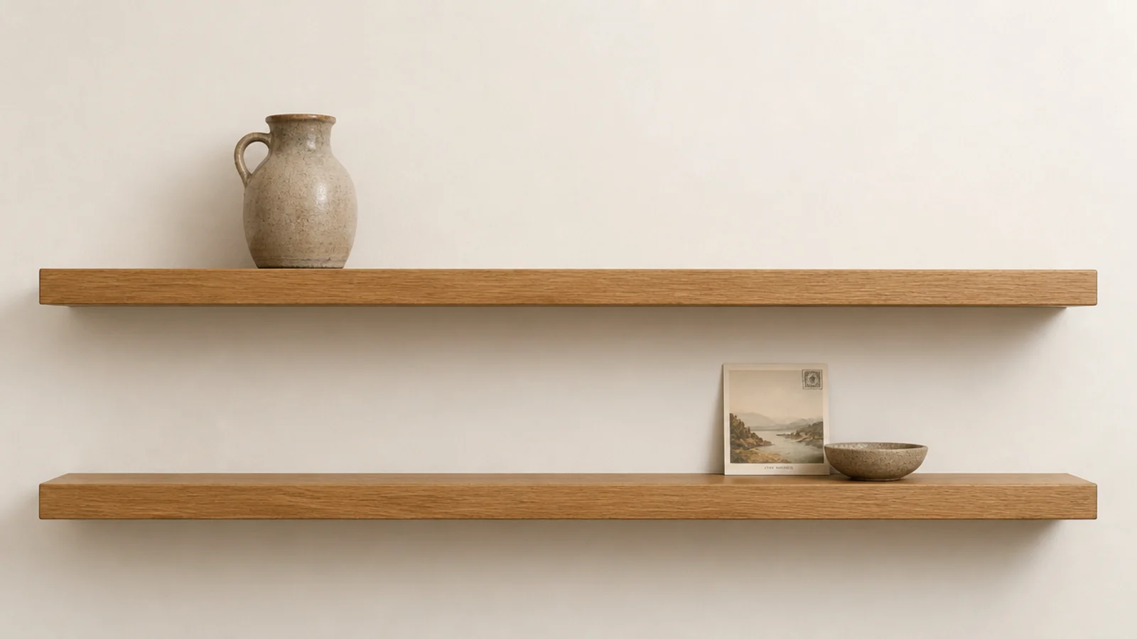
9. Hold the palette to three tones plus wood
Expensive-looking shelves are almost always quiet ones. Choose three tones — cream, terracotta and muted sage is my default — and let the wood be the fourth.
Everything else goes elsewhere in the house. This is a free change: you are not buying, you are editing. It works especially hard in a small room, where a shelf with eight colors on it makes the whole wall feel noisy and closer than it is.
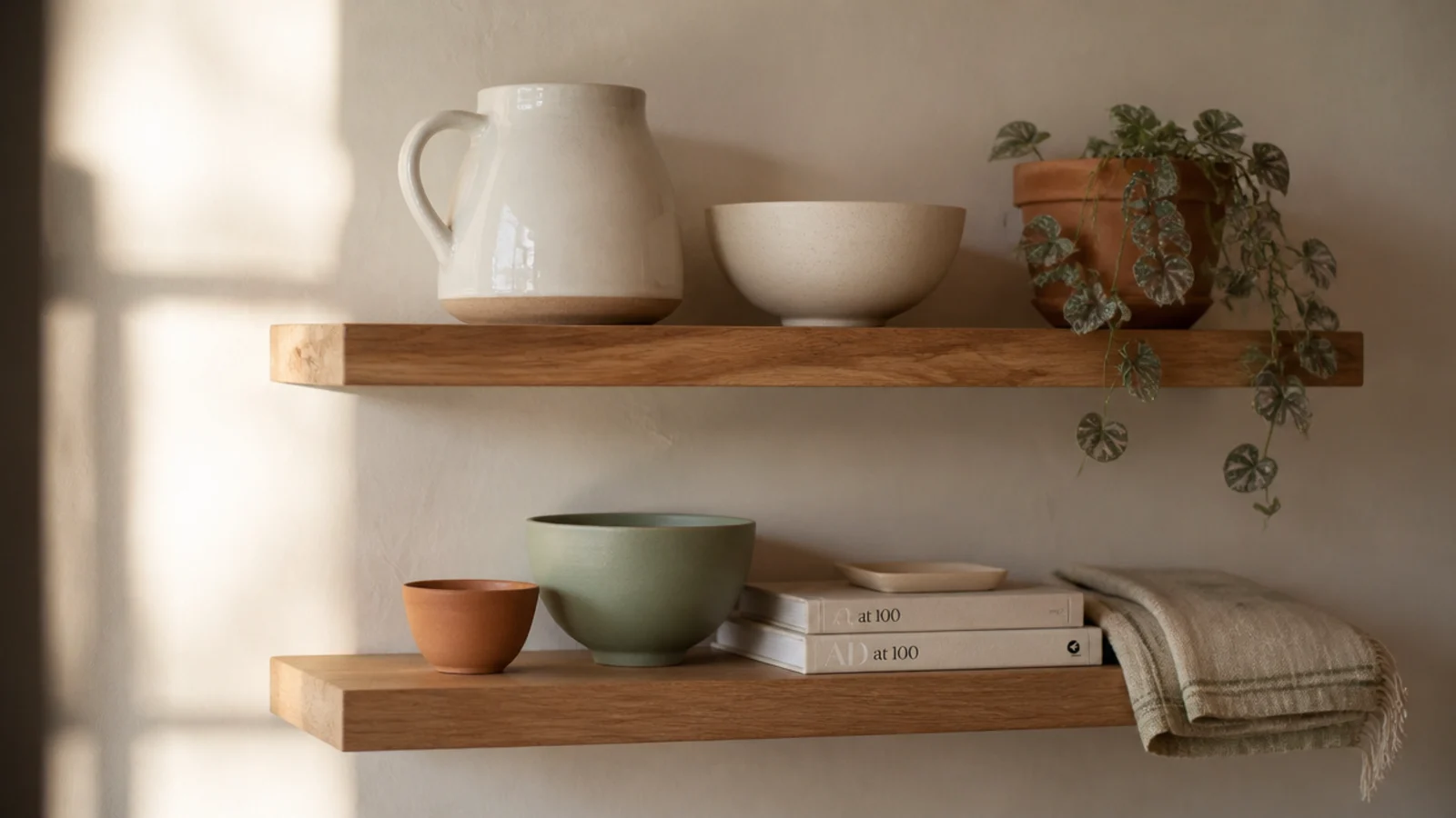
10. Vary texture instead of color
Once the palette is tight, texture carries the interest. Put a matte stoneware vessel next to brushed brass next to clear glass next to woven jute, all in the same sand tone.
Your eye reads four distinct things while the color stays calm. This is precisely why designer shelves look rich in photographs that are almost monochrome. Matte beside glossy is the highest-contrast pairing, so use it where you want the eye to land first.
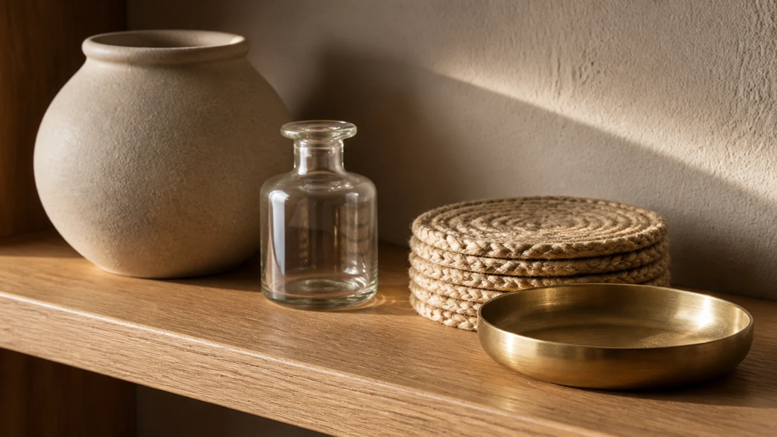
11. Compose across two shelves, not one
Two shelves styled independently look like two rows. Two shelves styled as one wall look like a room.
Run a loose diagonal: tall object low on the left, a leaning frame in the middle of the upper shelf, something trailing at the far right. Then check it from the doorway rather than standing in front of it, because that is the angle you actually see it from all day. The same logic scales to a whole wall of floating shelves in the living room.
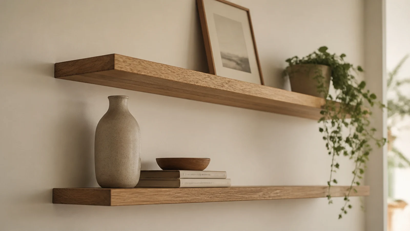
12. Add one small warm light
Nothing makes a shelf look more expensive at night than its own light. A small brass picture light above, or a 2700K LED strip routed into the underside, changes the shelf from a surface into a feature.
Warm white only. Cool light drains terracotta and walnut of color and makes every material decision above it pointless. Battery picture lights start around $20 and need no wiring, which makes this the rare upgrade renters can take with them.
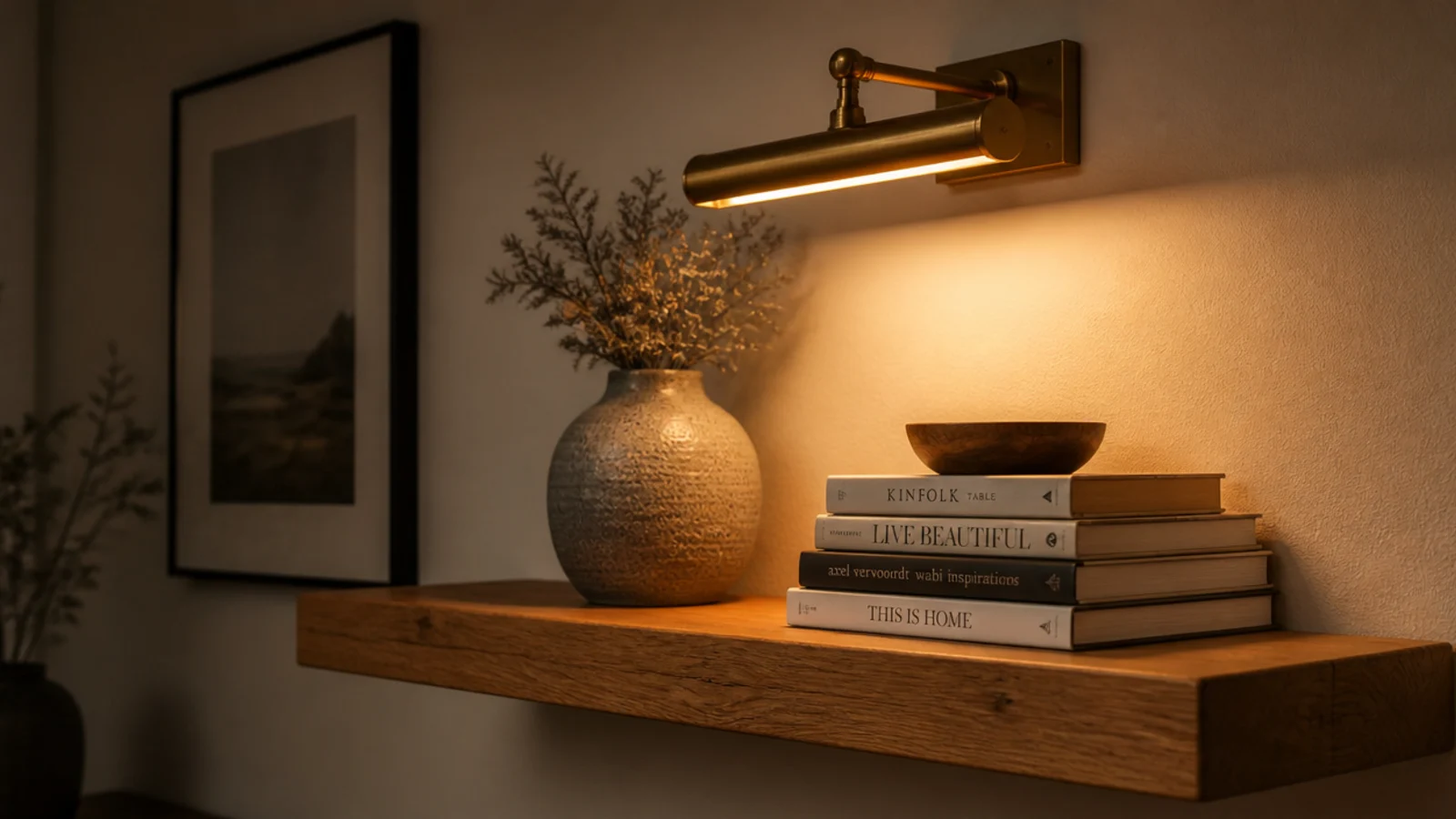
13. Break the top line with one tall object
The gap above a shelf is part of the composition, and most people leave it completely untouched. One object rising well into it releases the pressure.
Tall dried stems in a slim bottle are the cheapest version — a bundle of wheat or pampas costs about $8 and lasts years. Keep it to one per pair of shelves. Two tall objects on the same run start to compete and the shelf reads busy again.
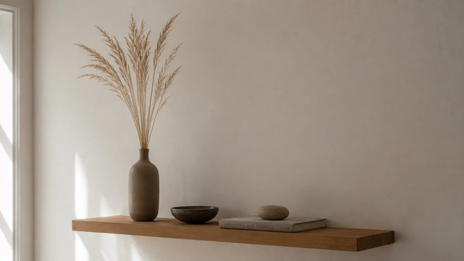
14. Hide the practical things in one basket
Remotes, chargers and reading glasses will end up on the shelf whether you plan for them or not. Give them one small lidded basket rather than fighting them.
A jute or seagrass box about eight inches wide absorbs all of it and reads as texture rather than storage. Put it at one end, never in the middle. This single container is what lets a styled shelf survive contact with real life, which is the only test that matters.
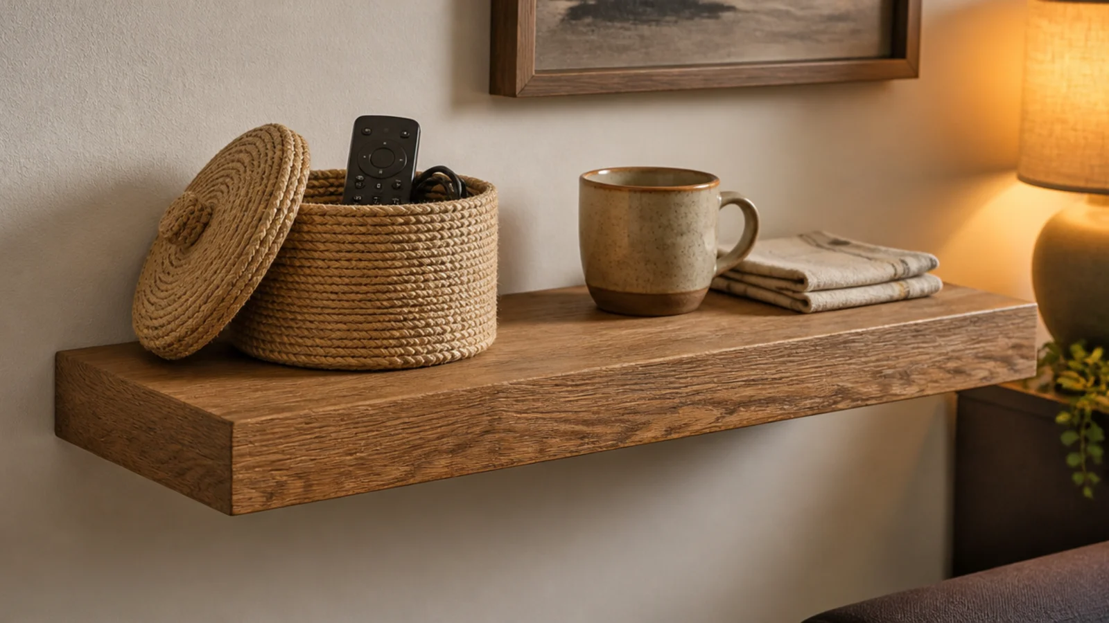
15. Restyle with three swaps, not thirty
Seasonal restyling does not mean clearing the shelf. Change three things and leave everything else exactly where it is.
Swap the dried stems, swap one textile, swap one small object for something with a seasonal color. Fifteen minutes, no shopping, and the wall feels refreshed. If a shelf still looks wrong after that, the problem is usually the arrangement rather than the objects, and the fixes in corner shelf styling apply to a straight run just as well.
Mistakes to Skip
- Spacing objects evenly across the shelf. Even spacing reads as a retail display, and grouping with one generous gap fixes it in thirty seconds.
- Styling with everything the same height. If your tallest and shortest objects are within two inches of each other, no arrangement will look composed.
- Leaving hardware unpainted on a stained shelf. A visible bracket in a contrasting finish undoes every other decision on the wall.
Frequently asked questions
How do I style a floating shelf so it does not look cluttered?
Three objects per shelf at three clearly different heights, with about a third of the surface left empty. Most cluttered shelves are not badly arranged, they are simply overfull. Take a third of the objects away and if the shelf immediately looks better, that was the entire problem rather than the arrangement.
What makes a cheap shelf look expensive?
Three things, in this order: a rounded front edge, hardware painted the wall color, and restraint. Sharp machine edges and a visible black bracket on a stained shelf read as budget from across the room. Then style with fewer, larger objects — five small trinkets always look cheaper than one good stoneware vessel.
Should objects on a floating shelf match?
No. Matching sets look lifeless because nothing varies in height, age or texture. What should repeat is one material three times across the run — three brass pieces, or three terracotta. That repetition creates a rhythm your eye reads as intentional while the objects themselves stay mixed.
How far apart should things sit on a shelf?
Group in twos and threes with real gaps between the groups, rather than spacing everything evenly. Even spacing reads as a shop display. Aim for one large gap of at least 6 inches on every shelf, and let one object overhang the front edge slightly so the arrangement is not perfectly contained.
What should I put on floating shelves in a small room?
Fewer and larger. In a small room, a shelf holding one big stoneware vessel and two books reads calm, while the same shelf holding nine small objects reads as storage. Keep the palette to three tones plus the wood, and let at least one shelf hold a single object with nothing beside it.
Take everything off, put back three things, and live with it for a day before you add a fourth. That single exercise fixes more shelves than any shopping trip. If the shelf itself needs work first, fifteen floating shelf ideas covers placement and depth, and the floating shelf build walks through the rounded front edge that does half the work here. Save the pin so the ratios are with you when you restyle.
Want more like this? Browse all 15 floating shelves guides — they all use the same measurements and budget tiers.
Pin it for later
Save this to your Floating Shelves board
Pin it now so it is waiting for you when the tape measure comes out — and so the next person hunting for this idea can find it too.
Save this pinKeep going
More ideas worth saving while you have the tape measure out.