Wall Clock · Listicle
25 Dreamy Aesthetic Wall Clock Picks To Steal

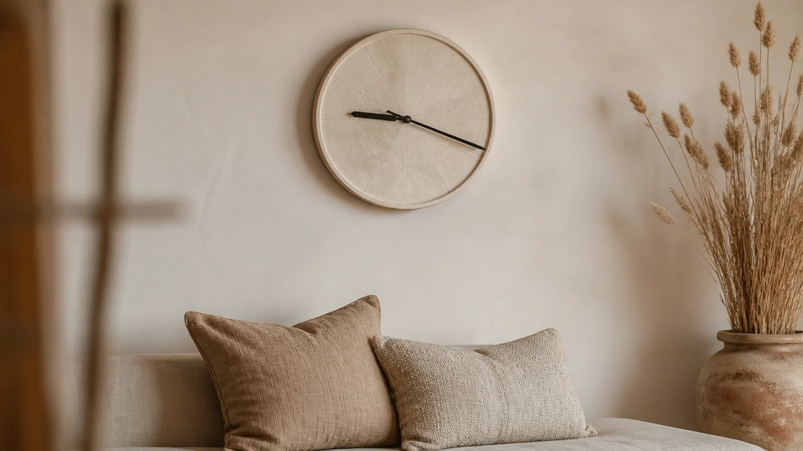
Soft finishes fail in exactly one place: nine in the evening, under a single lamp, when nobody can read the time. An aesthetic wall clock has to survive that hour as well as it survives a photograph, and the difference between the two is about three tones of contrast between hands and dial. Everything below is chosen for texture rather than colour, because a room built on cream, oatmeal and clay does not need a fourth shade — it needs something to touch. Here are twenty-five picks, with the diameter and contrast each one needs to actually work.
In this guide27 sections — tap to openHide
- 1.What an aesthetic wall clock has to do beyond looking good
- 2.A bone dial with no numerals
- 3.A warm oatmeal linen face
- 4.Aged brass, unlacquered
- 5.Woven cane and rattan rims
- 6.A limewash-effect painted dial
- 7.Terracotta and clay tones
- 8.Pale birch with a hairline rim
- 9.A black hairline ring on cream
- 10.Travertine and honed stone
- 11.Ceramic with a glaze that pools
- 12.A scalloped or wavy rim
- 13.An arched top case
- 14.A soft sage dial
- 15.Cream on cream, low contrast
- 16.A wooden bead rim
- 17.A fluted or reeded case
- 18.A soft checkerboard dial
- 19.A ribbon or leather strap hanger
- 20.Mushroom and greige tones
- 21.A six-inch clock for a shelf vignette
- 22.A frosted lens instead of clear glass
- 23.Handwritten script numerals
- 24.Match the dial to the curtain fabric
- 25.Style it with two objects, not five
- 26.A silent movement so the mood survives the night
- 27.Mistakes to Skip
What an aesthetic wall clock has to do beyond looking good
Start with contrast, because it is the only thing you cannot style around. A cream dial with soft grey hands reads comfortably to about 10 or 12 feet, which covers a bedroom, a study or a small sitting room. Past 15 feet you need at least three tones of separation, and dark-on-dark stops working at about 8 feet regardless of how good it looks close up.
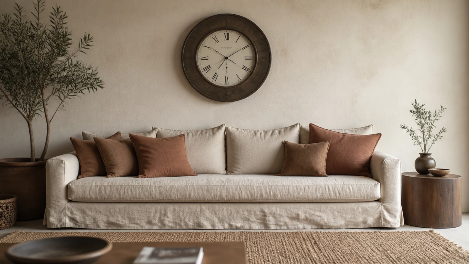
Then size it to the furniture. About a third of the width below: 24 to 30 inches over an 84-inch sofa, 18 to 22 over a 60-inch console, 14 to 18 in a small room. Centre at 57 to 60 inches from the floor, leaving 8 to 12 inches of clear wall above a sofa back.
Choose texture over colour. Cane, ceramic, limewash, unlacquered brass and reeded timber all add interest without introducing a new tone into a scheme that is already working. And repeat a metal you already have rather than adding a third.
Then the two practical points. Ceramic and stone faces weigh 6 to 18 pounds even at modest diameters, so anything over 8 pounds — and anything at all above a sofa or a bed — takes a number eight screw into a stud rather than the plug in the box. And fit a continuous-sweep movement at $12 to $18, because a step tick at 25 to 30 decibels ruins a calm room the moment it goes quiet. For tight rooms specifically, the small room design ideas go further.
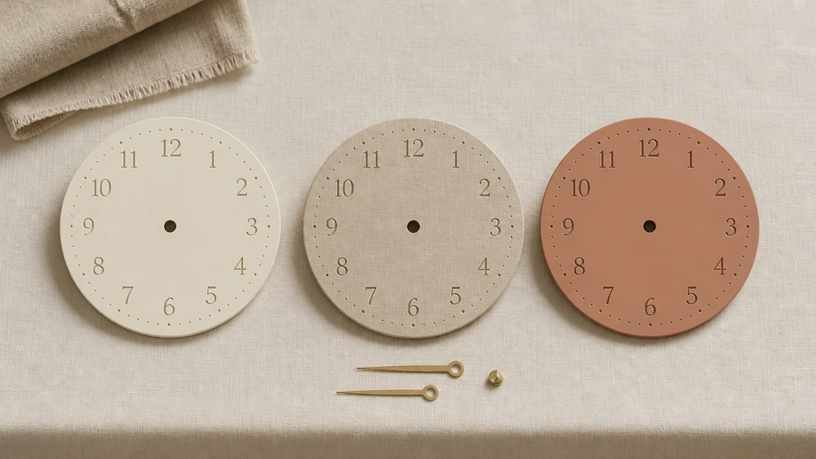
1. A bone dial with no numerals
Twelve fine markers give you the hour at a glance and leave the face quiet. It is the most photographed clock style there is for a reason, and the reason is that it adds shape to a wall without adding information. Keep it at 16 inches or more — below that a numberless dial reads as unfinished rather than restrained.
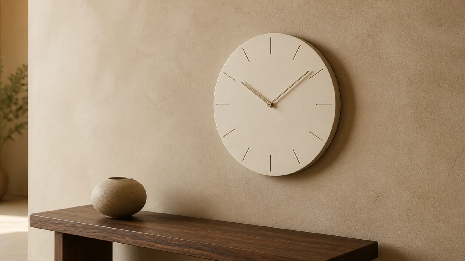
2. A warm oatmeal linen face
Woven linen stretched inside a slim ring brings a texture that photographs beautifully and behaves well acoustically, absorbing a little of the movement noise instead of reflecting it. Keep it out of kitchens and bathrooms, where fabric collects grease and damp. Expect $60 to $180 from a maker at 12 to 16 inches.
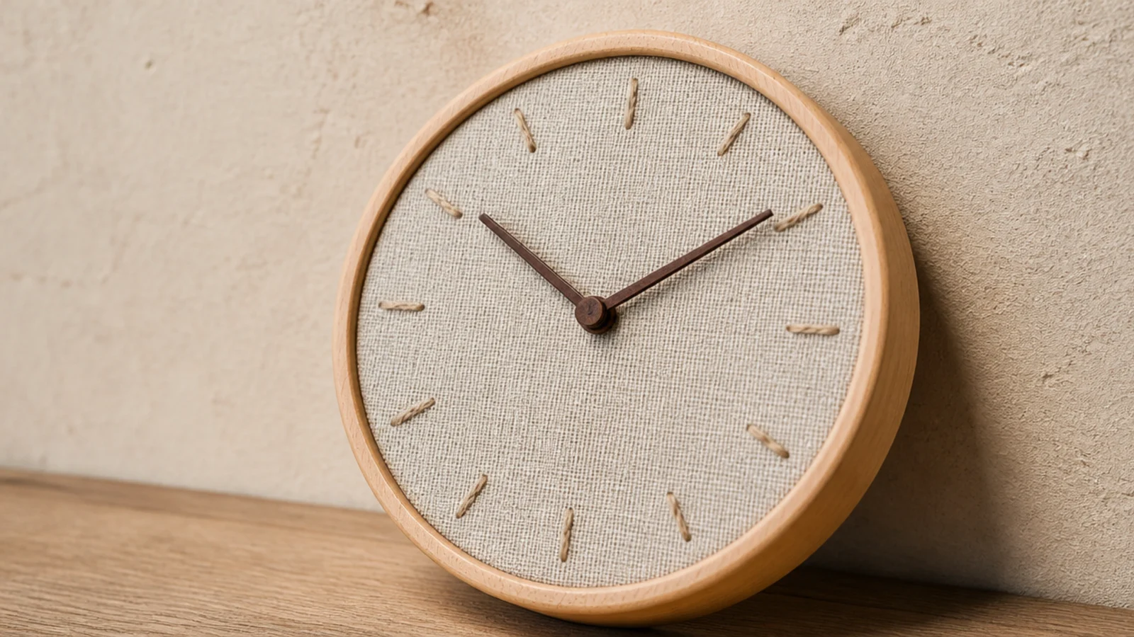
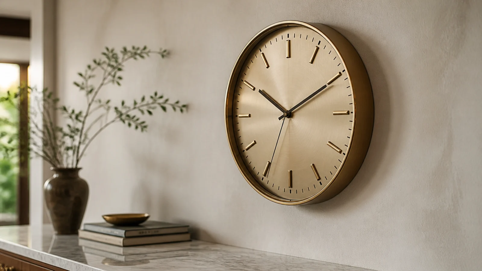
3. Aged brass, unlacquered
Lacquered brass stays the colour it arrived and eventually chips. Unlacquered brass darkens unevenly over a year or two into something no finish reproduces. If you want the change, buy unlacquered and do not polish it. If you want it to stay bright, accept that you are choosing a finish with an expiry date.
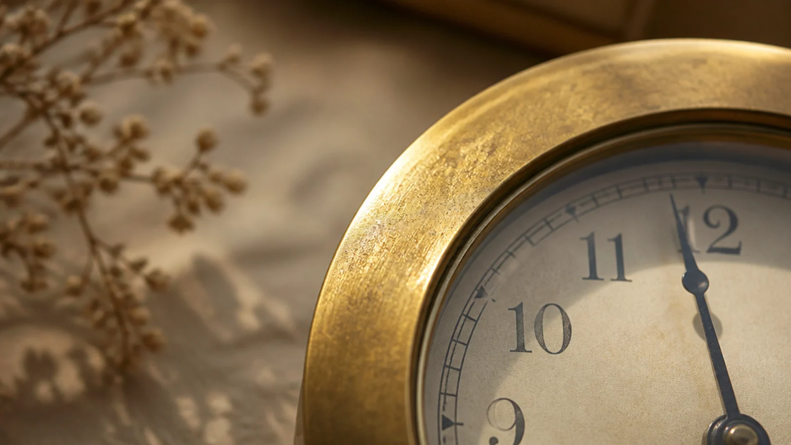
4. Woven cane and rattan rims
The cheapest texture upgrade on this list, at $30 to $75, and among the lightest — a 20-inch cane rim is often under 3 pounds. Check the weave is glued to a solid backing ring rather than self-supporting, because unsupported cane pulls oval within a year in a warm room.
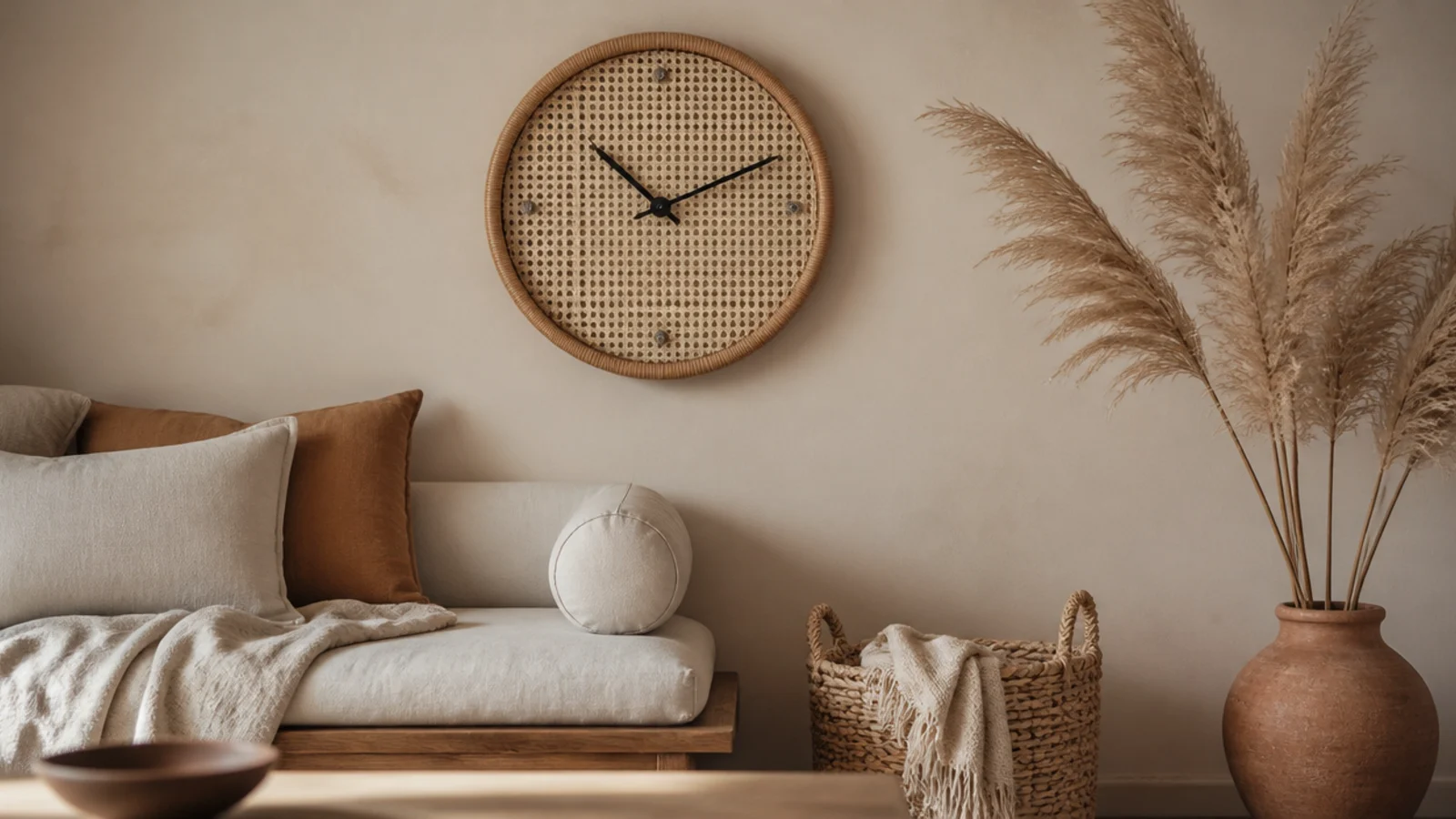
5. A limewash-effect painted dial
Chalky brush movement across the dial catches light the way a plaster wall does, which makes the clock read as part of the wall rather than an object on it. It is easy to do yourself with a tester pot and a dry brush, and it forgives an uneven hand far better than flat paint.
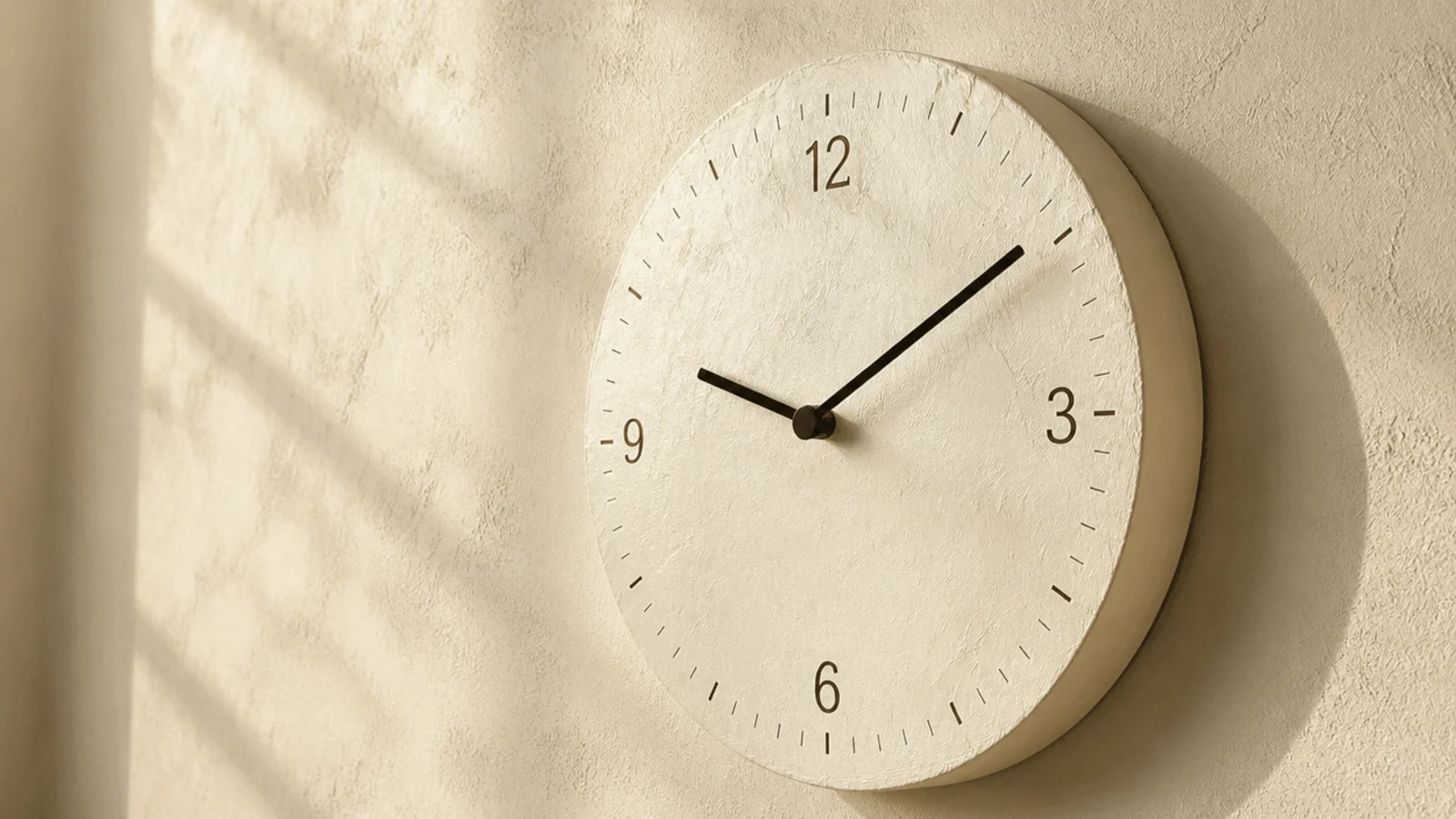
6. Terracotta and clay tones
One warm tone lifts an entire cool scheme, and a clock is a good place to put it because it sits at eye level without taking floor space. Keep the hands dark enough to read against it — clay on clay loses legibility fast, and a soft brown hand on a terracotta dial is invisible by lamplight.
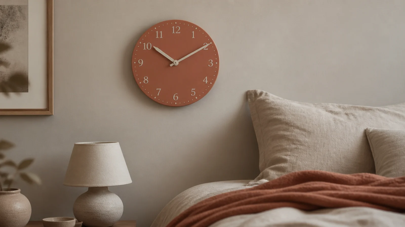
7. Pale birch with a hairline rim
A rim under an inch wide keeps a light timber clock feeling weightless. It suits a room where everything else is soft and low, and it costs $30 to $70. Check the rim is solid rather than veneered MDF, which shows a dark line at the edge under raking light.
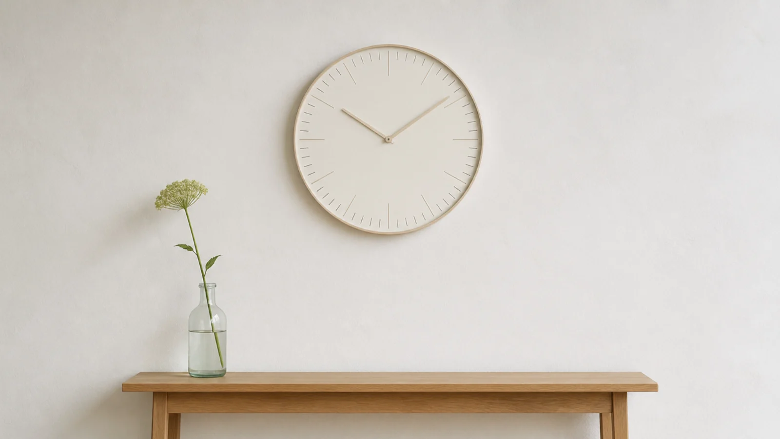
8. A black hairline ring on cream
The minimum viable contrast. A ring 3 to 5 millimetres thick on a cream wall reads as a drawn circle rather than a hung object, which is exactly the effect a very soft room wants. Keep the case under half an inch deep so it sits almost flush.
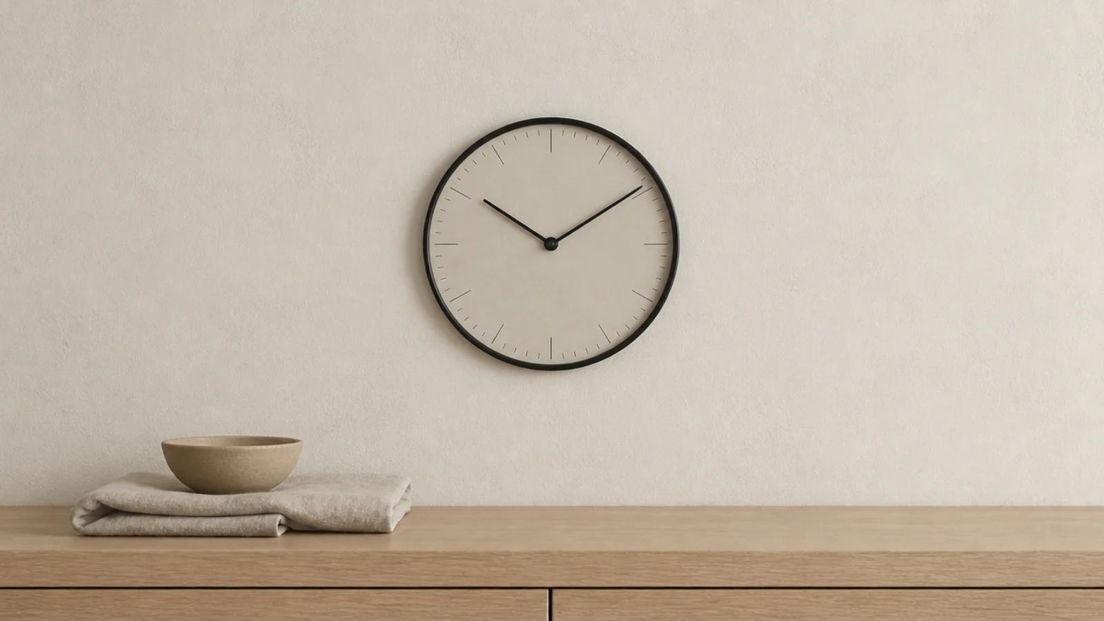
9. Travertine and honed stone
Travertine has natural pitting and warm veining, so it reads soft where marble reads cold and formal. It weighs 8 to 16 pounds at 12 to 14 inches — stud fixing territory. Around $120 to $300, and it pairs naturally with unlacquered brass hands rather than steel.
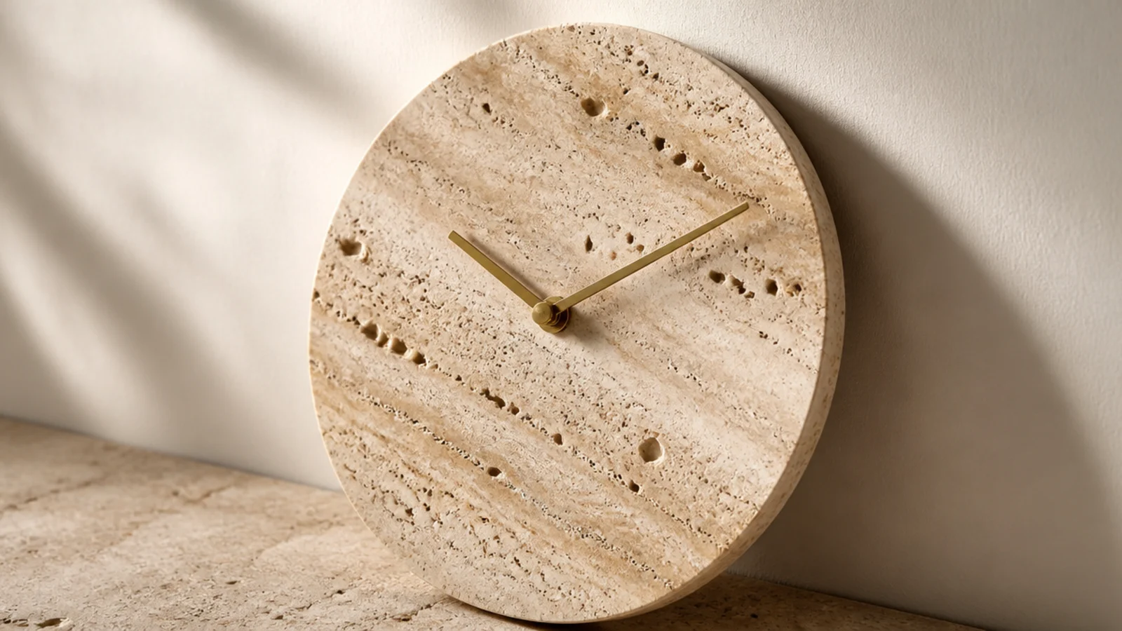
10. Ceramic with a glaze that pools
Glaze that runs slightly thicker at the lower rim is the mark of a real kiln rather than a printed finish, and it is the detail worth looking for. Hand-thrown faces at 10 to 14 inches weigh 3 to 6 pounds and cost $80 to $200. Check the movement is properly recessed behind the clay.
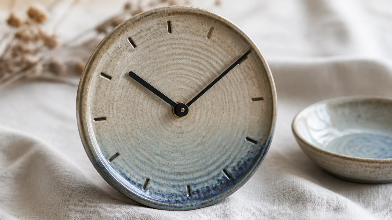
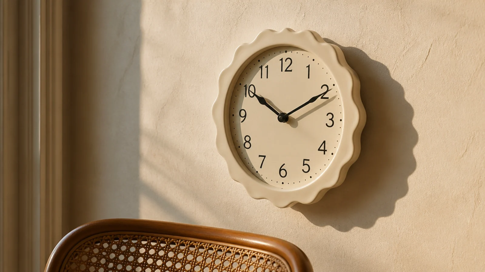
11. A scalloped or wavy rim
A shaped edge throws a rippled shadow that changes through the day, which gives a plain wall something to do in the afternoon. It works best in a single soft colour — scalloped plus patterned plus contrasting is three ideas at once. Expect $45 to $120.
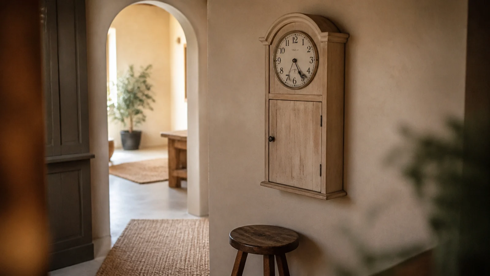
12. An arched top case
An arch echoes curved doorways, arched mirrors and rounded furniture, and it softens a room built entirely from right angles. Keep it as the only arch on that wall. Timber arch-top cases run $70 to $180 at 14 to 20 inches tall.
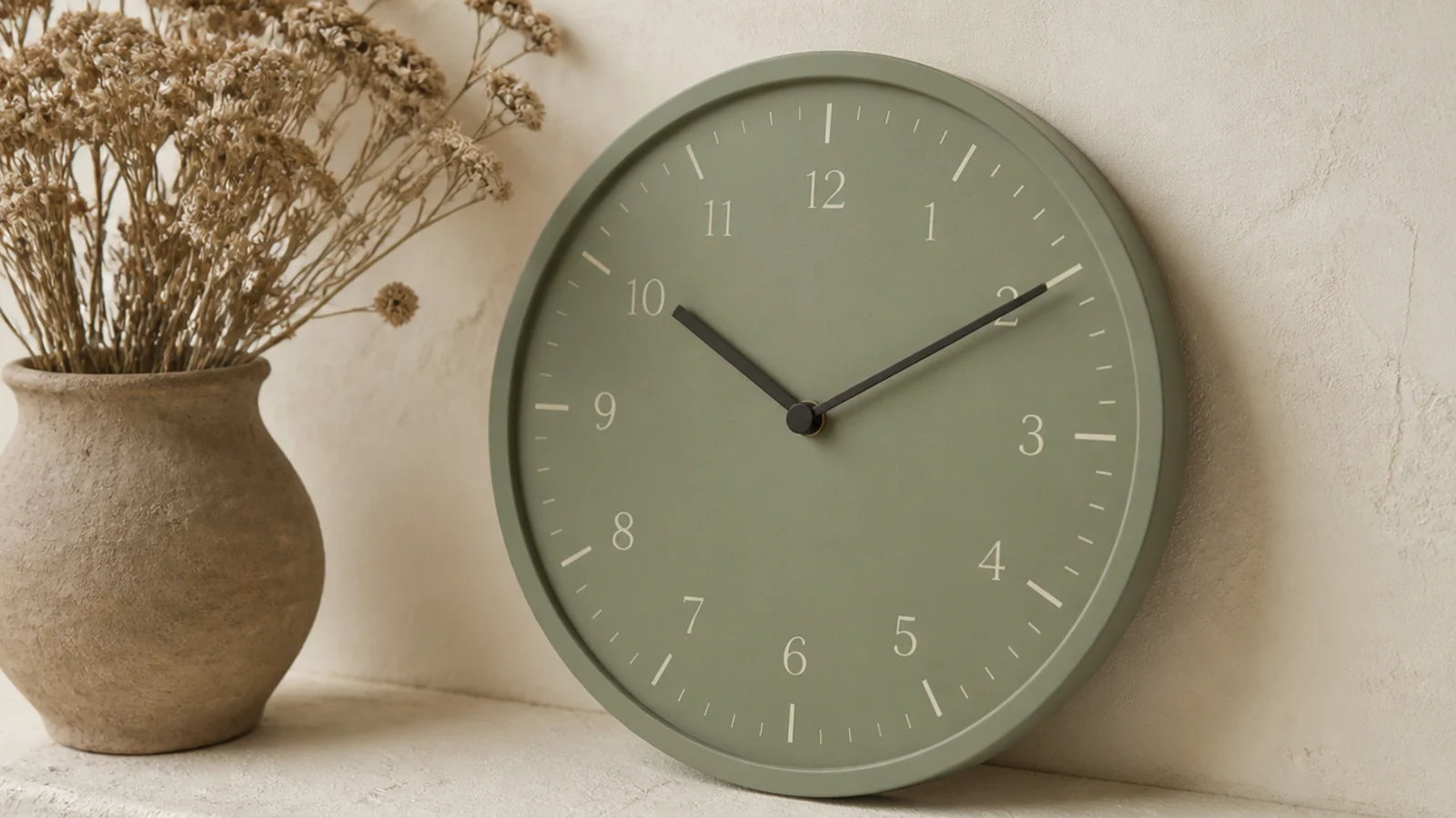
13. A soft sage dial
Sage sits quietly beside every warm neutral and is one of the few colours that never fights terracotta, oatmeal or walnut. Use cream markers rather than white, which reads cold against it, and keep the hands charcoal rather than black for the same reason.
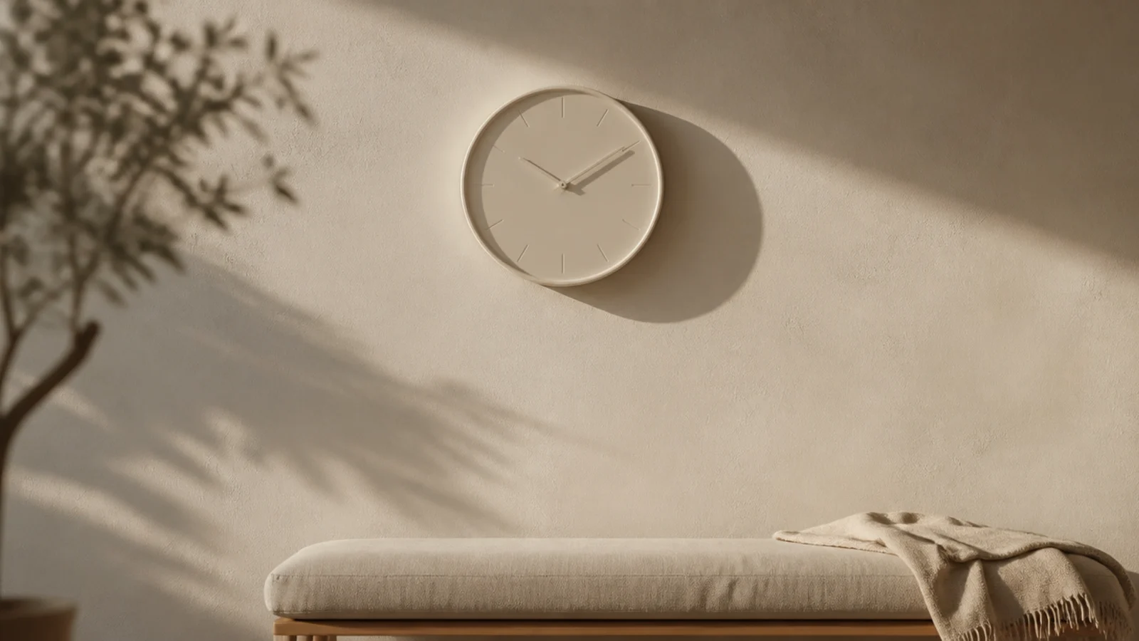
14. Cream on cream, low contrast
The shadow does most of the work here. A cream clock on a cream wall reads as a subtle disc with faint markers, which is lovely in a bedroom and useless in a kitchen. Give it a case with 1 to 2 inches of depth, because without a shadow line it disappears entirely.
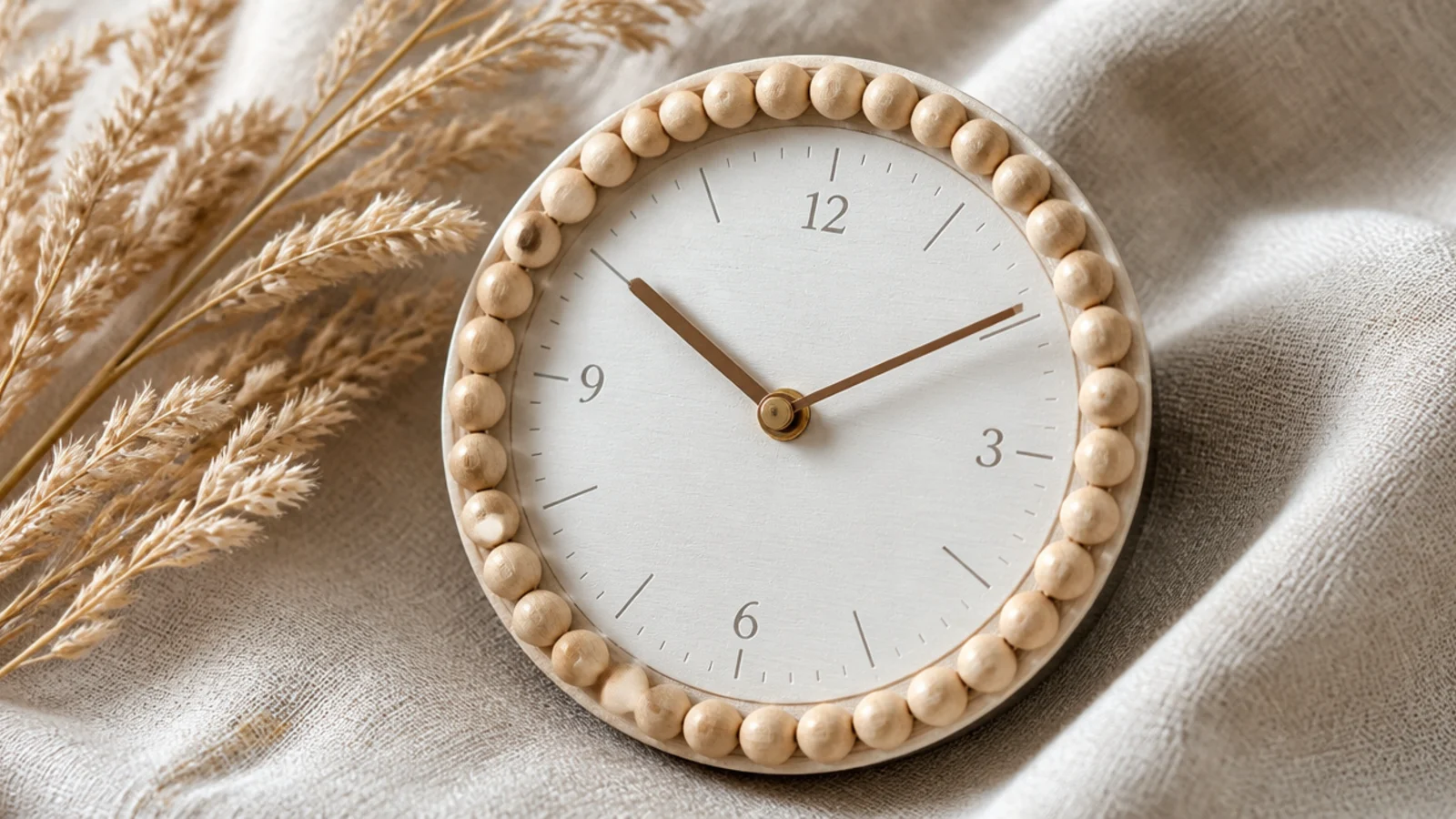
15. A wooden bead rim
A ring of small natural beads adds depth without adding weight, and it costs almost nothing to make from a $6 bag of beads on a plain disc. It reads best at 12 to 18 inches — beyond that the beads start to look like a border rather than a texture.
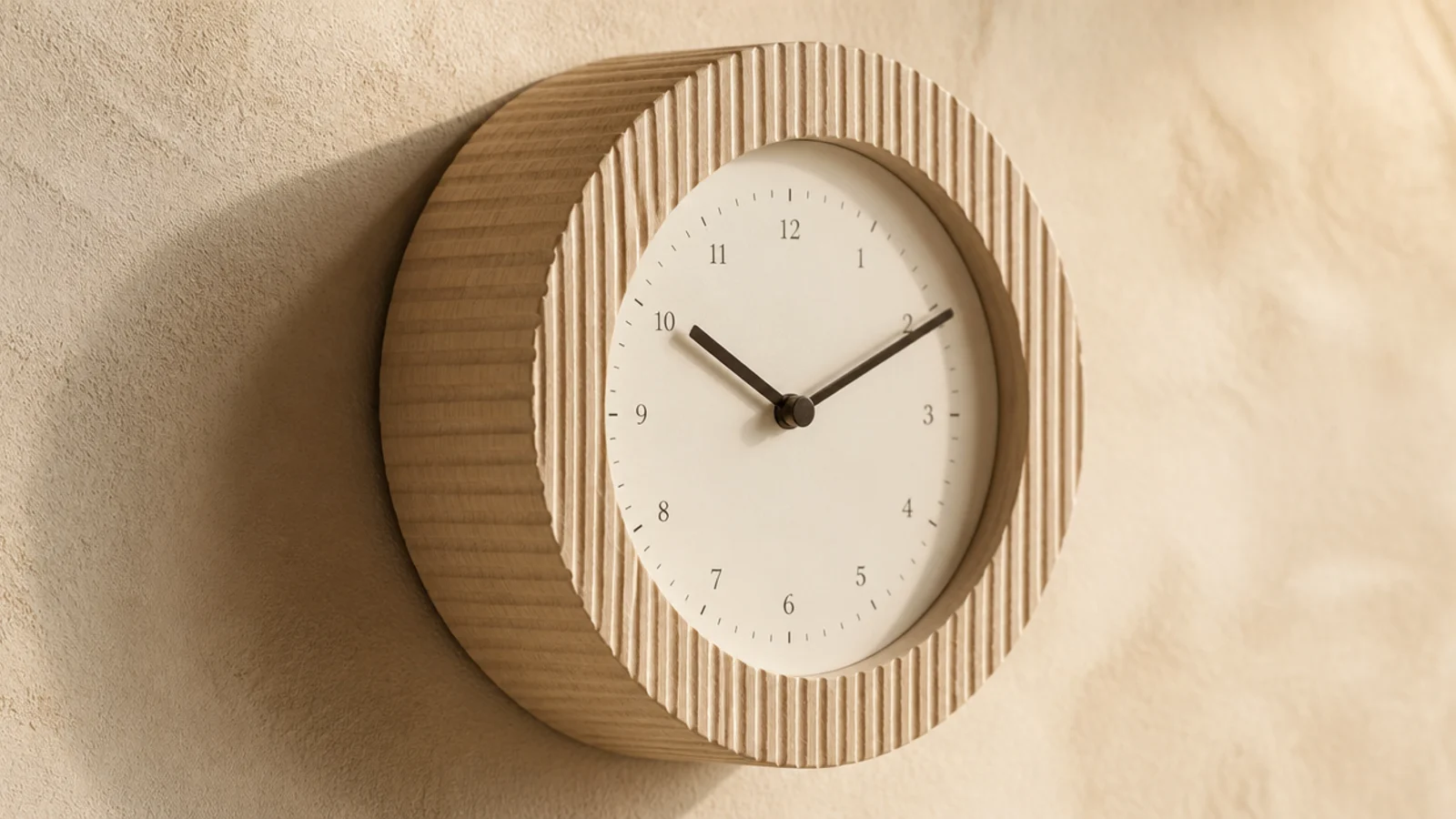
16. A fluted or reeded case
Fine vertical grooves catch raking light along the entire rim, which gives a plain circle a lot of quiet detail. It is having a moment on cabinetry and it translates well to a clock. Look for grooves a few millimetres apart rather than wide flutes, which read heavy.
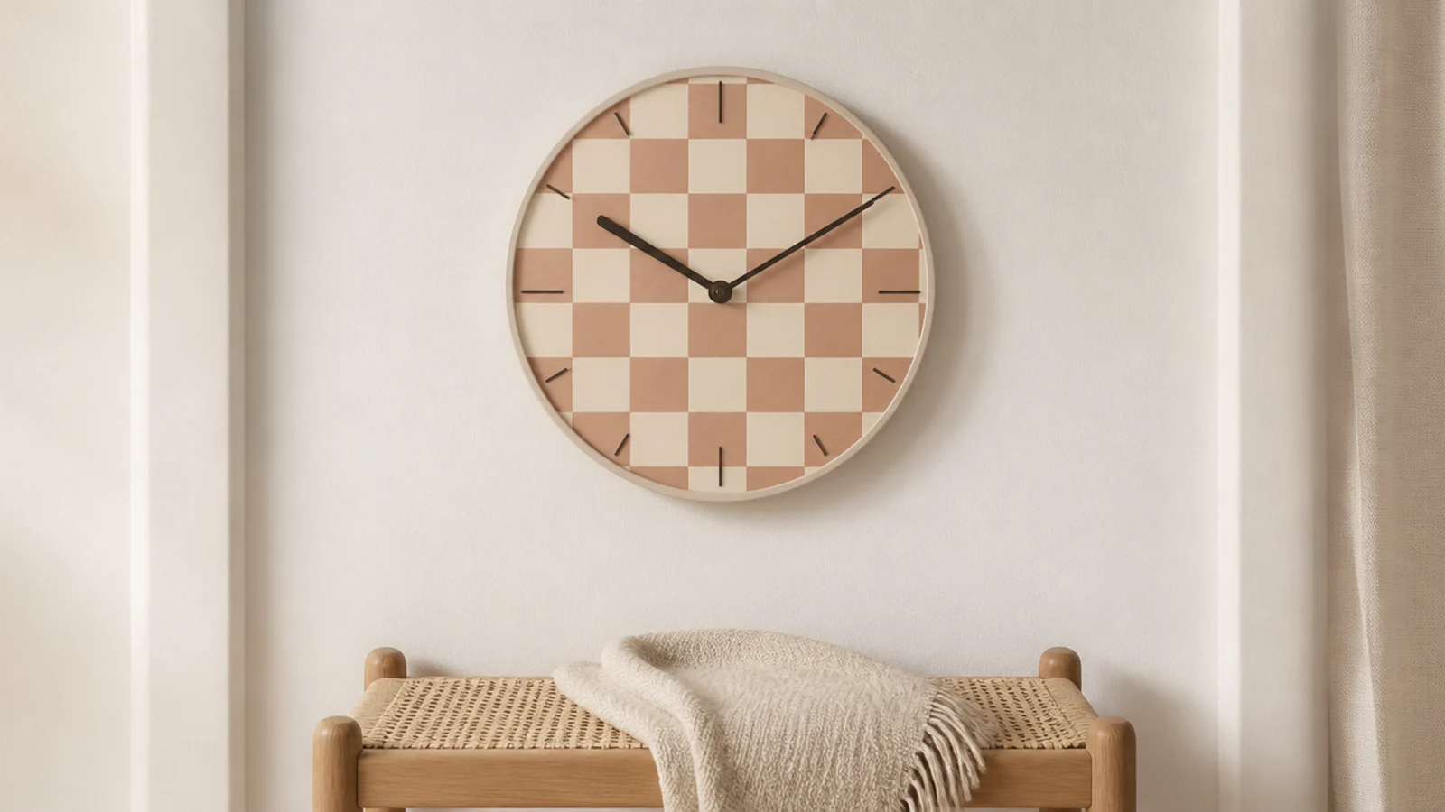
17. A soft checkerboard dial
Pattern that stays calm because the two tones sit close together — cream and clay rather than black and white. It gives a neutral room a graphic element without a colour change. Keep the hands dark enough to read across both squares, which is the detail most versions get wrong.
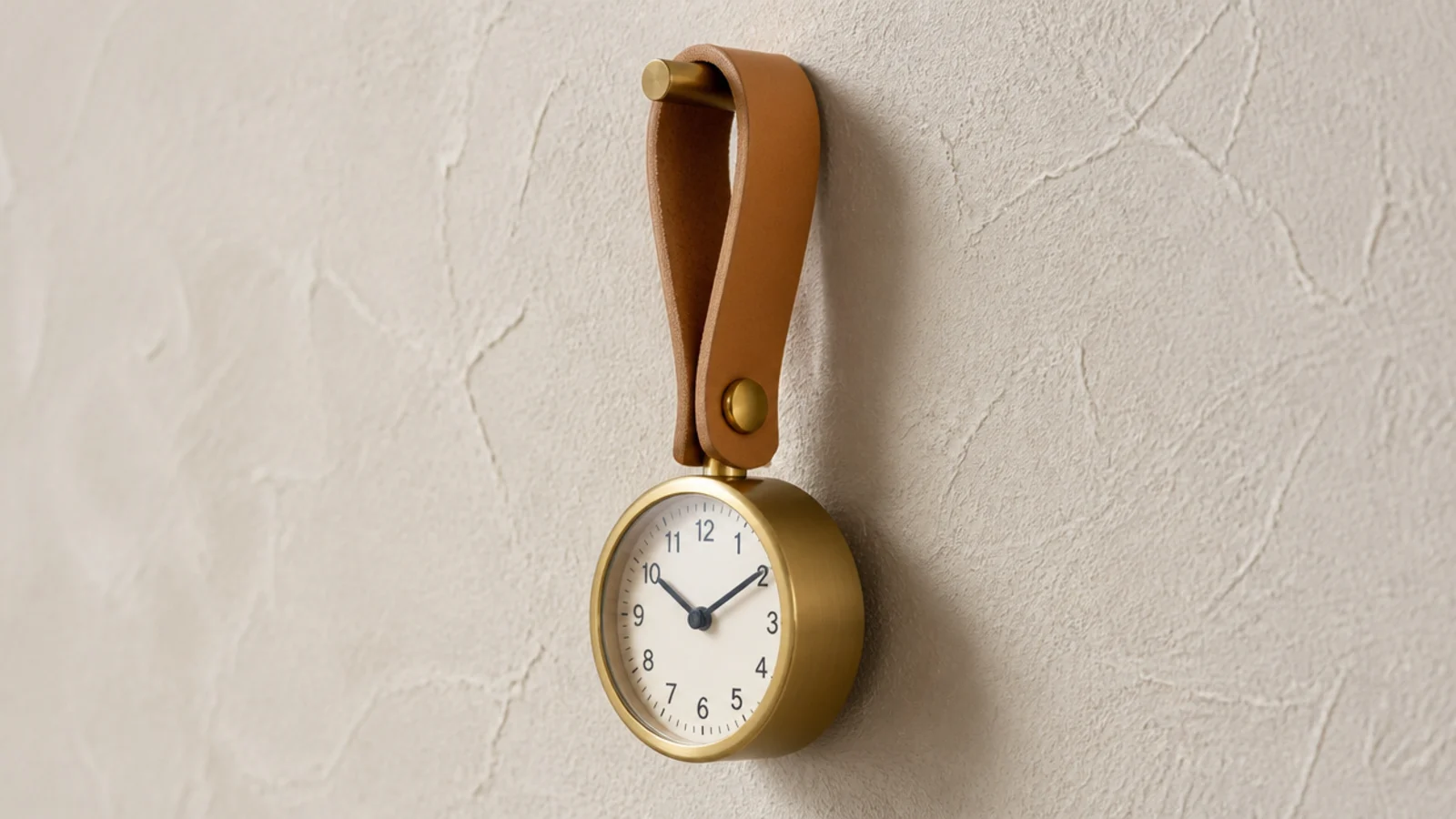
18. A ribbon or leather strap hanger
A small clock suspended from a leather strap over a brass hook turns the hanging method into part of the composition. It also drops the clock 4 to 8 inches below the fixing, which is useful when the only stud is higher than you want the dial.
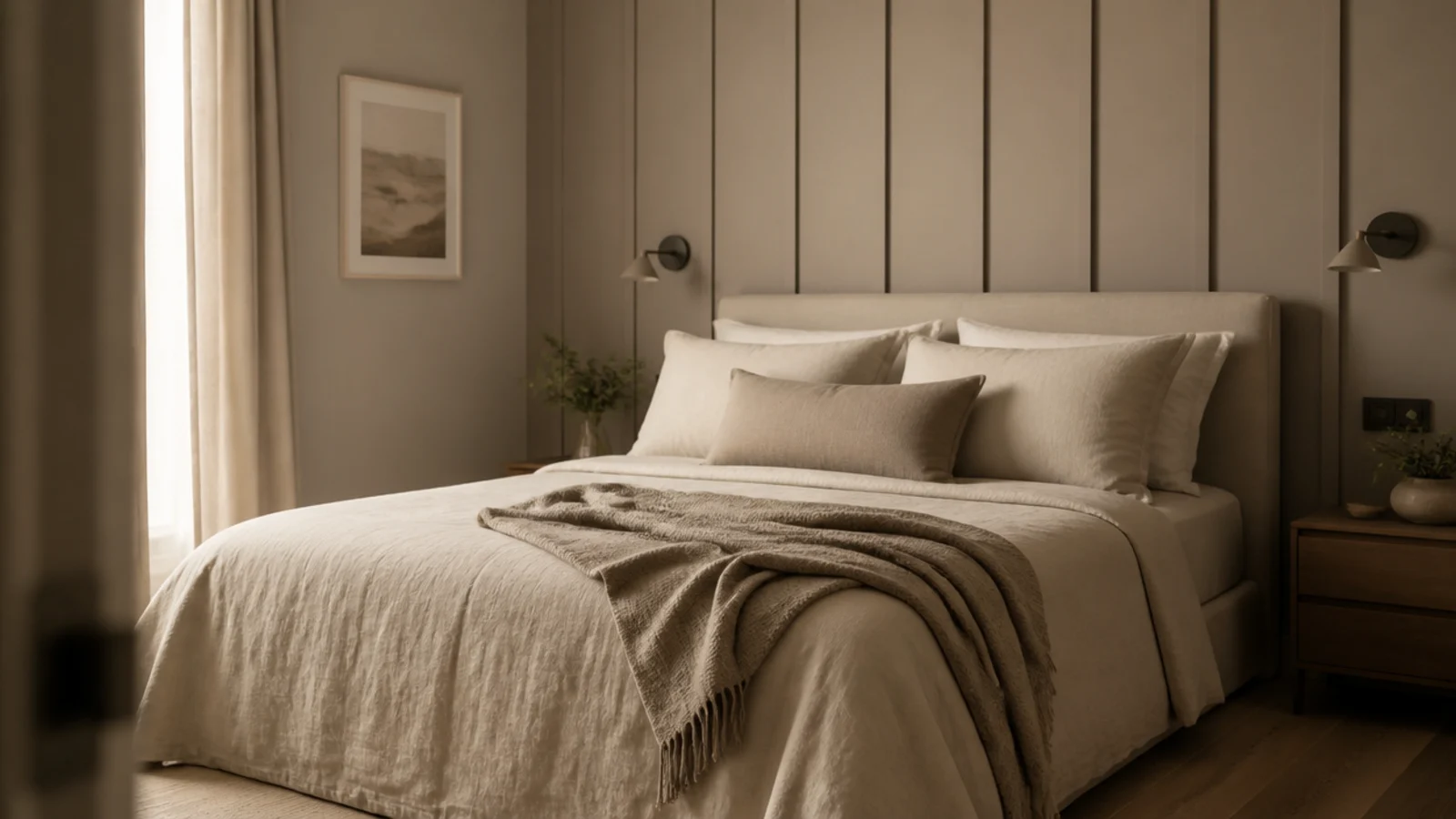
19. Mushroom and greige tones
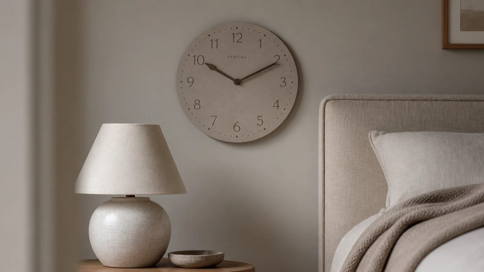
Greige bridges warm and cool schemes without committing to either, which makes it the safest dial colour in a room you are still finishing. It suits bedrooms particularly well, where you want something at eye level that does not draw attention at bedtime. Pair with soft lighting — see the bedroom hanging lights guide.
20. A six-inch clock for a shelf vignette
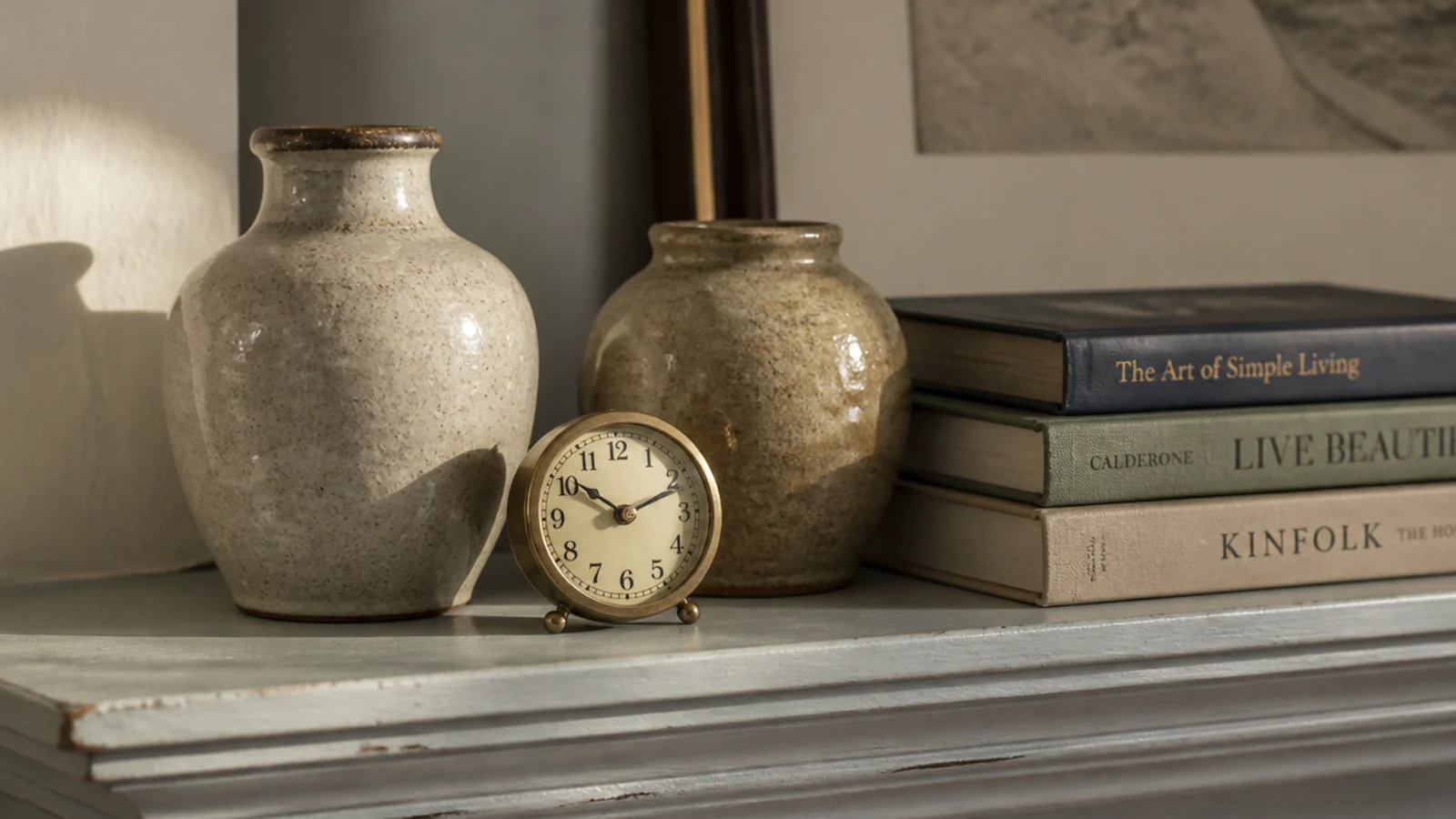
At 6 to 8 inches a clock stops being a wall fixture and becomes an object, which means it can join a shelf arrangement with ceramics and books. It also needs no fixing at all. Prop it at a slight angle against the back panel with putty under the rim.
21. A frosted lens instead of clear glass
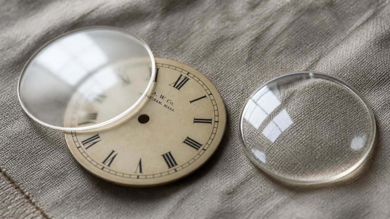
Frosted or matte glass loses the hard window reflection that ruins so many clock photographs and, more importantly, ruins the actual view from the sofa at four in the afternoon. It costs nothing extra and it is the single most useful lens choice for a bright room.
22. Handwritten script numerals
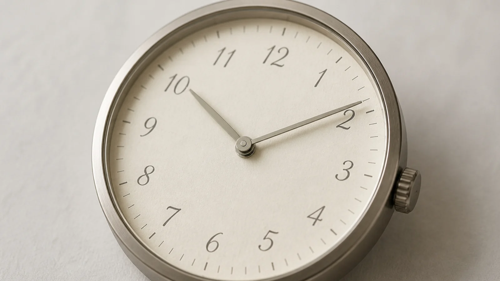
Painted script numerals have small irregularities that printed ones do not, and those irregularities are what make the face feel made rather than manufactured. Keep the script simple, because anything ornate becomes hard to read at 12 feet and the clock stops earning its wall.
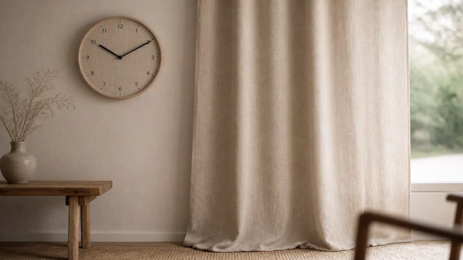
23. Match the dial to the curtain fabric
Borrowing a tone already in the room is more reliable than introducing a good one. Hold a fabric sample against the clock in daylight and again under lamplight — oatmeal and greige shift noticeably between the two, and the evening version is the one you live with.
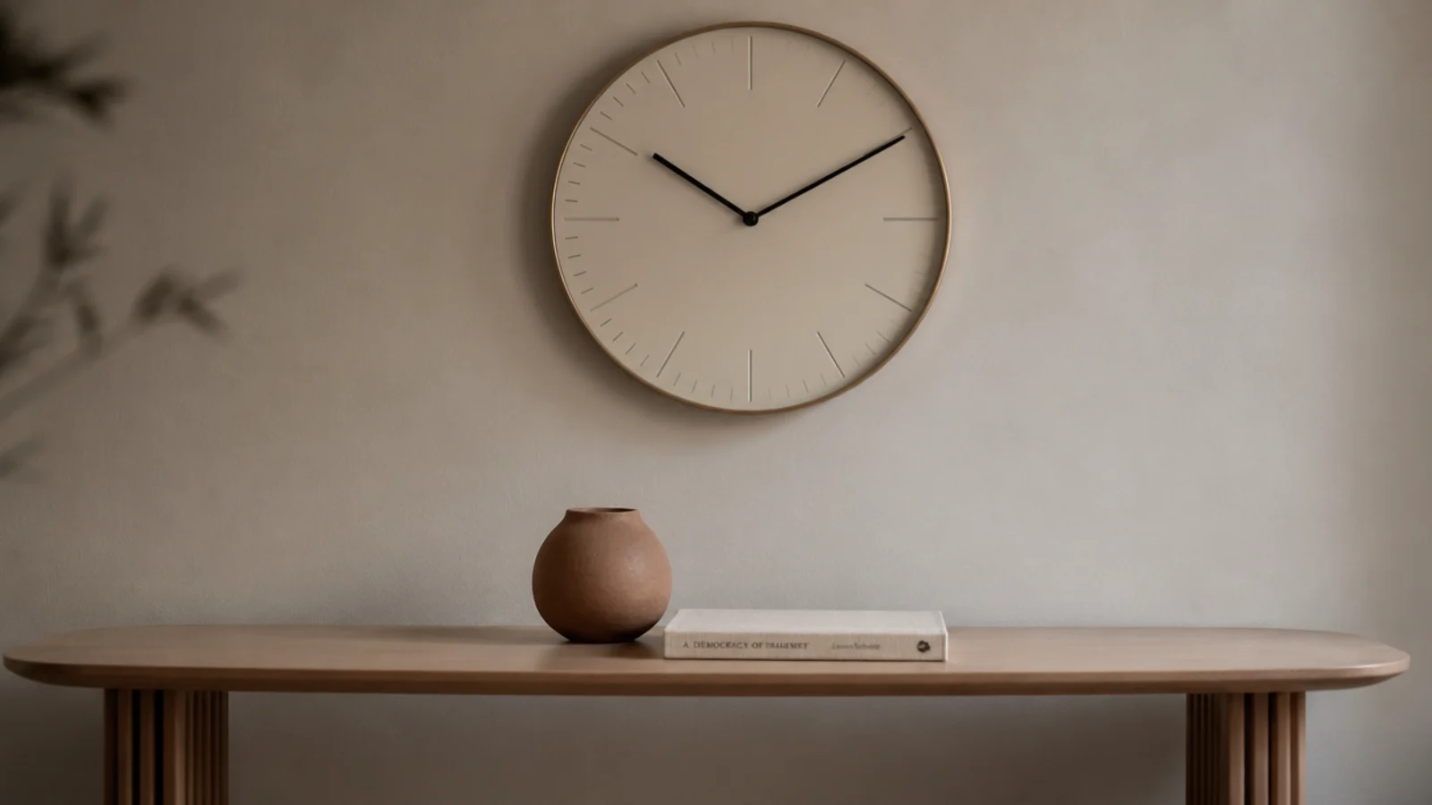
24. Style it with two objects, not five
The console beneath a soft clock wants one vase and one small book, not a full vignette. Every object you add competes for the same quiet attention the clock is asking for. Candlelight is the exception that always works — the candle decor guide covers the evening version.
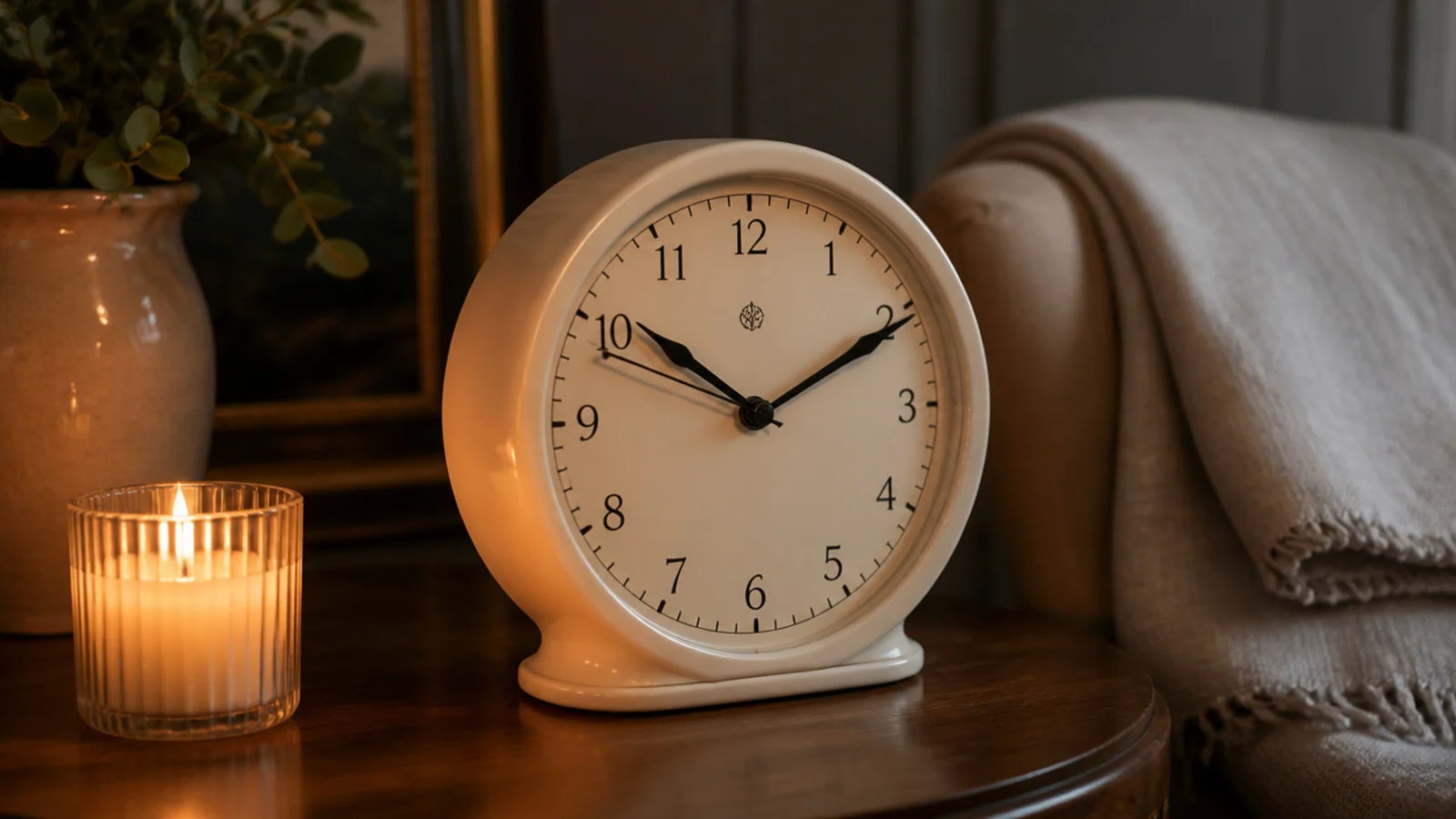
25. A silent movement so the mood survives the night
The face can be perfect and a step tick will still undo the room the moment the television goes off. A continuous-sweep movement costs $12 to $18, runs 8 to 12 months on a cell, and is the only upgrade here that changes how a room feels rather than how it looks. For timber-specific versions, the wood clock guide covers the finishes that last.
Mistakes to Skip
- Choosing a dial you cannot read from the seat you use. A clock that needs you to walk toward it is decoration, and there is nothing wrong with that as long as you chose it deliberately.
- Adding a fourth colour to a scheme that already works. Texture is what a neutral room is short of, and a painted dial in a new shade is the fastest way to make a calm wall look busy.
- Buying a ceramic or stone face and hanging it on the supplied plug. Six to eighteen pounds above a sofa needs framing, and a beautiful clock on the floor is a very expensive lesson.
- Leaving a ticking movement in place because the clock looks lovely. The mood you were buying disappears at exactly the hour you most wanted it.
Frequently asked questions
Can a low-contrast clock still be readable?
Up to a point. A cream dial with soft grey hands reads comfortably to about 10 or 12 feet, which covers a bedroom or a small study. Past 15 feet you need at least three tones of separation between the hands and the face, or the clock becomes decoration.
What finish suits a neutral room best?
Something with texture rather than colour. Cane, ceramic, limewashed timber and unlacquered brass all add interest without introducing a new tone, which is exactly what a scheme built on cream, oatmeal and clay needs. Painted finishes in a fourth colour tend to fight the room.
Should the clock match the rest of the metals in the room?
It should repeat one metal already present rather than introduce another. Two metals is the working limit for most rooms, and the clock is an easy place to echo a lamp base, a cabinet pull or a curtain pole instead of adding a third finish.
Does a pretty clock still need a proper fixing?
Yes. Ceramic and stone faces run 6 to 18 pounds even at modest diameters, and anything over 8 pounds, or anything above a sofa or a bed, needs a number eight screw into a stud rather than the plastic plug supplied in the box.
Why does my clock ruin the mood at night?
It is almost always the movement rather than the face. A step-tick unit measures roughly 25 to 30 decibels at a metre, which vanishes during the day and dominates a quiet room after dark. A continuous-sweep movement costs a few dollars more and removes it entirely.
Want more like this? Browse all 15 wall clock guides — they all use the same measurements and budget tiers.
Pin it for later
Save this to your Wall Clock board
Pin it now so it is waiting for you when the tape measure comes out — and so the next person hunting for this idea can find it too.
Save this pinKeep going
More ideas worth saving while you have the tape measure out.