Entryway & Foyer Ideas · Listicle
20 Genius Entryway Ideas for a Cozy Home

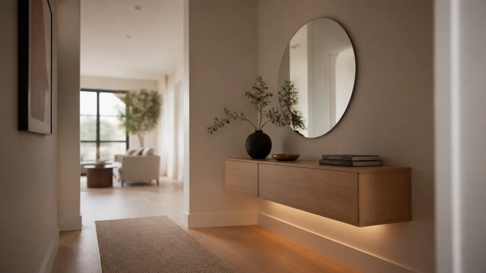
Modern foyer ideas fail in one specific way: they go cold. Clean lines, cool white light, hard floor, nothing soft, and an entry that feels like a lobby rather than the front of a home. The fix is not adding clutter back. It is warmth in the material and the light, with the discipline kept where it belongs. Here are twenty that stay crisp and still feel like somewhere people live.
In this guide22 sections — tap to openHide
- 1.What makes modern foyer ideas feel warm instead of cold
- 2.Put everything on one plane
- 3.A floating console with concealed brackets
- 4.Handleless fronts with push latches
- 5.One continuous material
- 6.A key slot cut into the joinery
- 7.Light washing down from under the float
- 8.A frameless round mirror
- 9.One hardware finish, everywhere
- 10.Vertical slat panelling behind the hooks
- 11.Coats behind a sliding panel
- 12.A monolithic bench in one material
- 13.A tiled landing zone at the door
- 14.A shadow gap instead of baseboard
- 15.One oversized pendant
- 16.Warm bulbs on a dimmer, everywhere
- 17.Let wool and linen do the warming
- 18.One organic shape to break the grid
- 19.A three-tone palette
- 20.Hidden shoe storage at nine inches deep
- 21.Two objects on the surface, and nothing more
- 22.Mistakes to Skip
What makes modern foyer ideas feel warm instead of cold
Three things do almost all of it: one wood tone, 2700K bulbs on a dimmer, and something woven underfoot. An entry with those three can be as spare as you like and it will still read as warm.
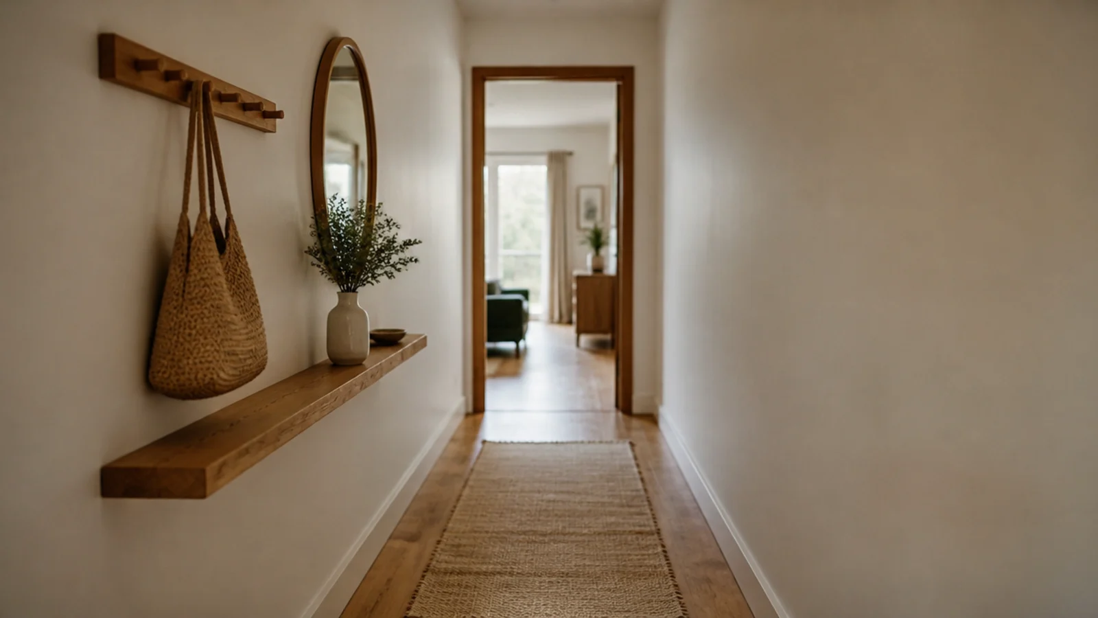
The jobs do not change with the style. An entry has five — a place to sit, a place for shoes, a place for coats, a landing surface for small items, and a mirror — and a working entry does at least three. Modern simply means doing them in one plane, so the wall reads as a single surface rather than four separate objects.
The numbers do not change either. Hooks at 52 inches, a lower rail at 40 for children, a floating console at 30 to 32 inches high and no deeper than 12, and a mirror centred at 57 to 60 with 6 to 8 inches between the surface and the frame. Under 36 inches of walkway clearance, drop the console and go fully wall-mounted.
Budget tiers: $ under $60, $$ $60–$150, $$$ $150 and up. Built-in joinery lands firmly in $$$, and every idea below has a cheaper or renter-safe version.
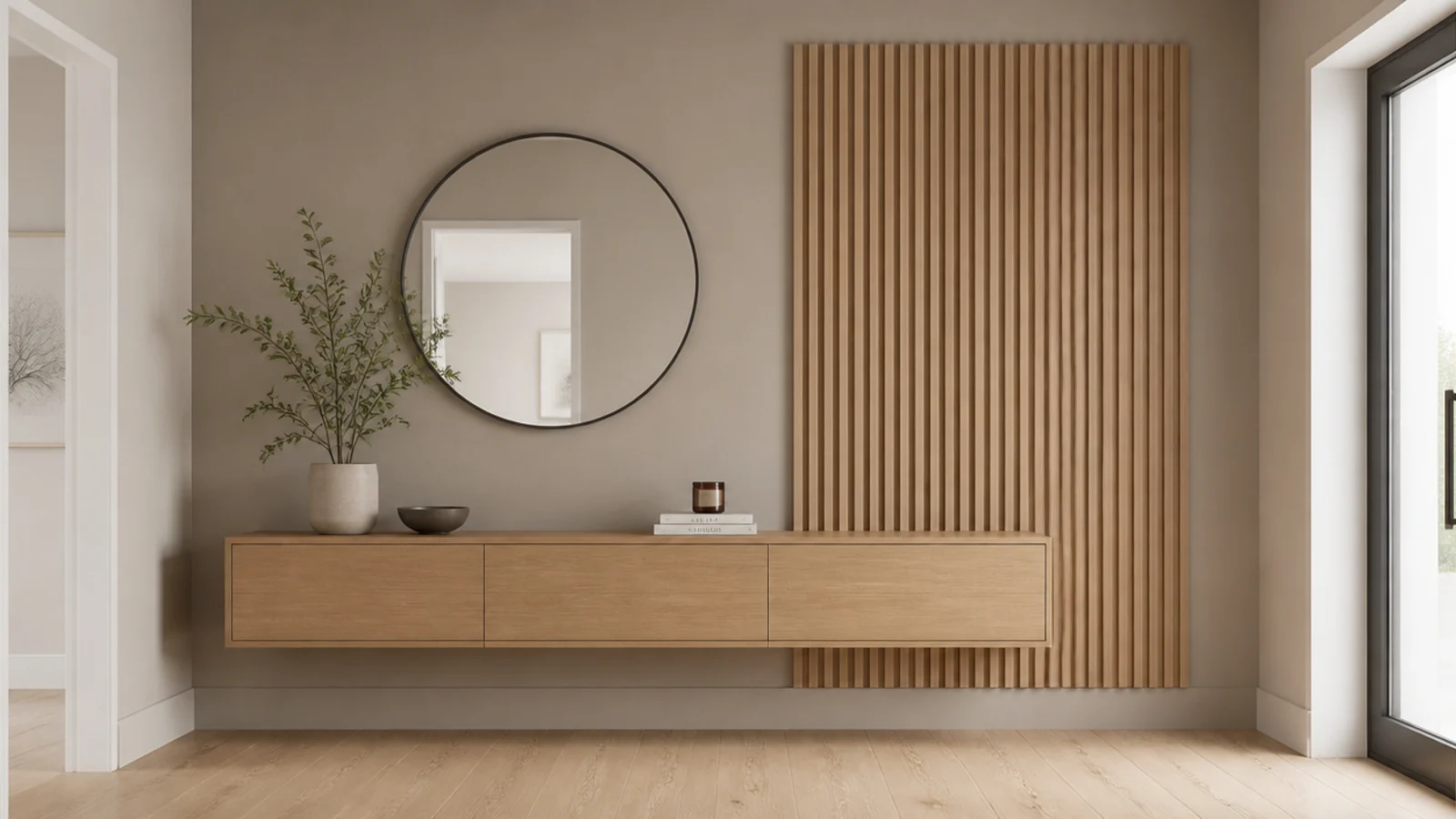
1. Put everything on one plane
Pick a depth and hold it. If the shoe cabinet is 12 inches deep, make the ledge 12 inches and the panelling flush with both.
Four separate objects at four different depths read as clutter no matter how minimal each one is. The same four at one depth read as a single designed wall. This costs nothing extra — it is a decision, not a purchase, and it is the difference between modern and merely sparse. Free
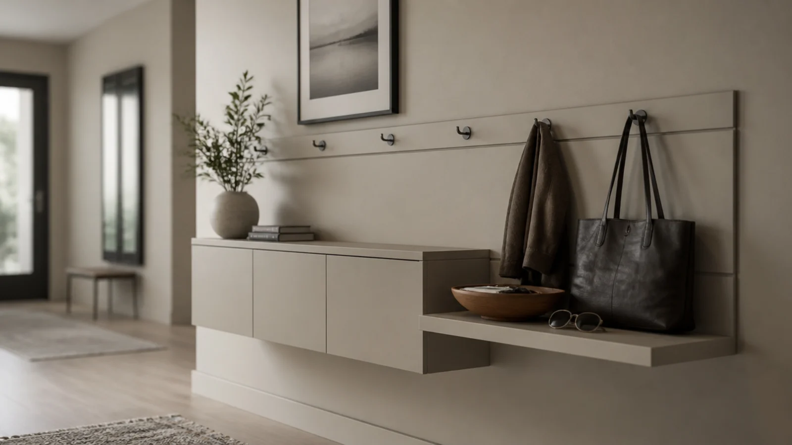
2. A floating console with concealed brackets
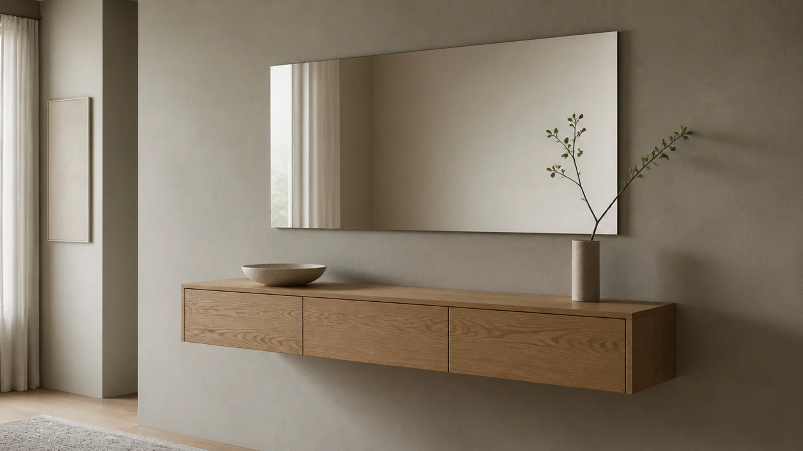
Legs create shadow, dust traps and visual noise. A floating console on a hidden French cleat or steel rod brackets leaves the floor running unbroken underneath.
Twelve inches deep, 30 to 32 high, fixed into at least two studs. A 36-inch floating oak ledge runs $80 to $200, and a plain board on concealed brackets can be built for about $45. Renters: two toggle bolts and a 6-inch shelf give most of the effect. $$–$$$
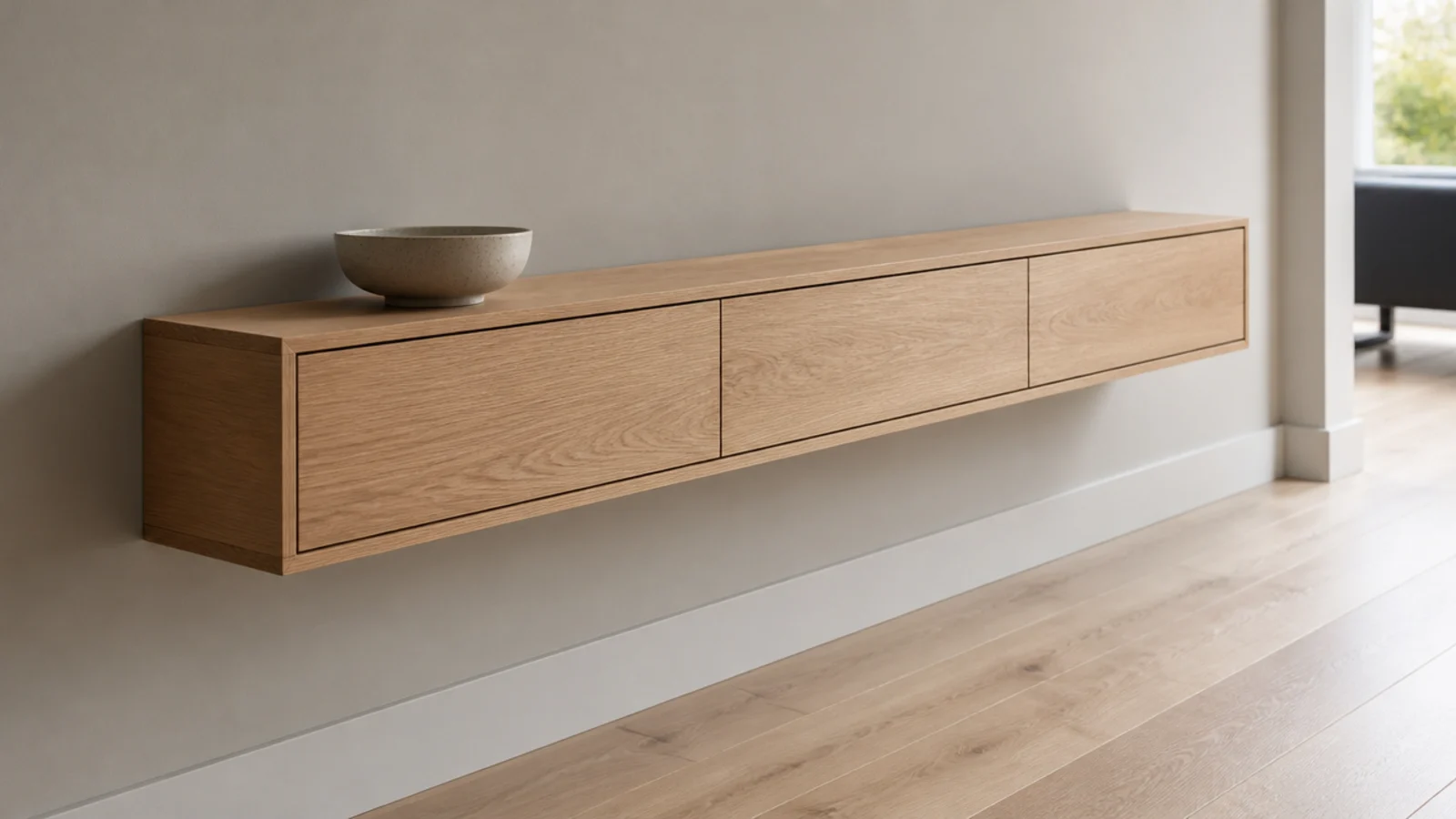
3. Handleless fronts with push latches
Handles are the most visually busy element in any entry joinery. Push-to-open latches cost about $3 each and remove them entirely.
They also stop sleeves catching in a narrow hall, which matters more daily than it sounds. Fit two latches per door on anything wider than 18 inches so the door does not rack. Existing cabinet? Removing the handles and adding latches is a $20 afternoon. $
4. One continuous material
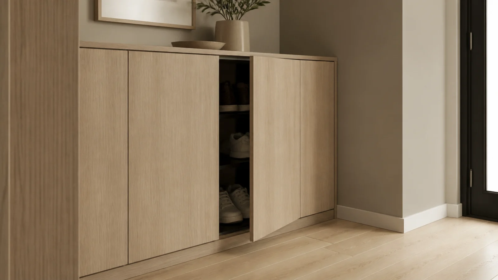
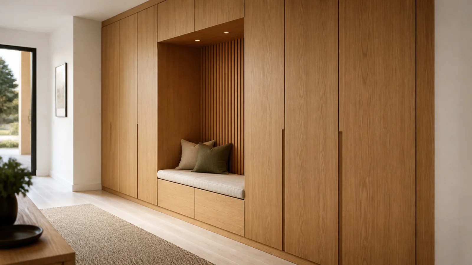
One wood, one grain direction, across every front. Matching the grain is what makes joinery read as architecture rather than as furniture pushed together.
If the budget will not stretch to real veneer, paint everything the same colour instead — a single flat tone does the same unifying job. What you must avoid is two similar-but-different woods, which reads as a mistake rather than a mix. $$–$$$
5. A key slot cut into the joinery
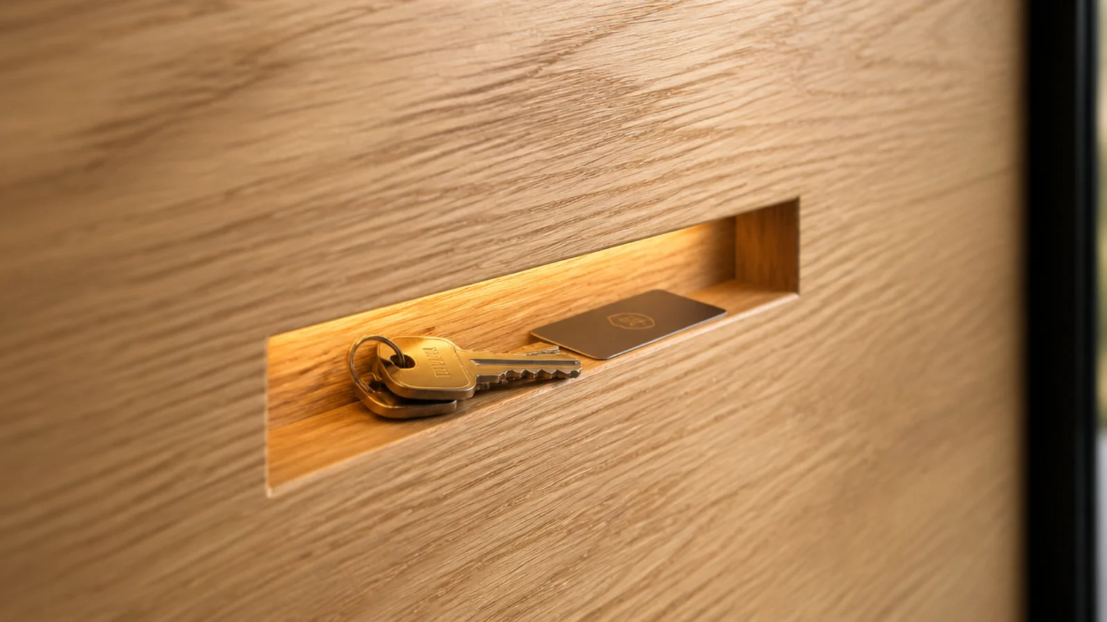
Instead of a tray, route a narrow recess into the top surface — about 8 inches long, 2 wide and half an inch deep — and let keys and cards live in it.
The surface stays completely flush, which is the whole modern proposition. If you are not cutting joinery, the equivalent is a tray that sits within the depth of the shelf rather than proud of it. One container, either way. $
6. Light washing down from under the float
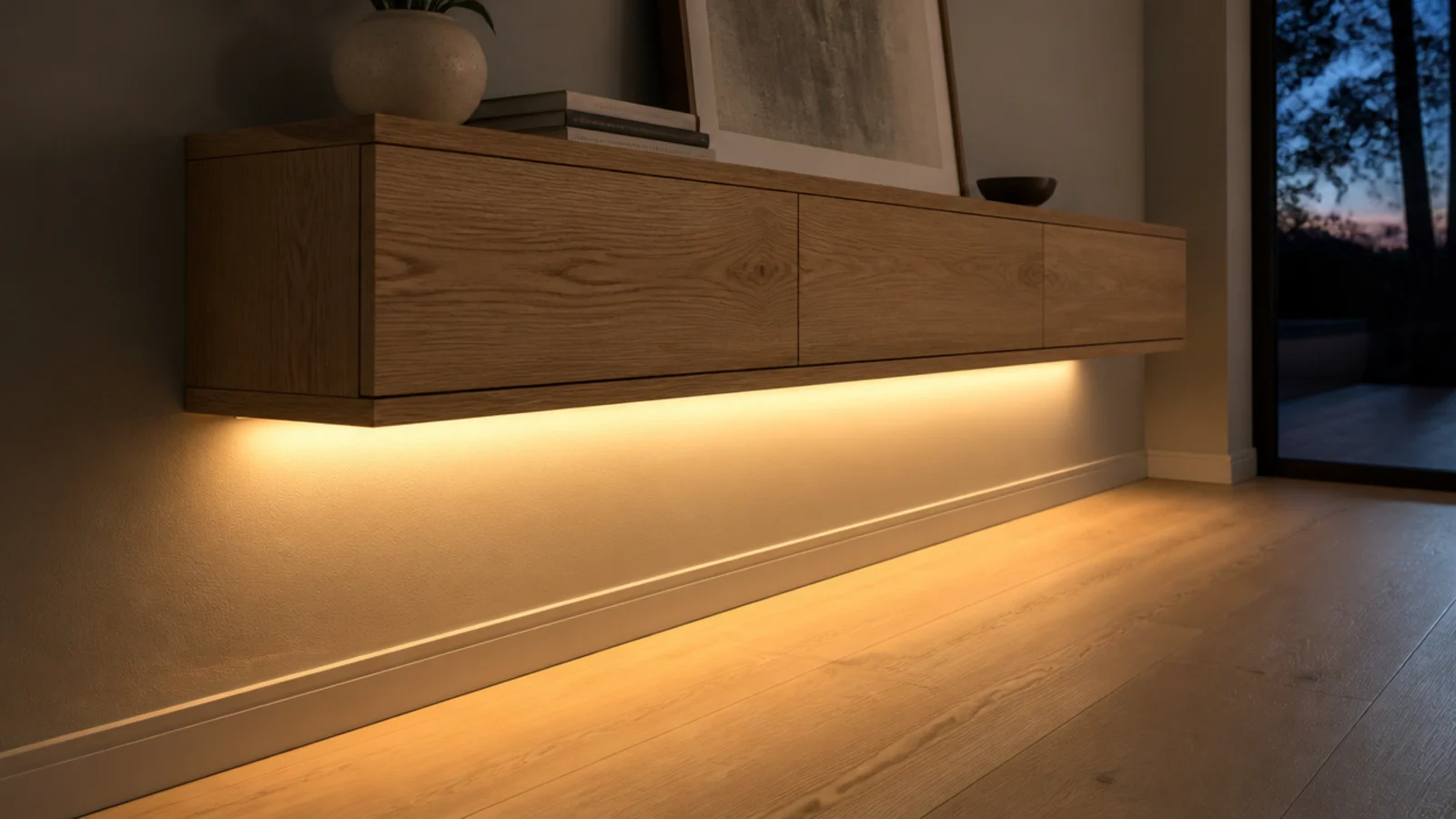
A concealed LED strip under a floating console makes the whole unit appear to hover and gives you a second light layer without a single visible fitting.
Warm white at 2700K, dimmable, aimed down the wall rather than out into the room. Hardwired versions cost $40 to $90; a rechargeable magnetic strip does the same for $20 and needs no electrician at all. $–$$
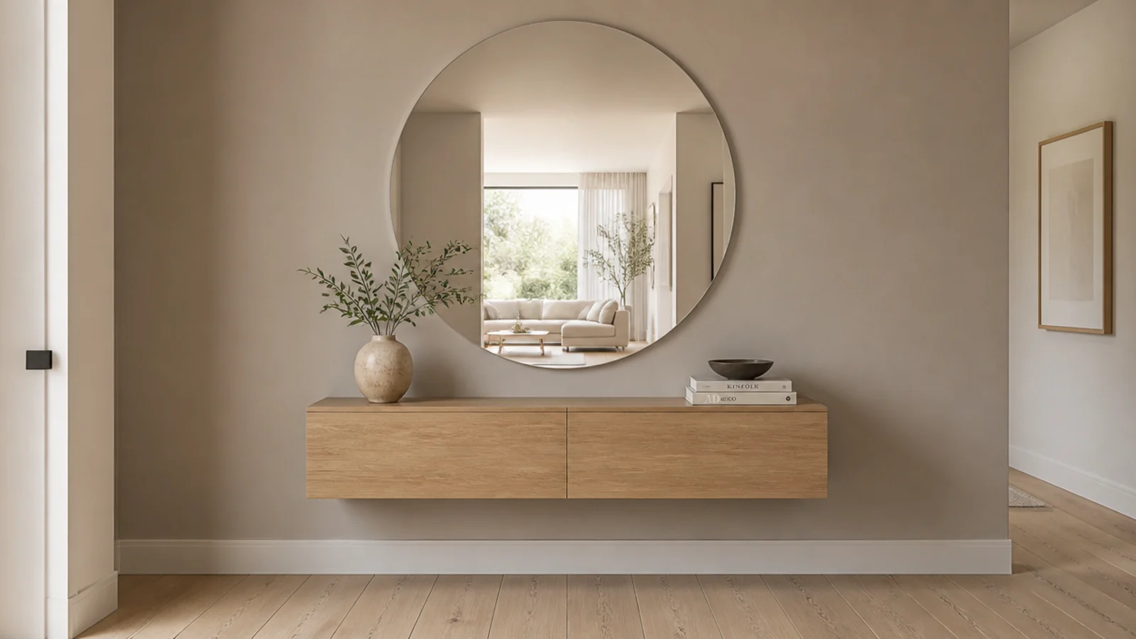
7. A frameless round mirror
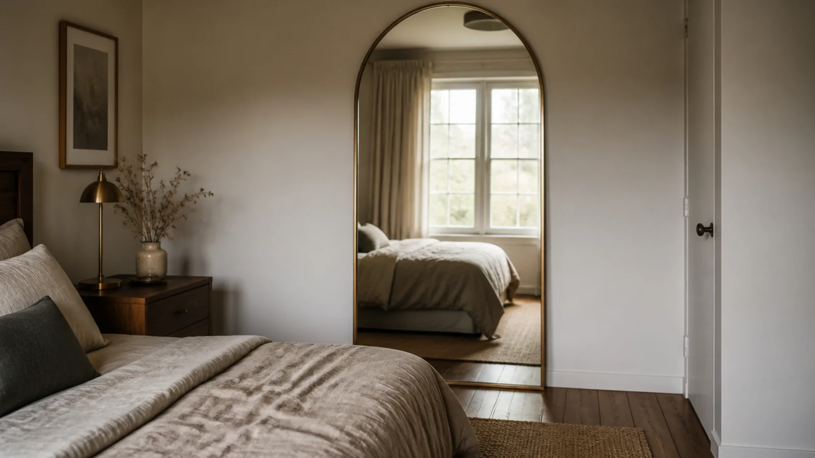
A frame adds a competing line. A polished-edge round mirror mounted flush gives you reflection without any outline at all, and the circle softens a wall made entirely of rectangles.
Twenty-four to 30 inches across, centred at 57 to 60 inches high. Hang it on the wall that reflects the room beyond rather than the front door. There is more sizing detail in mirror wall decor ideas. $$
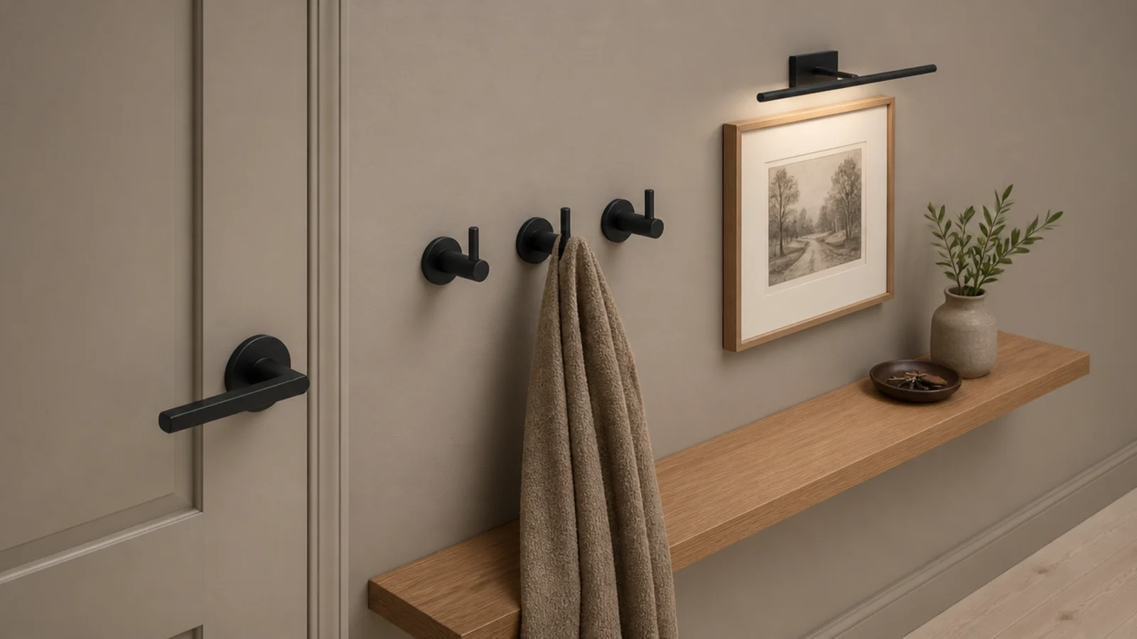
8. One hardware finish, everywhere
Hooks, door lever, latch pulls and light fittings in a single finish. Matte black is the easiest in a cool palette; brushed brass warms a greige wall considerably.
Two finishes can work in a large hall where each appears several times. In a small foyer, one lonely chrome object among black hardware reads as an oversight from the doorway. Swapping a door lever takes twenty minutes. $
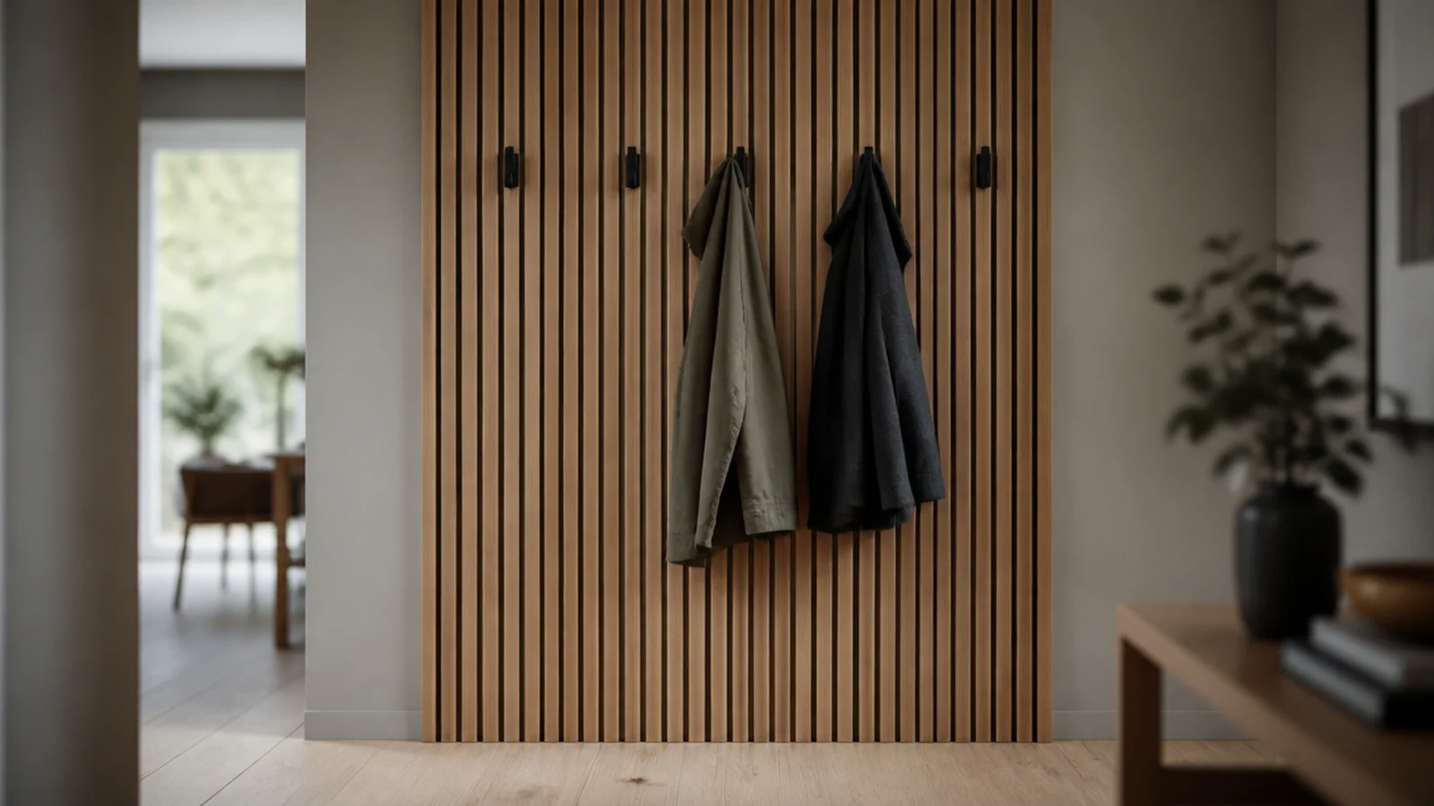
9. Vertical slat panelling behind the hooks
Slats do three things at once: they hide the scuffs that entry walls collect, they draw the eye upward so a low ceiling reads taller, and they give a flat wall texture without pattern.
Run them floor to ceiling on the coat wall only. Real oak slat panels run $30 to $60 a square metre; peel-and-stick slat boards give renters the same look and lift off cleanly. $$
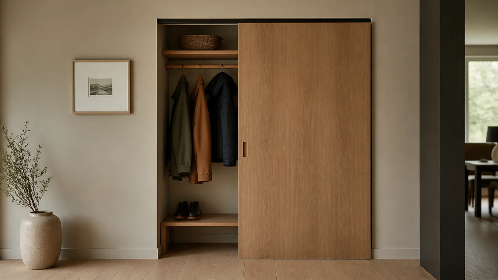
10. Coats behind a sliding panel
Hanging coats are the single biggest visual load in any entry. A flat sliding panel on a slim top track hides all of them and keeps the wall reading as one surface.
Track and panel run $120 to $250. The renter version is a floor-length linen curtain on a tension rod for about $30, which removes exactly as much visual noise for a tenth of the cost. $–$$$
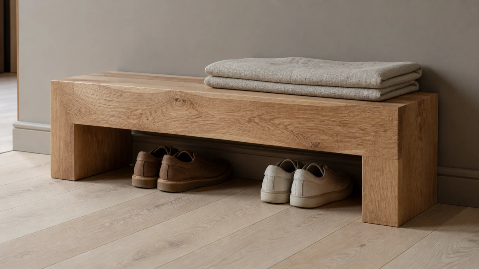
11. A monolithic bench in one material
A block bench with square edges and no visible legs or joints reads as sculpture rather than furniture. Eighteen inches high, 14 to 16 deep, the same wood as everything else.
Solid oak is expensive; a plywood box clad in veneer and finished with hardwax oil gets there for about $120 in materials. Leave 36 inches of walkway in front of it whatever it is made of. $$–$$$
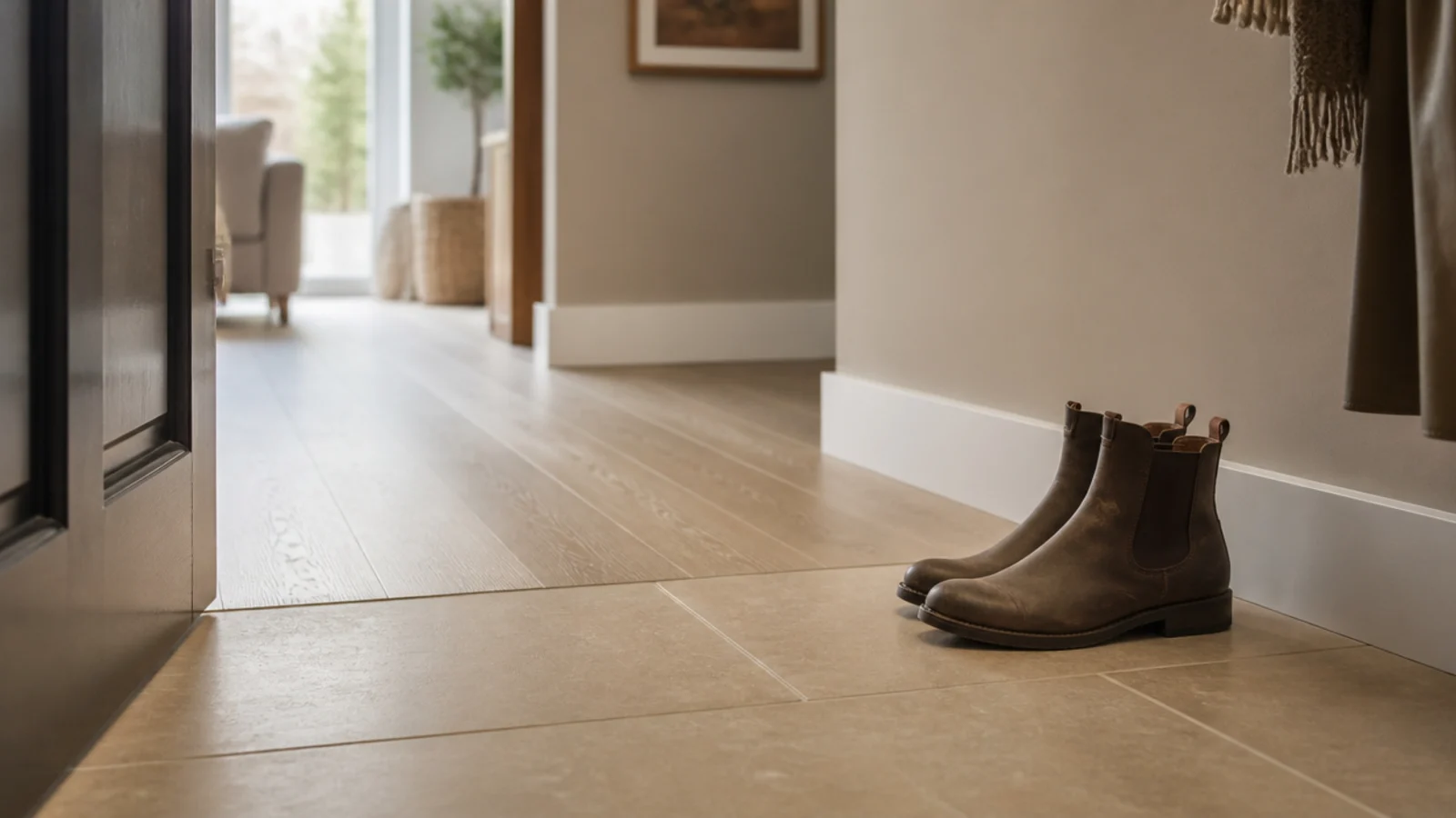
12. A tiled landing zone at the door
Large-format tile or microcement inside the door gives wet boots somewhere to land that is not your floorboards, and the change of material marks the entry without a single wall.
Keep the join line straight and square to the door. Three by three feet is enough. Peel-and-stick large-format vinyl gets renters the same effect for $2 to $4 a square foot. $–$$
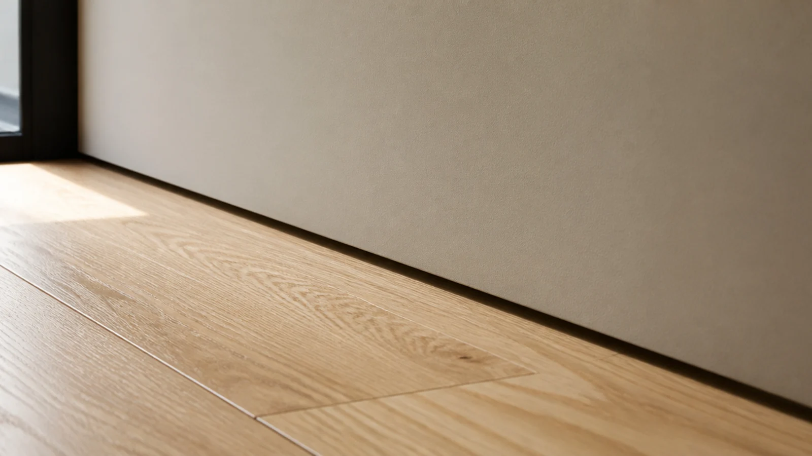
13. A shadow gap instead of baseboard
A recessed gap where the wall meets the floor replaces a trim profile with a line of shade. It is the cleanest possible junction and it costs almost nothing in a new build.
Retrofitting is not practical, so the achievable version is painting the existing baseboard the exact wall colour. That removes the horizontal line and makes the wall read taller for the price of a sample pot. Free–$
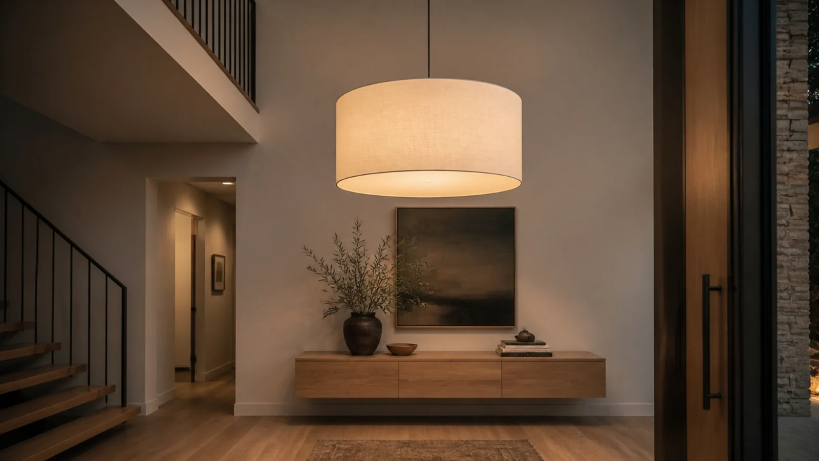
14. One oversized pendant
Modern entries are ruined by three small fixtures doing a job one large one would do better. A single generous pendant is calmer and reads as deliberate.
Hang it so the bottom sits at least 7 feet from the floor in a normal hall, lower in a double-height foyer where the drop is the point. Linen or frosted glass diffuses better than anything with an exposed bulb. $$
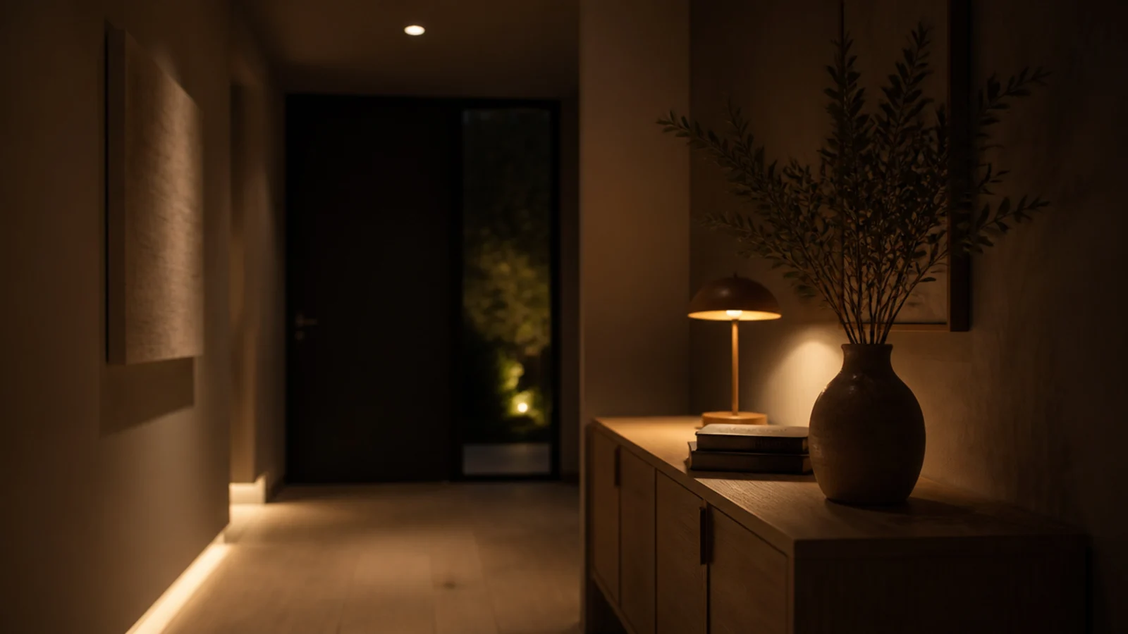
15. Warm bulbs on a dimmer, everywhere
Cool white light is the single biggest reason modern entries feel clinical. Every bulb in the space should be 2700K, and every switch should dim.
A single ceiling fixture flattens an entry regardless of colour temperature, so add a lamp or a picture light as a second layer. A dimmer switch is about $20 and takes fifteen minutes; a smart bulb does it with no wiring at all. $
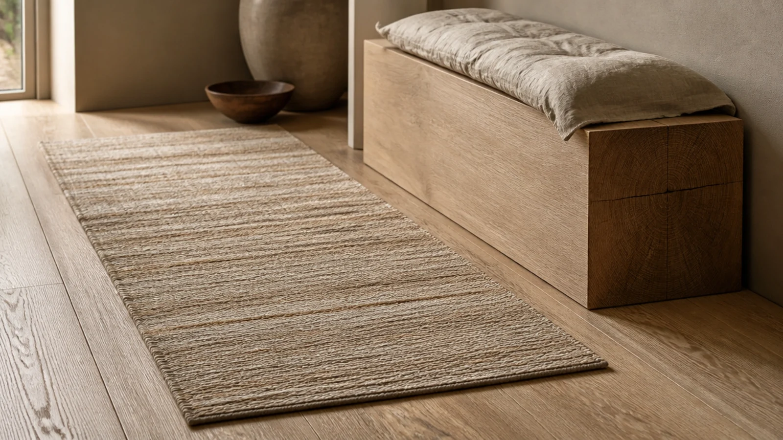
16. Let wool and linen do the warming
Hard, flat, clean surfaces need one soft thing to land on. A flat-weave wool runner and a linen cushion on the bench are usually the whole answer.
Flat-weave and washable, because a modern entry takes the same grit as any other — a deep pile mats down in the traffic lane and looks tired within a winter. Leave 4 to 6 inches of bare floor on each side. $$
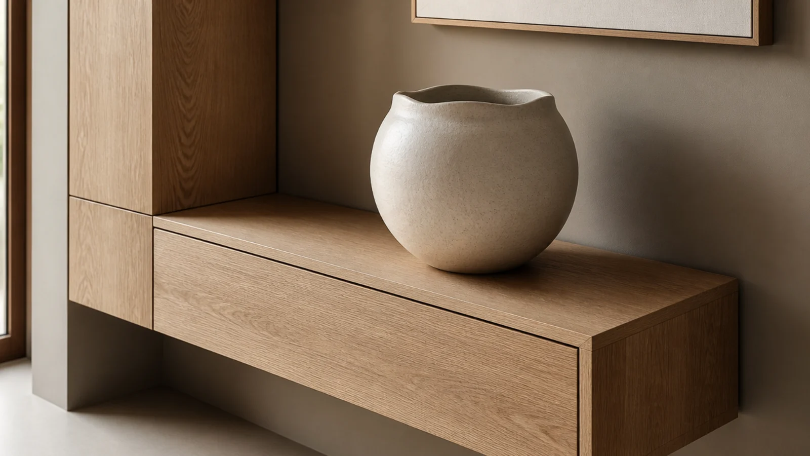
17. One organic shape to break the grid
In a space made of straight lines, a single curved object does an enormous amount of work — a round mirror, a rounded stoneware vessel, a woven basket with a soft rim.
One is the number. Two curves start to look like a theme, and none makes even a beautiful entry feel like a corridor. Put it on the surface where the eye lands first. $
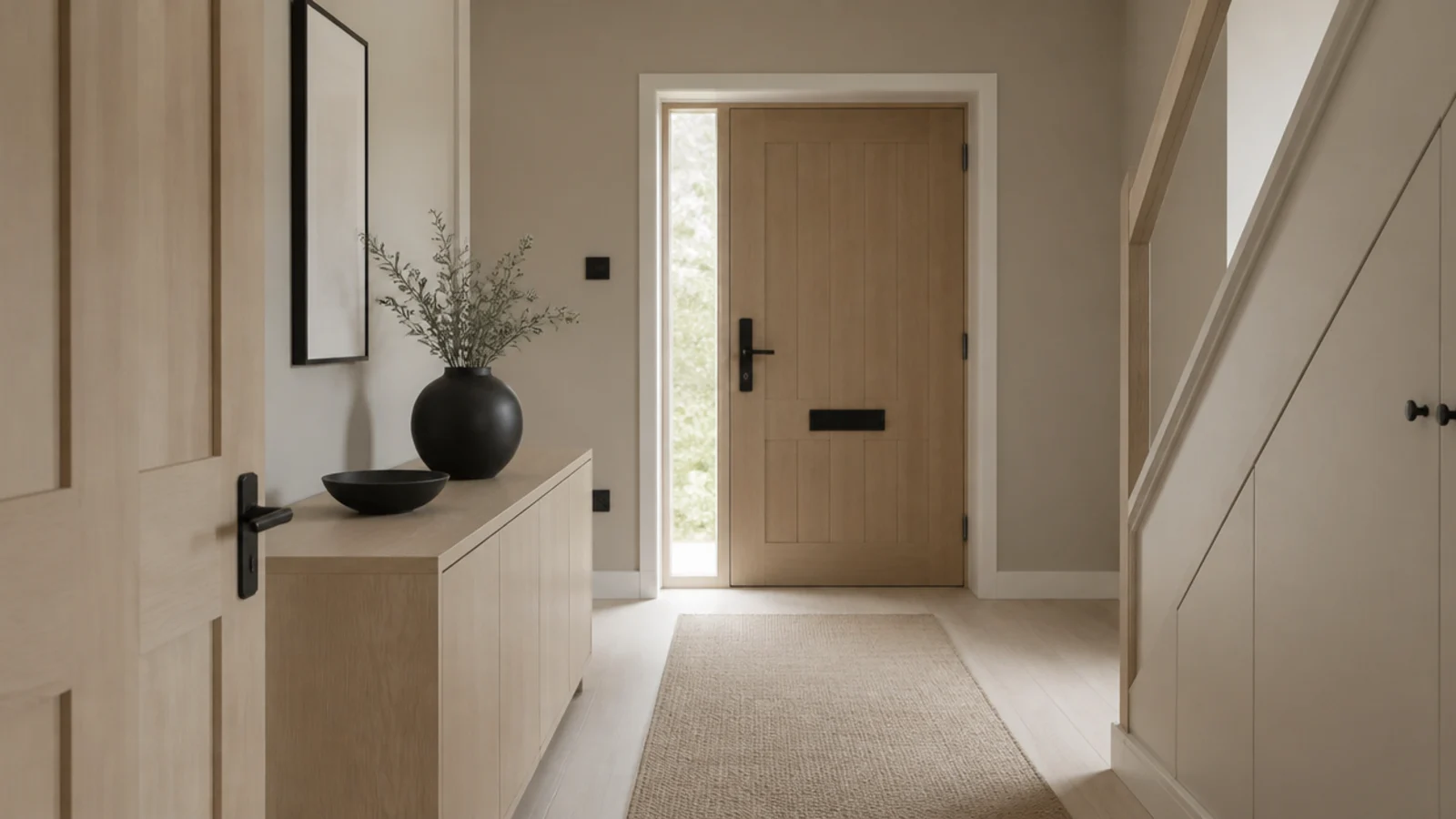
18. A three-tone palette
One wall colour, one wood, one metal. Warm greige, pale oak and matte black is the most forgiving combination there is, and it photographs well in almost any light.
The fourth tone is where clean-lined entries go wrong. If you want more interest, get it from texture — slats, weave, matte against satin — rather than from another colour. Free
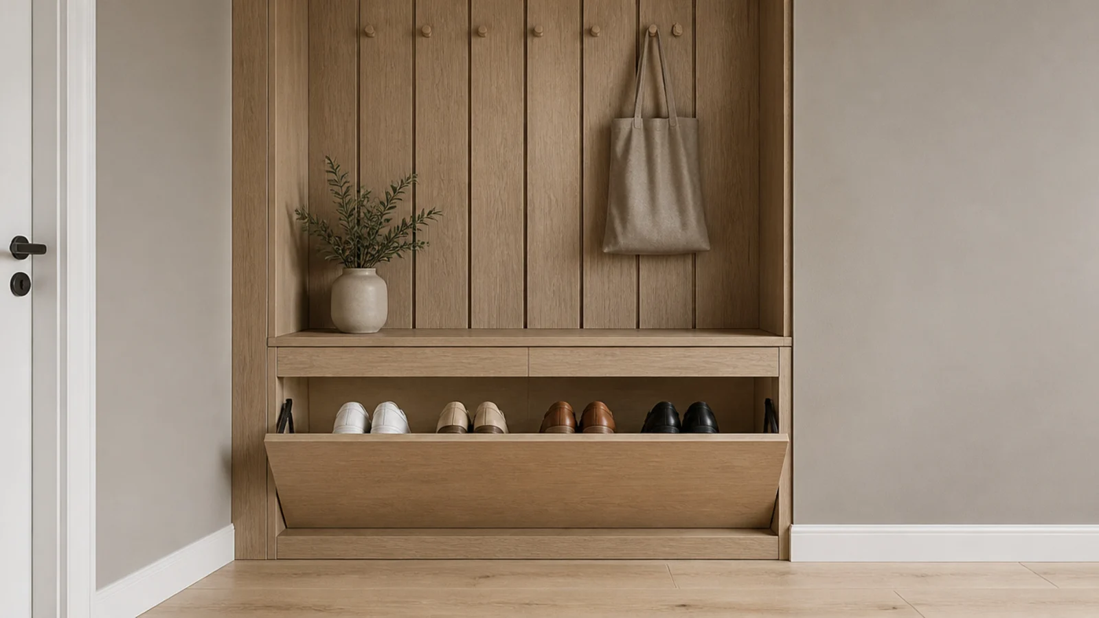
19. Hidden shoe storage at nine inches deep
Shoes are the job that ruins a minimal entry fastest. A tilt-out drawer 9 inches deep swallows a 12.5-inch sneaker because the shoe sits at 45 degrees.
Two drawers hold six to eight pairs and no boots, so plan a floor tray for those. Integrated into joinery it is invisible; freestanding versions start around $80. Modern shoe cabinets covers the options. $$
20. Two objects on the surface, and nothing more
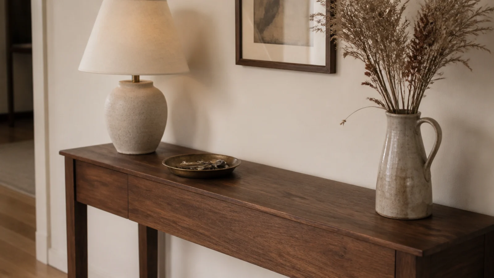
The restraint is the style. A low bowl and one branch in a narrow vessel is a complete arrangement on a modern console.
Leave the rest bare, including a genuine gap where a bag can land — a floating shelf with no free space gets used as a shelf anyway, just untidily. Styling the surface properly is covered in entryway table decor. $
Mistakes to Skip
- Using 4000K bulbs because they look crisp in the showroom. In a small foyer at night they read as an office corridor, and no amount of oak will warm that up.
- Mixing three different depths on one wall. Even minimal pieces read as clutter when the plane keeps stepping in and out.
- Leaving every surface hard. Without a wool runner or a linen cushion, a clean-lined entry echoes and feels unfinished the moment somebody walks in.
Frequently asked questions
How do you make a modern foyer feel warm?
Warmth comes from material and light, not from adding objects. Use one wood tone across the joinery, keep every bulb at 2700K on a dimmer, and let a wool runner and linen do the softening. A modern entry that feels cold almost always has cool white light and a single ceiling fixture doing all the work.
What does a modern entryway need?
The same five jobs as any entry — a place to sit, a place for shoes, a place for coats, a landing surface and a mirror — with at least three of them handled. Modern simply means handling them in one plane: floating joinery, concealed fixings and a single material, so the wall reads as one surface rather than four objects.
Can renters get a modern entryway look?
Yes, with three swaps. A wall-mounted ledge on two toggle bolts replaces built-in joinery, a freestanding slim shoe cabinet replaces integrated storage, and a rechargeable strip light gives you the concealed glow without wiring. Slat panelling also comes as peel-and-stick boards that lift off cleanly at move-out.
What colours work in a modern foyer?
Three tones, no more: one wall colour, one wood, one metal. Warm greige, oak and matte black is the most forgiving combination and photographs well in almost any light. Adding a fourth tone is the most common reason a clean-lined entry starts to look busy despite having very little in it.
How deep should modern entryway joinery be?
Twelve inches at most for a floating console, and 9 inches for shoe storage, since shoes stored at a 45 degree tilt need far less depth than shoes lying flat. Keeping everything at one depth is what makes the wall read as a single plane, which is the whole point of the look.
Hold one depth, one wood, one metal and one colour temperature, and a modern entry will feel calm rather than cold — the warmth comes from restraint plus texture, not from adding things back. For tight halls where the joinery has to go fully vertical, narrow entryway ideas has the depth limits, and fifteen entryway ideas covers the underlying heights. Save the pin so the numbers are with you when you plan the wall.
Want more like this? Browse all 15 entryway & foyer ideas guides — they all use the same measurements and budget tiers.
Pin it for later
Save this to your Entryway & Foyer Ideas board
Pin it now so it is waiting for you when the tape measure comes out — and so the next person hunting for this idea can find it too.
Save this pinKeep going
More ideas worth saving while you have the tape measure out.