Bookshelf Ideas · Listicle
20 Creative Bookshelf Ideas Anyone Can Do

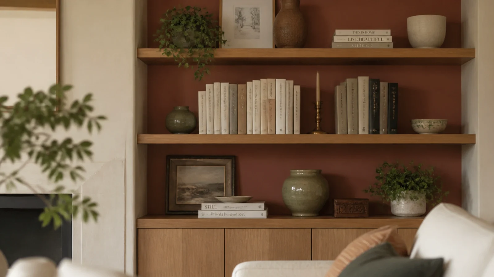
Colorful bookshelf ideas usually go wrong in the same direction: someone sorts every spine into a rainbow, photographs it once, and then lives with a wall that reads flat for the next three years. Color on a shelf works better when it comes from surfaces and objects rather than from the books themselves. Here are twenty ways to do that, all of them reversible, most of them under $40, and none of them requiring you to alphabetize anything.
In this guide22 sections — tap to openHide
- 1.How colorful bookshelf ideas stay warm instead of loud
- 2.Paint the back panel a single muted terracotta
- 3.Color-drench the case and the wall together
- 4.Paint the frame and leave the shelves raw oak
- 5.Peel-and-stick the back panel instead of painting it
- 6.Paint only the front edges of the shelves
- 7.Line an alcove in sage and stop at the trim
- 8.Run one color band across a single shelf
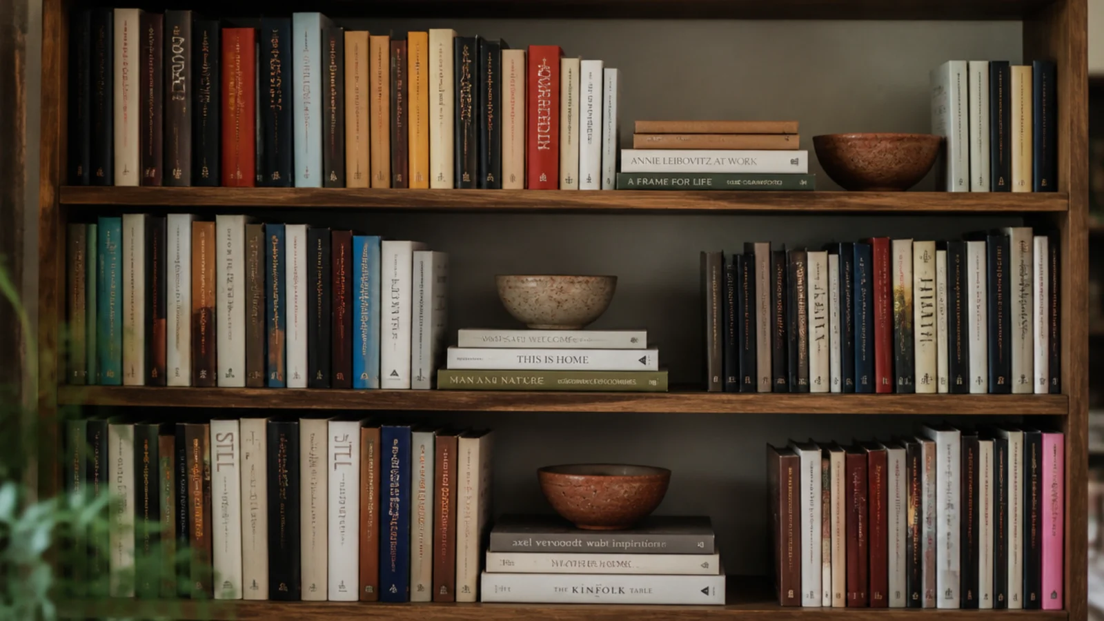
- 9.Take the dust jackets off
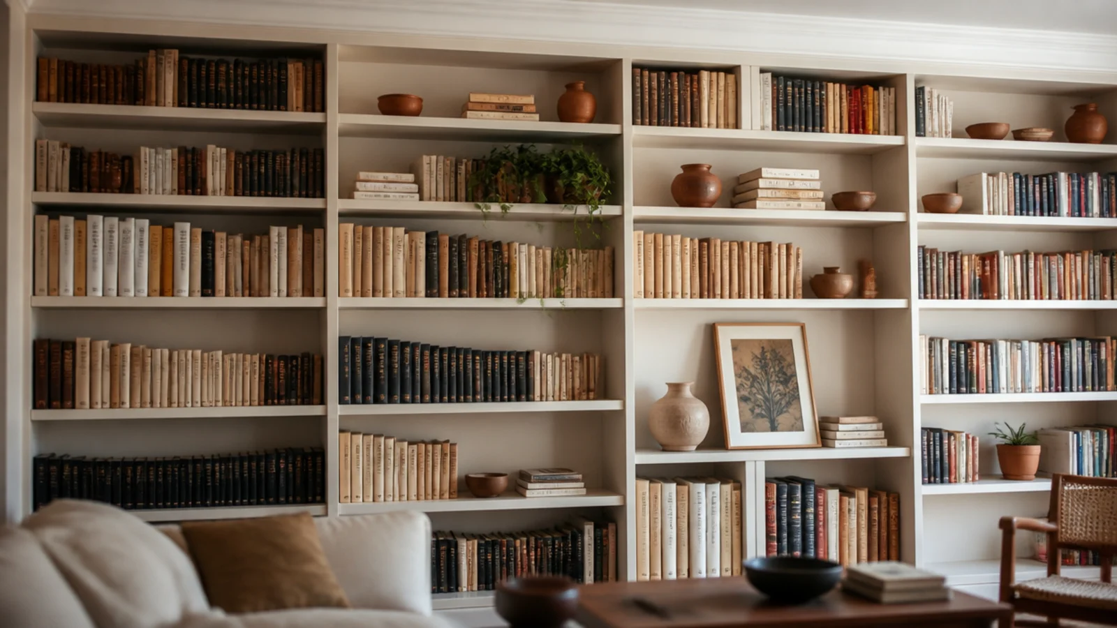
- 10.Repeat terracotta pots as a color rhythm
- 11.Keep the stoneware to three glaze tones
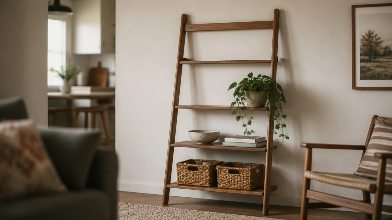
- 12.Let jute and rattan be your warm neutral
- 13.Put colored glass where the light lands
- 14.Lean one big print as the color anchor
- 15.Add dried grasses in ochre and rust
- 16.Choose brass as the one metal
- 17.Swap plastic bins for linen-covered boxes
- 18.Color-block the bottom third of a tall case
- 19.Back the shelves with fabric instead of paint
- 20.Group by height and let the color fall where it lands
- 21.Light it at 2700K or the color dies
- 22.Mistakes to Skip
How colorful bookshelf ideas stay warm instead of loud
There are two separate decisions on a colorful shelf, and mixing them up is what causes the trouble. Arrangement is one decision. Color is the other.
Arrangement should follow height. Group books and objects into descending steps, alternate horizontal stacks with vertical rows, and leave roughly a third of every shelf empty. That structure is what your eye actually navigates. Sorting by color removes it, which is why rainbow shelves look busy and static at the same time.
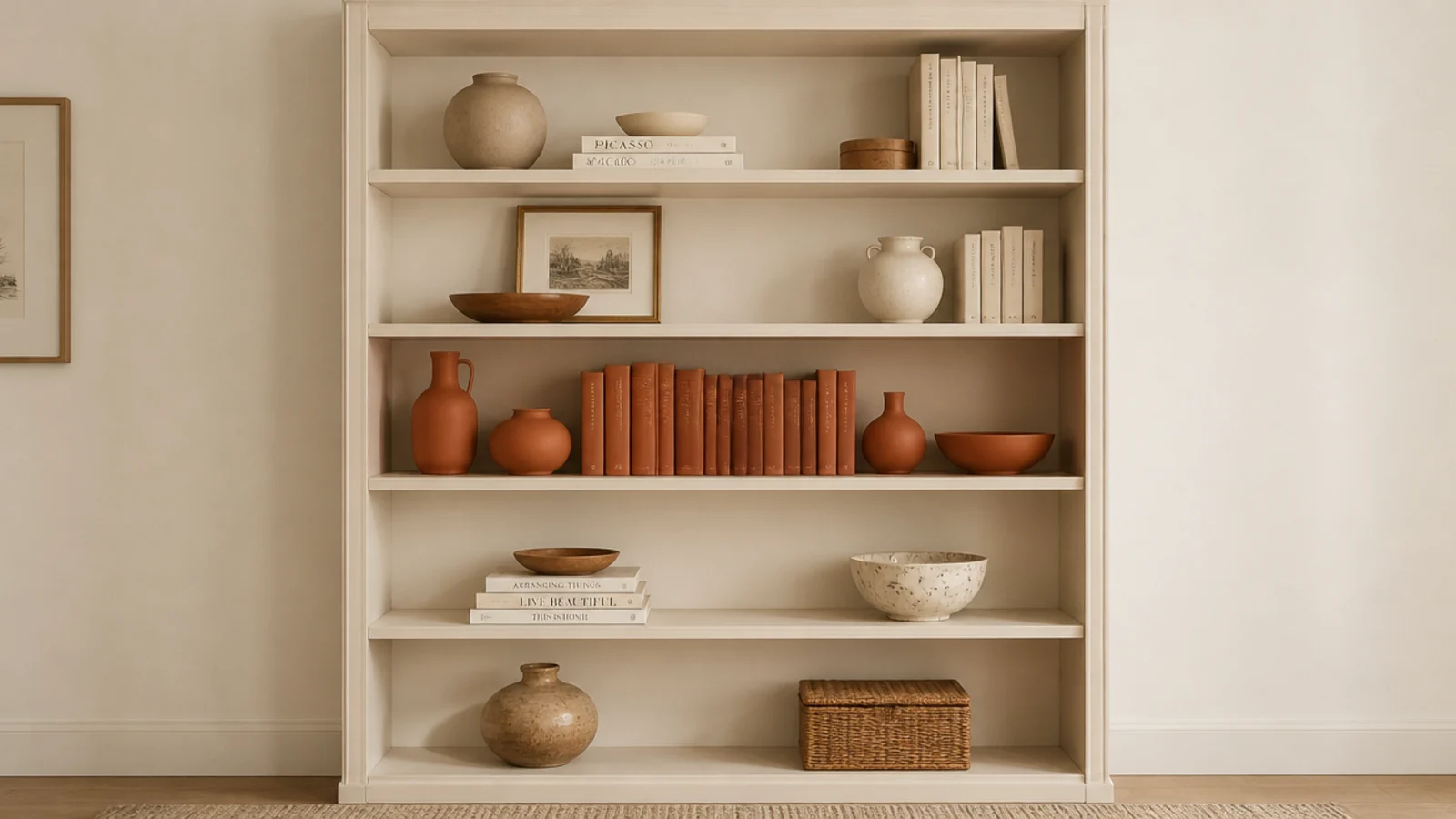
Color should then arrive on the surfaces behind and between those groups: a painted back panel, repeated clay pots, one leaning print, one metal. Keep it to a single painted surface plus two accent tones across the whole case, and it will read considered from across the room.
The practical numbers still apply. Shelf depth wants 11 to 12 inches for hardbacks and 9 to 10 for paperbacks, with 11 to 13 inches of clear height so a hardback stands up. A linear foot of hardbacks weighs 20 to 25 pounds, so a 36-inch shelf carries 60 to 75 and needs studs or a mid support. And 3/4-inch stock sags past a 32-inch span unless you add a front lip.
Budget tiers below: $ under $50, $$ $50 to $150, $$$ $150 and up.
1. Paint the back panel a single muted terracotta
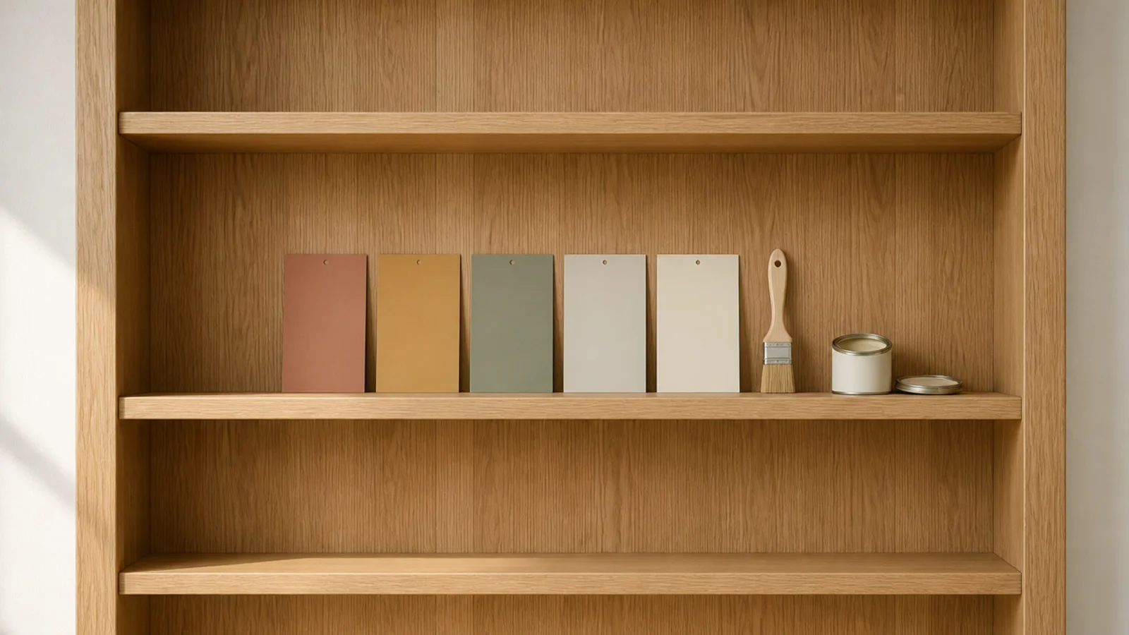
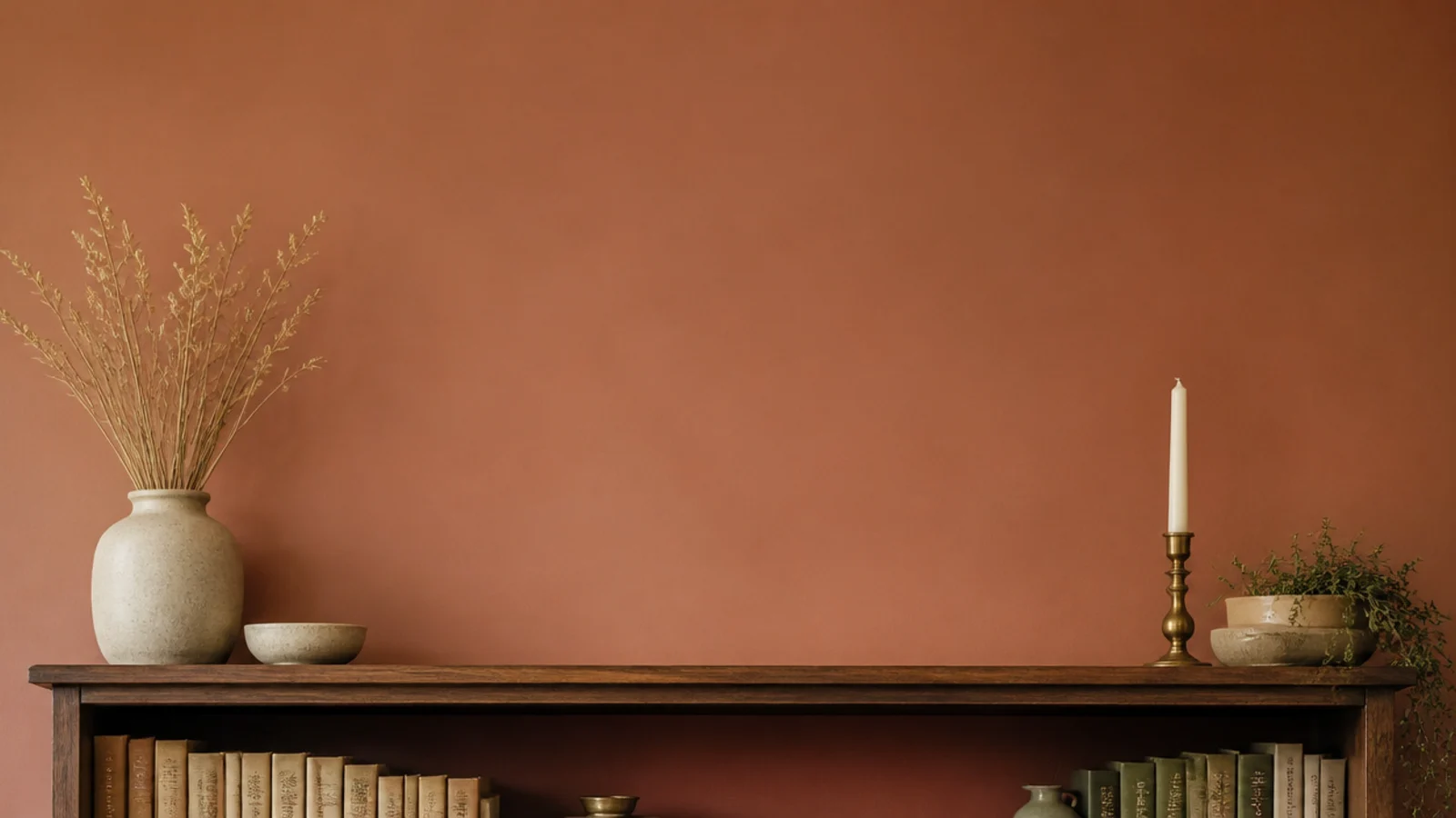
The back panel is the highest-leverage surface in any bookcase, because you only ever see it in narrow slivers between objects. That means a color reads two or three times stronger there than it does on a test card.
Choose a muted terracotta or warm clay rather than anything bright. One sample pot, about $9 ($), covers the back of a standard 30-inch case in two coats. Use a matte or eggshell finish so it absorbs light rather than bouncing it back at you.
2. Color-drench the case and the wall together
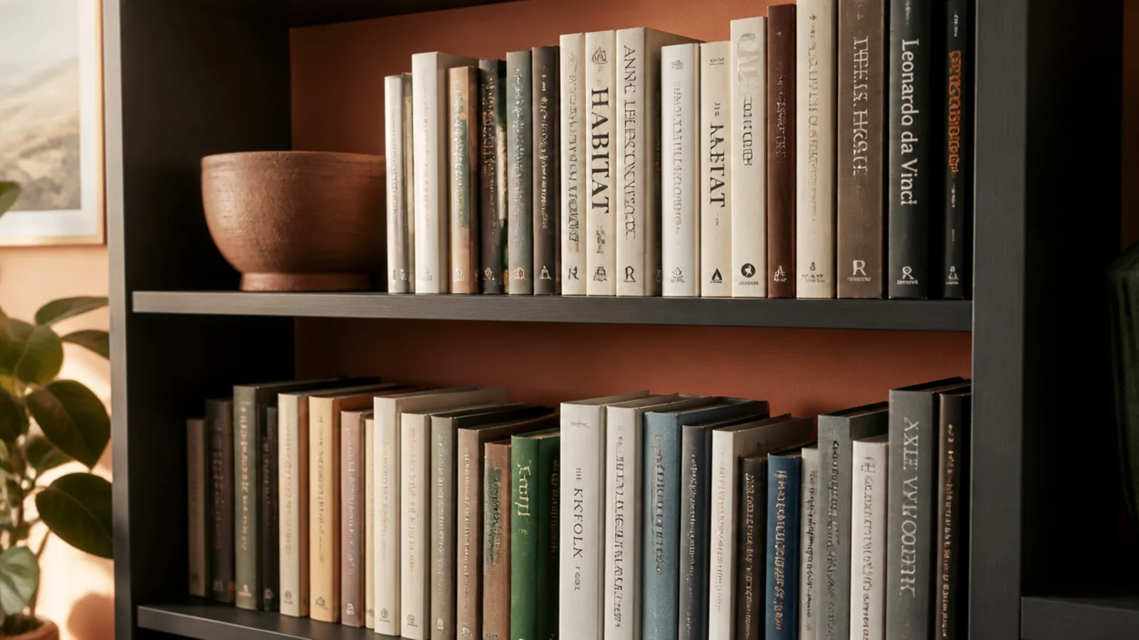
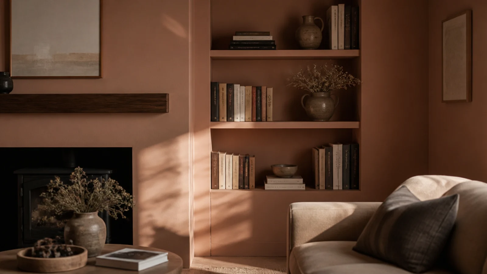
Painting a bookcase its own contrasting color makes it read as furniture stuck to a wall. Painting the case, the wall and the trim the same tone makes the whole thing read as architecture.
This is the trick that makes a $120 flat-pack unit look built in. Use eggshell on the woodwork and matte on the wall so the sheen difference gives you a subtle edge. Two liters of paint runs $35 to $60 ($) and covers an alcove unit comfortably.
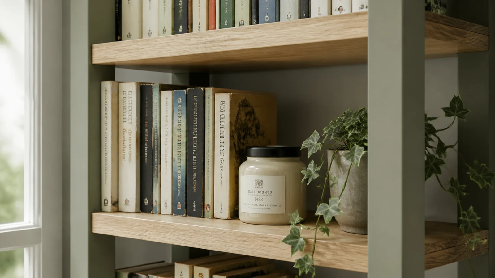
3. Paint the frame and leave the shelves raw oak
A halfway version that suits anyone nervous about committing. Paint the uprights and the top in a muted sage or clay, and leave the horizontal boards as bare oak or pine.
The result reads as color with the grain still visible, and it costs one sample pot. It also disguises the cheapest part of most flat-pack units, which is the frame, while keeping the good surface — the board your books sit on — honest. Seal the raw boards with a clear matte oil so they do not mark.
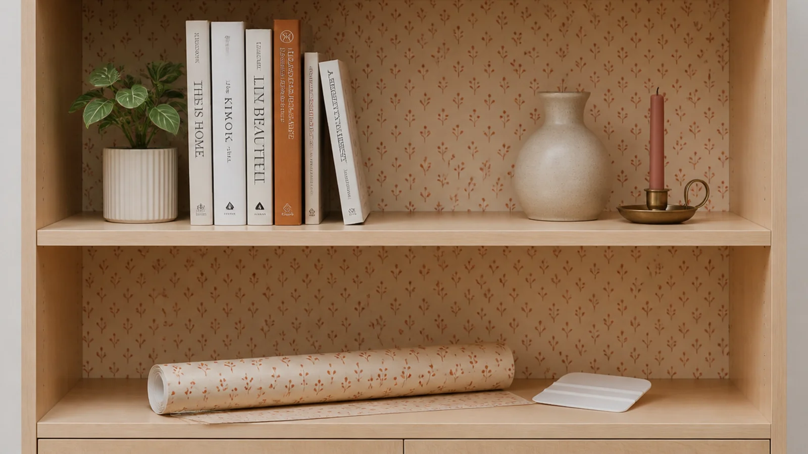
4. Peel-and-stick the back panel instead of painting it
If you rent, the back panel is still available to you. Cut peel-and-stick paper to the internal width and apply it directly to the rear board, or to a sheet of thin card you slot in behind.
Small repeating patterns work better than large ones here, because you only see fragments. Budget $15 to $40 ($) for enough to cover a standard case, and keep the offcuts — you will want to patch a corner eventually. It peels off cleanly in about ten minutes.
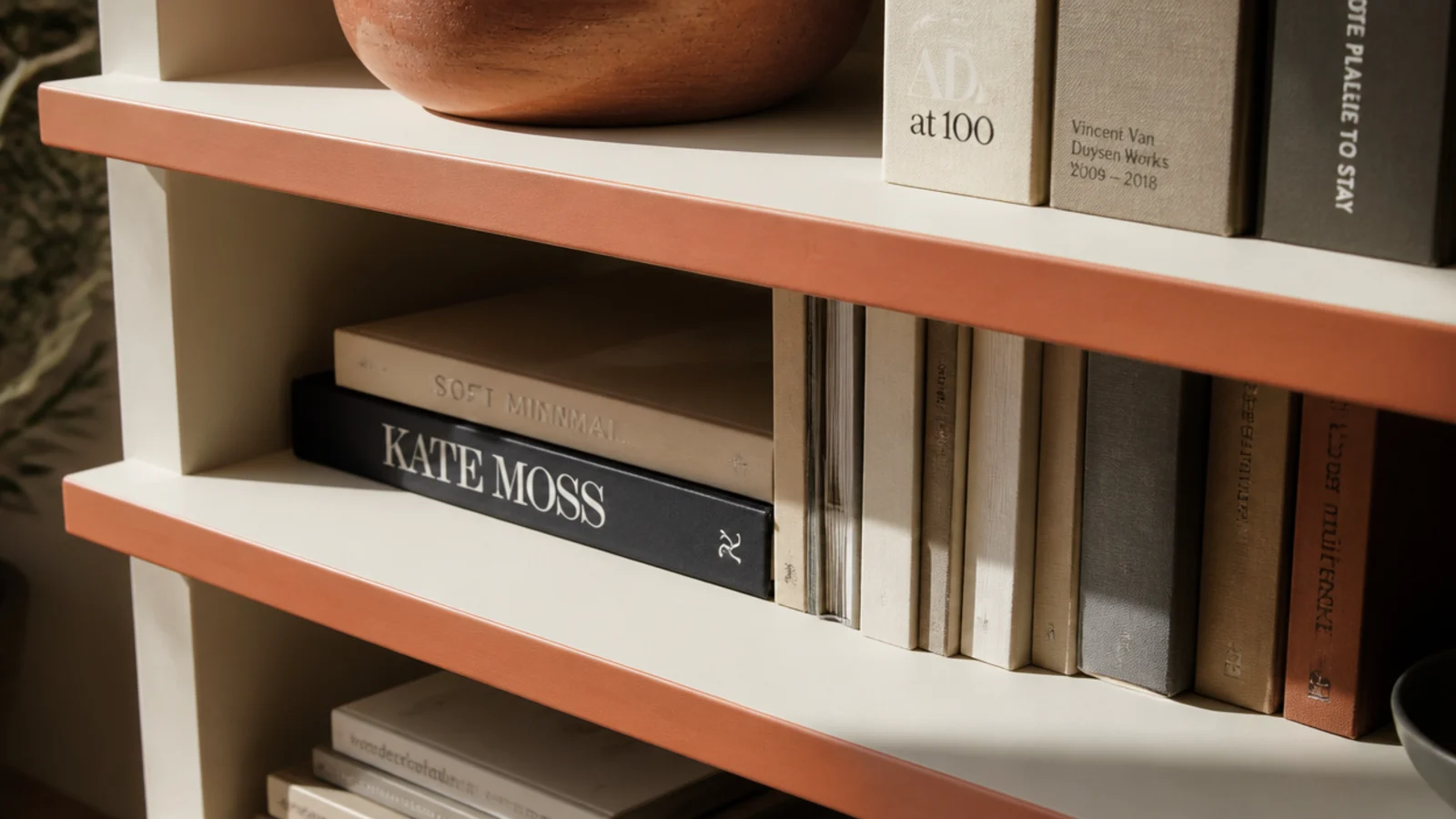
5. Paint only the front edges of the shelves
The narrowest possible dose of color, and one of the most effective. Paint just the 3/4-inch front face of each board in a clay or ochre tone and leave every other surface as it was.
From straight on you see a set of thin horizontal color lines that give the case a rhythm. From an angle, the color mostly vanishes. It takes an hour, one sample pot and a roll of painter's tape, and it is completely repaintable if you tire of it.
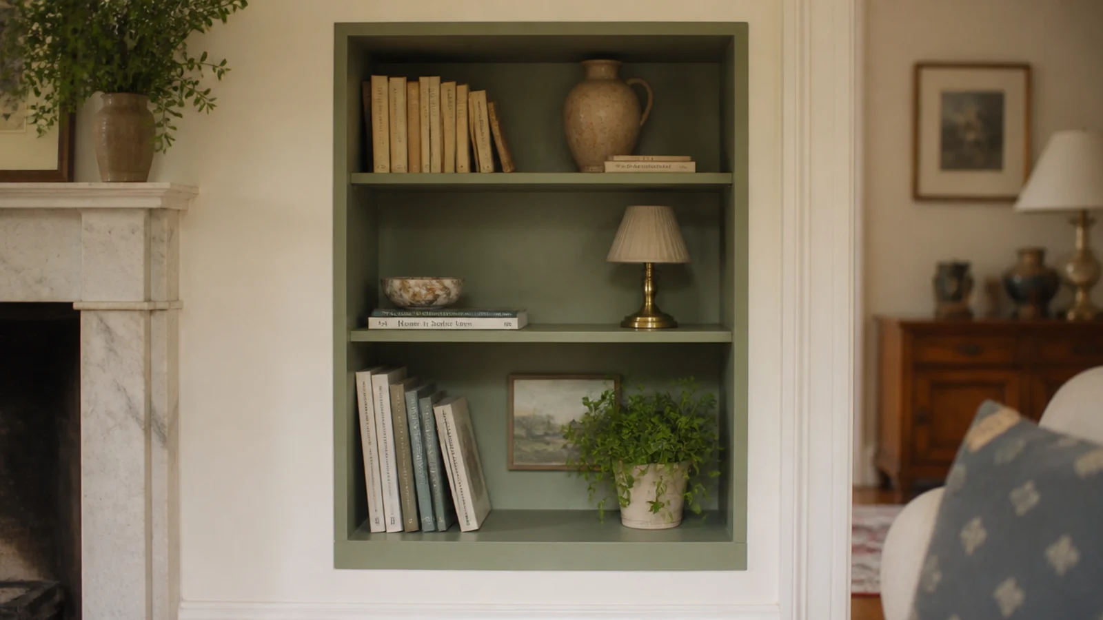
6. Line an alcove in sage and stop at the trim
In a chimney alcove, paint every internal face — back, sides, shelf tops — in a muted sage, and leave the surrounding wall cream. The recess turns into a defined pocket of color instead of a shadowy gap.
Stop the color cleanly at the front edge of the alcove. That crisp line is the whole effect. Sage sits well against oak, brass and terracotta, which are probably already in the room, and it reads calm rather than decorated.
7. Run one color band across a single shelf
Instead of spreading color through the whole case, load it onto one shelf. Put every rust and clay object you own on the middle board and keep the shelves above and below in neutrals.
The concentration is what makes it work — a single saturated band gives the eye somewhere to land and lets everything else recede. Choose a shelf at or just below eye level, roughly 48 to 55 inches from the floor, which is where anyone standing in the room naturally looks first.
8. Take the dust jackets off
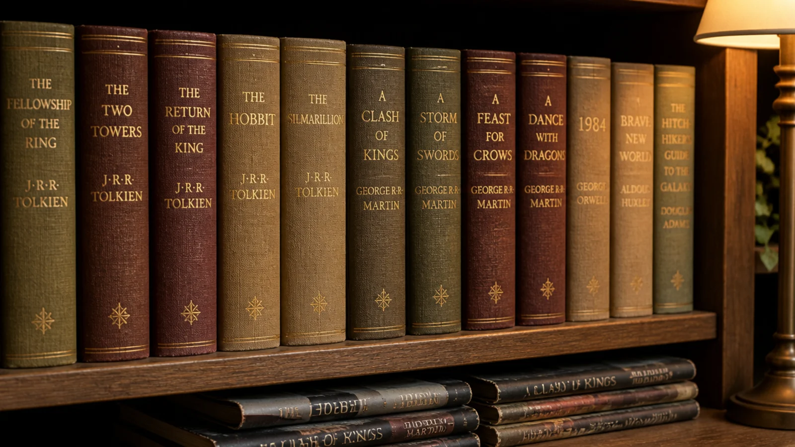
Underneath most hardback jackets is a cloth binding in a muted olive, oxblood or sand, usually with gold lettering. Removing the jackets gives you a quieter, warmer color palette for free.
Keep the jackets flat in a box if the books matter to you. This is the only book-based color move I genuinely recommend, because it lowers the contrast rather than raising it. Twenty minutes, no money, and it changes the temperature of a whole case.
9. Repeat terracotta pots as a color rhythm
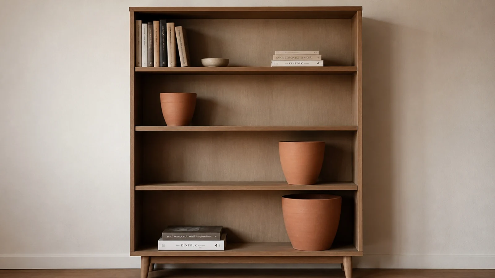
One terracotta pot is an accent. Three of them, on three different shelves, is a rhythm — and rhythm is what makes a styled case look composed instead of decorated.
Use plain unglazed pots in graduated sizes and set them on a diagonal through the case rather than in a vertical column. They cost $3 to $8 each ($), the clay breathes so plants prefer it, and the color is the same warm orange that oak, brass and linen all sit happily beside.
10. Keep the stoneware to three glaze tones
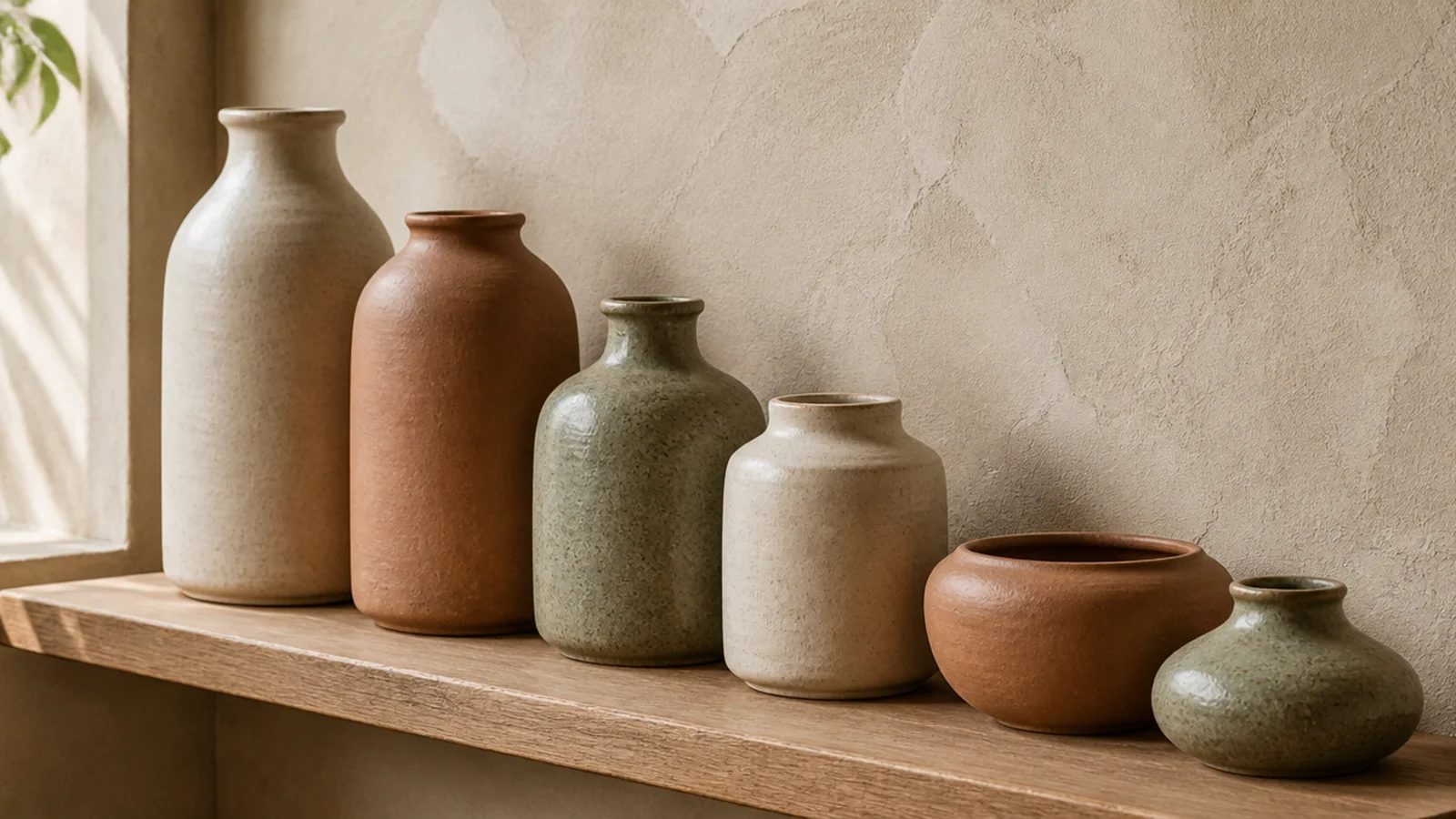
Pottery is where color creeps in without anyone deciding to let it. Cap yourself at three glaze tones across the entire case — cream, clay and one speckled mid-tone is a reliable set.
Matte glazes read calm; high gloss reads busy under warm light. Six colors of pottery look accumulated, three look collected, and the difference costs nothing since you probably own more than you need. Box the rest and rotate it seasonally, which is also how bookshelf decor ideas keeps a case from silting up.
11. Let jute and rattan be your warm neutral
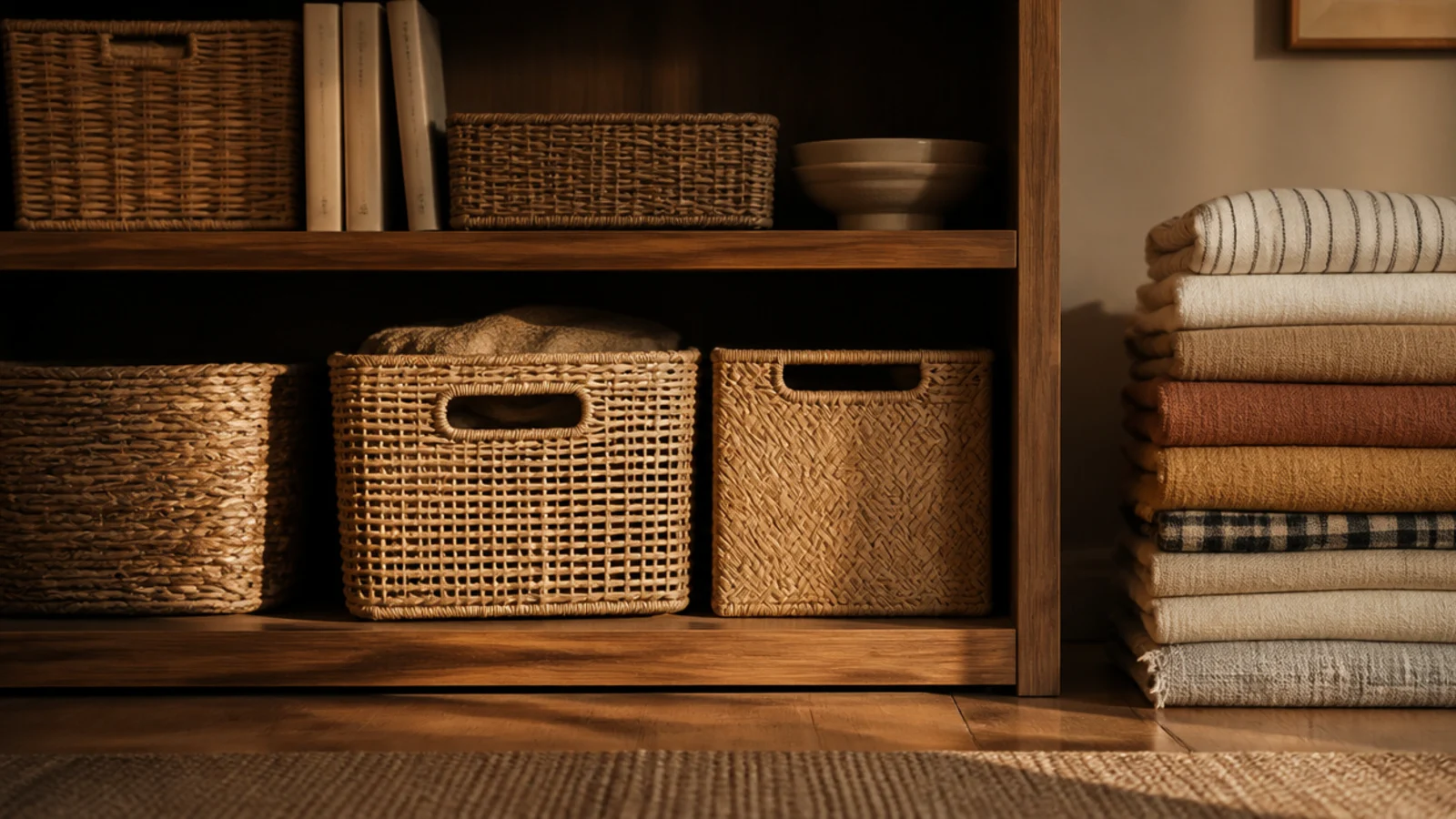
Woven texture behaves like a color under warm light. A row of jute baskets on the lower shelves gives you a honey tone that no paint chart will sell you, plus storage for the things you do not want on display.
Buy in one material and two sizes. Keep them on the bottom two shelves, where weight belongs anyway, and leave the upper shelves lighter. A pair costs $18 to $35 ($) and they hide an astonishing amount.
12. Put colored glass where the light lands
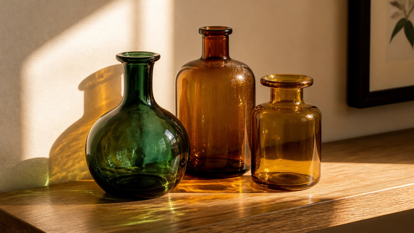
Glass is the one material that changes through the day. Put three amber or bottle-green vessels on the shelf that catches direct sun and they will throw color onto the board beneath them for an hour every afternoon.
Thrift stores are full of these for $2 to $6 apiece. Group them tightly rather than spacing them out, and keep them clear of books — glass sweats slightly in a cold room, and paper does not forgive that.
13. Lean one big print as the color anchor
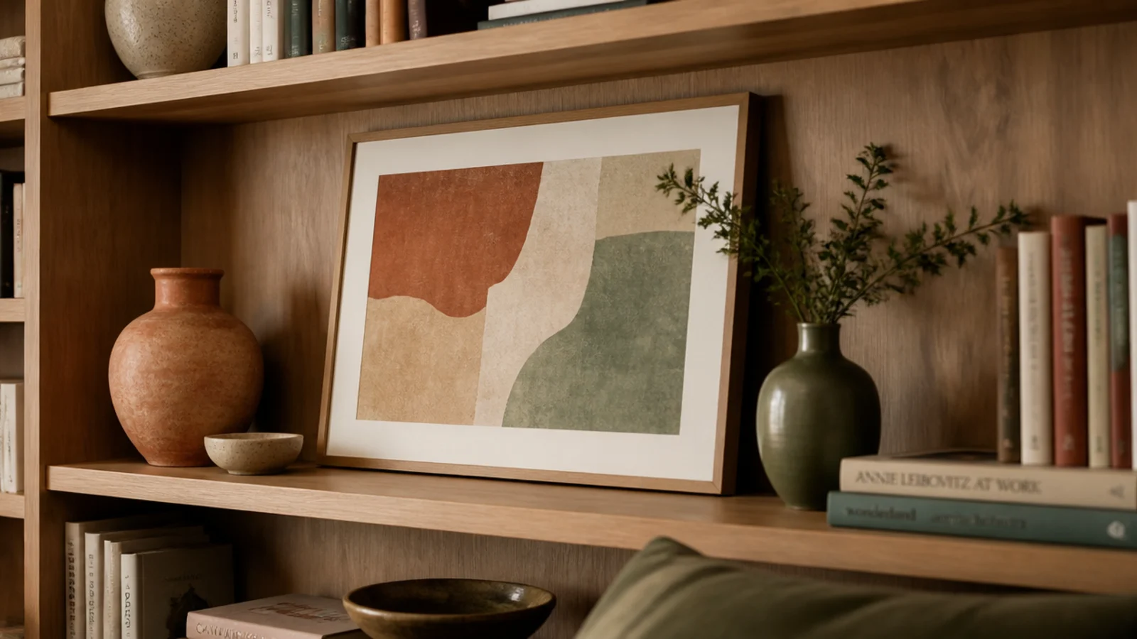
A single large framed print leaning at the back of a shelf sets the palette for the whole case, and every object in front of it then has something to agree with.
Choose a frame that fills at least two-thirds of the clear height, so roughly 8 to 10 inches for a 12-inch gap. Overlap its front edge with a plant or a clay vessel so it sits in the composition rather than behind it. Thrifted frames and a $12 print do this as well as anything expensive.
14. Add dried grasses in ochre and rust
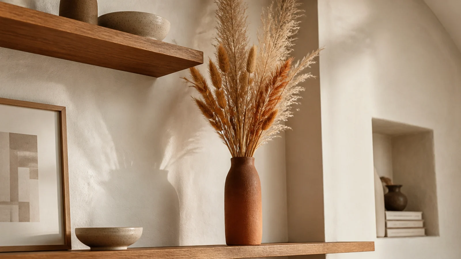
Dried stems bring warm autumn color at a height nothing else reaches, because they can rise past the shelf above without needing headroom of their own.
Put them in a slim clay bottle on an upper shelf and let them break the horizontal line. Pampas, bunny tails and wheat all hold their color for a couple of years. A bunch runs $8 to $18 ($) and needs no water, which matters on a shelf you cannot easily reach.
15. Choose brass as the one metal
Every warm palette needs a metal, and mixing three of them is what makes a colorful shelf look chaotic. Pick brass and stay there.
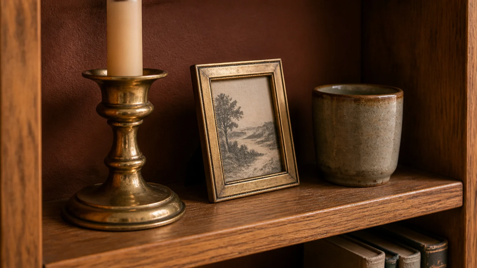
Brass warms terracotta, flatters sage and glows under a 2700K bulb in a way chrome never will. A candlestick, a small frame and a pair of bookends is plenty across a whole case. Aged or unlacquered brass patinates rather than tarnishing badly, and thrifted pieces cost $4 to $15.
16. Swap plastic bins for linen-covered boxes
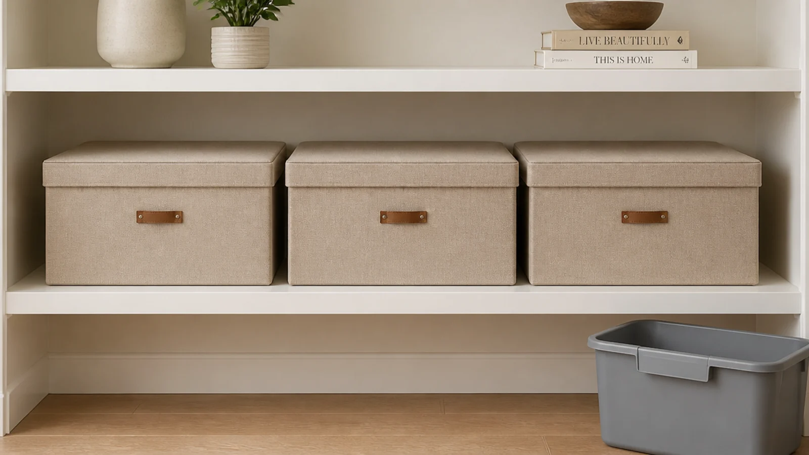
Gray plastic storage bins are a color decision, and not a good one. Three linen-covered boxes in warm sand cost $12 to $25 each ($) and turn hidden storage into part of the palette.
Match them exactly rather than approximately — near-matching neutrals look like a mistake in a way that near-matching brights do not. Add a small leather or card label tab so you never have to pull all three down to find the cables.
17. Color-block the bottom third of a tall case
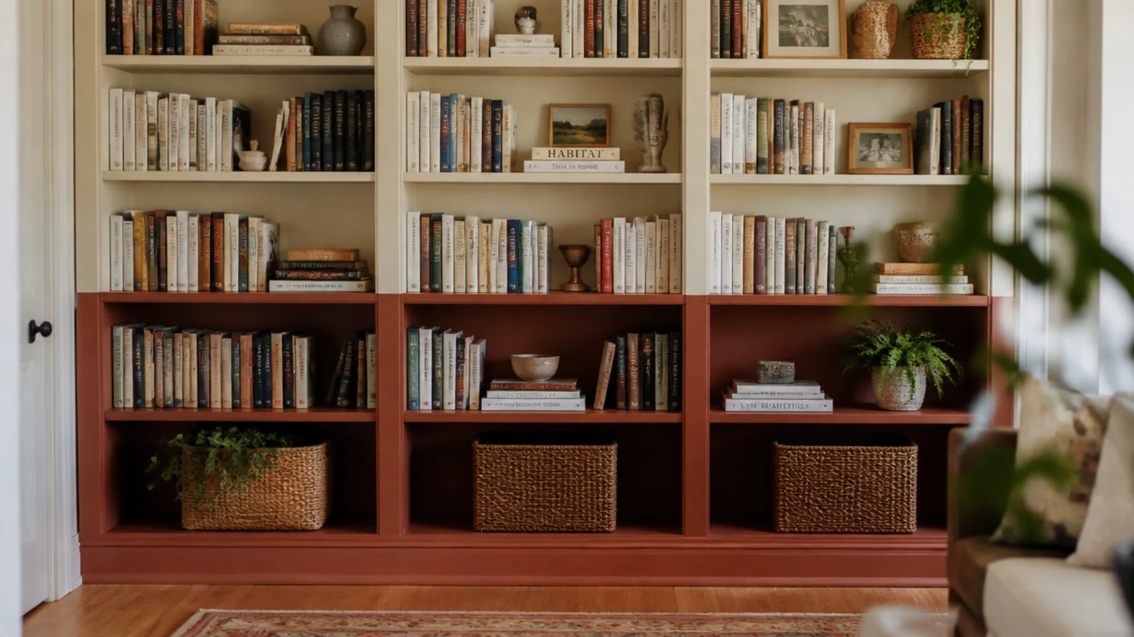
On a floor-to-ceiling unit, paint the lowest three shelves and their frame in a deep clay and leave everything above in cream. The eye reads weight at the bottom and lightness at the top, and the case appears taller than it is.
This works especially well under a low ceiling. Keep the transition on a shelf line rather than mid-panel so it looks deliberate. Two sample pots and an afternoon, or roughly $20 ($).
18. Back the shelves with fabric instead of paint
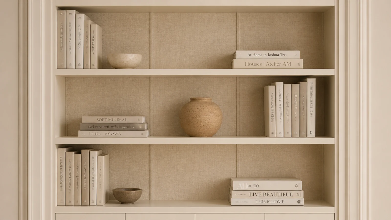
A stretched linen or cotton panel behind the shelves softens both the color and the acoustics of a room, which is a real bonus in a hard-floored apartment.
Staple the fabric to a thin plywood sheet cut to the internal size and slot it in — no adhesive touches the case, so it lifts straight out. Warm oatmeal, faded rust and muted sage all work. Fabric plus board runs $25 to $50 ($$) and takes an evening.
19. Group by height and let the color fall where it lands
This is the arrangement rule that everything else hangs from. Sort into descending height groups, alternate a horizontal stack with a vertical row, and pay no attention at all to spine color while you do it.
Scattered spine color reads as a real collection. Sorted spine color reads as a display. Once the heights are right, the shelf will look composed even before you add a single painted surface — which is exactly the order bookshelf styling ideas works through.
20. Light it at 2700K or the color dies
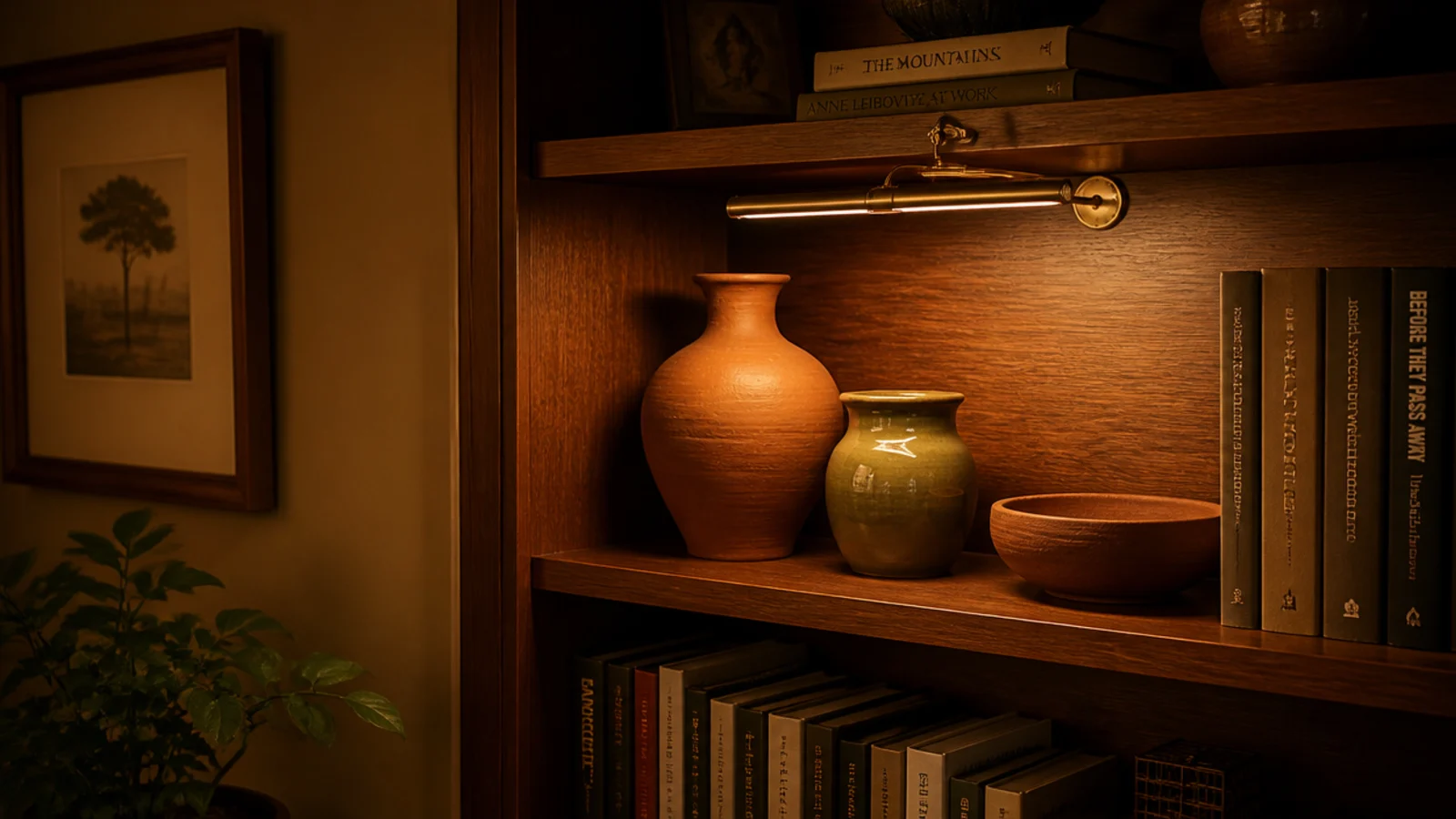
You can make every good color decision in this article and then cancel it with a 4000K bulb. Cool light drains terracotta, grays down oak and turns warm sage into hospital green.
Change the bulb in the nearest lamp to 2700K, or clip a small warm picture light above the case. Four dollars for a bulb, $15 to $30 for a rechargeable strip ($). It is the cheapest and most dramatic change in this entire list, and it takes about a minute.
Mistakes to Skip
- Sorting books into a rainbow. It photographs well once and then flattens the shelf permanently, because you have removed every height cue your eye uses to navigate.
- Using more than one metal finish. Brass, chrome and matte black on the same case cancel each other out and make careful color choices look accidental.
- Painting a freestanding case a contrasting color and skipping the anti-tip strap. Color does not hold a bookcase up, and every freestanding unit in a home with children needs one, without exception.
Frequently asked questions
What color should I paint the back of a bookshelf?
Pick a tone two or three steps deeper than your wall rather than a contrast. Muted terracotta, warm clay and soft sage all sit behind books without fighting them. A back panel is seen in narrow slivers between objects, so a saturated color reads far stronger there than it does on a test card held against the wall.
Should I arrange books by color or by height?
By height, every time. Color-sorting looks striking in a photograph and flattens in a room, because it strips out the height variation your eye uses to move along a shelf. Group by height first, alternate horizontal stacks with vertical rows, and let color arrive through painted surfaces, pottery and art instead.
How do renters add color to a bookshelf without painting?
Peel-and-stick paper or a cut-to-size fabric panel on the back of the case, held with removable strips. Both are reversible in minutes and cost $15 to $40. Beyond that, color can come entirely from objects: terracotta pots, a leaning print, colored glass and warm linen boxes need no permission from anyone.
How much color is too much on one bookshelf?
Keep to one painted surface and two accent tones across the whole case. Once a third and fourth color arrive, the eye stops reading groupings and starts reading noise. The safest structure is a colored back panel, a repeating clay tone in the pottery and one metal, usually brass, tying it together.
Does a dark painted bookshelf make a small room feel smaller?
Not if the case and the wall share the same tone. A shelf painted its own color reads as furniture stuck to the wall, which does shrink a room. Painted to match, it reads as architecture and the room holds its size. Colored back panels are the exception, because they sit behind objects rather than around them.
Pick one surface and one accent tone and stop there for a fortnight. A painted back panel plus three terracotta pots will change a room more than a whole afternoon of rearranging spines. For the case itself, diy bookshelf ideas covers building and finishing, and if the colorful wall is in a bedroom, headboard decor ideas keeps the palette consistent above the bed. Save the pin so the tones are with you at the paint counter.
Want more like this? Browse all 15 bookshelf ideas guides — they all use the same measurements and budget tiers.
Pin it for later
Save this to your Bookshelf Ideas board
Pin it now so it is waiting for you when the tape measure comes out — and so the next person hunting for this idea can find it too.
Save this pinKeep going
More ideas worth saving while you have the tape measure out.