Apartment Balcony Ideas · Listicle
30 Stylish Apartment Balcony Ideas to Copy Now

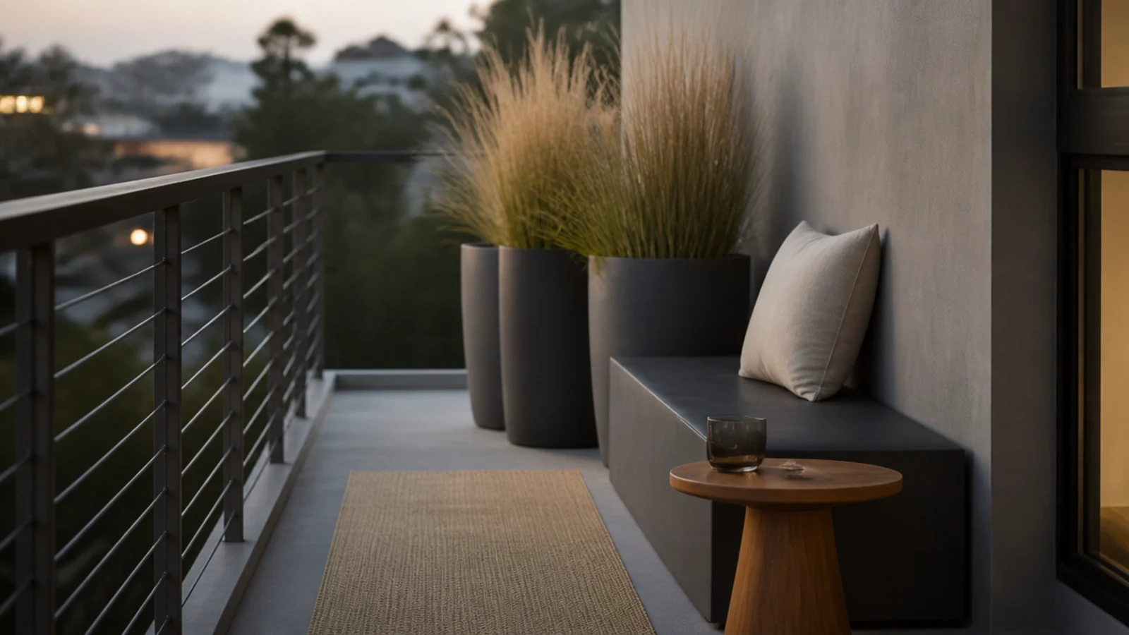
A modern apartment balcony is mostly a subtraction exercise. The look comes from a tight palette, low profiles and light you never see the source of — not from spending more. I have styled four of these, two above the tenth floor, and the versions that held up used two colours, one wood tone and fewer objects than felt comfortable on day one. All thirty of these are renter-safe and none of them touch the railing.
In this guide32 sections — tap to openHide
- 1.What makes a modern apartment balcony read as designed
- 2.Choose two colours and refuse the third
- 3.One pot material across every single planter
- 4.Rectangular planters instead of round ones
- 5.Repeat one plant three times
- 6.Keep the seating below thirty inches tall
- 7.One long bench instead of a pair of chairs
- 8.Matte black metal, never gloss
- 9.Oiled teak or acacia for the warm half
- 10.A horizontal slatted screen inside the rail
- 11.Static-cling frosted film on a glass balustrade
- 12.Texture instead of pattern
- 13.Hide every light source below seat height
- 14.A squared-edge rail-hung table
- 15.A flat-lid storage bench that reads as a plinth
- 16.Tone the rug to the floor, not against it
- 17.Line the tops up on one horizontal
- 18.Align everything to an invisible grid
- 19.One ornamental grass as the sculptural anchor
- 20.An outdoor pouf instead of a second chair
- 21.A narrow console at rail height on the wall side
- 22.Solid monochrome cushions, no prints
- 23.Concrete-look planters, kept near the wall
- 24.One sculptural object and nothing else decorative
- 25.Route every cable, or go cordless
- 26.Match the furniture to the window frame
- 27.Clean the glass and the rail before anything else
- 28.Mirror the two ends of a narrow slab
- 29.Treat the walkway as a design element
- 30.Trim the plant palette to three species
- 31.Make the hardware disappear
- 32.Mistakes to Skip
What makes a modern apartment balcony read as designed
Three decisions carry the whole look, and you make them before you buy anything.
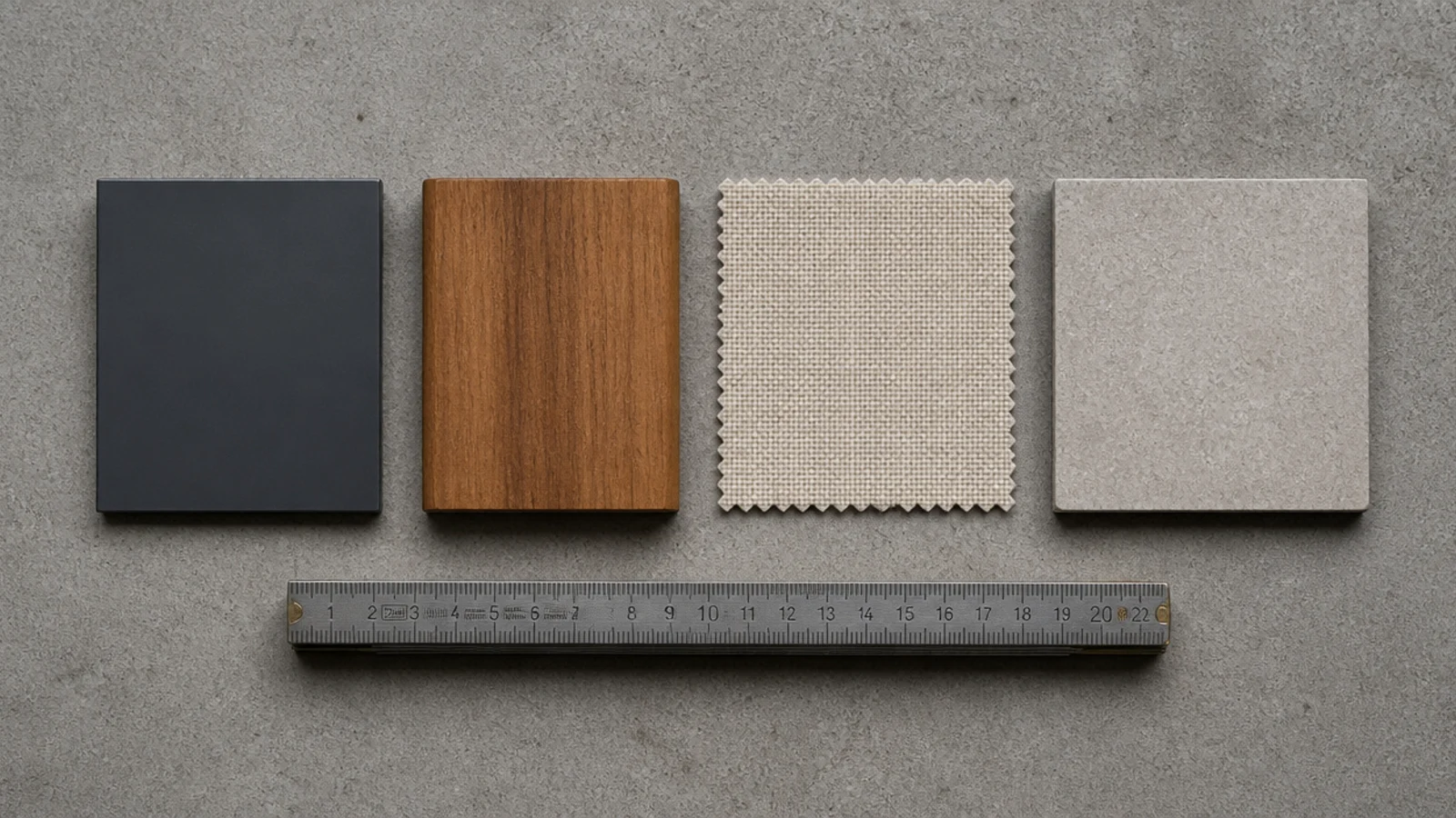
The palette. Two colours and one wood. Charcoal or matte black for the hard elements, oiled teak or acacia for surfaces, sand or cream for textiles. Let the plants be the only green. A third colour is where outdoor spaces start looking assembled rather than designed, and on 30 square feet there is nowhere for a stray finish to hide.
The line. Everything either horizontal or vertical, tops aligned where you can manage it, spacing even. This costs nothing and does more than any purchase.
The height. Keep almost everything below rail level so the slab reads open, and let exactly one tall element carry the vertical interest.
Then the constraints that are not negotiable. Read the balcony clause first — most buildings prohibit drilling into the wall, ceiling or slab, prohibit attaching anything to the railing, and ban open flame outright. Nothing ever mounts on the outside face of a railing, because a piece that works loose four floors up lands on a person. And above the third floor, wind decides: mass low, profiles low, slatted rather than solid, and nothing tall left loose.
Budget tiers: $ under $30, $$ $30 to $100, $$$ $100 to $300.
1. Choose two colours and refuse the third
Write the palette down before you shop: one dark neutral, one wood, one textile tone. Then hold it even when something lovely in terracotta appears.
On a slab this size, a single off-palette object is 5 percent of everything visible. That is why balconies with a strict palette look expensive and mixed ones look accumulated. Free
2. One pot material across every single planter
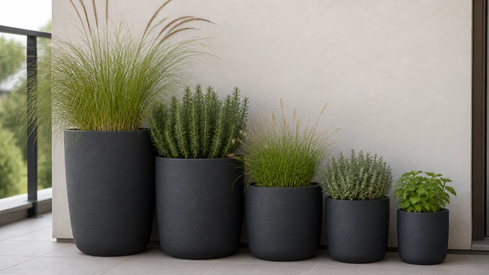
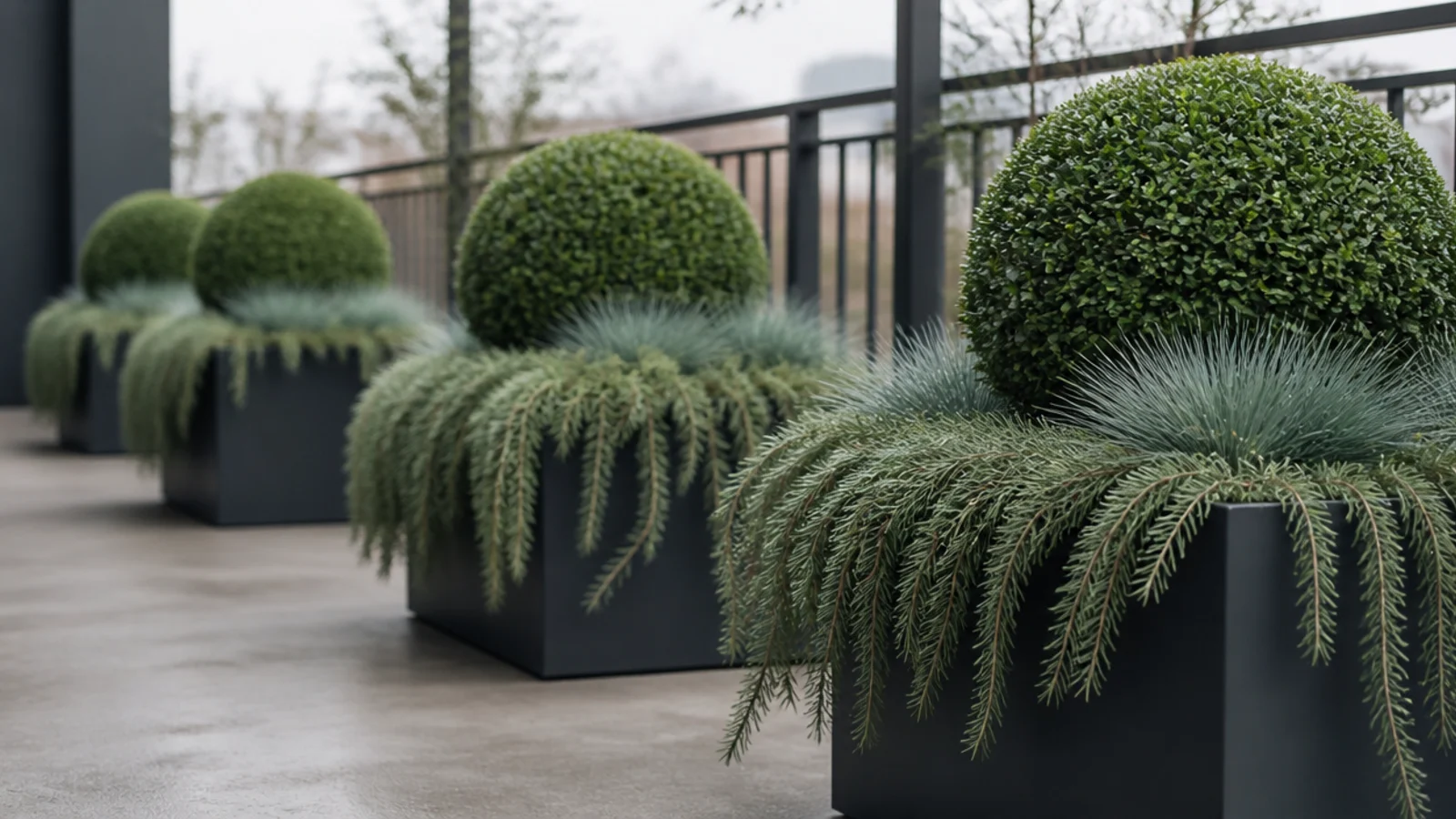
Matching containers pull a mismatched plant collection into one composition faster than matching plants ever could, and it is the cheapest route to a designed look.
Pick matte charcoal fiberstone, plain unglazed terracotta or powder-coated steel and buy nothing else. Different sizes are fine. Different materials are not. $$
3. Rectangular planters instead of round ones
Round pots leave crescent gaps against a straight wall. Rectangular troughs sit flush, which on a slab three or four feet deep buys back real inches.
Long low troughs also spread weight better than a single heavy round pot. Keep them against the building wall and step down in size as you move toward the rail. $$

4. Repeat one plant three times
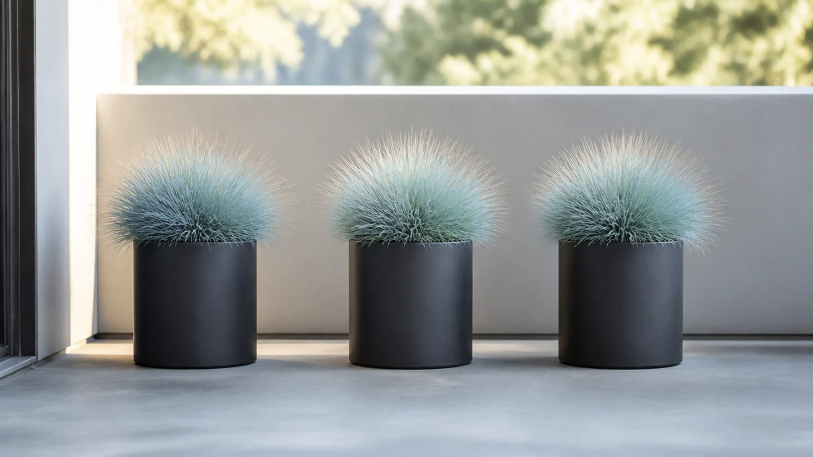
Three identical grasses in three identical pots read as a deliberate installation. Three different plants in three different pots read as leftovers from a nursery visit.
Repetition is the most reliable modern move there is, and it costs the same as variety. Space them evenly along the wall. $$
5. Keep the seating below thirty inches tall
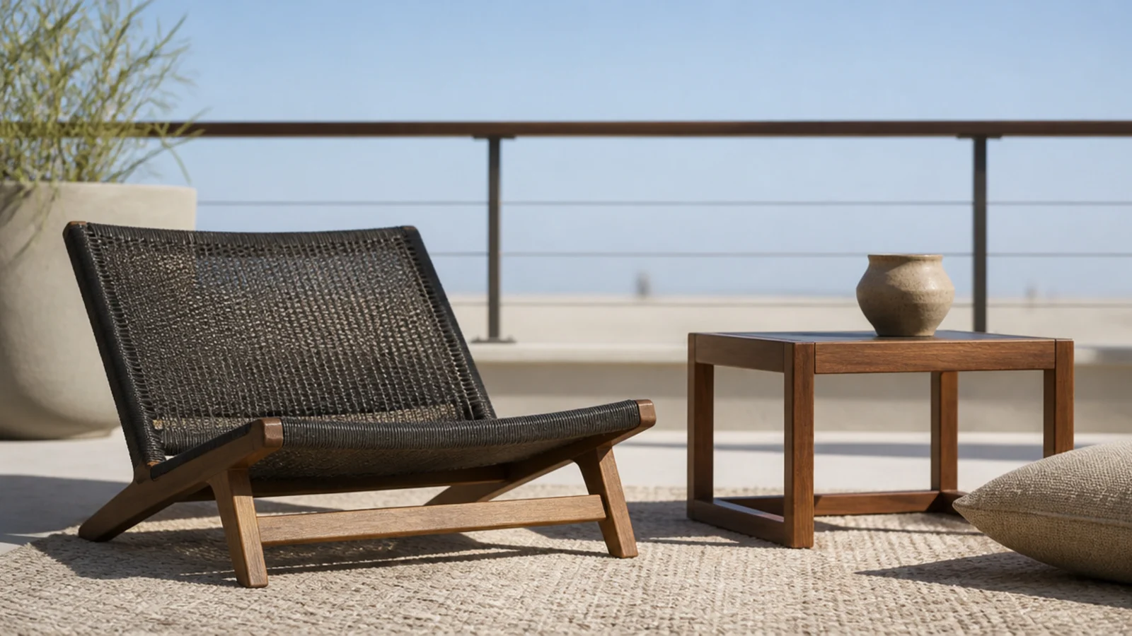
Low seating is the difference between a balcony that feels like a room and one that feels like a corridor with chairs in it.
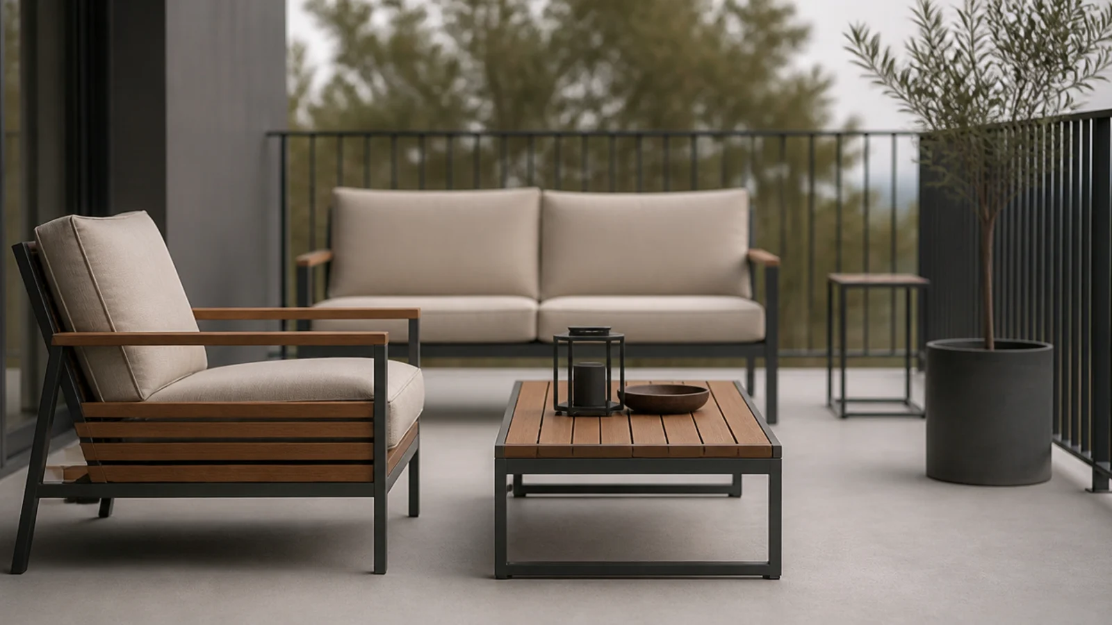
Look for a seat height around 14 to 16 inches and an overall back height under 30. It opens the view over the rail when you sit and keeps the whole composition beneath the balustrade line. $$$
6. One long bench instead of a pair of chairs
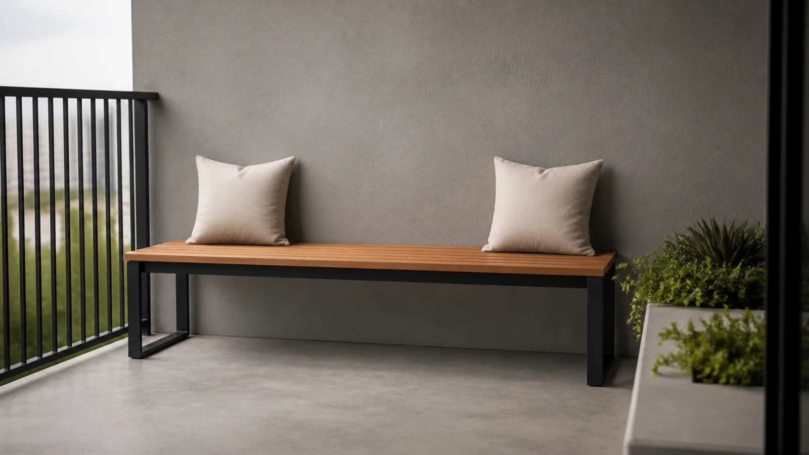
A single bench running the width of an end wall gives one unbroken horizontal line where two chairs give you two competing shapes and a gap.
Fourteen to sixteen inches deep is comfortable with a cushion. It also sits flat against the wall, which puts the mass where the slab is strongest. $$–$$$
7. Matte black metal, never gloss
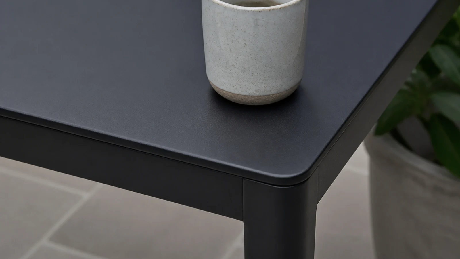
Gloss finishes outdoors show every water spot, every scratch and every fingerprint, and they throw hard reflections that flatten a small space.
Powder-coated matte black or charcoal stays quiet, hides city grime between cleans, and photographs far better. Check for a genuine powder coat rather than sprayed paint, which chips at the feet within a season. $$
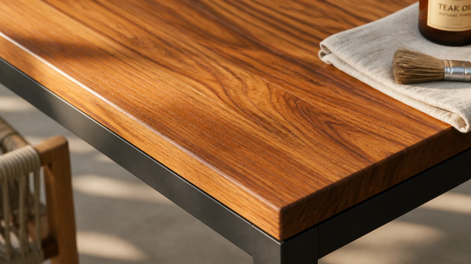
8. Oiled teak or acacia for the warm half
Every all-dark balcony I have seen needed one warm material to stop it reading as a fire escape. Wood is that material.
Teak and acacia both weather well. One coat of outdoor oil each spring keeps the colour warm; skip it and both silver to grey within two summers, which is a look but not this one. $$–$$$
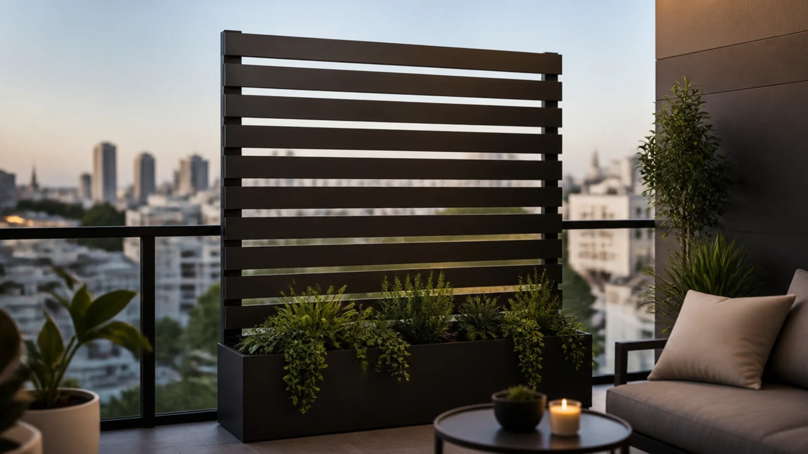
9. A horizontal slatted screen inside the rail
Horizontal slats read modern and make a narrow slab look wider, where vertical slats stretch height you do not need.
Stand it inside the railing, weighted in a long planter, across one section only. Slatted rather than solid so wind passes through instead of turning it into a sail. Confirm the lease allows screens first — plenty of buildings prohibit anything above rail height. $$$
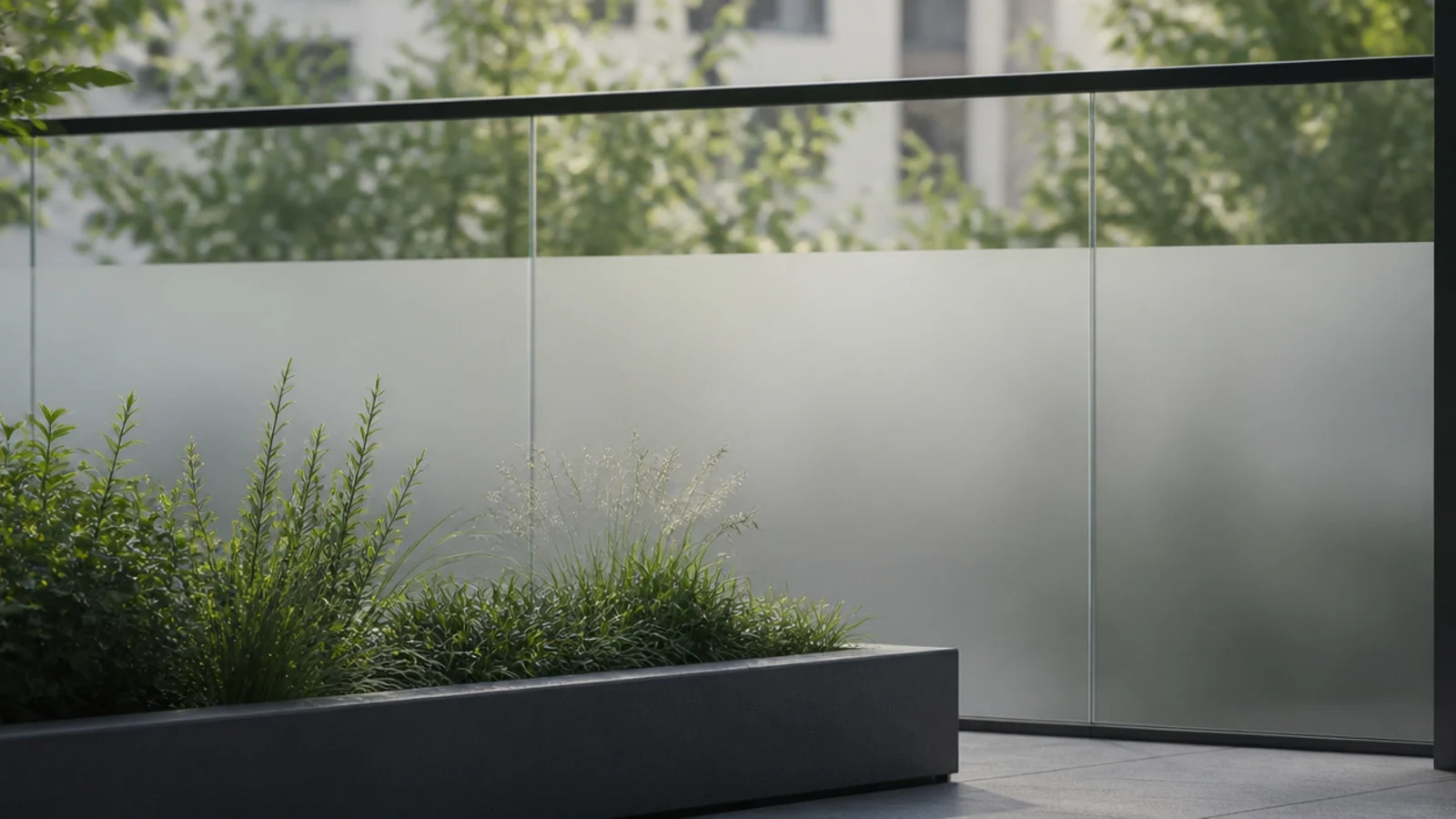
10. Static-cling frosted film on a glass balustrade
If you have a glass balustrade and no privacy, static-cling film is the neatest renter fix there is. No adhesive, no residue, peels off in one piece.
Apply a band across the lower two-thirds so light still passes at eye level. Cut it with a straight edge — a wobbly line is more noticeable than no film at all. $
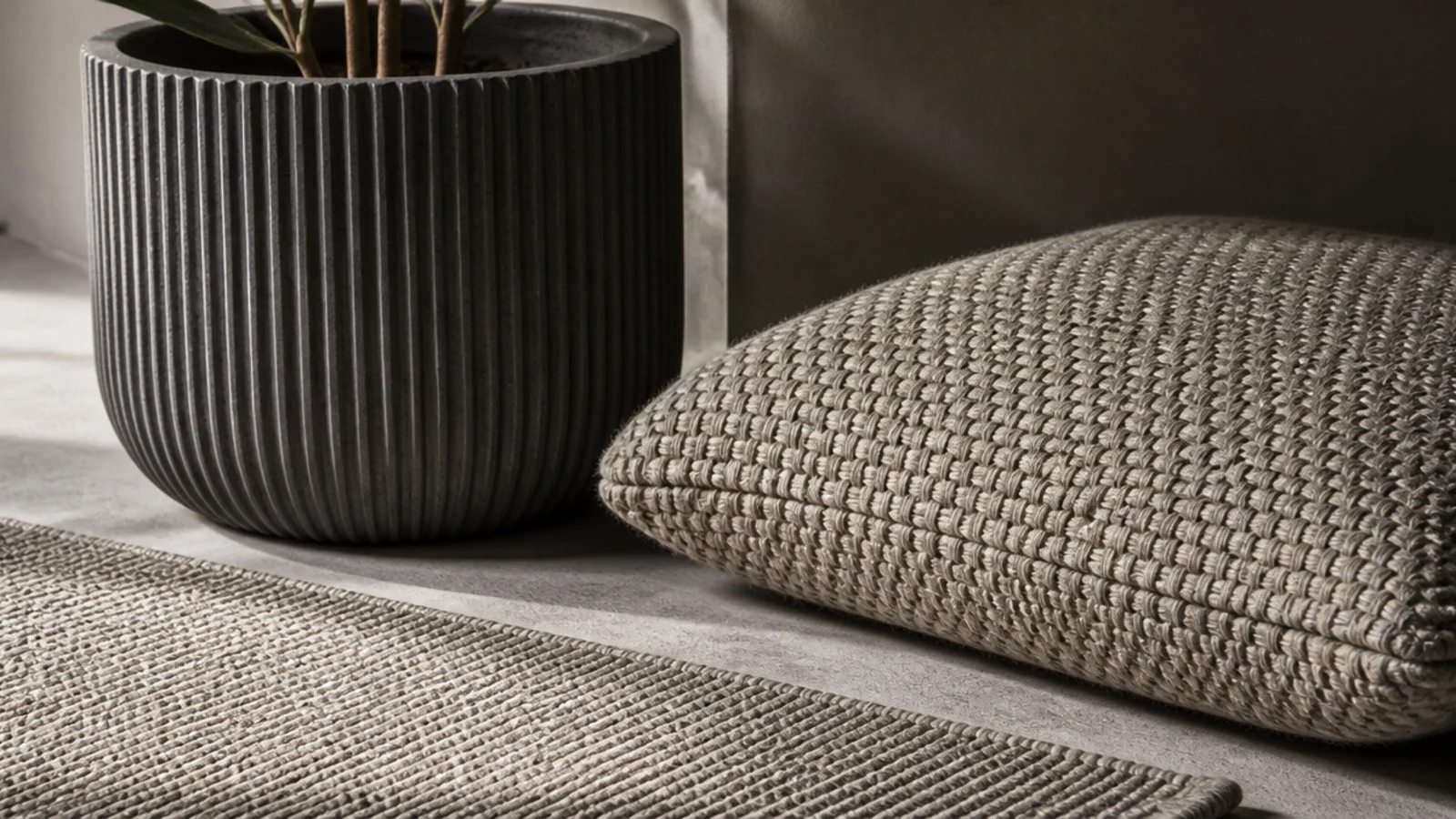
11. Texture instead of pattern
A modern balcony holds together because everything is one colour and nothing is one texture. Ribbed planters, a chunky woven cushion, a flatweave rug and smooth metal all in the same sand and charcoal range.
Patterns date fast outdoors and fade unevenly in UV. Texture never does. $$
12. Hide every light source below seat height
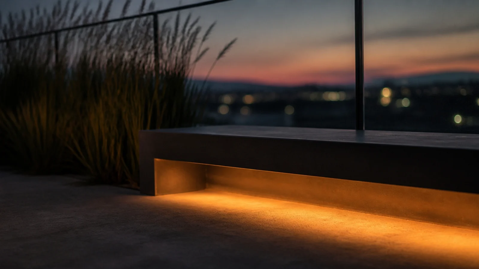
The most expensive-looking thing you can do out there is light the balcony without showing a single fixture.
Warm LED tape under a bench lip, a puck under a console, disc lights at the base of the wall. Everything at 2700K, nothing above seat height, no visible battery boxes. The full renter-safe kit is in apartment balcony lighting. $$
13. A squared-edge rail-hung table
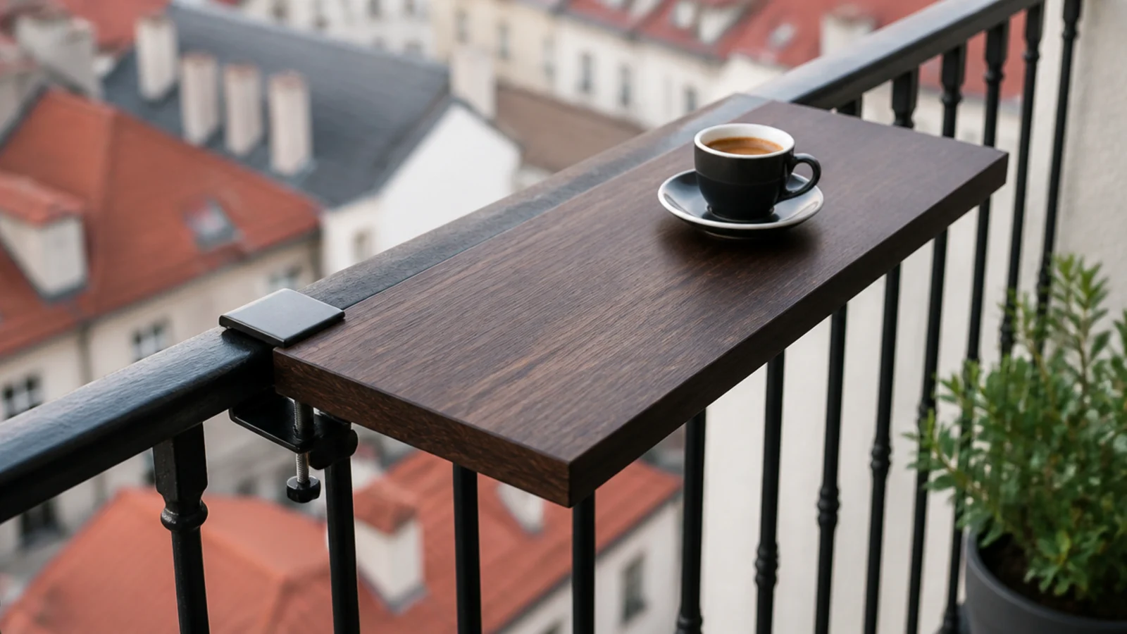
A rail table with crisp square edges reads far more considered than the rounded folding versions, and it disappears when you drop the leaf.
Clamp it over the inner face of the top rail only, tighten the thumbscrews properly, and check them monthly and before any windy stretch. Never anything on the outside face. $$
14. A flat-lid storage bench that reads as a plinth
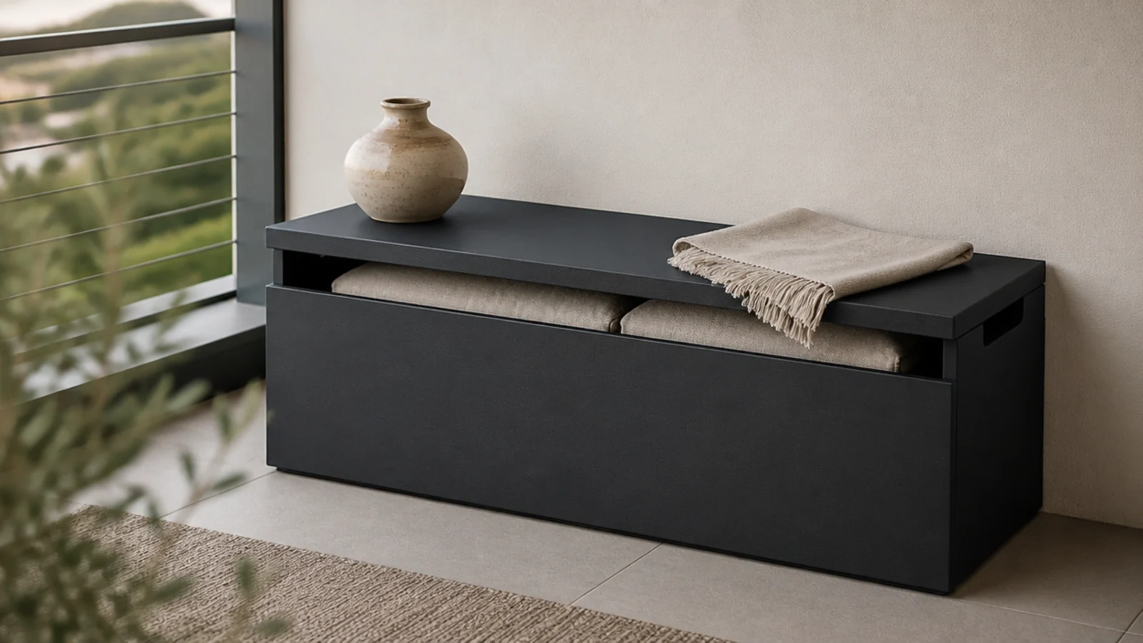
A storage box with a flat lid does three jobs: it seats a person, it swallows the cushions, and its top becomes a plinth for one object.
Keep it against the building wall for ballast. Look for a hinge stay so the lid does not slam in a gust, and put two silica packs inside against damp. $$$
15. Tone the rug to the floor, not against it
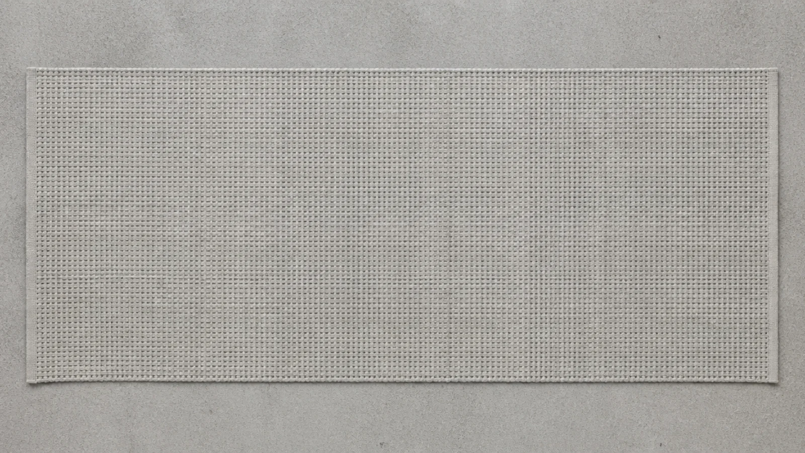
A rug in a close tonal match to the concrete makes the whole slab read as one continuous surface. A contrasting rug chops the floor into a small island with a border.
Open-weave flatwoven polypropylene only — dense pile traps water against the slab and leaves a permanent stain your deposit pays for. $$
16. Line the tops up on one horizontal
Get the top of the side table, the arm of the bench and the rim of the tallest planter within a couple of inches of each other and the whole balcony snaps together.
It costs nothing and it is the single most noticeable difference between a styled outdoor space and a collection of objects. Adjust with pot risers. Free
17. Align everything to an invisible grid
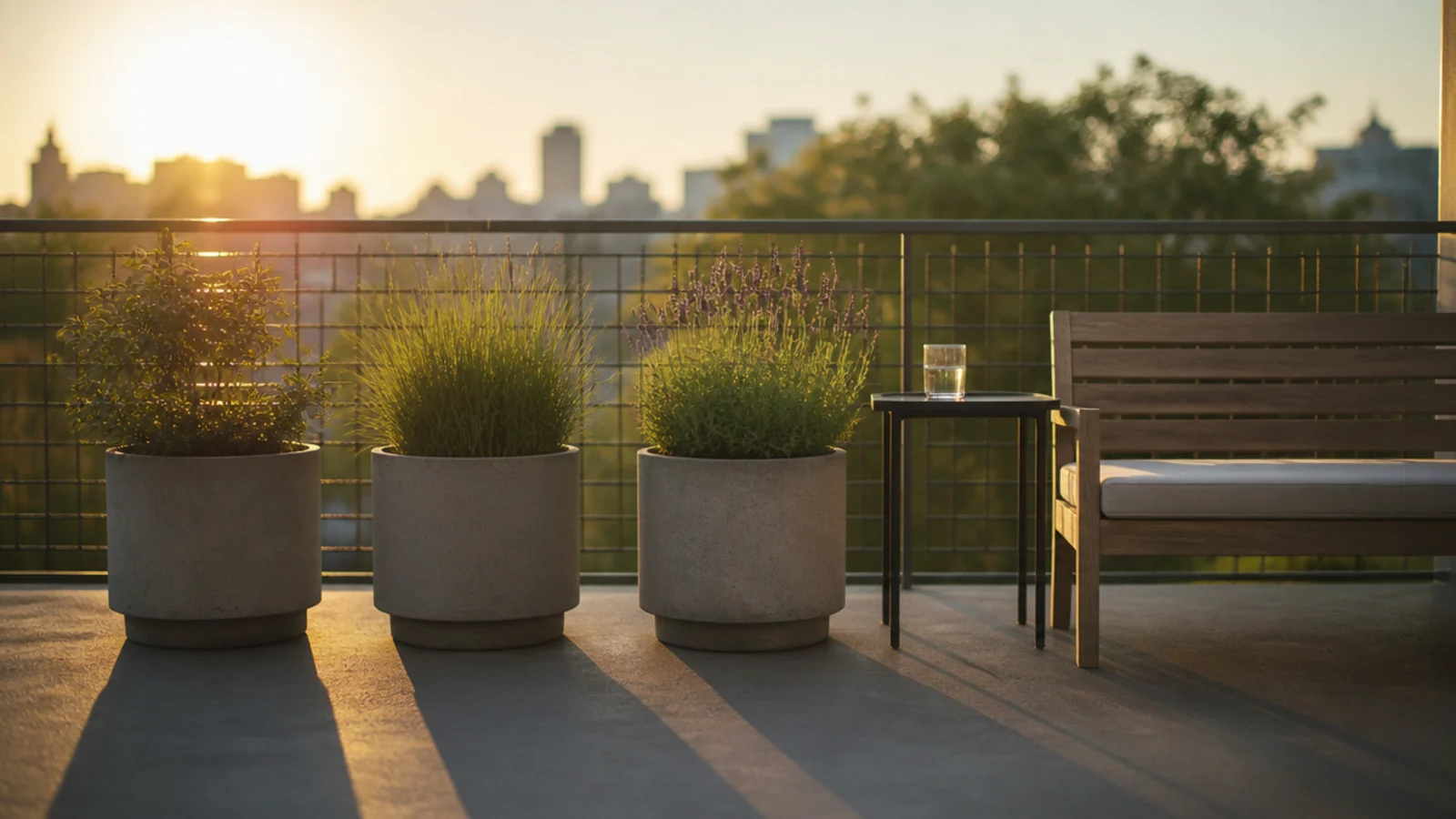
Set objects parallel to the wall, at even intervals, with equal gaps. Nudging a planter four inches to true up a spacing is free and reads as care.
The eye picks up regular rhythm long before it identifies anything else about a space. On a small slab it is most of the work. Free
18. One ornamental grass as the sculptural anchor
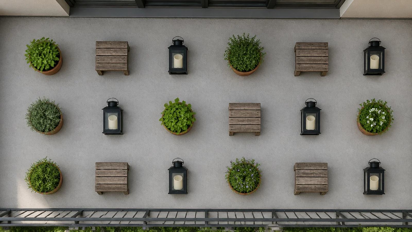
Every modern balcony needs one thing with height and movement, and a tall feather grass in a slim cylinder does it better than any object you can buy.
It catches low sun, it moves in wind rather than fighting it, and it needs cutting back once a year. Put it where the door frames it from inside. $$
19. An outdoor pouf instead of a second chair
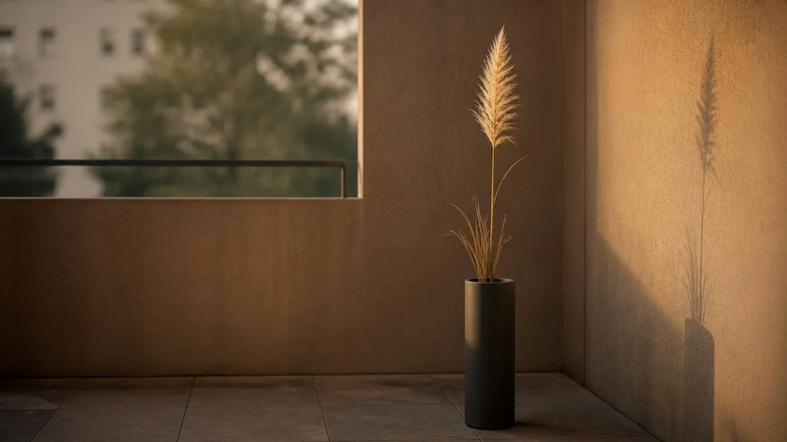
A woven pouf is a seat, a footrest and a table base, and it has no frame to visually clutter a small floor.
It is also light, so on a high floor bring it in or wedge it under the console when you leave. Choose solution-dyed woven polypropylene rather than fabric-covered foam, which holds water for days. $$
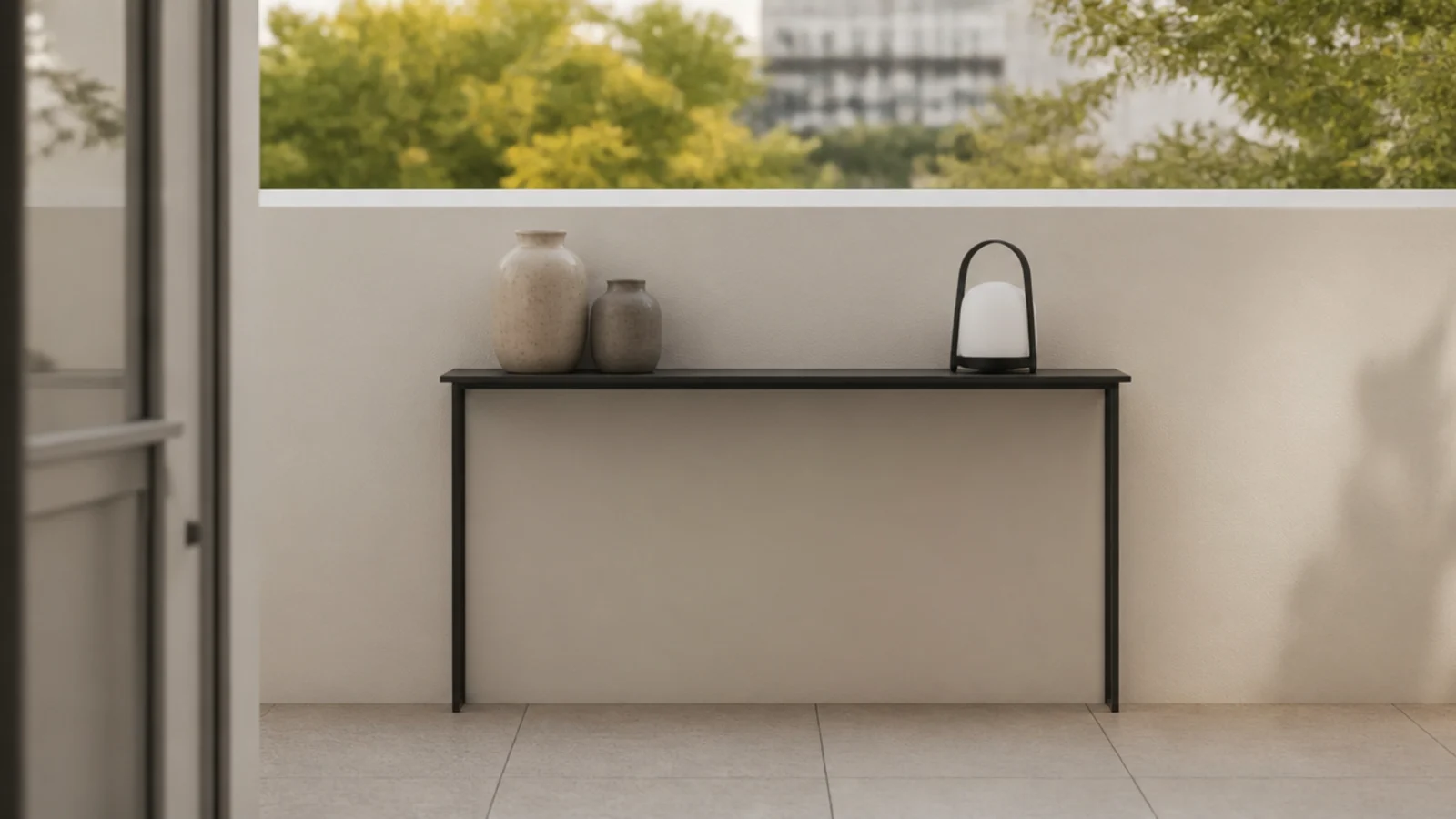
20. A narrow console at rail height on the wall side
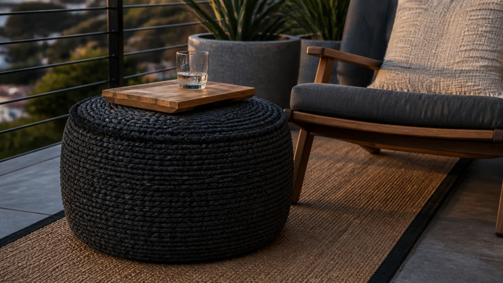
A shallow console at balustrade height gives you a surface that never intrudes on the walkway and puts objects at a line your eye already reads.
Ten inches deep is the maximum on most balconies. Wall side only, heaviest items low, and check it does not block the door swing. $$
21. Solid monochrome cushions, no prints
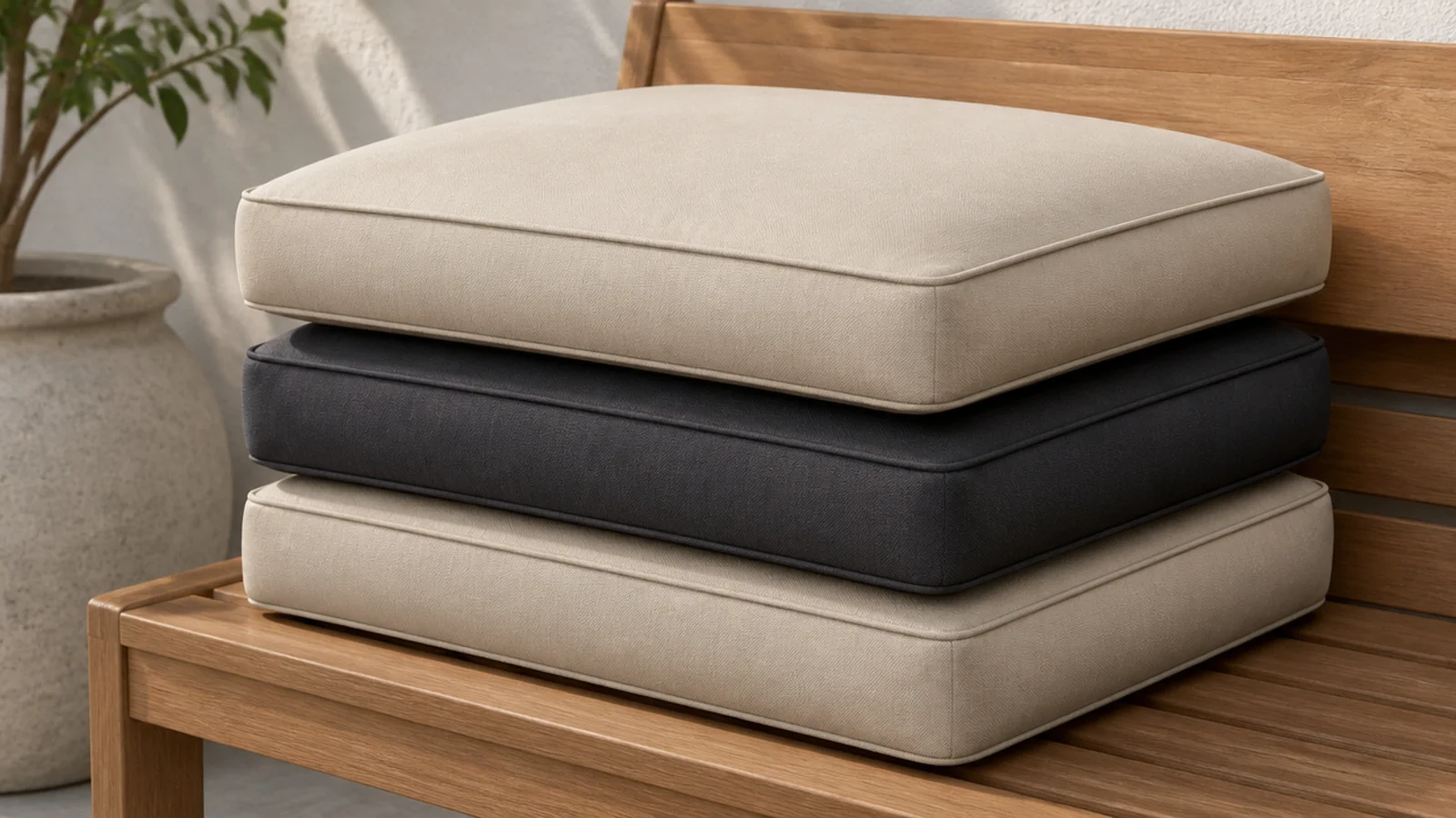
Plain solution-dyed acrylic in sand or charcoal holds colour for years. Printed polyester fades unevenly within a single season and looks worse every month.
Two seat pads and one lumbar cushion is the whole textile budget on a two-seat balcony. More than that and the modern read collapses. $$
22. Concrete-look planters, kept near the wall
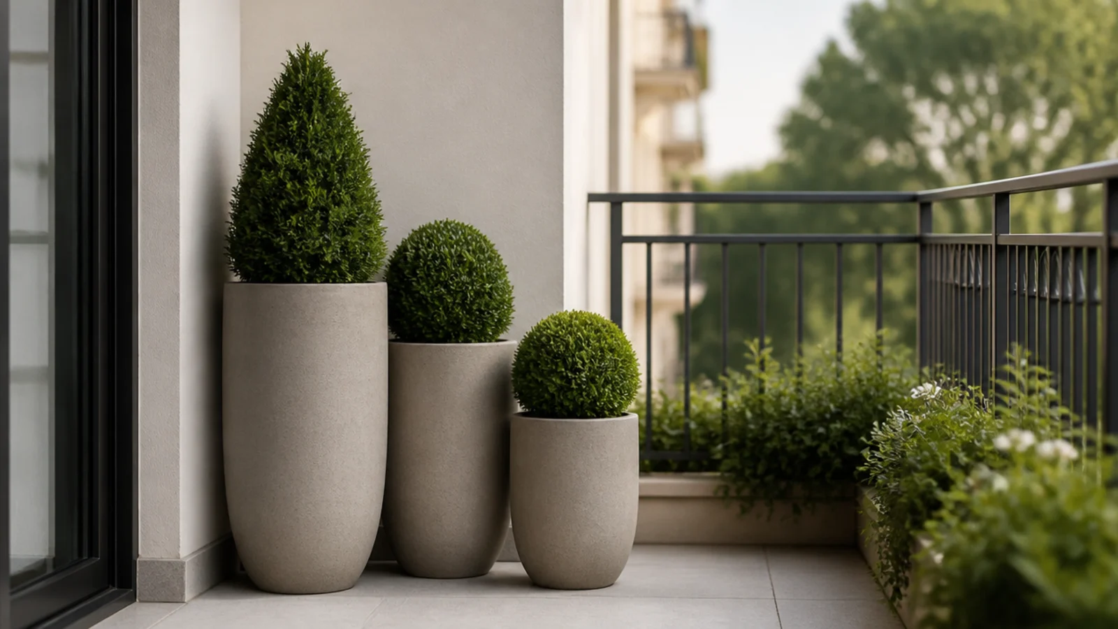
Fiberstone and polyresin give you the matte concrete look at a fraction of the weight, which genuinely matters when a filled 16-inch planter can pass 100 pounds.
Even so, mass belongs against the building wall rather than lined along the outer rail. Balconies are engineered for distributed load, not a heavy row at the edge. $$–$$$
23. One sculptural object and nothing else decorative
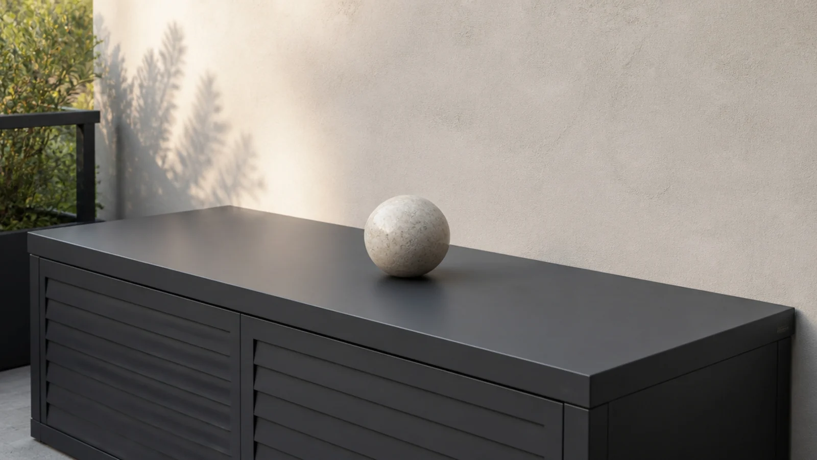
A single pale stone, a plain ceramic vessel or one weathered wood form on an otherwise empty surface reads as art. Five objects read as a shelf that migrated outdoors.
Choose something that survives rain and does not blow away — 5 pounds minimum on a high floor. $–$$
24. Route every cable, or go cordless
One white cable draped down a wall cancels every other decision on the balcony. Either go entirely solar and rechargeable, or route the cable properly.
Black outdoor-rated cable, matching dark clips, run down an internal corner to a weatherproof outlet. Never through a door gap where the slider crushes the jacket. $

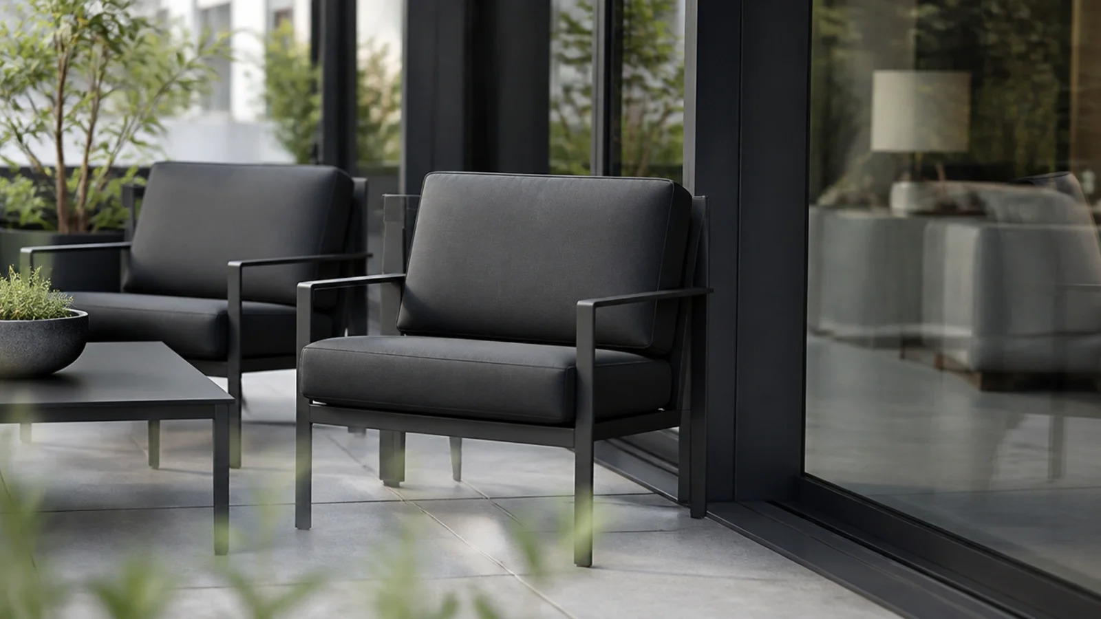
25. Match the furniture to the window frame
Your building already chose a colour for you: the door and window frames. Matching furniture to that tone makes the balcony read as part of the architecture rather than as things placed on it.
Dark aluminium frames pair with charcoal furniture almost exactly. It is free coordination. Free
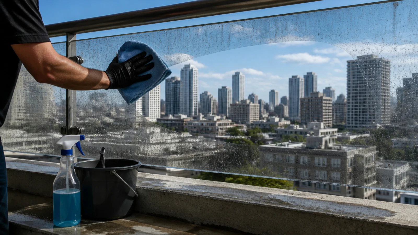
26. Clean the glass and the rail before anything else
City balconies collect a grey film of traffic grime that dulls everything behind it, and a modern scheme with hard clean lines shows it more than a layered one.
Ten minutes with a cloth and a bucket does more than $100 of styling. Do it before you photograph anything, and repeat monthly through summer. Free
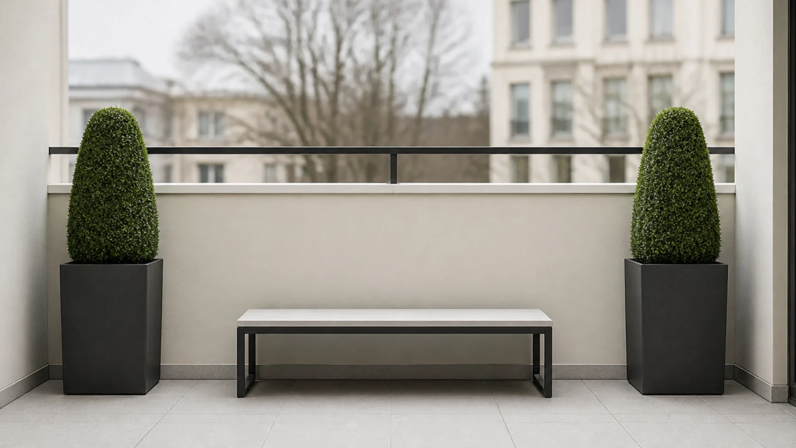
27. Mirror the two ends of a narrow slab
Symmetry is the cheapest formality available. Two matching planters at the far ends with a bench centred between them will read as designed even if every piece was inexpensive.
It works especially well on a long narrow balcony where an asymmetric arrangement just looks like things pushed to one end. $$
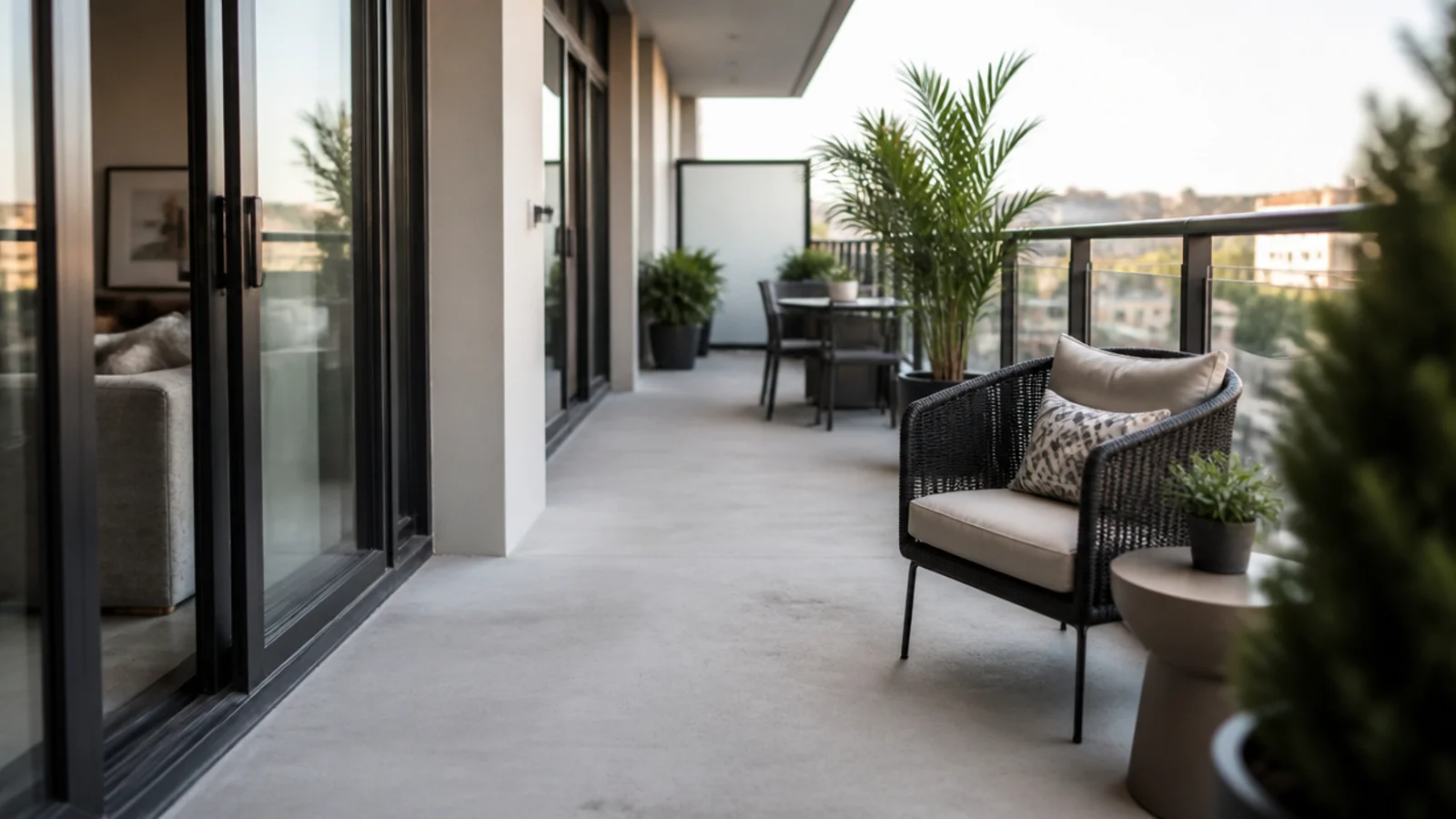
28. Treat the walkway as a design element
The 24-inch clear path from the door to the far end is a fire egress requirement in most buildings. On a modern balcony it is also the negative space that makes everything else read.
Push furniture and planters tight to one side and let the strip of bare concrete stay genuinely empty. Nothing loose in the doorway, ever. Free
29. Trim the plant palette to three species
Nine species planted once each looks like a nursery clearance. Three species repeated across matching pots looks like a scheme.
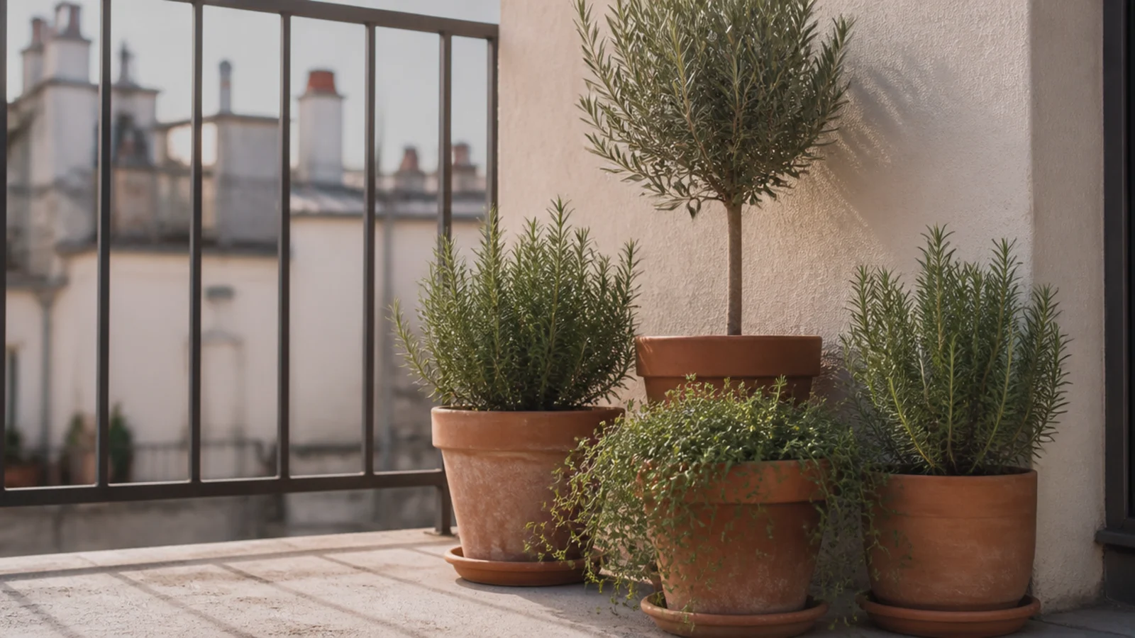
Pick one structural evergreen, one grass and one trailing plant, and match all three to your aspect — a balcony is either a sun trap or near-total shade, and the wrong choice cannot be watered into working. There is a full list in apartment balcony plants. $$
30. Make the hardware disappear
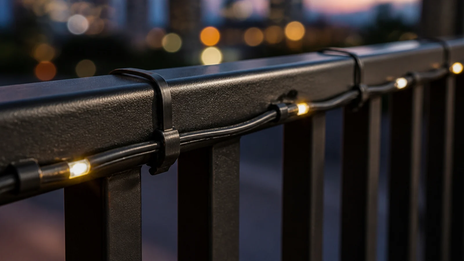
Black zip ties on a black rail, dark clips on a dark cable, felt pads under charcoal feet. Every fixing should match what it fixes.
It takes no extra money and it is the last 5 percent that separates a balcony that looks styled from one that looks finished. $
Mistakes to Skip
- Fixing screens, hooks or planters to the outside face of the railing. Most leases ban it, and anything that works loose at height falls onto people below.
- Choosing a tall solid privacy panel on a high floor. Solid surfaces catch wind like a sail, and the panel takes the planter, the rail fixings or itself over the edge.
- Adding a third and fourth colour once the balcony is furnished. On 30 square feet each stray finish is a large share of everything visible, and it is what makes a modern scheme collapse.
Frequently asked questions
What makes a balcony look modern rather than just tidy?
A tight palette and consistent lines. Two colours, one wood tone, one pot material and everything either horizontal or vertical will read as designed even on a cheap budget. Mixed finishes are what make an outdoor space look assembled over time, and on 30 square feet there is nowhere for a stray finish to hide.
What colours work best on a modern balcony?
Charcoal or matte black for the hard elements, one warm wood for surfaces, and cream or sand for textiles. Let the plants supply the only green and let the sky supply the only blue. Skip white on an outdoor slab unless you enjoy cleaning it, because city grime shows on white within about a fortnight.
Can I make a rented balcony look modern without drilling?
Yes. Every structural move here is freestanding, clipped or weighted — slatted screens that stand in a planter, static-cling window film on glass balustrades, adhesive LED tape under a bench lip and furniture that holds itself down with mass. Nothing goes into the wall, the ceiling, the slab or the railing itself.
How do I light a modern balcony without visible fixtures?
Hide the source below seat height. LED tape under a bench lip, puck lights under a console and low disc lights at the base of the wall give you glow with no visible hardware. Keep everything warm, around 2700K, and skip anything with a dangling battery box or a visible white cable.
Does modern styling work on a very small balcony?
It works better on a small one. A restrained palette and low profiles make a shallow slab read deeper, and a modern scheme needs fewer objects than a layered one. The constraint that hurts is height — keep almost everything below rail level and let one tall element carry the vertical interest.
What should I avoid on a high-floor modern balcony?
Anything tall and light, anything glossy, and anything that catches wind. Umbrellas, lattice, hollow resin furniture and lightweight lanterns all move in a gust, and above the third floor whatever leaves your balcony lands on someone. Choose mass, low profiles and slatted rather than solid surfaces.
Write the palette down, buy in threes, and leave one surface empty — those three habits carry a balcony further than any single purchase. For the softer version of the same slab, a boho apartment balcony works from the opposite direction, and if you want the restrained palette continued on the other side of the glass, a neutral candle aesthetic uses the same two-colour discipline. Save the pin before your next shopping trip.
Want more like this? Browse all 15 apartment balcony ideas guides — they all use the same measurements and budget tiers.

Pin it for later
Save this to your Apartment Balcony Ideas board
Pin it now so it is waiting for you when the tape measure comes out — and so the next person hunting for this idea can find it too.
Save this pinKeep going
More ideas worth saving while you have the tape measure out.